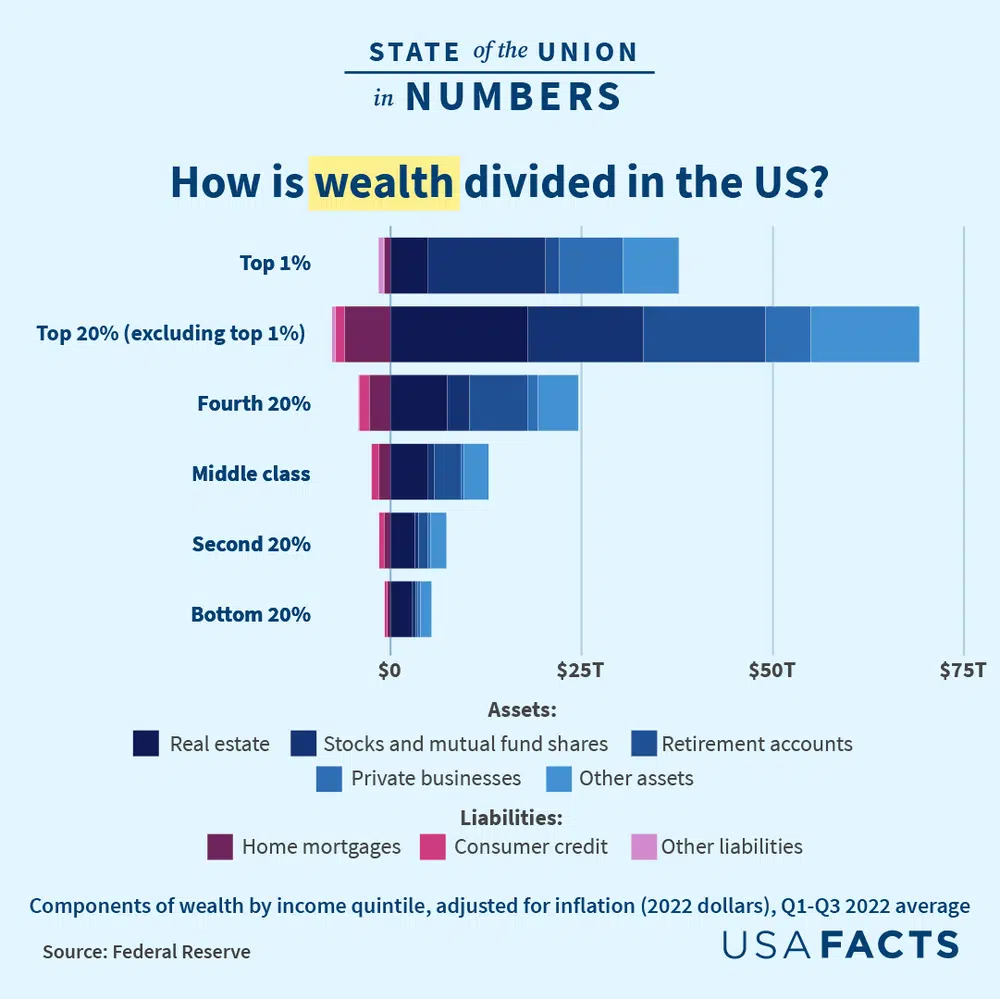
USAFacts’ 2023 State of the Union in Numbers features a detailed look at the composition of household wealth across income levels. Using Federal Reserve data, the chart visualizes how much Americans of different incomes both own and owe — from real estate and mortgages to retirement account, stocks, and credit card debt.

Each bar outside of the top bar represents an income quintile. The bottom bar is the bottom 20% of earners by income in the US, followed by next 20%, and so on. The top bar represents the top 1% of income earning households in the US, and the next bar represents the rest of the top 20%.
On the right of the chart are assets, which increase household wealth, marked in blue. On the left are liabilities, or debts these households hold, in pink.
Here are three key takeaways from this chart:
1. There is significant wealth inequality, especially at the top of the income bracket.
To simplify, the chart below combines the entire top 20% into one visual. Notice the overall shape.
Each of these income quintiles contains the same number of households. If wealth were equally distributed, the bars would all be the same length. Instead, this chart shows significant wealth differences between the income quintiles, and the top 20% has markedly more wealth than the other quintiles.
Get facts first
Unbiased, data-driven insights in your inbox each week
You are signed up for the facts!
The scale of inequality between the income quintiles grows at the top. The top 20% group has over four times as much wealth as the fourth 20%, which has close to double the wealth of the third 20%. The second 20% has around 1.3 times as much wealth as the bottom 20%.
When separating the top 1%, the inequality at the top is even clearer.
The above chart shows that the top 1% has more than half the wealth of the rest of the top 20% collectively, despite representing 5.3% as many households.
2. The greatest difference in assets between higher and lower income quintiles is money in stocks and mutual fund shares.
Further up the income quintiles, real estate and retirement fund wealth increases. However, the starkest difference between income groups is money in stocks and mutual fund shares. Below is a chart of only assets in stocks and mutual funds.
The top 1% has more in stocks and mutual funds as the rest of the top 20% combined, despite representing 5.3% of the number of households.
The differences in scale continue down the income quintiles. The top 20% has more than 10 times as much wealth in stocks/mutual funds as the next 20%. The fourth 20% has three times as much wealth in stocks/mutual funds as the middle income quintile.
Those in the second and bottom 20% have similar wealth in stocks and mutual funds, with an average of $16,000 in stock wealth per household.
3. Mortgage debt burdens the middle class the most.
For many Americans, their biggest source of wealth is their home. Around 65% of Americans are homeowners. Many households put a significant amount of their wealth into real estate, which is reflected in both assets and liabilities. Mortgages represent the amount of money households still owe for their homes, and the financial burden of these mortgages are highest among the middle 60% of earners (including the second, third, and fourth quintiles).
One way to evaluate the relative size of mortgage debt is taking it as a percentage of overall net worth. Net worth is equal to the total amount of assets owned minus the total liabilities owed.
For the middle 60% of earners, mortgage debt is highest relative to overall net worth. Mortgage debt represents around 13 to 14% of the middle 60% of America’s net worth. People in the bottom 20% are less likely to own homes; mortgage debt represents 8% of their net worth. On the other end of the chart, mortgage debt is 2.5% of the top 1%’s net worth.
Learn more about wealth and savings in the US and get the facts every week by signing up for our newsletter.


.jpg?w=600)


