The world was stunned Monday and Tuesday by the release of the first science images from the James Webb Space Telescope, showing targets from nebulae to deep fields in glorious detail. But a telescope isn’t like a smartphone camera where you can point at an object and press a button to capture it. The process of taking data off Webb’s four imaging instruments and adapting it into a color image is part science, part art form.
The four images released this week were processed by just two people: Joe DePasquale and Alyssa Pagan of the Space Telescope Science Institute, and they told Inverse how they did it.
The data that comes from the telescope’s instruments is downloaded to Earth and sent to instrument specialists, who refine the data and pre-process it into a usable form before passing it on to the image processors.
For typical images, the processors might take up to two weeks to work on an image such as a Hubble release. But for JWST’s early release images, they had to work swiftly to get the images ready to show the public. The pre-processing was done in just three days, and the processing in another three days.
It was an intense work period, but Pagan wouldn’t have wanted to stop working on Webb images in any case: “We were so in love with the new data that we wouldn’t even want to part from it,” she tells Inverse. “It was 24/7 working on the images and not wanting to stop.”
When the processors first receive an image to work on, it comes as a binary file with metadata and an image in black and white. “It’s usually very dark. It shows up as black on our screen before we’ve done anything to it. And that’s because it has an extremely high dynamic range,” DePasquale tells Inverse. “Most of the information is contained in the darkest region of the image, and we have to get that before we can see anything.” This is done in a process called stretching, which brightens the darkest part of the image without blowing out the brighter areas.

James Webb Space Telescope: From filters to full color
Images will come through with a variety of filters from different instruments, with each filter representing a different wavelength of light, and this stretching process is applied to each one. To get from a black and white image to a color one, the processors work on each filter, with shorter wavelengths generally assigned bluer colors and longer wavelengths assigned redder colors. The processors select a combination of unique filters to create a color image, which is how they can merge data from multiple instruments into one picture.
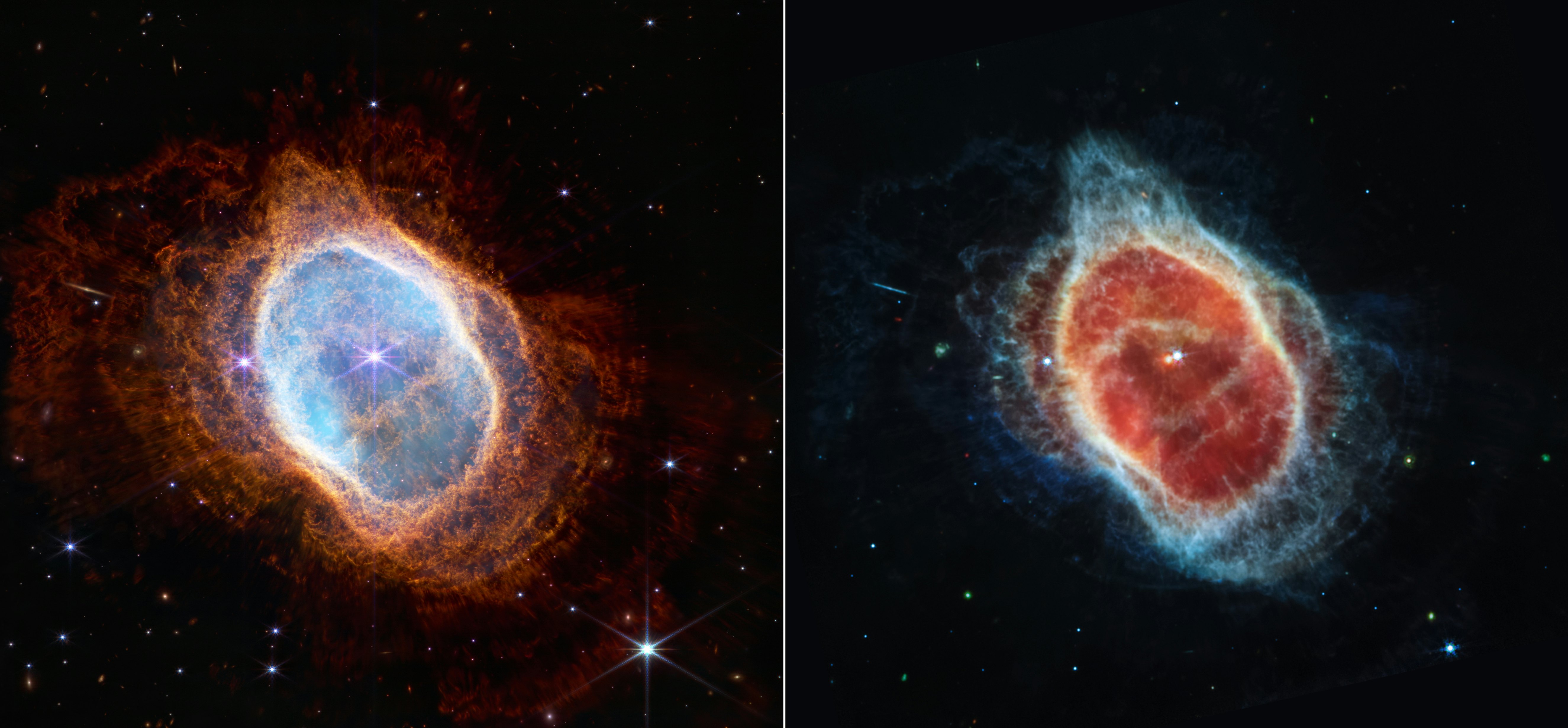
The choice of which filters to use and how to combine them is a key decision in the production of an image. The processors look for filters that can emphasize different details of the object, and you can see how this works in the two images of the Southern Ring Nebula, showing the different features that are visible in the mid-infrared and near-infrared ranges.
Sometimes filters provide images that look very similar, so these can be averaged together. But when many of these filters are picking up different features you can assign each filter its own color range to create a very rich picture, like the image of the Carina Nebula. “Every filter gave you a different look at the Carina, which is why it ended up looking so colorful because it has so much happening,” Pagan says.

Then the element of artistry comes in. The processors start adjusting the colors and tones to create an image that is both accurate and visually pleasing. They aim for a balance of both scientific veracity and appealing beauty, “but I do think these two reinforce each other,” Pagan says. “Sometimes the most scientifically interesting things are also the most beautiful things.”
This approach worked great on targets like the Carina nebula, which had many features to pick up. But processing Webb’s deep field image required a different approach. Because the galaxies shown in this image are very distant and are moving away from us, the light they give off is shifted into the infrared range which is how Webb can detect them. This infrared light has to be shifted back into the visible range, and instead of assigning each filter to a color the six filters were combined into three channels.
This allowed DePasquale to show the nearby galaxies sharply in white and blues, while the more distant galaxies were red and blurrier. “These galaxies are appearing the way they would to our eyes if we could see them, if we had the sensitivity of a telescope,” he says.
With the early release images finished and shared with the public, STScI will continue doing some image processing of future data releases along with other image processors from organizations like NASA. And there’s a lot more Webb data to come.
Pagan says she’s particularly excited to see planetary data from our solar system, like being able to see the rings of Uranus, and to work on more beautiful nebulae images. As for DePasquale, he’s most keen to get his hands on more deep field images, which will be even deeper and have even more detail than the image released this week. “I can’t imagine. We’ve got so much detail in just this one image,” he said. “What more can we get? I don’t know, but we’re going to see.


