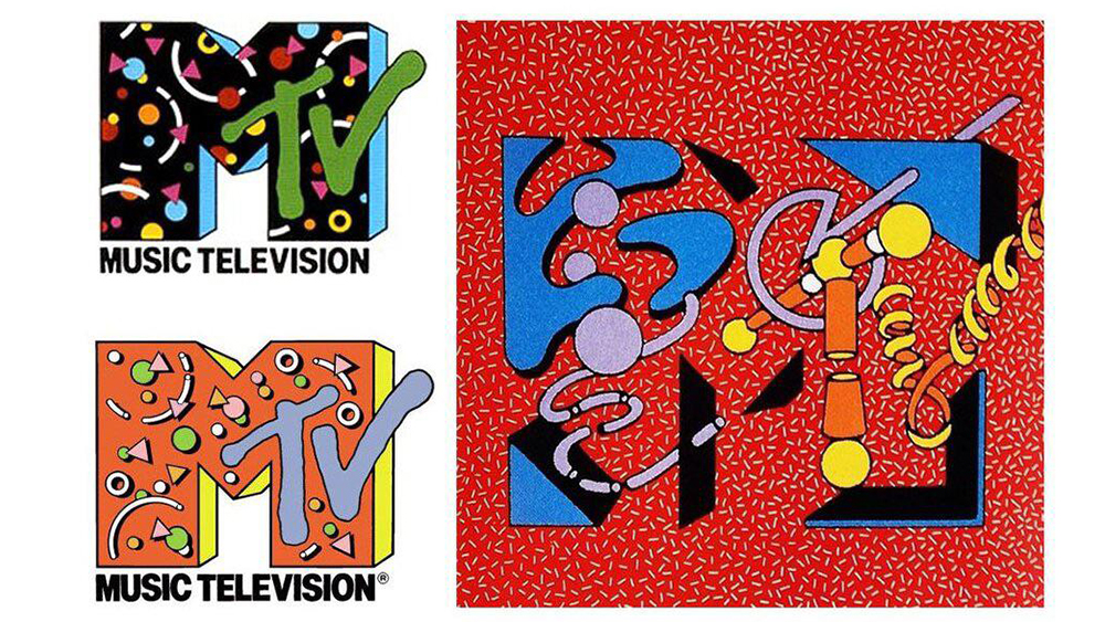
Ah, the 1980s. The decade was a blur of saturated colours, zany patterns and, yes, feathered hairdos. And if one single logo design captured this frenetic, rule-breaking creative energy, it has to be the MTV logo.
The shifting look of Warner-Amex's (WASEC) music channel tapped into a look that remains influential today by using a simple logo that could, and did, take on myriad different themes. And it's just being rediscovered by a new generation (see our guide to how to design a logo for more inspiration).
Classic versions of the MTV logo, 1980’s from r/DesignPorn
MTV began life back in 1981 and would revolutionise pop culture and entertainment with its back-to-back music videos (it was literally music television back in the day) and, perhaps even more notably, its design.
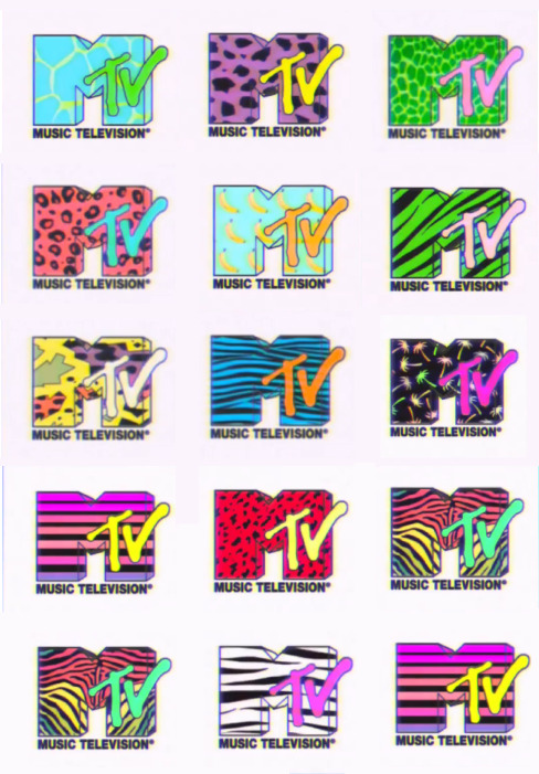
As recently noted on Reddit, the MTV logo could take on different themes depending on the occasion needed, and these were often wild Memphis design patterns that would look chaotic and garish today.
While some Reddit users are having to explain the concept of MTV to younger peeps for others, the logo designs bring back a wave of nostalgia for the 80s arcade aesthetic. "I used to draw this on my school notebooks when I was 12," one person wrote. But how was the MTV logo born, and why does it so perfectly capture the spirt of its age?
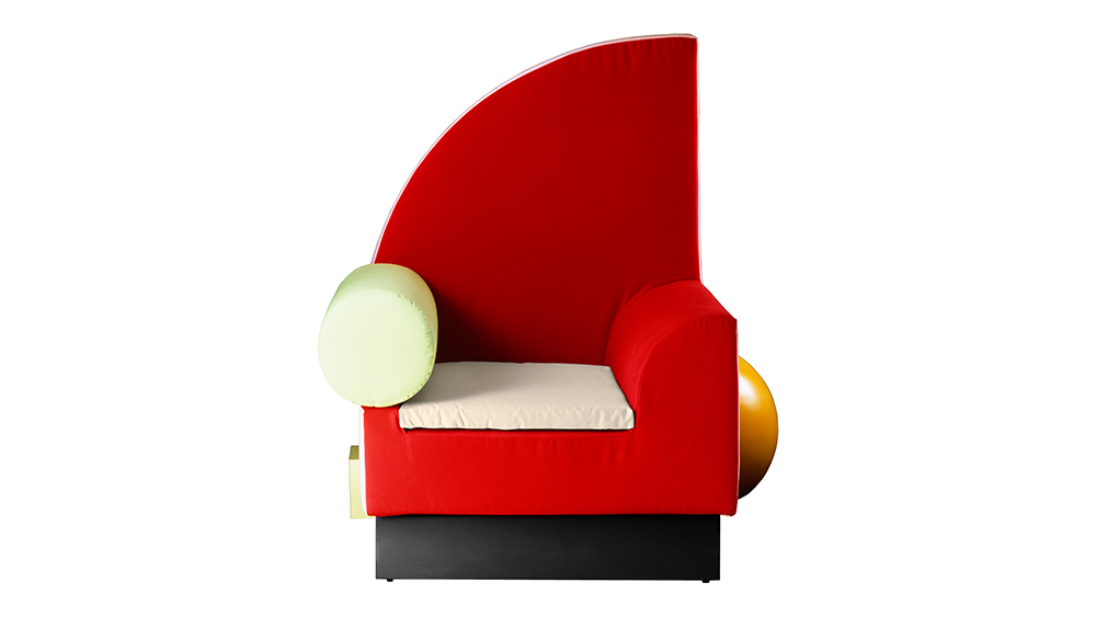
The MTV logo tapped into the international Memphis design movement. Led by the Italian architect Ettore Sottsass, the Memphis group's first show, featuring objects like the Bel Air chair, was held at the Salone del Mobile Milano in 1981, the same year that MTV launched.
The various iterations of the MTV logo with its hand drawn look and crazy patterns reflected the graphics coming out of the Memphis movement. It was the work of young studio Manhattan Design, which was hired by WASEC vice president of creative services Fred Seibert.
But their first proposal was very, very different to the MTV logo we know. On his website, Seibert shares a 1982 article and interview from the industry magazine Cablevision, in which he reveals that the agency sent him a Polaroid of a sketch of a hand holding a musical note as if it were an Apple. He loved it, but attempts to work it into a wordmark were disastrous.
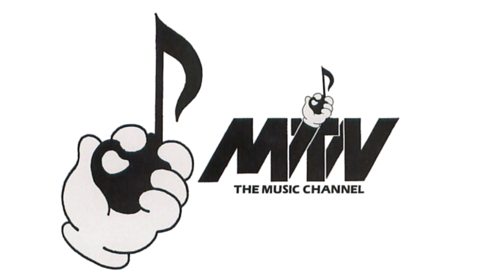
After that failure, and with it now decided that a 'MTV' needed to be in the design, the designers began playing around with the letters alone. The result was something simultaneously simple but unique and daring. A massive stately M as a 3D projection with TV scrawled over it.
The simplicity of it meant that the logo could take on a life of its on, with the M subject to all kinds of interventions, from bricks to flags, animal prints and fruit. These many outfits have the logo a feeling of movement, even if it was static.
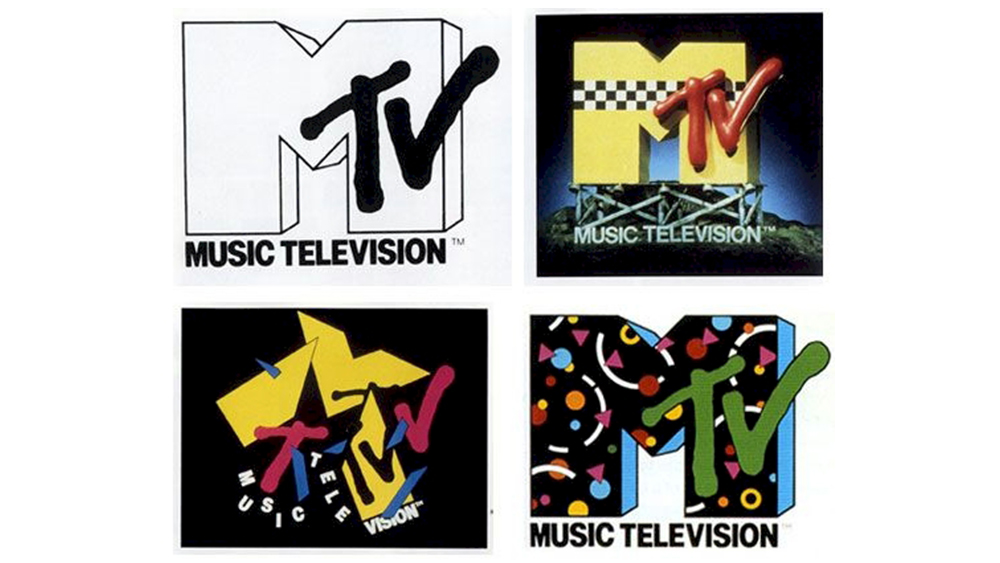
Some of them may have been hard to read, but that's not really an issue. It's MTV, it was the zeitgeist. People soon knew what it was. Seibert says the design went against everything he knew, but it came to define an era.
For the design stories behind the identities of more recent media outlets, see our explorations of the YouTube logo history and the TikTok logo history.


