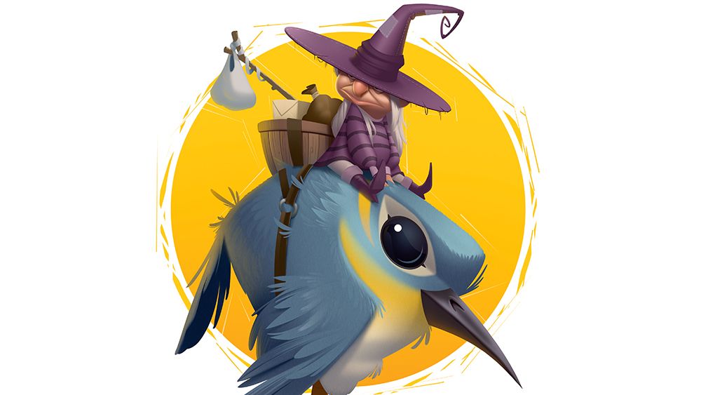
In this piece, I aimed to create a small witch traveller riding a bird, focusing on atmosphere, character and visual clarity. From the beginning, I had in mind a mysterious figure with a calm, nonchalant personality; someone who feels experienced and self assured rather than dramatic.
I wanted the character to appear as though she were quietly passing through the forest, observing rather than demanding attention. In my work, I always put strong emphasis on shape design, using clear silhouettes and simplified forms to make the character immediately readable.
My design thoughts were aiming towards triangular shapes in the overall space, with circular ones to create shape contrast and lead the viewer to the focus point. I combined natural elements, such as feathers, fabric and organic matter, with a more graphic and stylised approach.
This balance allowed the design to feel grounded in nature, while at the same time maintaining a sense of visual boldness and intentionality. See my process below. For more inspiration see our roundup of character design tips. Also see how shape played a role in why Hoppers looks so different from other Pixar movies.
01. Simple planning
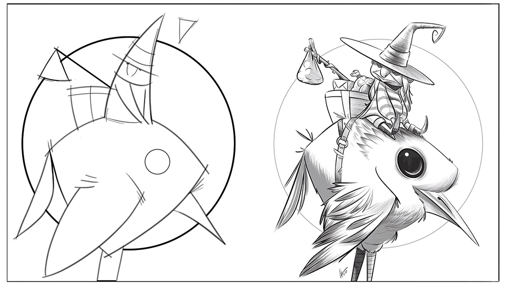
When I start a piece, I first set the ‘architecture’ of the illustration or design, which includes three points: a clear silhouette and having shapes that play well with each other (details are not important at this point); positions of objects and spacing; and flow and action lines.
This blueprint helps with making faster iterations and setting your rules for the design.
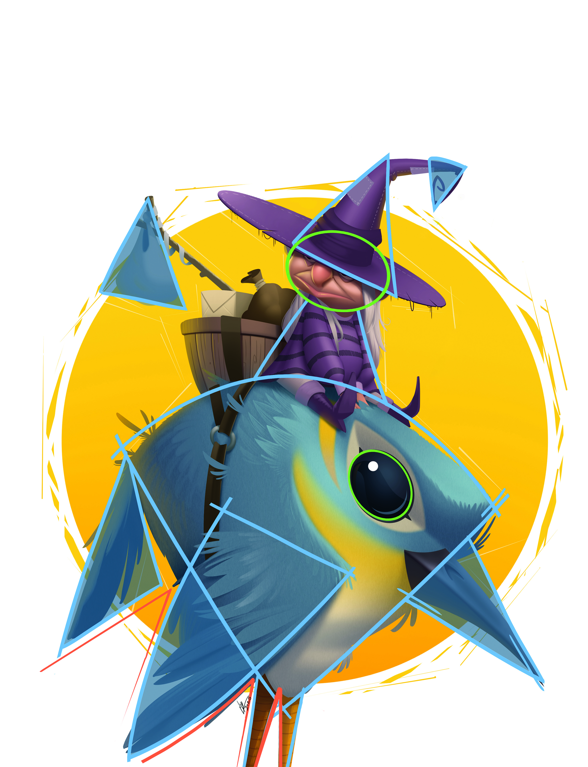
I try to use shapes that can complement each other. In this case, most of the design is led by triangles, while around the character’s face the shapes are rounded.
The circle background acts as an inner frame and serves as the overall shape that helps organise all the items around and within it, and complements the silhouette.
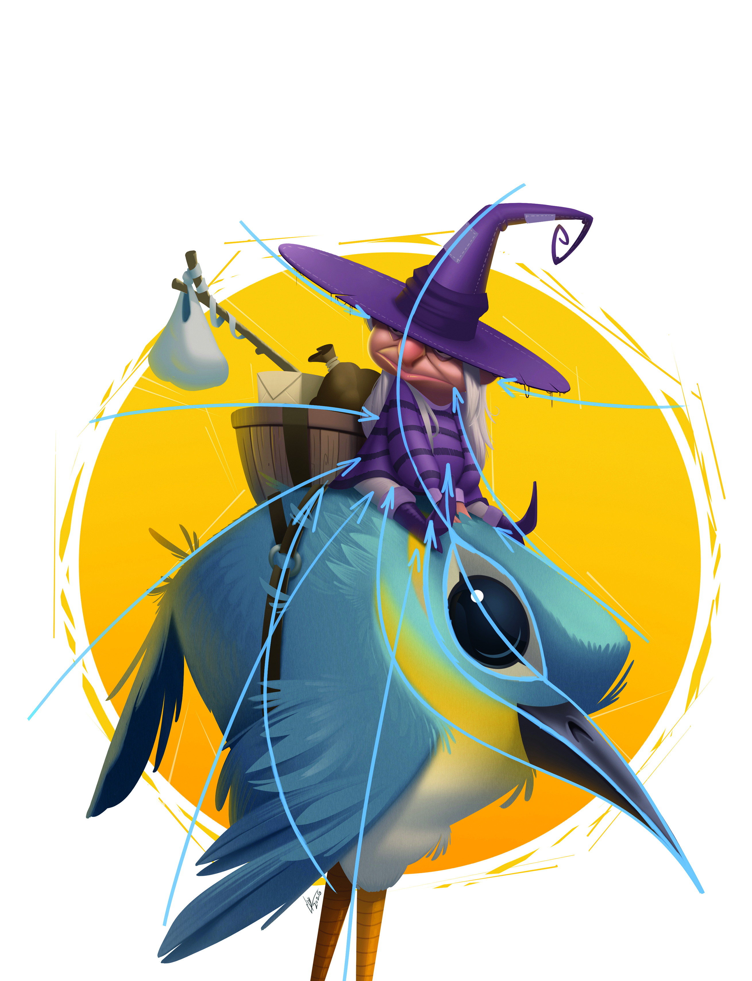
I use shape flow and action lines. Here, I look at shapes as opportunities to bring more dynamism by pushing the general design and shape orientation to direct the overall flow towards the point of interest – in this case, the character’s face.
Shape in negative spaces also plays a role. I try to use similar shapes to give clarity to the surroundings and keep the design’s shape harmonies.
I look to music notes by trying to find the right spacing and negative spaces, so that I can get a nice rhythm. This also helps me find clarity of objects within a chosen space.
02. Colours
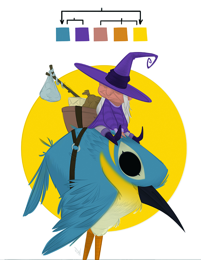
These are not randomly picked; it involves a blend of mathematical principles and emotional responses. Understanding contrast can make elements stand out, while harmony can create a seamless integration.
By choosing colours, you influence the mood and atmosphere, shaping the viewer’s experience and evoking feelings associated with your work.
03. When’s it done
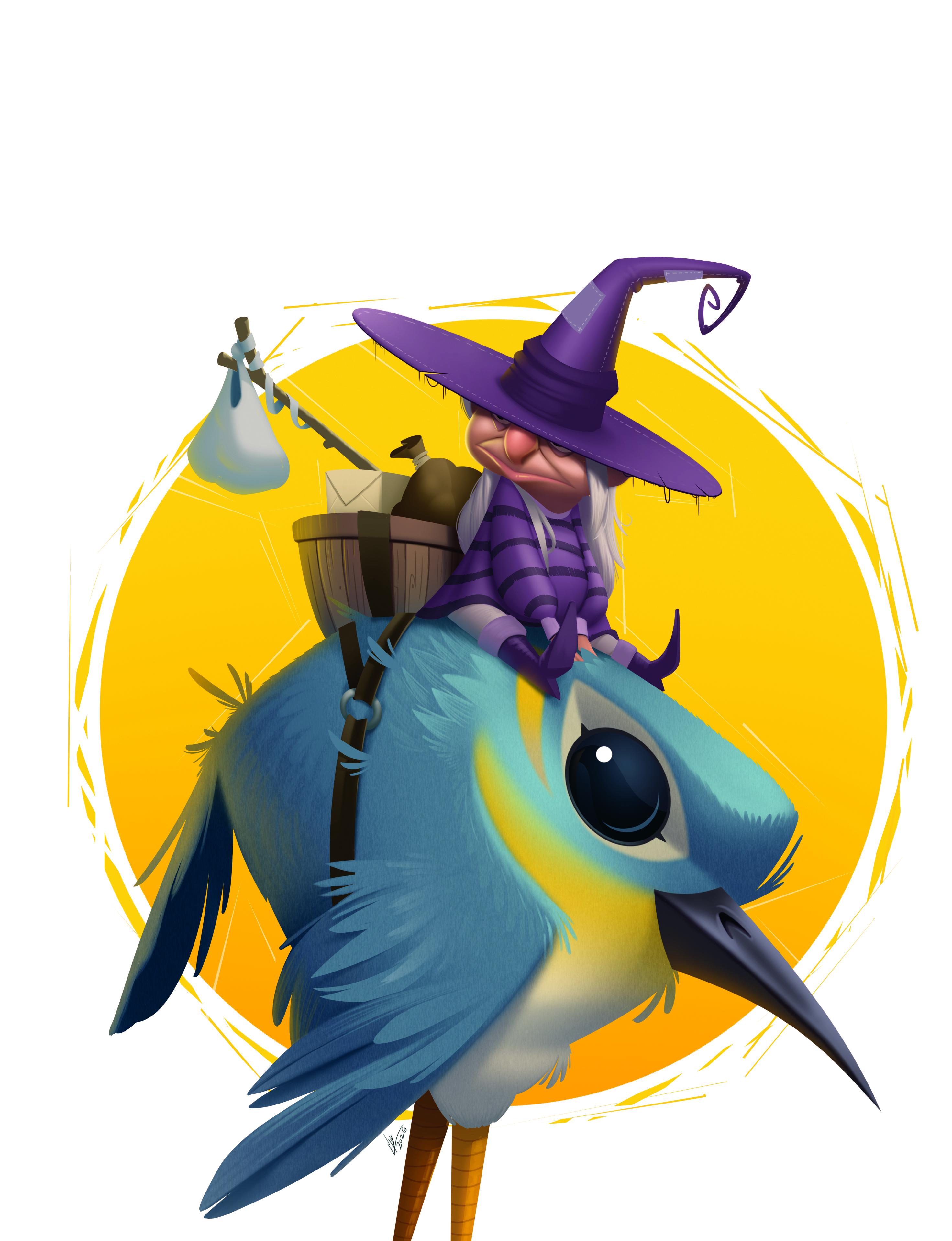
There are a few things I look at before I ship it: whether the details are consistent, because I don’t want elements to feel off or isolated; if it’s saying what I intended, or adjustments need to be made; and whether I enjoyed making it.
As the process is what makes it enjoyable, it’s important to like what you did – or at least the process – and see what you could do better next time.
This article originally appeared in ImagineFX. Subscribe to ImagineFX to never miss an issue. Print and digital subscriptions are available.