Since the birth of the modern Olympic Games in 1896, the event has become one of the most significant and widely recognised in the world – and not just for the thrilling 100m sprints or the awe-inspiring gymnastics routines.
The Olympic Games is well known for its wider cultural symbolism and has one of the strongest brand identities you’ll find anywhere in the world. Not only is the summer Olympic Games a global sporting event, it is also a visual experience par excellence.
For design enthusiasts like me, the Olympics is always an opportunity to analyse how design trends are shifting and witness the evolution of a timeless brand every four years, as it flexes to reflect the identity of each host nation. This year’s Olympics identity is no different. In fact, as Marie Sallois, Brand Management Director at the International Olympics Committee has written, this year saw the introduction of a comprehensive new design system for us to pore over.
There is no doubt that to create a new Olympic Games logo and visual identity is one of design’s toughest branding challenges. As well as preserving the foundations of the event’s long-term identity, there is also a need to convey the culture of its host nation and city, and present both its heritage and future. All of this must be contained in a design simple enough to work in a number of different environments, from wayfinding signage and lanyards to giant billboards, digital touch points and live TV broadcasts.
So, let’s take a deep dive into this year’s Olympic visual identity, and explore how the IOC has managed to evolve a timeless brand with finesse.
The new design: a balance of tradition and modernity
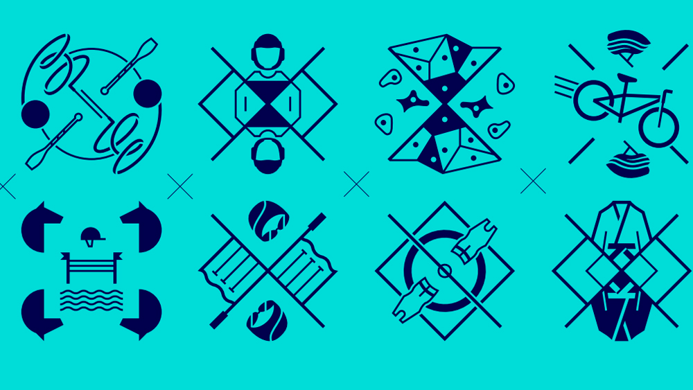
The design system implemented this year aims to retain the heritage of Olympic legacy while bringing the games into the future. The symbols and custom typeface were created by agency Royalties-Ecobranding, while the global branding (look of the games, pictograms, signage system) were designed by W Conran Design.
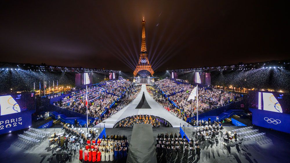
The two creative agencies have crafted an identity that will go straight into the ever-evolving history of graphic design, with an audacious and innovative approach to branding and the overall graphic language. From the iconic symbol to the colourful sports fields, to the memorable opening ceremony: all expresses freedom, inclusion, and hope.
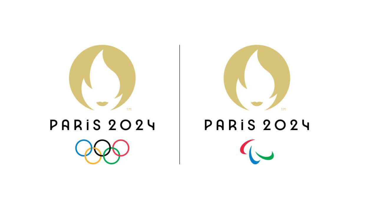
The custom typeface is inspired by Art Deco, the artistic movement which originated in France during the 1910s and projected a culturally rich image of France throughout the 1920s – when the Olympic Games last took place in Paris (see the logo from that games here). References for the typeface seem to have been sign lettering from famous historical shop entrances and areas, such as Le Bon Marché, BVH/Le Marais, Les Folies Bergère or Le Louxor. The typeface family spans across 7 weights, including alternative glyphs to enhance expression, as well as matching italics and a variable font version.
This is a fluid design, full of curves and quirky features that add dynamism and vibrancy to the visual identity. It is rooted in the past yet modern, reflecting the host city’s rich cultural history and ability to lead on social and artistic trends even today.
Choosing a creative direction rooted in a popular historical art movement runs the risk of ending up with an identity that feels dated, and unrepresentative of current cultural expressions. The IOC and their creative partners have avoided this pitfall by producing multi-colour branding assets and a patchwork of shapes and graphic elements for use across sports fields, billboards, outfits and printed assets, adding a strong sense of modern vibrancy to pull the identity into a contemporary spirit, inspiring energy and a sense of the future.
The typeface, obviously only suited for display usage, looks gorgeous in Italic Black, particularly in monumental sizes for words or short sentences. The representation of the word ‘Paris,’ for instance, finds that perfect balance between art, heritage, and progress.
Leaving an indelible mark on the sporting experience
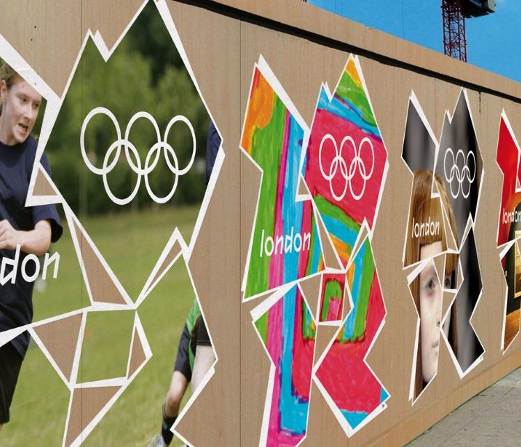
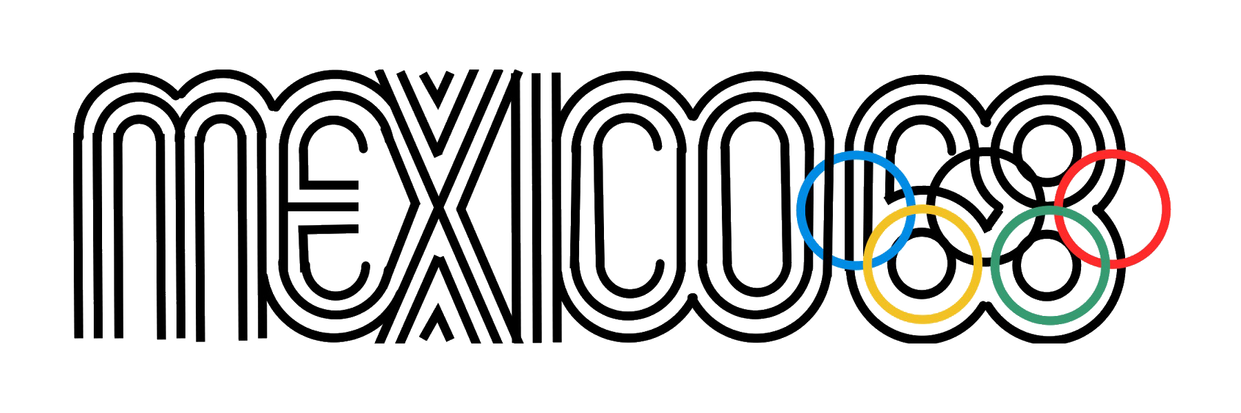
The Olympics has a proud history of era-defining identities, with custom typefaces and visual palettes used to anchor the cultural heritage of host cities and countries into the minds of audiences around the world. Mexico 1968 and London 2012 are two wonderful examples of this, identities you can recognise and remember in the blink of an eye.
The hypnotic logo and typeface of Mexico and the bold energetic letter shapes for London 2012 are unique expressions of the individual nations’ cultures that host the Games. They show sport as fans and players see and experience it, which is never staged or set up. The identities and typefaces also always convey the motion of competition, action - and communities brought together through sport.
When the design of a typeface, a symbol and a visual identity are crafted all together based on local culture and a truly global experience, it creates an impactful experience that reaches people’s subconscious and leaves an indelible mark. And that is how a visual identity makes history. This year, the Paris Games saw another injection of modernity into a timeless brand, a perfect representation of the Olympics’ values of encouraging progress and peace by uniting the world on the field of play.
For an overview of Olympic design, see the best Olympic posters ever.