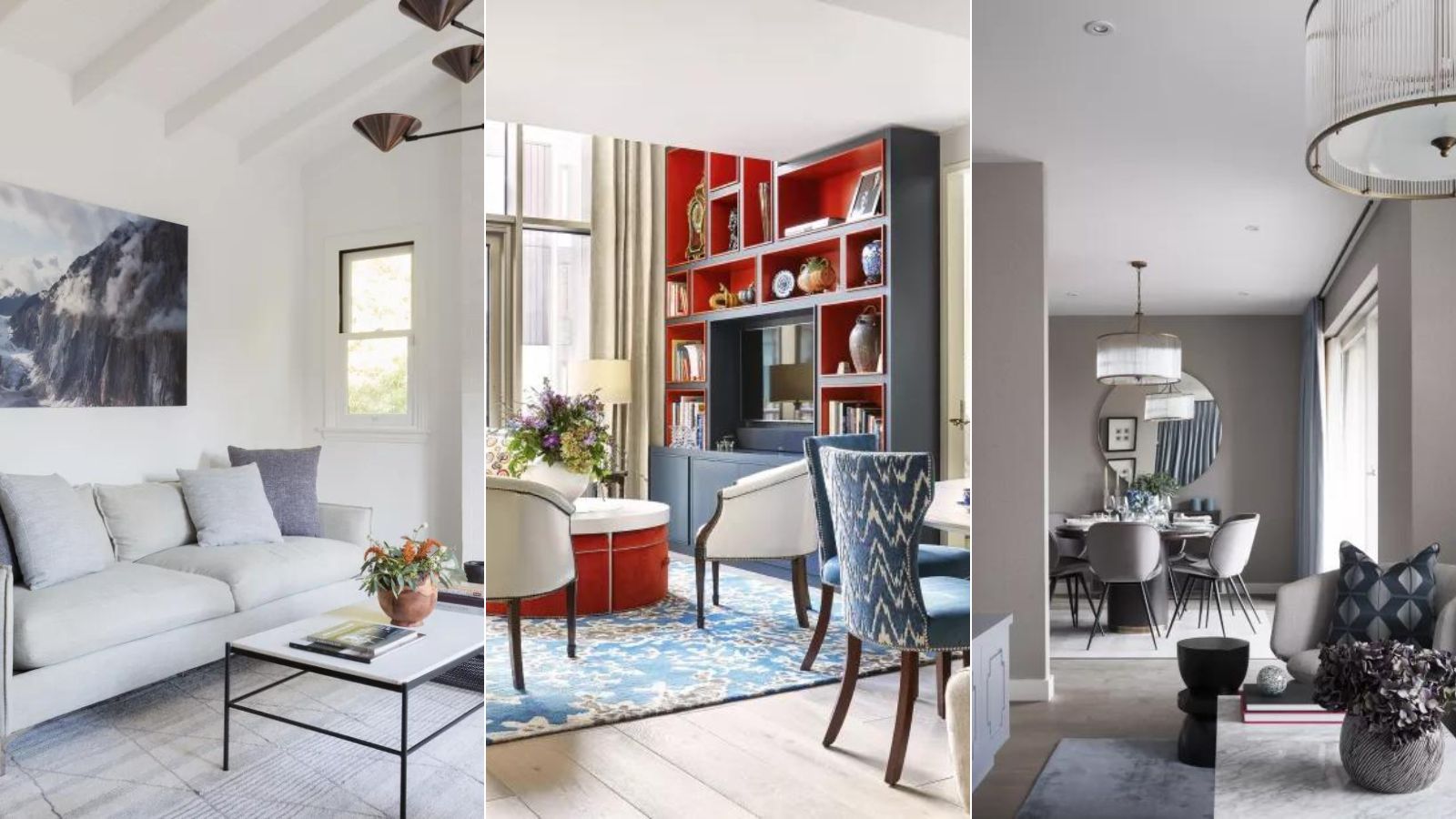
Designer, amateur, or otherwise: curating a color scheme for your home – let alone the number of colors – can be overwhelming. Scrolling Pinterest or Instagram can often leave you even more riddled in decision paralysis; just as one perfectly painted bathroom comes up (that’s the one!), another bathroom capsizes your original idea (no wait, that color!).
The truth is: Some designers have rules on how many room colors should be in a home, and other designers think things like personal expression and color combinations are more important deciding factors. Here, we share what designers, color consultants, and experts take into consideration when they’re curating their color palette of a home – and how many they choose. We’ll share both, then you can decide what works best for you.
The general consensus is that you’ll naturally have an intentional home color scheme when you take it all in holistically; considering your inspiration sources, the light sources within your home (is it north facing? or south facing?), how your colors combine, the mood and life of your rooms, and, of course, having the confidence to express your own personal style, is what’s paramount. Break the rules, follow the rules: The choice is yours.
Curate your inspiration thoughtfully
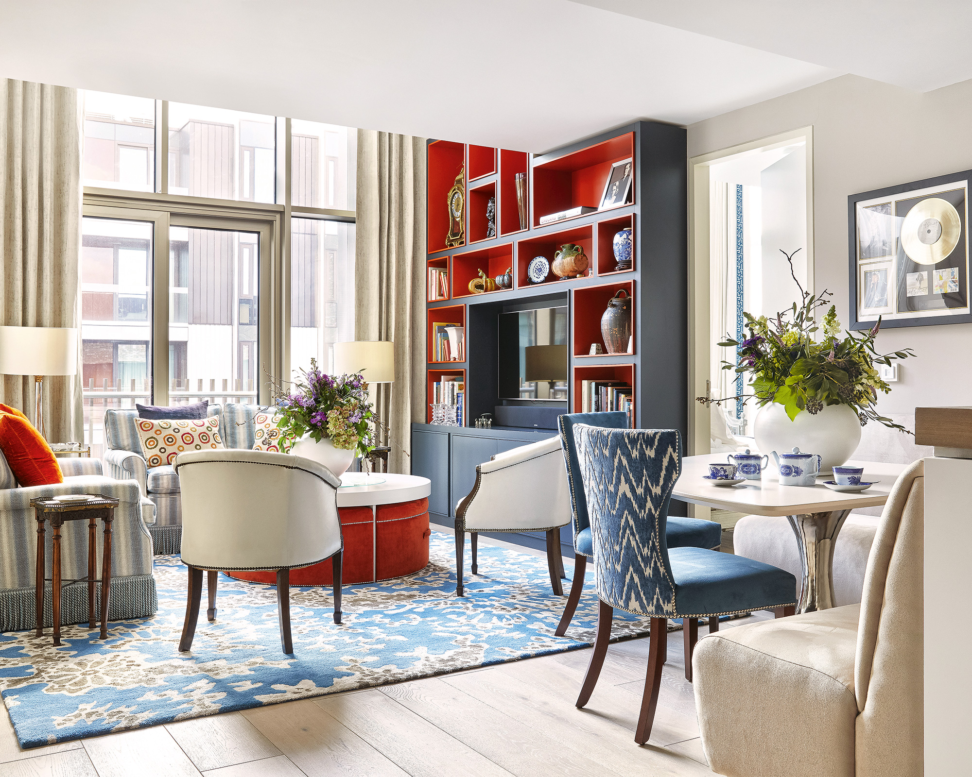
Color aside, you first need to think: where am I getting my home ideas from? What are my reference points? If you’re calling it a day after screenshotting one or two nice colorways of a living room on Instagram, or only using Pinterest as your inspiration source, this might be why it’s hard coming up with your own personal color palette. It’s information overload, but not of enough depth.
Make your color inspiration gathering more varied: look in your wardrobe, at what colors are coming up. How about your favorite artworks, an art movement you love, book covers, photographs? Notice what colors are catching your eye on the street, or even the colors that come up when you’re cooking. Consider your surrounding space too and the nature you’re drawn to – what kind of grasses, flowers, rocks, pebbles, or sands come to mind? Do you notice a theme?
When you attune your eye to the colors that extend beyond just image after image of interior design rooms, you’ll find that your color palette will become gradually more refined and selective, because it’s a curation of your own ideas mixed together in a unique way.
Think about your personal aesthetic
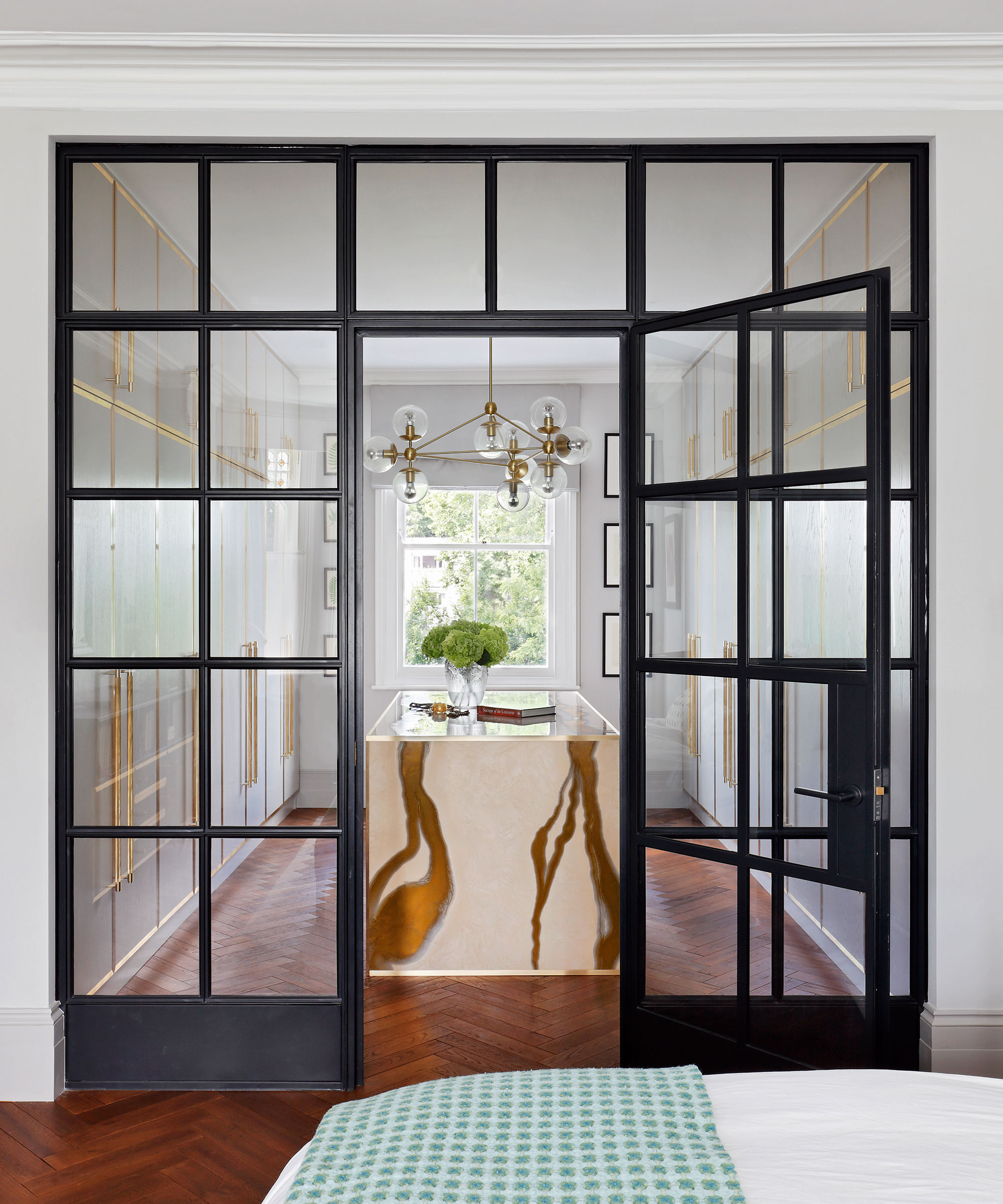
Being intentional with your inspiration means you’re no longer at the whim of whatever design image hits your feed, or whatever next trend tapping at your screen; it’s about carving out a clear conviction on what colors are right for you, your lifestyle, and your home.
It’s something that Patrick O’Donnell, international brand ambassador for Farrow & Ball agrees with: ‘There is no real rule, you can have a different color in every room if so desired and what those colors are will depend on your personal aesthetic and natural confidence. Your chosen palette could be bold and adventurous, a combination of colors sharing a similar ‘weight’ or just a simple transition of colors and tones through a particular color family, with possibly a few complementary accents thrown in for good measure. Or at the other end of the scale, have one color running throughout – the choice is yours.’
‘There is no set rule,’ says Amy Hemmings-Batt, founder and director of Coco & Wolf. ‘It’s important to remember that our home should be a place where we create what we love, you don't need to be lured in by color trends and rules, no matter what Instagram says.’
Start with an ‘anchoring’ color

If you don’t know where to start, Lick’s director of interior design and color Psychologist, Tash Bradley, suggests it’s ‘really important to have one whole house color scheme as your thread throughout the house that links all of the rooms together. For example, you could have pink running through the house in each room which will really tie the palette together throughout the whole house.’
What could help you flesh out your home color palette further is then by researching your colors’ complementary hues from the color wheel: ‘Loved by artists and interior designers alike, the color wheel is an age-old concept for working out which colors complement one another. In theory, colors opposite each other on the wheel will work together in a contrasting scheme, so if you really don't know where to begin, a color wheel is a great place. Most of us will have an idea of colors we love or are naturally drawn to, so start there when consulting the wheel,’ says Amy Hemmings-Batt.
Think about how the colors combine with eachother
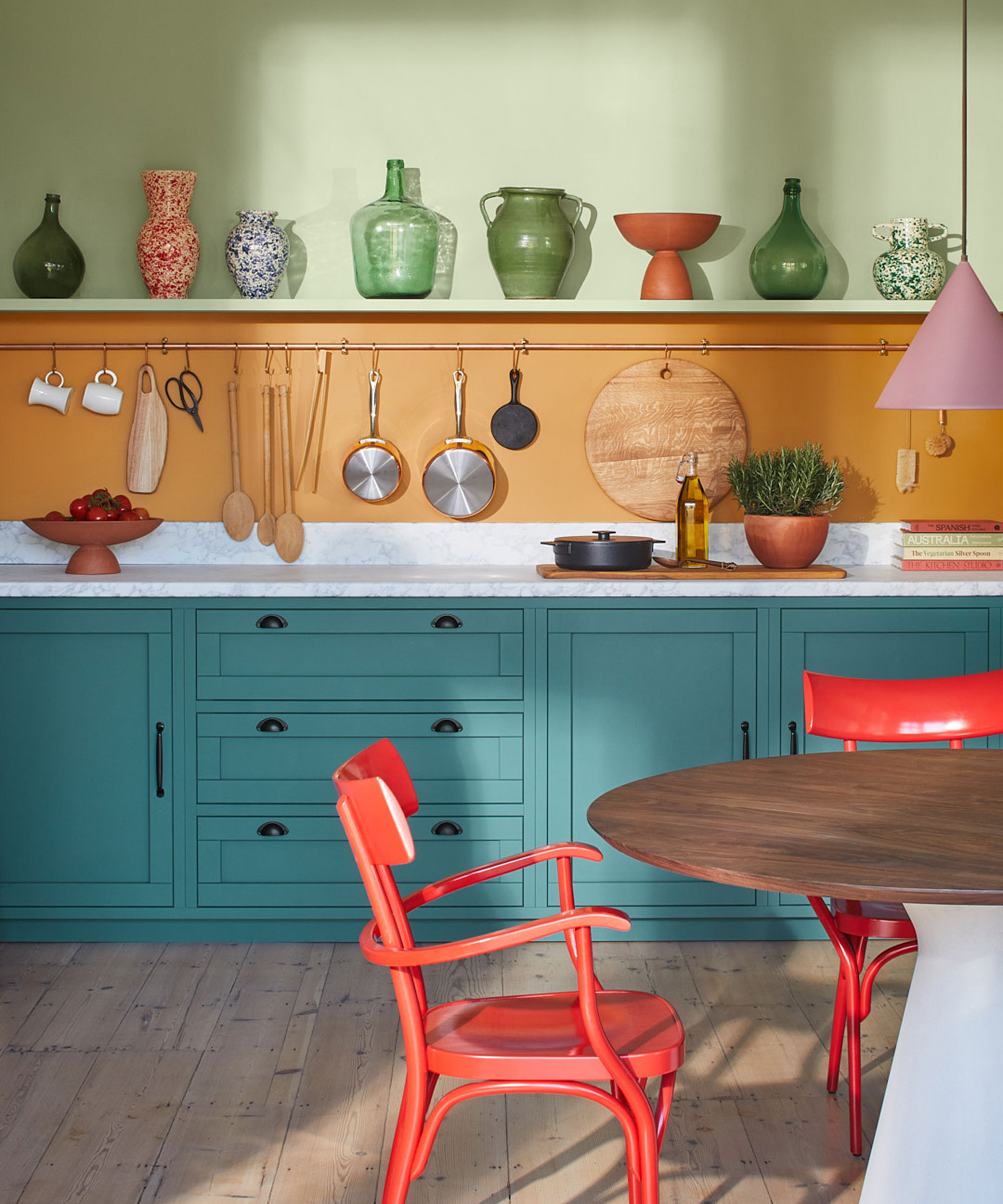
‘More important than the number of colors is the interaction between them,’ argues Tamsin Saunders of Home & Found. ‘Where and how different colors meet and how that affects your experience of those colors. It’s not just the walls, it’s the doors and the architraves, the worktops, the ceilings, the floors, the artwork, the different textiles, objects and pieces in a room, and how they play off, combine and interact with each other. Everything I place in a room is there not just for its form or its function but for the color and texture it brings to a room.’
Think of it this way: painters will be much more intentional about which colors they’re putting next to each other in painting, then think to tally up the number of colors as one ‘golden rule’ beforehand. Take Van Gogh – he had a wooden box next to him in his studio. It was full of threads of wool of different vivid colors, to save himself from wasting expensive paint on experimentation, he’d bind and wind, play around with the different contrasting and complementing colors of the woolly threads, weaving them together before he daubed his color pairings on the canvas. It’s not just about the number of colors then, crucially: it’s how you let them sit with each other.
Create your own ‘rule plan’ – if you want one
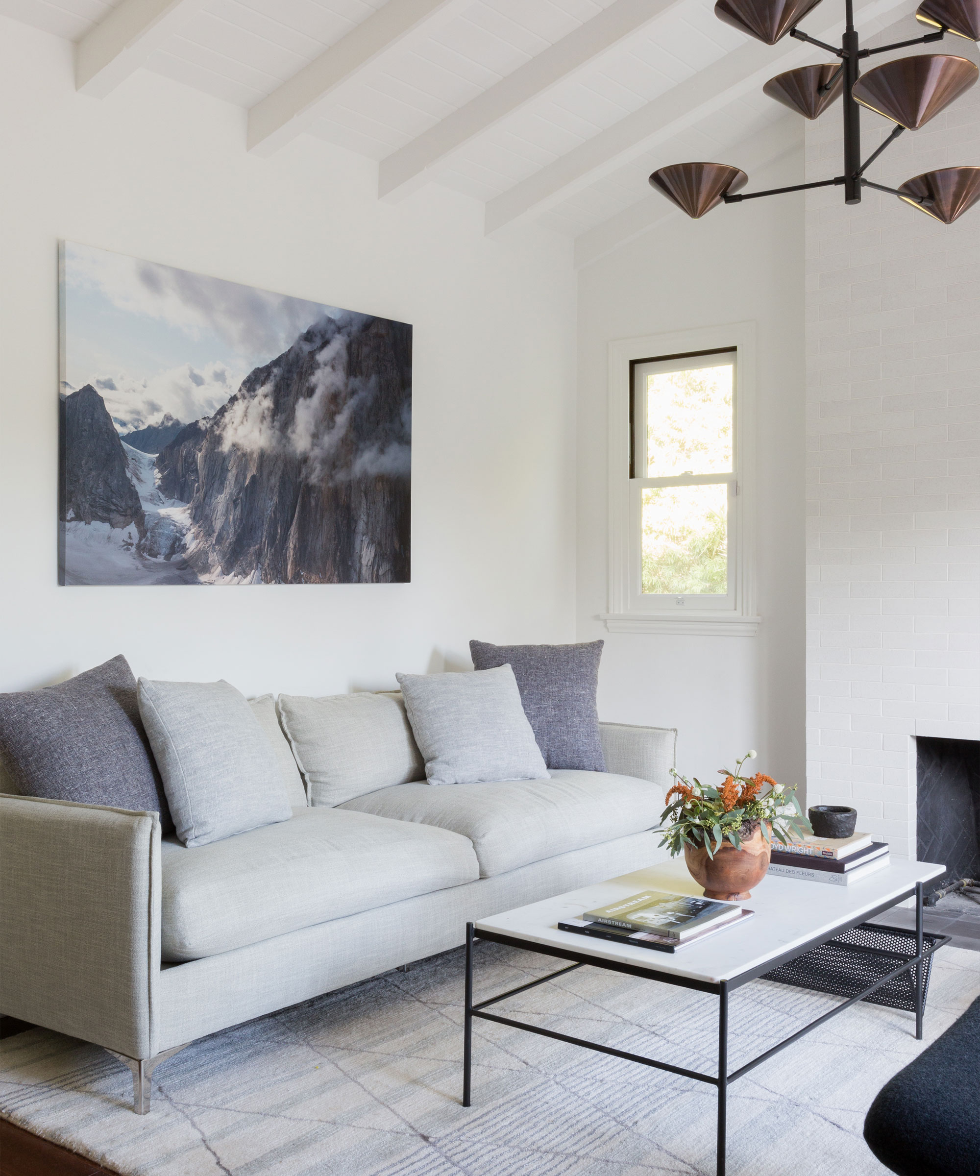
Constraints can make you more creative. Though there are no ‘golden rules’ when it comes to how many colors should go in a home, sometimes designers make their own internal color rules to help guide them with their design projects.
That’s the case for Jen and Mar at Interior Fox. ‘We don’t have a rule on the maximum number of colors in a house, but we do have a minimum of five colors in a room. That might sound like a lot, but it’s not! We consider floor color, wall color, ceiling color, furniture, and textiles as the main five to think about.’
‘For walls and ceilings,’ Jen and Mar say, ‘we like to have the ceiling color just a few tones lighter than the walls.’ They also say that color, even if you don’t love being bold with it, their rule still stands: ‘You don’t need to go with bold jewel tones or dark hues but having a range of colors in the house brings so much life. It can even be as simple as having different hues of white if you are worried about color on the walls and adding color to the furniture or textiles instead.’
Tash Bradley at Lick shares how she follows her rules: ‘I would stick to no more than six to eight colors for a full house renovation. I would then recommend no more than three colors per room. For instance, if you have white, green, blue, teal, pink and an accent yellow, you’re able to go up and down the weight and scale of those colors. For example, you could use pink on the walls, and then go for a dark pink for your sofa, and it then remains within one of the three colors per room. This will also help you avoid a room becoming too ‘matchy matchy’, so you can have fun when playing with the tones of your color palette.’ Rules can be a great guiding force in a project, so pick whatever feels right for you and your home.
Don't forget about natural lighting
Lastly, don’t create a color palette for your home without thinking about how natural light enters. Color is ‘constantly changing according to the light and the season,’ says Tamsin Saunders. ‘The colors you notice in a room will change according to what’s seen through the windows and the light coming in from outside.’
It’s not just the seasons: a north-facing room will have limited direct sunlight throughout the day (so expect cooler tones) – so you may want to decide on warmer hues here. The reserve applies to a south-facing room, where there is much more direct sunlight during the day. It’s also about your daily rhythms with the light in your home too. ‘It’s somehow good for the soul to spend daylight hours in lighter spaces, and follow the circadian rhythm by going to darker spaces at night,’ says color consultant at Farrow & Ball, Joa Studholme, in an Instagram video.


