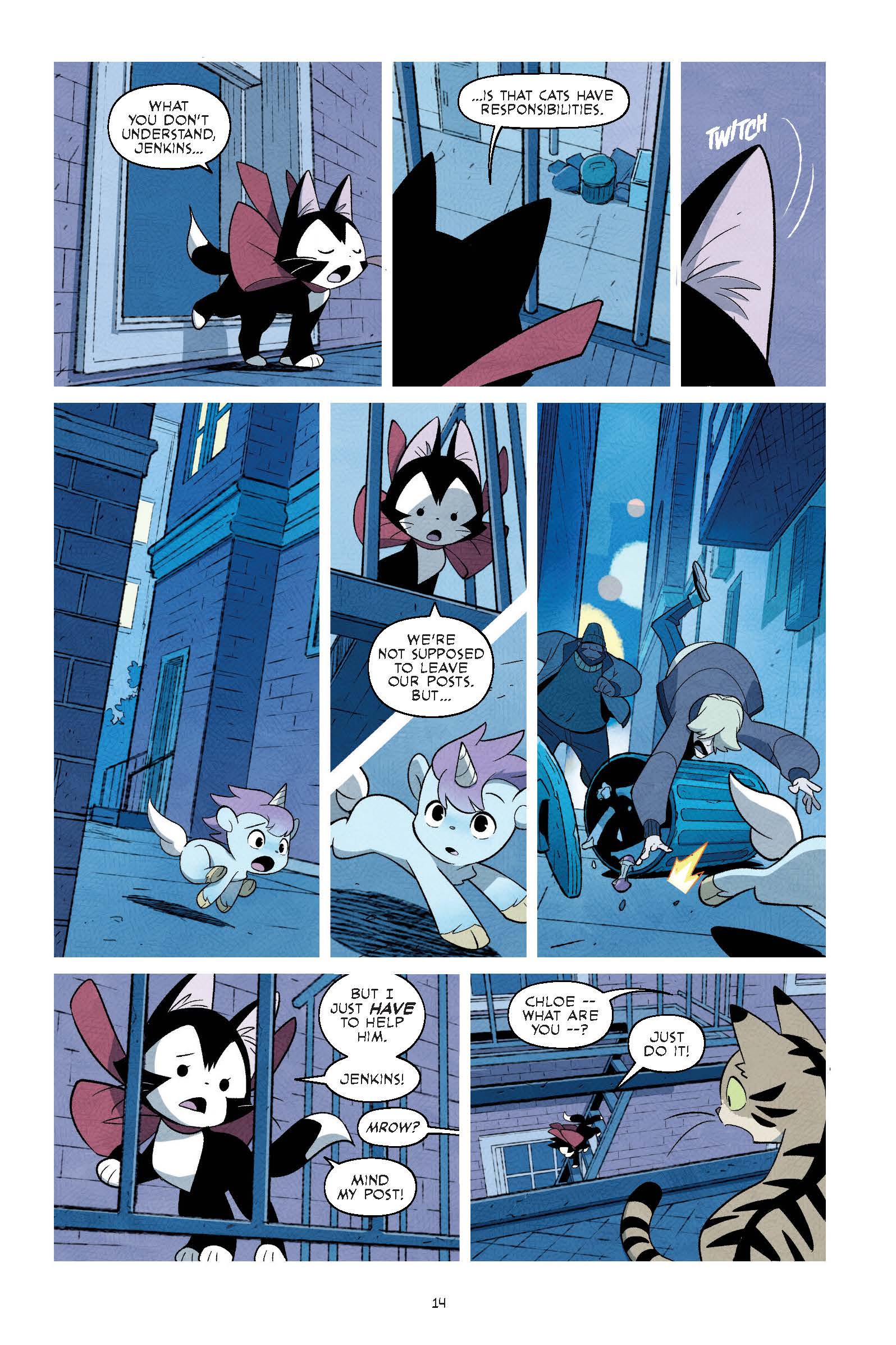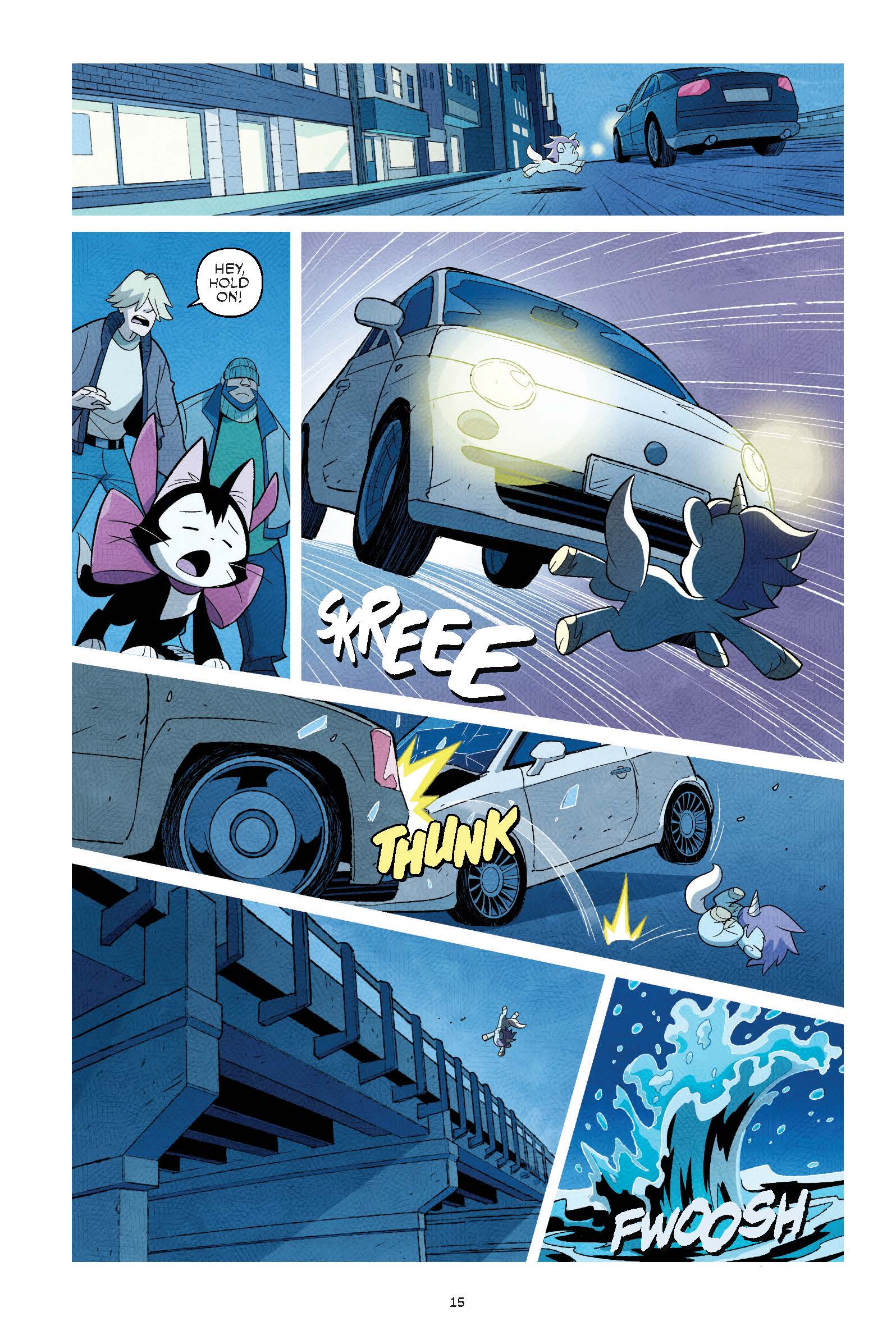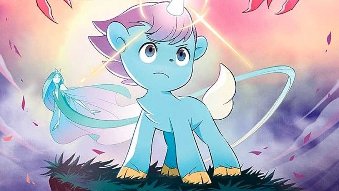
Artist Osamu Tezuka is often referred to as the 'father of manga' and one of the greatest comic artists of all time, so you can imagine the pressure on an art team asked to redesign characters by the creator of Astro Boy. That's just what Japanese creative team Gurihiru were tasked with doing for the new kid-friendly reworking of Unico, a manga by Osamu Tezuka first published in 1976.
"There was a lot of pressure for us to work on a manga by Tezuka-sensei," says Gurihiru. "We really thought a lot about being a part of this project and took a long time until we answered."
Gurihiru is an Eisner Award-winning art team, the duo of Chifuyu Sasaki (artist) and Naoko Kawano (colourist), who explain: "The reason we chose to work on the project was that we wanted the challenge and that Tezuka Pro told us that we should not stick to the original design and to work freely with our style. Those two things made us think that we can work on the project."
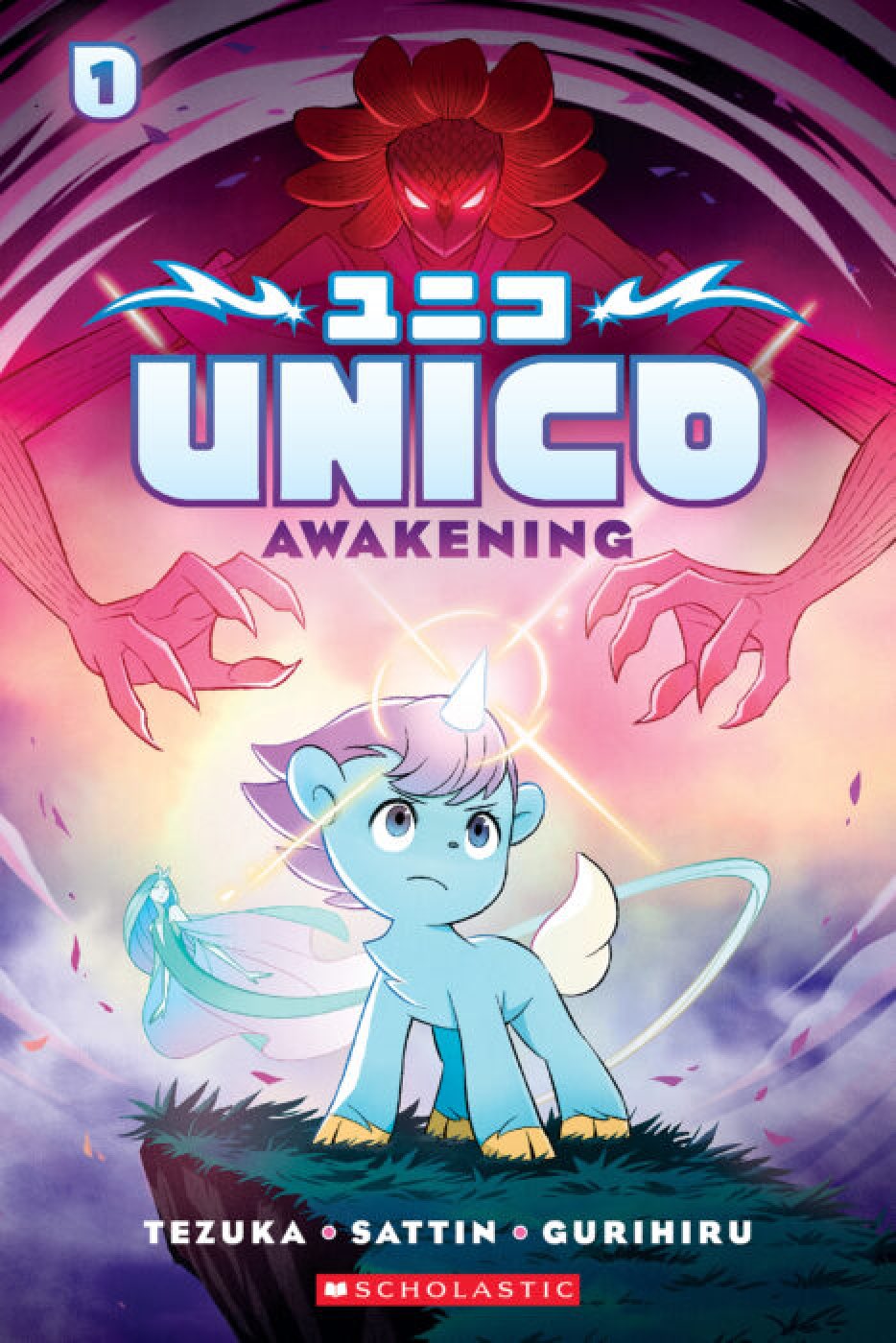
Published by Scholastic, the new book, called Unico: Awakening, follows the adventures of the titular unicorn, who after being convinced to turn a cat named Chloe into a human girl releases all manner of problems to overcome and unforeseen consequences.
The book is the first manga from Scholastic and has teamed the artists at Gurihiru with award-winning writer Samuel Sattin, who tells us why this this is the ideal creative team to take on Osamu Tezuka's book.
"No one draws like Gurihiru. I mean that. They’re not just absurdly talented artists. They’re unique. They combine eastern and western cartooning so seamlessly they’ve created a new kind of art," says Samuel.
He adds: "At risk of embarrassing them, I’d say that they’re exactly what Tezuka imagined when he talked about comics being an international language. They’re bridge builders. They also just have such an amazing command of movement and color and expression. If you were to mash up Tezuka himself with the art of classic Disney films (Tezuka’s principal inspiration), then you’d have Gurihiru. They’re the stuff of legend."
Unico: Awakening releases 6 August, follow the Unico Twitter for updates. Below I speak with Gurihiru and learn a little more about this creative team's approach to art and character design.
CB: How did you begin the reinvention of Osamu Tezuka's characters?
Gurihuru: Unico is an old manga so we thought that if we can arrange it so the kids nowadays will look at it and will not think that it looks old it may work.
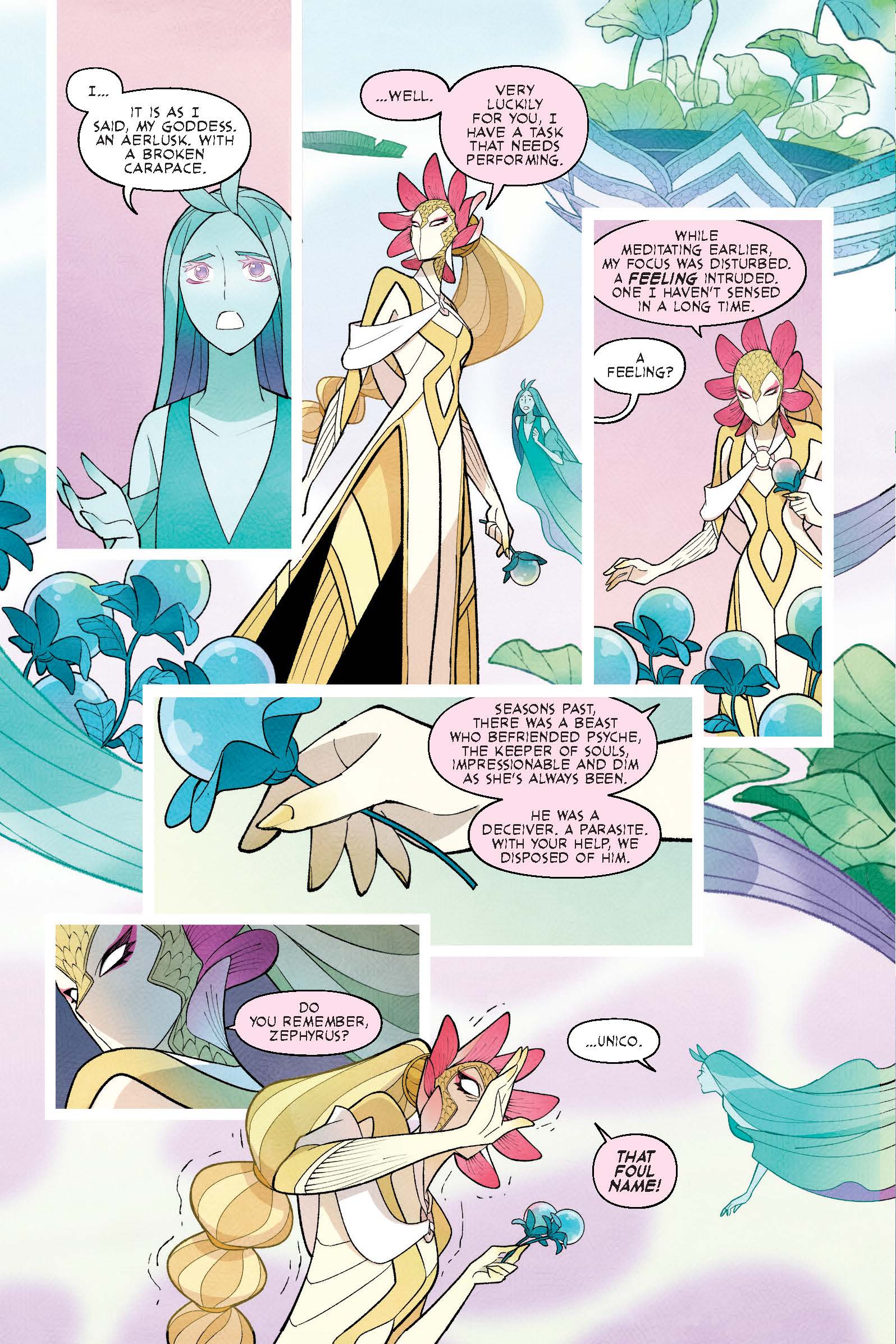
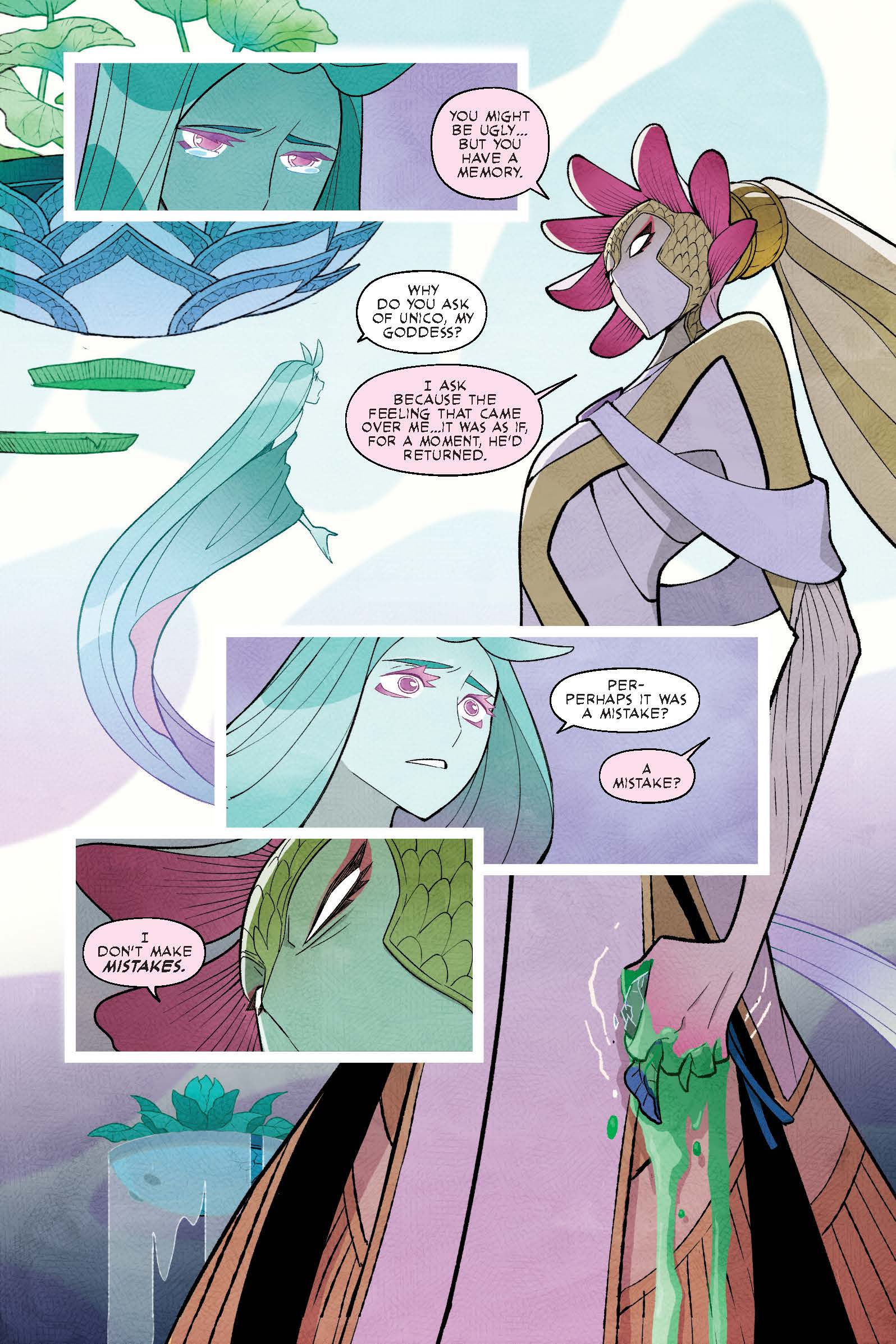
The original Unico can look like a girl at some point so we made the mane a bit stronger and more gender neutral. Venus was drawn as a beautiful woman in the original manga, but the definition of beauty depends on each and everyone’s values, so in our Unico, we stopped expressing with the look and make it more like an alien. And the villain, Byron’s suits are designed based on modern day clothing.
But we did not re-design without thinking. We wanted to keep the charm of Tezuka-sensei’s design as much as possible and tried to re-design it with the best expression possible in our art style.
CB: Can you describe your typical workflow?
Gurihuru: When we work on Unico, we receive the script from our writer Sam and we discuss some of the points we would like to know more and/or things we don’t understand. After the script is done, Sasaki will work on the pencils and inks, and Kawano will work on the colours.
But in each step, we talk closely and exchange ideas and give suggestions. We have been working in the American comic book industry for a while and we basically work the same way and have not changed. We can both see each others’ work objectively.I think that is the good part about working together as a team.
Of course we do have some arguments and if there are some points that one of us do not want to change, we keep talking until we agree.
CB: How has your art style evolved over the years, and what influences have shaped it the most?
Gurihuru: When we first started as an art team, it was all traditional style, but now we use digital tools from the beginning with the rough sketches to colour. The software (for the computer) keeps on evolving so we have changed our style to match that little by little.
We have too many that have influenced us to list here, but we think it is important to keep checking new information and the knowledge and to accept that. But what we have as a base has not changed. We don’t think about that much, but the fans/readers say that our art is cute and bright. So we are guessing that that is our style.
CB: What tools and software do you use in your illustration and coloring process, and why?
Gurihuru: From rough sketches to ink, we use CLIP STUDIO, and we colour with Photoshop. Like we answered previously, we used to work with traditional tools but since Clip Studio’s pen strokes became closer to traditional tools, we changed all our work flow to digital 12 years ago. We wanted to grow our efficiency for our workflow.
Most of our work will be printed on paper at the end, so when we set the colors, Photoshop works the best so we keep on using that. And since we get old, our eyes are getting bad, so digital is easy for us to zoom in and zoom out, which was another reason it was good to change to digital.
CB: What are the key elements you focus on when designing characters to ensure they are memorable and unique?
Gurihuru: We believe that it is important to make the image by the direction of the character. Who will see it? Where will people see this? Beautiful silhouettes and interesting looks may be important, but we think that when you design a character, it is important to keep in mind their role and the attributes so that the character will be attractive
CB: Your coloring is quite distinct and vibrant. What’s your approach to choosing and applying colours?
Gurihuru: We never compared with other artists so we never thought that our colouring is distinct and vibrant.We usually use low saturation hue a lot. No matter which colour we use, we care about the value. We recently learned that if we change the colour to black and white, we can understand the value a lot easier. Our art is simple, but we are trying to colour it so that the readers can feel the atmosphere.
CB: What have you learned from the Unico project, and has it influenced how you design characters?
Gurihuru: There weren’t any influences on the character design, but before we became part of this project, we re-read Unico and we were touched by the kindness of Unico and the theme of universal love. We might have re-learned about “caring about others” which many people have forgotten in this modern day society. We hope to keep respecting the precious theme that Tezuka-sensei has put into this story while we work on our Unico.
Inspired by Gurihuru? Then read our guide to the best digital art software, the best drawing tablets and the best laptops for drawing and start creating your own comic art. Get even more ideas by reading our exclusive preview extracts of Gurihuru's reworked of Unico, below.
