On the face of it, this Virginia family weren't asking for much. They were looking to build a new home with enough space to accommodate their four young sons and their close extended family. They wanted a place to call home, where everyone could have their own space. Oh, and although the house would be newly built, they didn't want it to look that way. They were looking to create a sense of tradition and history.
The result is breathtakingly beautiful. This 11,500-square-foot family house is reminiscent of a Cape Cod-style cottage. Built in the shingle-style aesthetic that's common to Cape Cod, Massachusetts, the house is the result of a winning collaboration between interior designer Skip Sroka and GTM Architects.
Designer Skip Sroka shows us round, and explains how he balanced traditional elegance with modern-day comforts to achieve exactly the look the owners wanted.
The homeowners are New Englanders, so the exterior architecture is very much in that tradition, and was a relatively easy win. However, this wasn't to be a piece of living history. The owners, as designer Skip Sroka esplains, 'wanted a “new”, “Old House”. Something to grow into and love being in. Spacious, well organized, and with a place for everyone.' The designer's challenge was to accomplish these more ethereal requests.
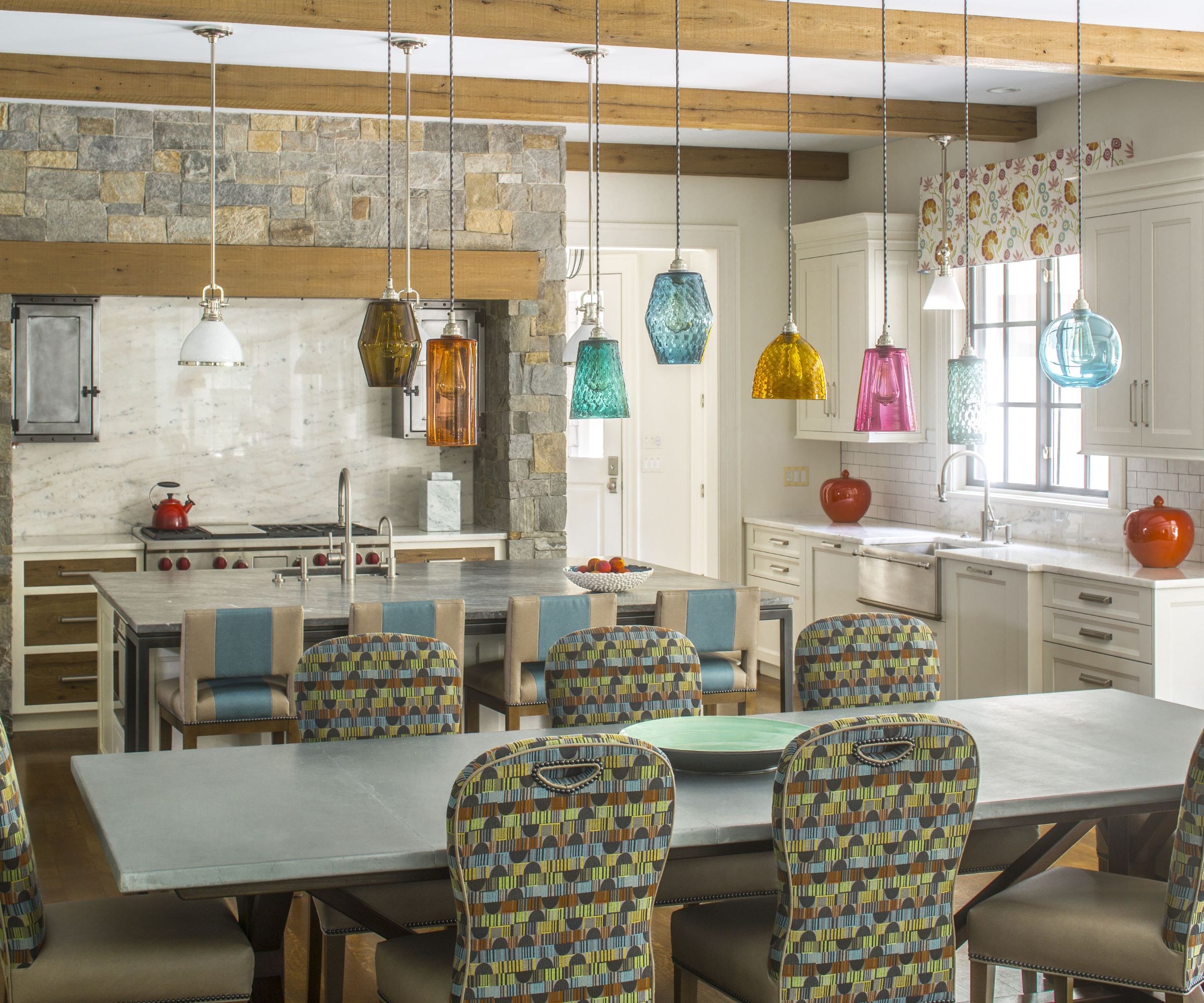
There's space for the whole family around the breakfast room table. Anyone looking for inspiring eat-in kitchen ideas, should note the way the table is topped with zinc to match the island worktop beyond, adding harmony to the style references across the two spaces. The casual dining space is punctuated with fun glass pendant lights from Rothschild & Bickers, London. The breakfast room chairs are covered in Crypton fabric.
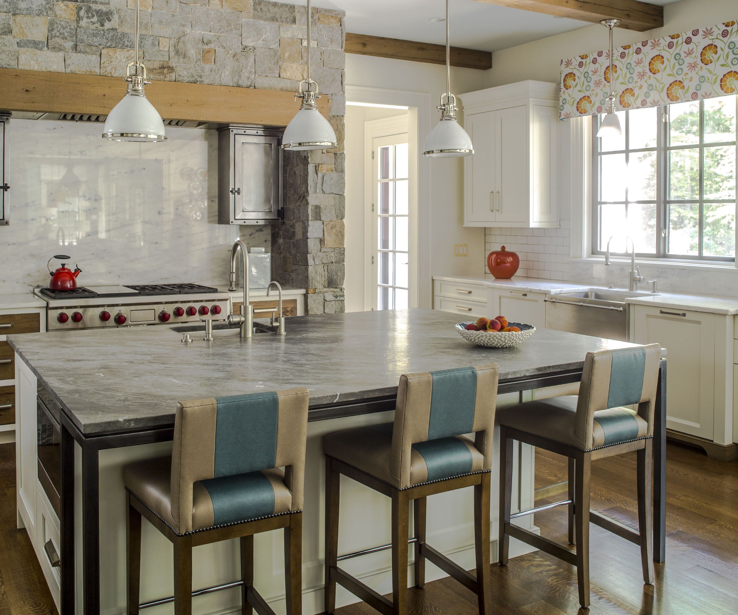
'The kitchen is at the heart of the home. Four stools equal four boys!' says designer Sroka, whose kitchen ideas here include the traditionally styled practical cooking area, with a large-scale range cooker set in a stone surround with metal corner cabinets. The care of this kitchen is easy and color has been used throughout. The kitchen cabinetry is by Lobkovitch.
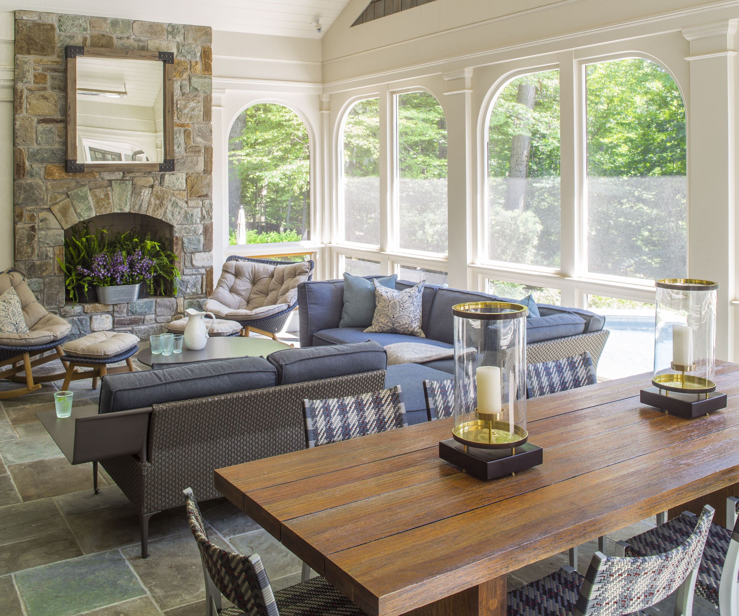
'Relaxed and cozy, this shady spot keeps you out of the sun, but in the breeze. The forest surrounds you,' says Sroka, who aimed to embrace the home's woodland setting in his plans for this screened porch. Back porch ideas include easy-care outdoor furnishings by Dedon that lend casual comfort to the space.
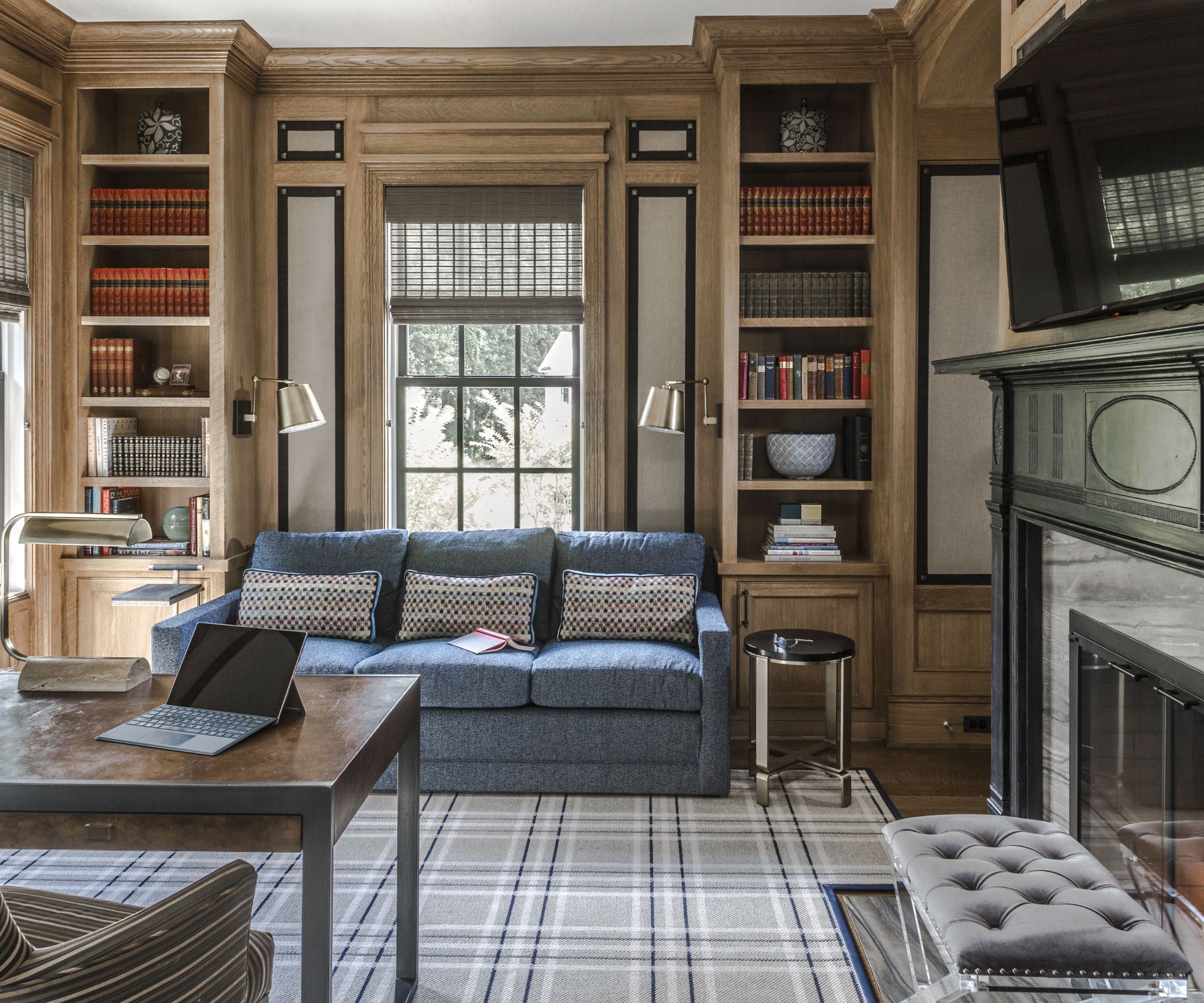
In the office, an upholstered insert in the paneling provides detailing, acoustics, and a textural balance to the millwork. 'The plaid rug grounds the room,' says designer Sroka. 'We incorporated large square brass tacks into the corners. A very updated take on a classic room.'
This is exactly the kind of space that bridges the gap between traditional style and modern-day living. There's a nod to English country house style, but with fresh prints and colors to bring the new space to life. Incorporating a comfy couch for reading is a good addition to home office ideas and will help steer the room's aesthetic away from the workaday, towards a much more relaxed and homey look.
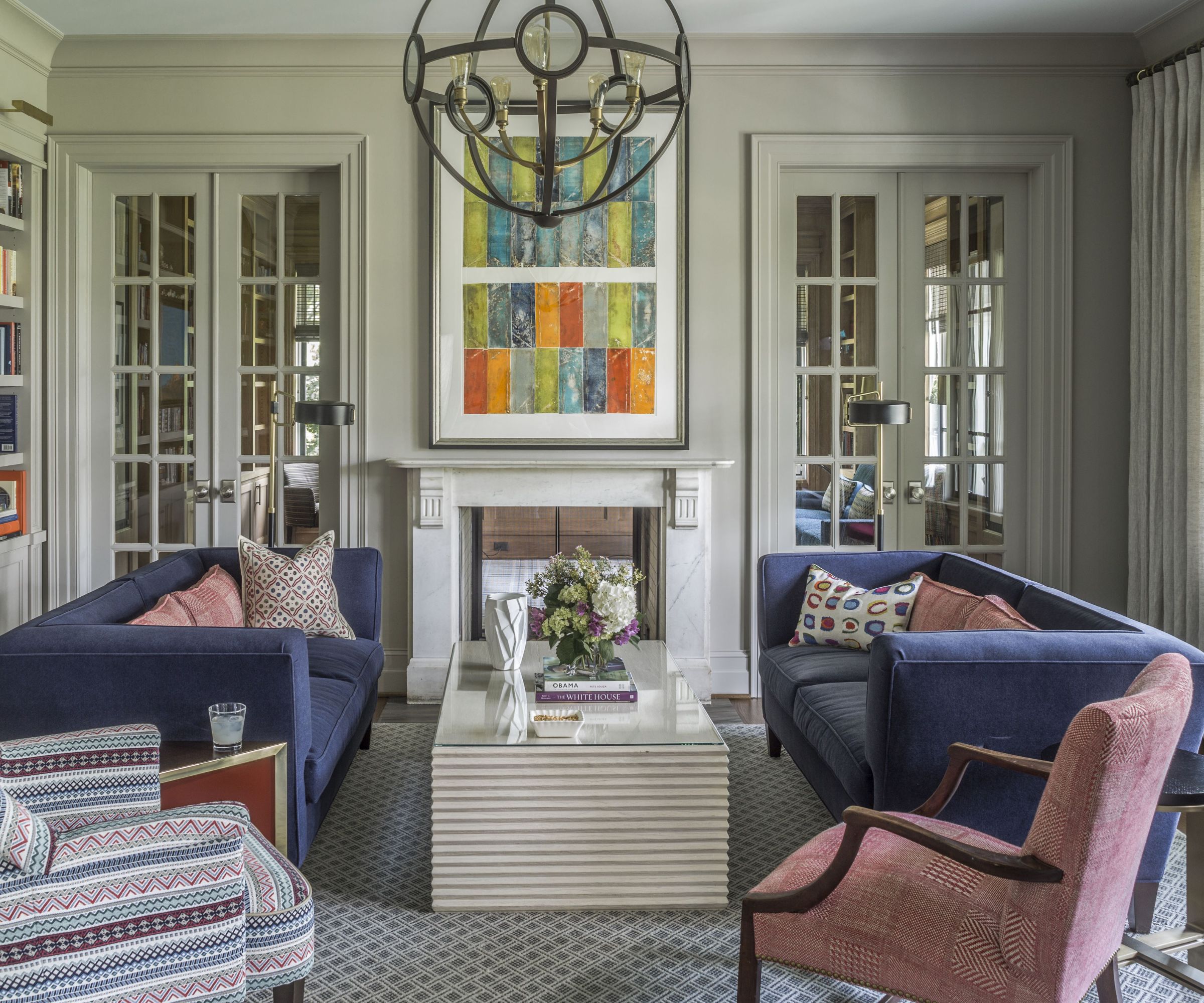
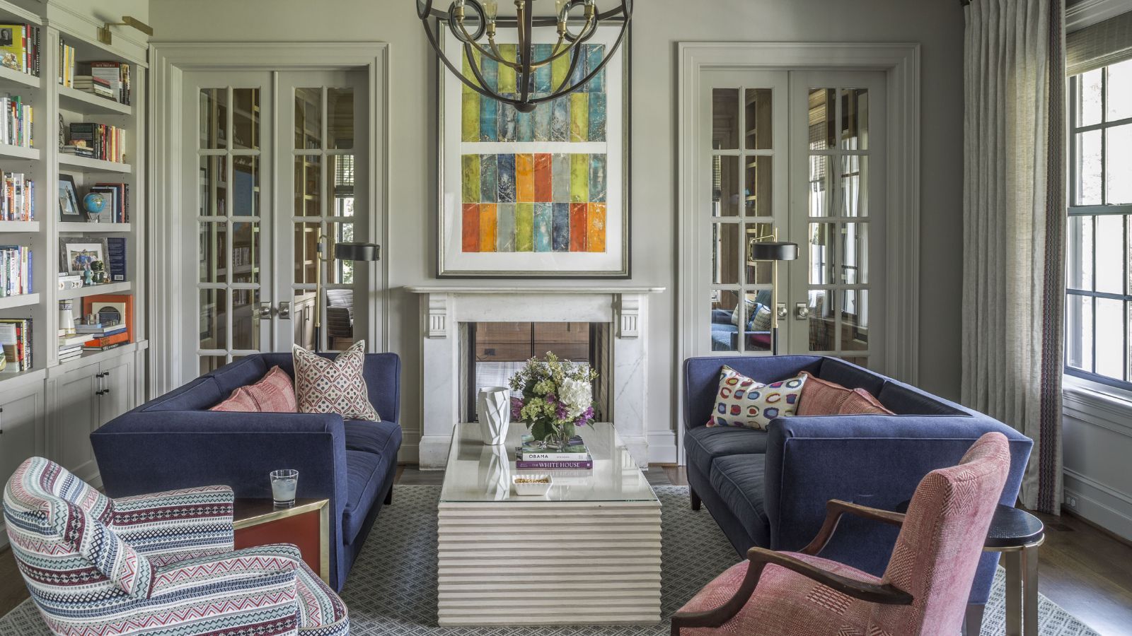
Living room ideas for the formal front parlor are very much in the formal tradition, yet it's a cozy space gathered around the fireplace. A mix of old and new furnishings are used, with an old mantle, salvaged from New England.
'The room's bold colors and patterns were inspired by London designer Kit Kemp,' adds designer Skip Sroka. 'The owners’ artwork, with a brilliant use of color, hangs above a double fireplace that opens to a home office on the other side of the wall.'
The two chairs are family heirlooms and the light fixture by Hinkley Lighting is a new take on round lantern.
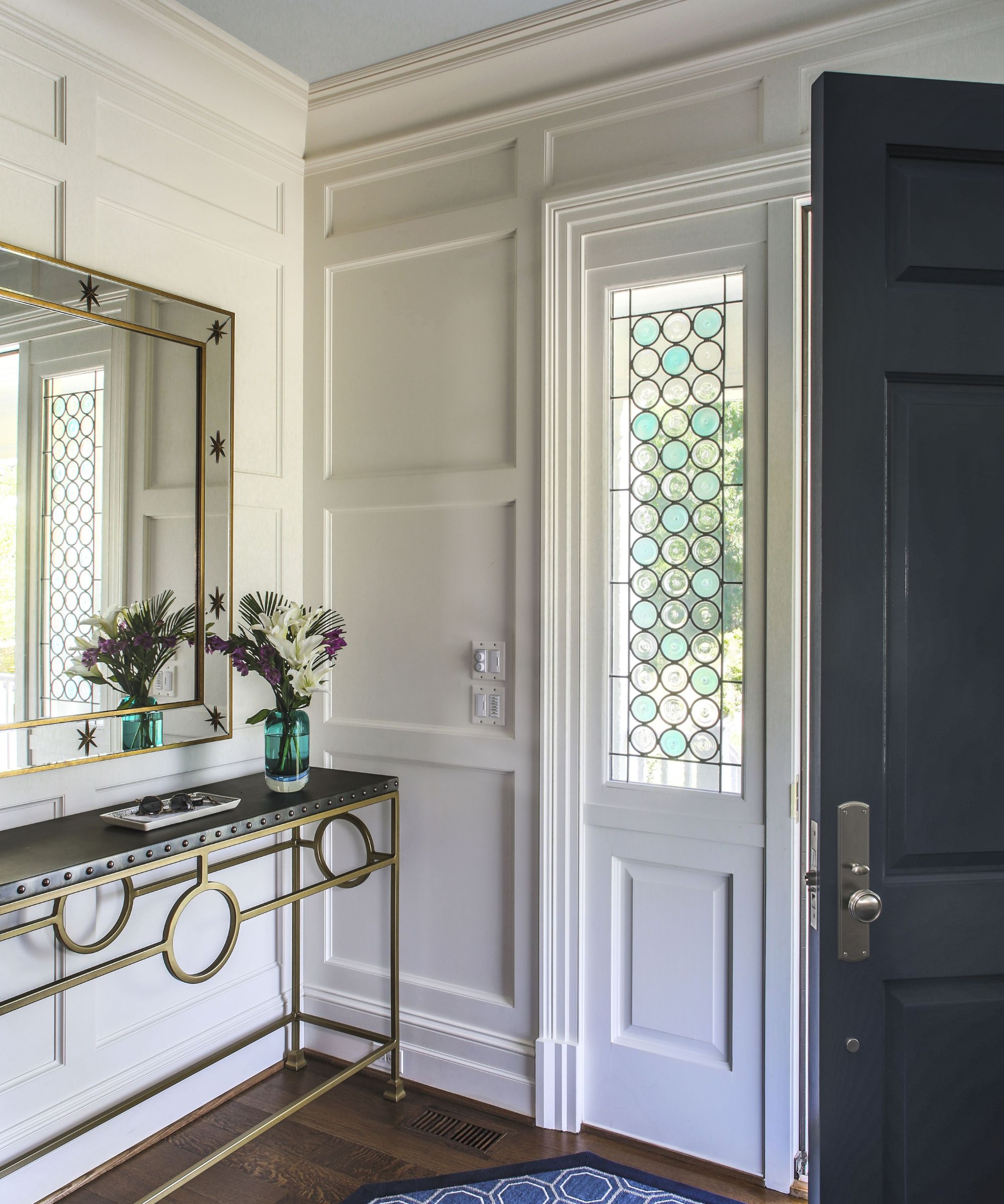
'This characterful foyer welcomes you with its scale and paneling,' says designer Sroka. 'The glass adds a delicate note.'
Looking for entryway ideas? A smart console table and a huge mirror are the classic accessories to help create a great first impression.
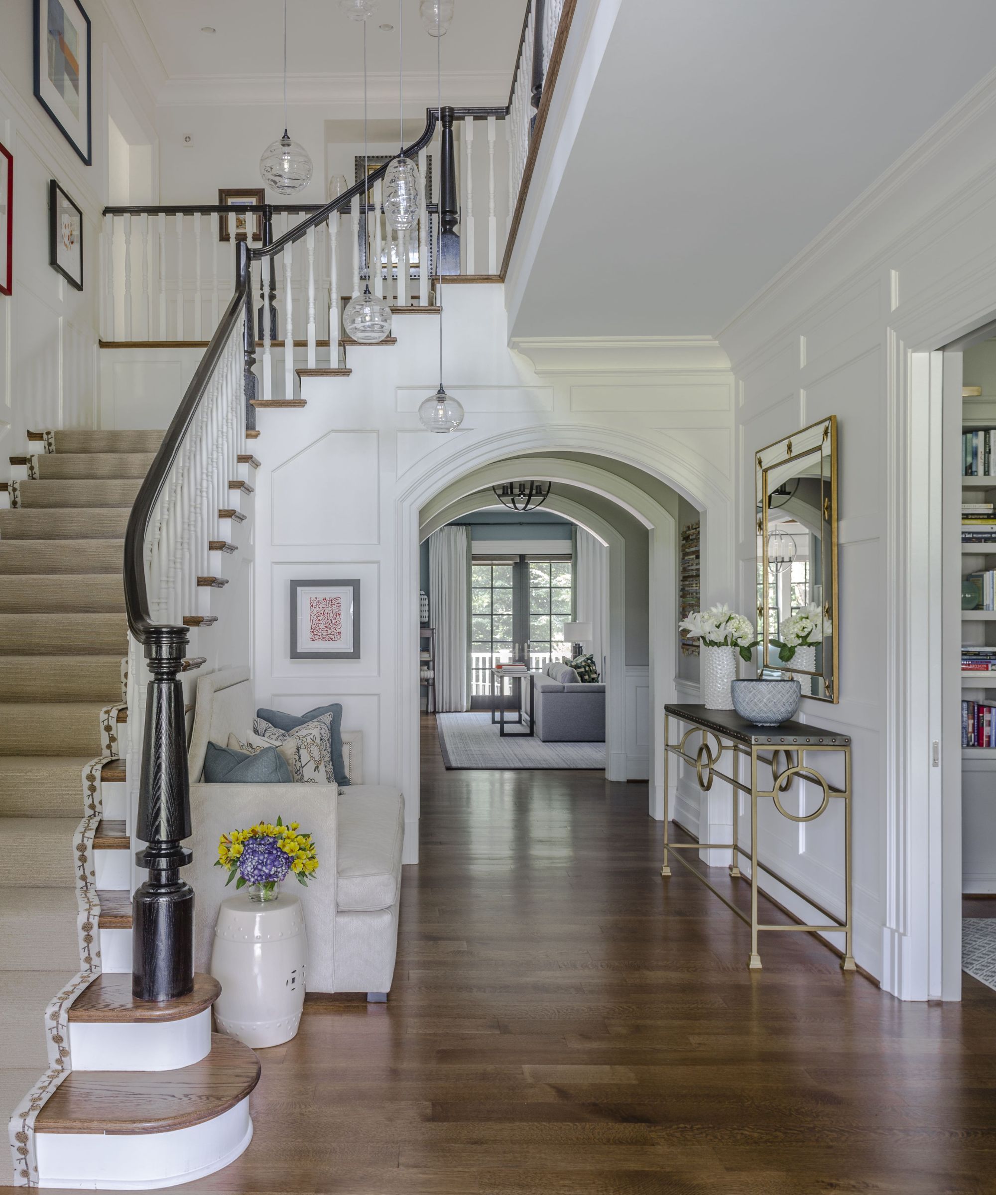
A grand period-style staircase and wide arched hallway elevate the new-build home with a touch of grandeur. The foyer lighting is by Hammerton Studio and the settee is from Bernhardt Furniture Co. The millwork and stair balusters were custom designed by Sroka, who says that one of his favorite design elements in the whole house are the newel posts (crafted just for the client) that he says draw on a tradition of mid-Atlantic American homes.
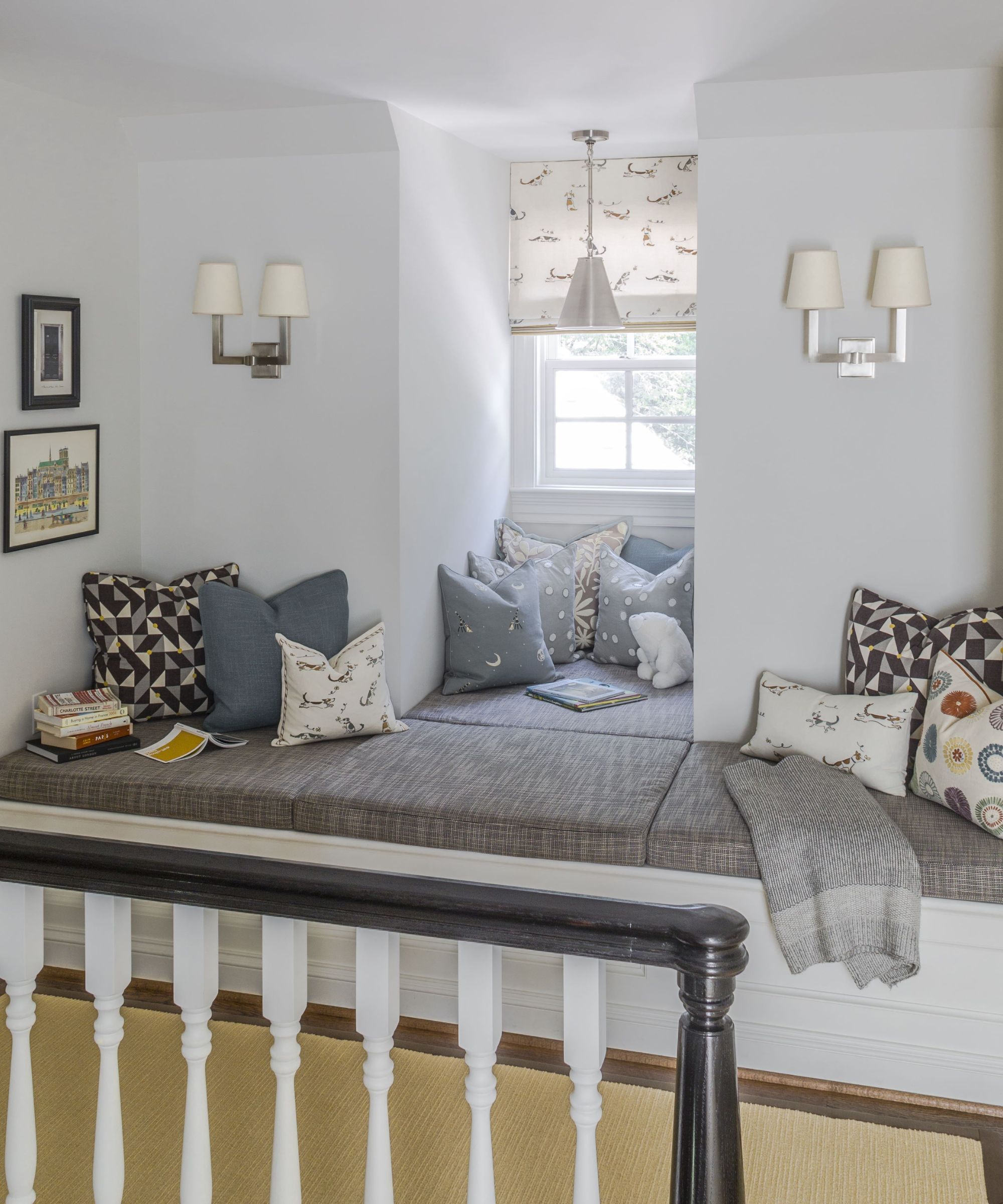
Outside the grandparent’s bedroom is a wonderful lounging area for all. Who could resist curling up with a good book on this spacious window seat? The idyllic space is full of great reading nook ideas: layers of pillows and bespoke seat cushions, good lighting and, of course, that inviting window alcove.
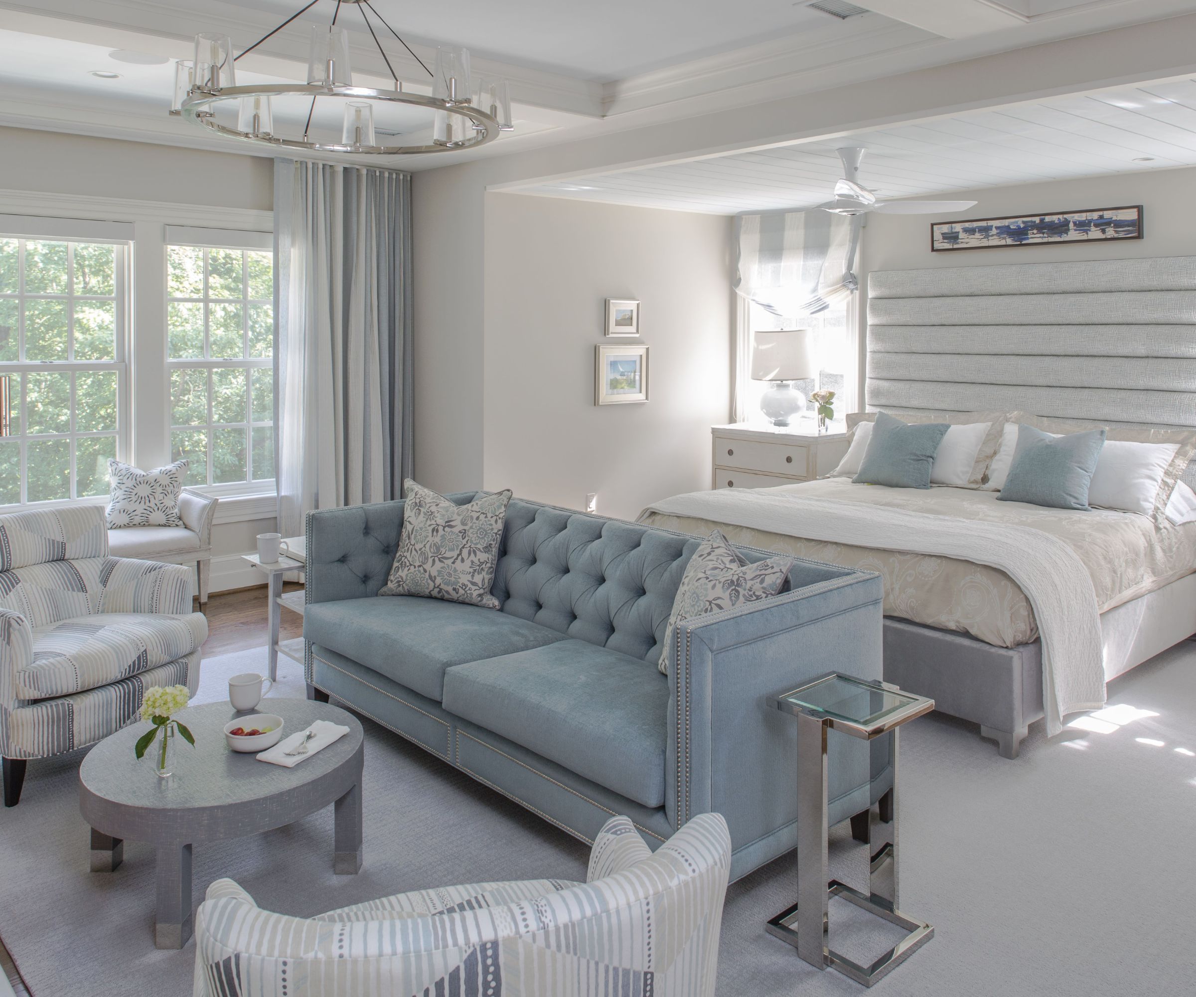
Furnished in the classic Cape Cod shades of cool blues, grays and off-whites, the primary bedroom is a serene and restful space. Bedroom ideas for the generously proportioned room include a neat button-back couch and two armchairs all in keeping with the coastal color scheme.
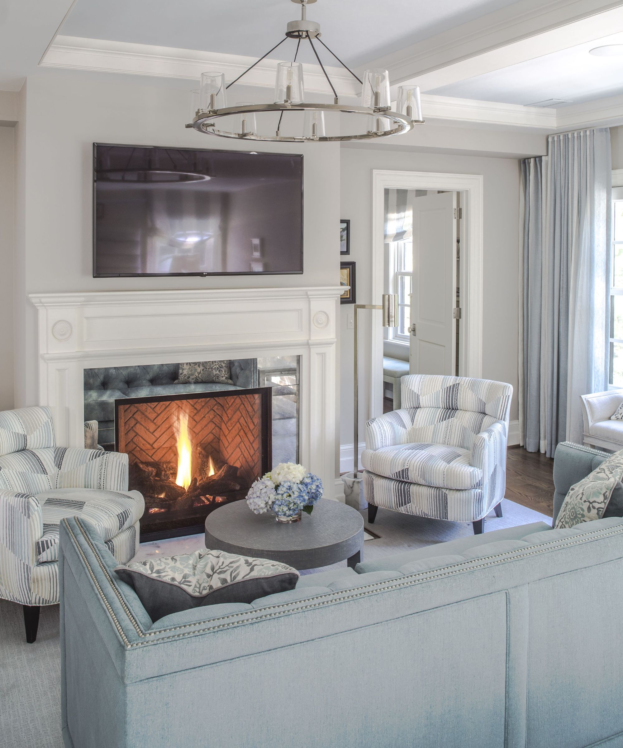
It may be decorated in cool New England colors, but there's nothing chilly about the primary bedroom's seating space in front of the fire, as designer Sroka explains: 'An important part of family life is gathering in front of the fireplace here. A glam touch of antique mirror is used around the fireplace.' The perfect illustration of an old material, expertly used to give the space a modern twist.
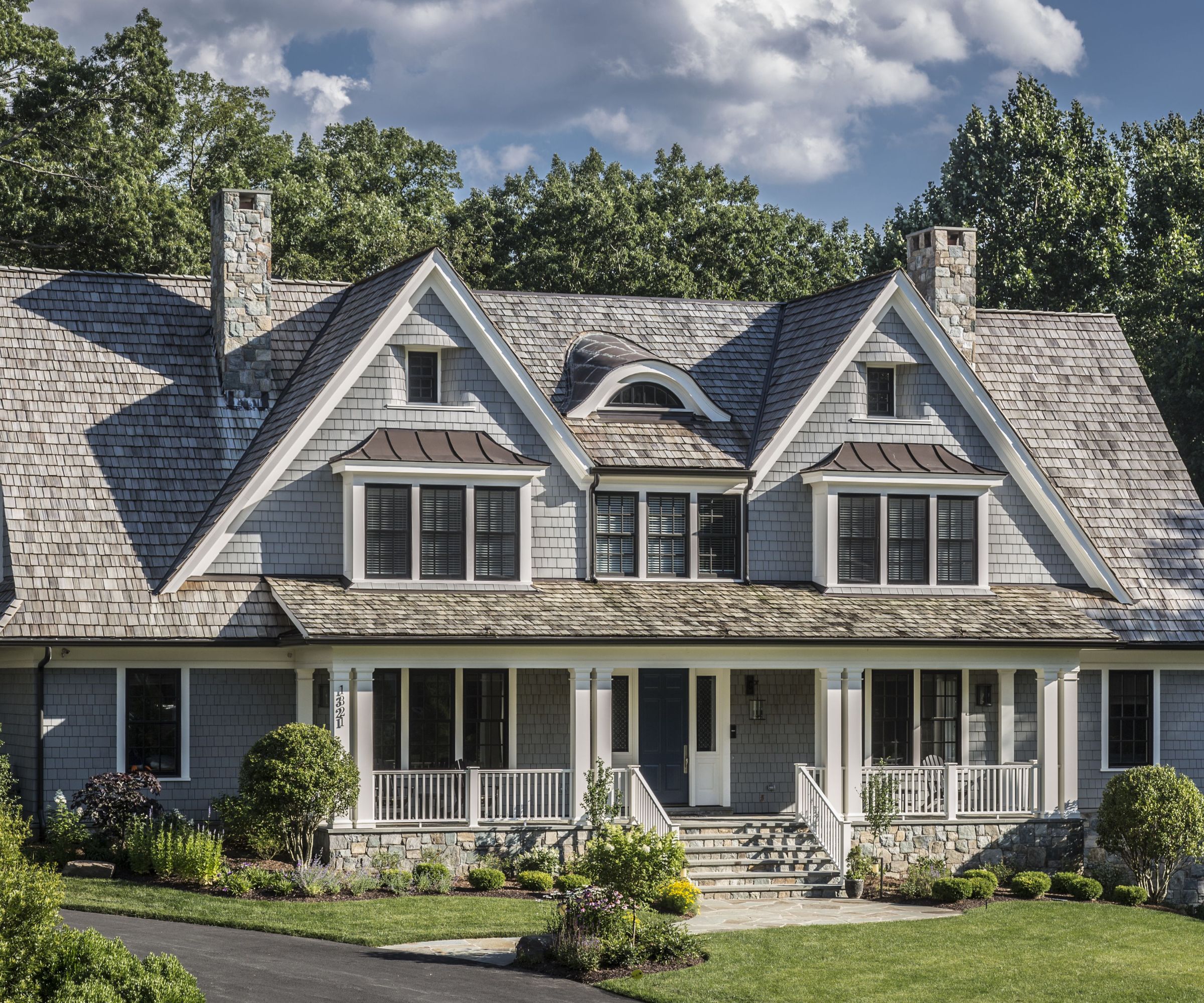
Designer Skip Sroka is delighted with the way this new 'old home' has turned out. Its traditional New England-style exterior sets the tone for the classic coastal interiors, which include surprising new twists to keep the look fresh.
Interior design: Sroka Design
Architecture: GTM Architects
Photography: Erik Kvalsvik


