The 1970s are an iconic decade of design, known for its natural materials, earthy colors, and midcentury furniture. And while the color palette of the '70s (think mustard yellow, soft green, and terracotta) is one that's gained appeal again in recent years, how are designers using these shades in 2026?
Rather than creating rooms that feel obviously midcentury, interior designers are taking cues from the earth tones of this decade and incorporating them in more modern ways. Whether it's with color-drenching or unexpected color pairings, these hues can feel fresh and stylish with thoughtful applications.
Here, we've rounded up our favorite projects from designers that showcase the standout color trends from the '70s, to inspire your next project with a warm and layered approach to color.
1. Ochre
Mustard yellow was an incredibly popular color in the '70s, but as interior styles have evolved, designers are now favoring muddier shades of ochre. 'Ochre feels modern when it's treated as a foundational neutral, not a feature color,' says the designer Lauren Saab. 'Pairing it with crisp plaster white, deep espresso wood, or matte black immediately sharpens it and prevents it from feeling overly nostalgic.'
'The fastest way to make ochre feel dated is surrounding it with too many competing warm tones,' warns Lauren. 'Orange woods, yellow undertones, and overly warm palettes flatten the space. Ochre looks strongest when it leads, supported by contrast that keeps it sharp and intentional.'
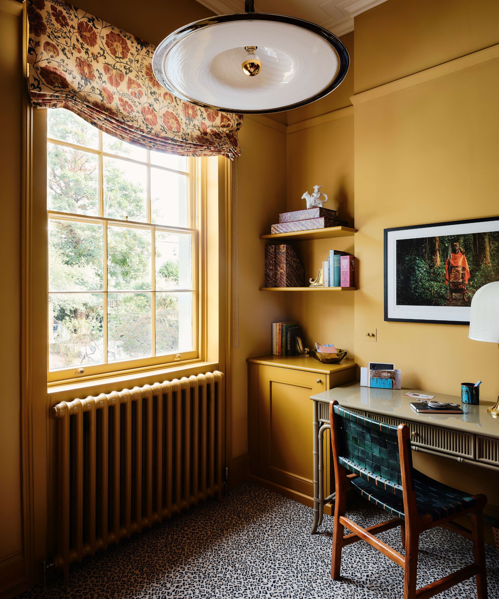
In this home office designed by Tiffany Duggan, founder of Studio Duggan, Farrow & Ball's Cane drenches the room for a contemporary look, while cooler and darker tones offer balance.
Bring ochre to your walls with this small-scale patterned wallpaper.
Add a brighter pop of ochre with this velvet pillow cover – a happy shade to add to living rooms.
The yellow tone of this lamp base is earthy and textured, which gives it more of a neutral feel.
2. Muted Gray-Green

The '70s design styles had a focus on natural materials and earthy schemes, so it makes sense that decorating with green saw lots of appeal. Muted greens and gray-toned greens offered a natural and calming backdrop, a color trend that designers are still loving today.
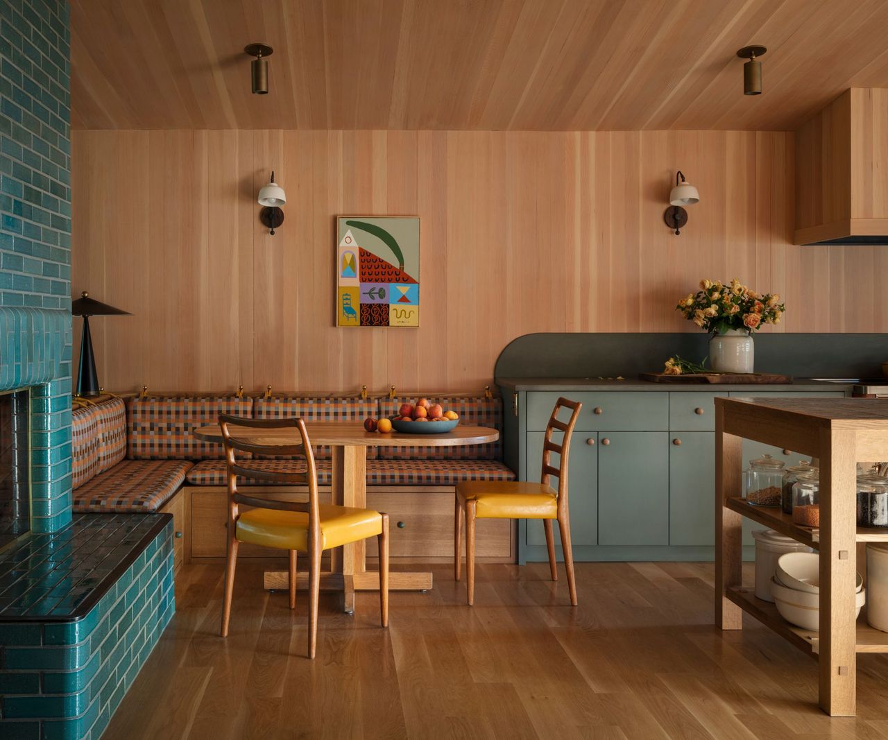
In this kitchen, the designer Jessica Helgerson used Farrow & Ball's Green Smoke on the kitchen cabinets. 'The dominant wood color makes the room feel warm, cozy, and inviting; the complementary green helps keep it fun and playful,' explains Jessica. 'This green color comes back throughout this project in the cabinets, the tile, the countertops, and the trim around the windows. It helps the space feel dynamic.'
While Green Smoke is gray enough to keep spaces feeling fairly neutral, if you're looking for something slightly warmer, go for Little Greene's Sage Green.
This pillow cover is a soft shade of gray-green, which would add subtle color to neutral rooms.
Add a decorative look to your scheme with this sculptural vase in a cool, soft shade of green.
Ground your room with this sage green rug – a great choice for the upcoming spring months.
3. Earthy Brown
Continuing the theme of earthy colors, decorating with brown was also popular in the '70s. From wood furniture to wood-clad walls, warm brown was often used as a prominent color, allowing for bolder pops of brighter tones. Today, designers are favoring richer brown tones, such as chocolate brown, used to provide coziness and depth.
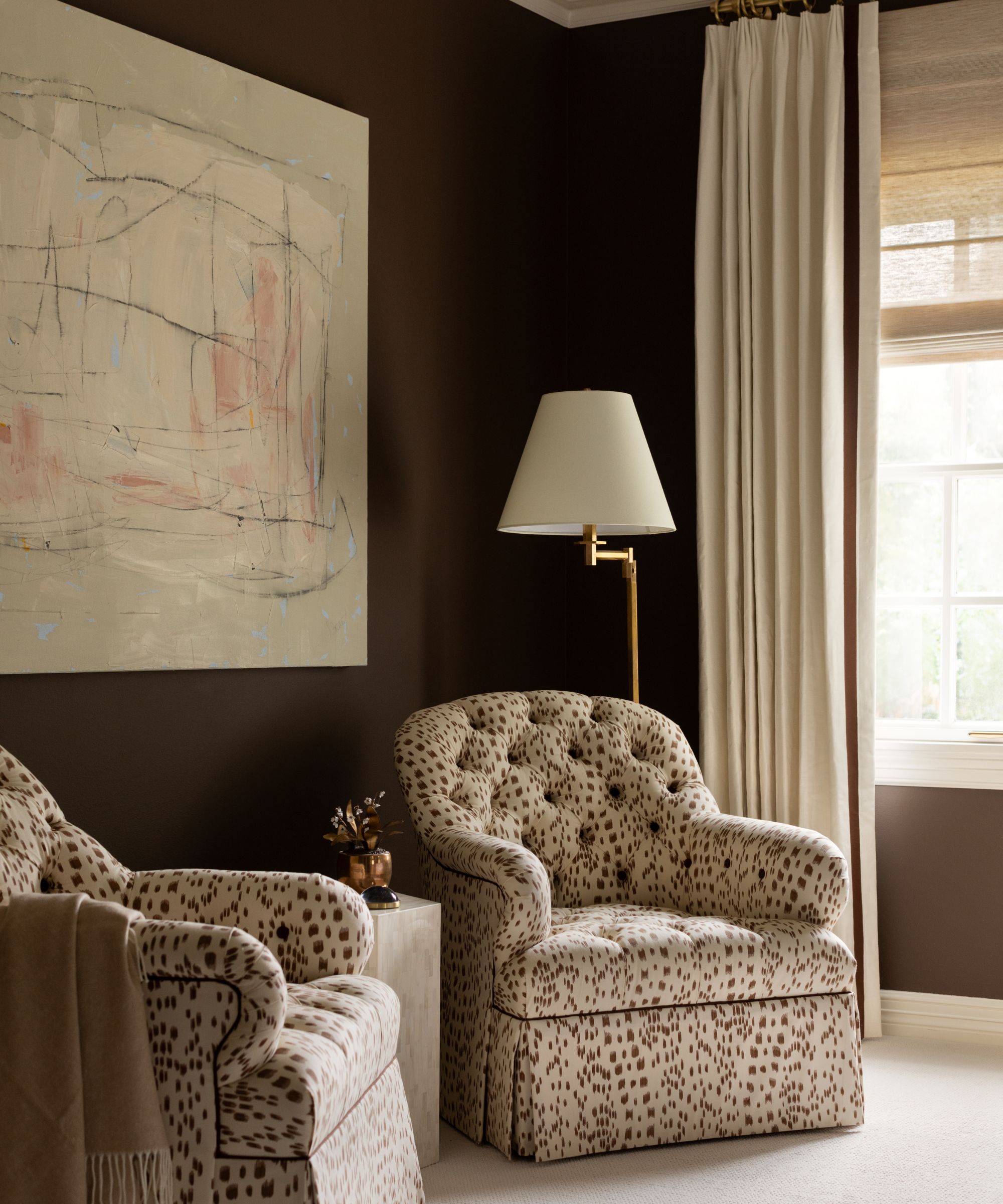
In this bedroom, the designer Paloma Contreras painted the room with Benjamin Moore's Dixon Brown, a rich yet soft shade. 'We chose chocolate brown for this space because it creates an immediate sense of depth and intimacy,' she says. 'Brown can feel nostalgic, but by pairing it with tailored upholstery, modern artwork, and clean-lined silhouettes, it feels fresh and elevated rather than heavy or outdated. It’s a rich, intimate palette balanced by soft neutrals and subtle pattern so it never feels too dark or overwhelming.'
This floral chocolate brown pillow cover would look wonderful in traditional rooms.
Add depth and richness to your bedroom with this linen duvet cover set.
The wavy edge of this wooden wall mirror adds a playful and contemporary look.
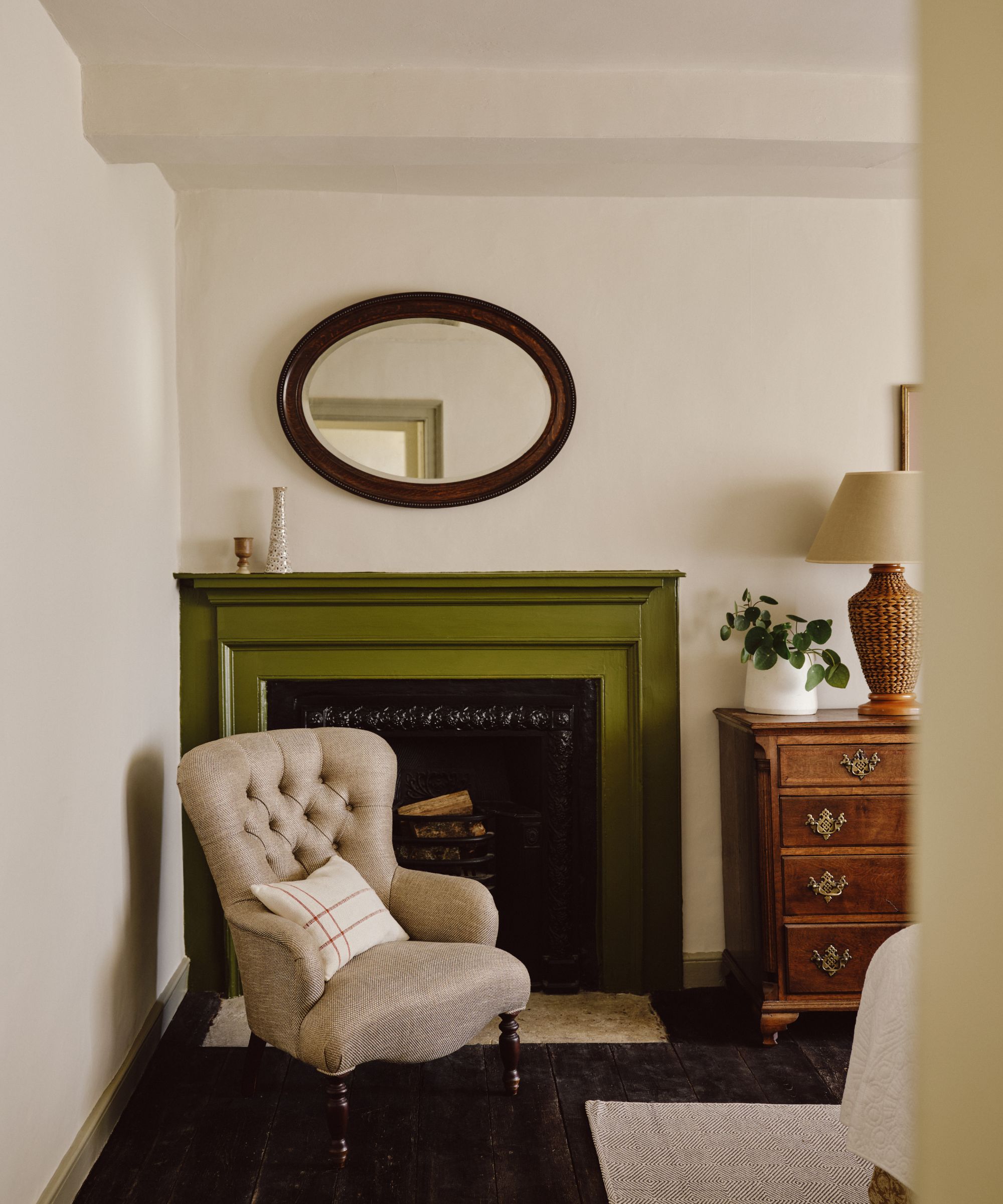
4. Moss Green
Not only do muted greens feel reminiscent of the '70s, but much warmer greens, too. Shades such as avocado green, lime, and moss green brought an uplifting look to homes, especially when teamed with other warm tones. To bring this color trend to the present day, designers enjoy using it as an accent color to add interest to neutral rooms.
'For her recently renovated farmhouse on the Mapperton Estate, Julie Montagu, Countess of Sandwich, chose a palette of calming off-whites and neutrals to ground the interiors and create a base on which to add bolder accents of color,' explains Dominic Myland, CEO at Mylands. 'The fireplace pictured here was painted in the deep olive shade Caca d'Oie, which felt joyful but rooted in heritage. Julie wanted the space to feel playful and contemporary without being trendy, and create an atmosphere that still felt complementary to the history of the home.'
This dark green cushion has a fun scalloped edge for a decorative look.
Bring moss green to your walls with this abstract floral wallpaper.
The warm green tone of this linen tablecloth feels earthy and timeless.
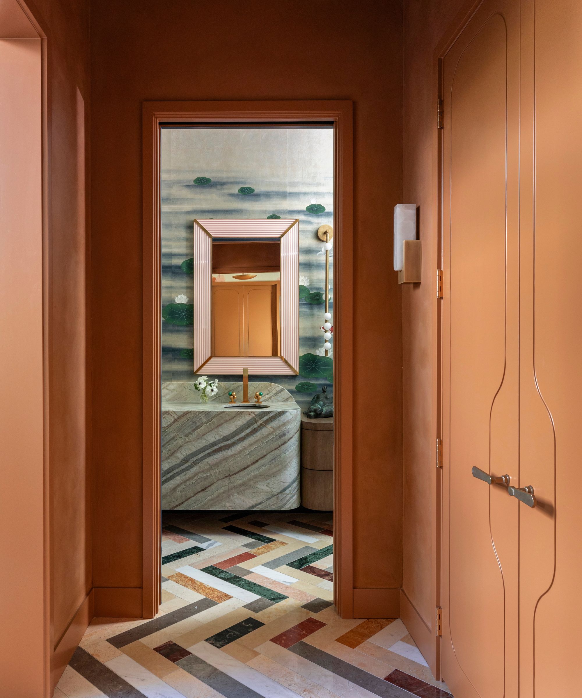
5. Terracotta
Terracotta was another tone that gave the '70s its earthy and organic aesthetic. From terracotta floor tiles to decor, it added warmth and softness amid brighter tones. As a modern take on this color, designers are using it to color-drench rooms for a cocooning look.
'In planning this entry hall and the adjoining powder room, we wanted drama,' says the designer Linda Eyles. 'We also wanted to connect to the rich, earthy tones found in the reclaimed marble floor, and the perfect way to do that was with Sherwin-Williams' Smokey Topaz. It is a deep and unconventionally elegant terracotta tone that brings an element of surprise to these spaces. The color connects the rooms and pairs beautifully with the greens in the stone and in the wallpaper.'
Bring rich and earthy terracotta to your bedroom this spring with this linen quilt.
With its splattered finish, this vase feels like a modern take on '70s terracotta.
The textured quality of this table lamp gives it a rustic and organic look.
Colors associated with the 1970s have an earthy quality to them, which makes them versatile and easy to incorporate into lots of schemes. To avoid the room appearing as obviously themed or dated, make sure to add balance with sleek, modern details, light neutrals for contrast, and natural textures.
Love beautiful design ideas, expert advice, and inspiring decor trends? Sign up for our newsletter and get the latest features delivered straight to your inbox.