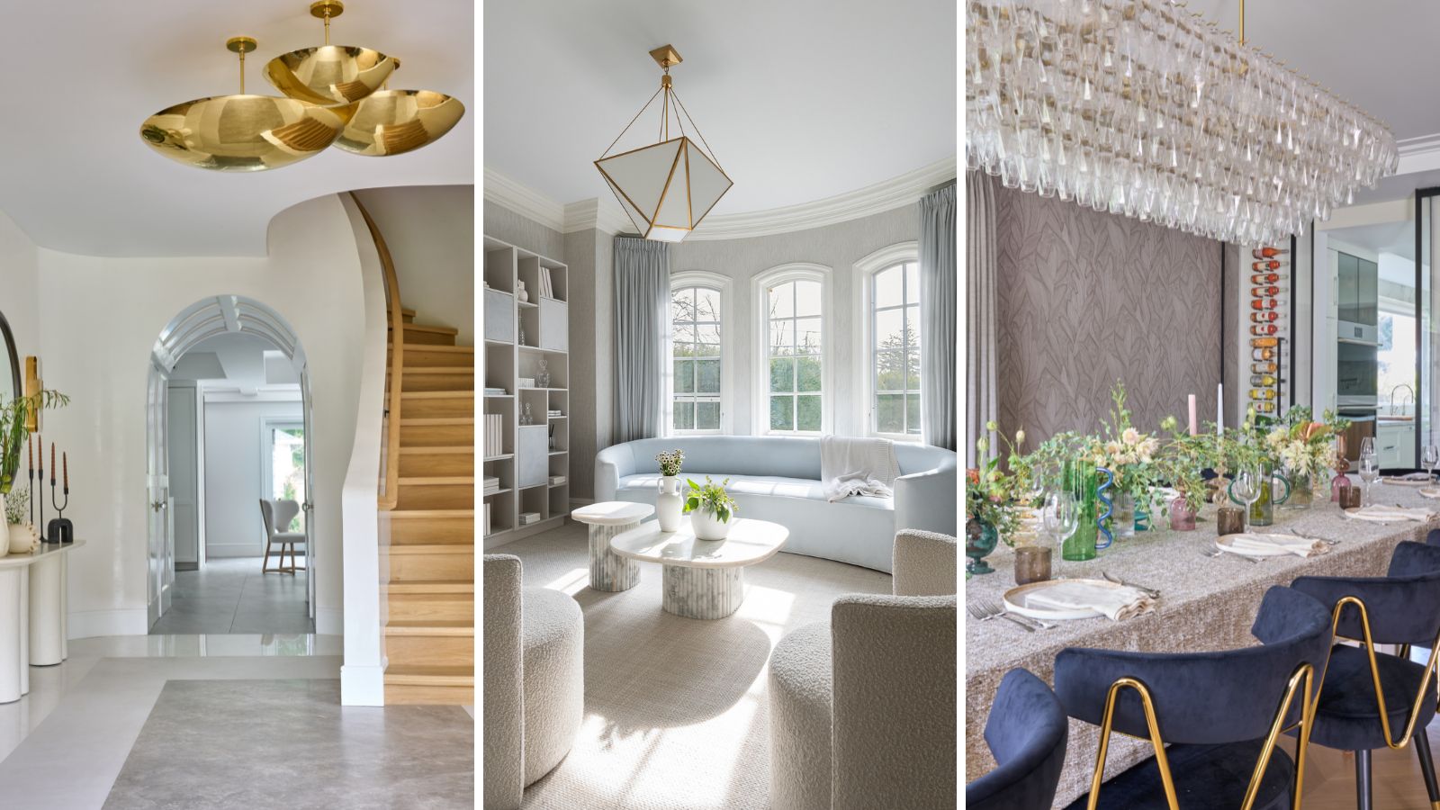
It's not often that a staircase takes a starring role in a redesign but for this family home it was the elegant curve of the new stairs that inspired other updates in layout, design and color scheme. The original house design of the Long Island home was a center-hall colonial, built in 1930. It was a beautiful property with good bones, but required a gut renovation to update it.
The owners brought in interior designer Tova Kook of TK Design to make the property work for them, their four children, and the family dog.
'It was clear from the start that the couple were looking for something spacious, light, and familiar to their own childhoods,' says the designer. 'He, being a busy doctor, and she, a determined lawyer, needed easy and effortless chic for their family. After exploring and understanding their aesthetic preferences and needs, I opted for an understated and calming – but never boring – classic vibe for this home.'
Take the tour as designer Tova Kook shares the highlights and reveals how her inspiring stairway design almost didn't get off the ground.
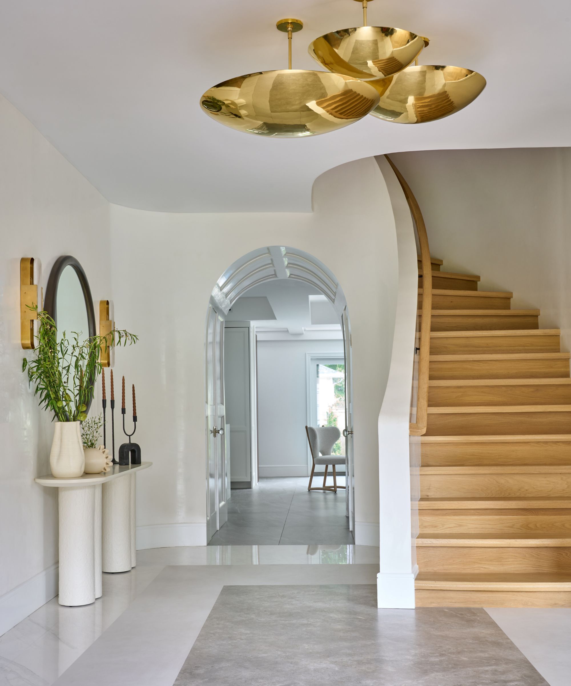
The clue is in the name: this being a center hall colonial-style home, the hall and thus the stairs are at the heart of the home's layout and are the first features you see as you enter the home.
'One of the first challenges we tackled in this renovation was the staircase,' says designer Tova. 'The home had an old straight staircase which had a landing that jutted out, extended to two additional steps, and simply was smack in your face when you walked in. My client's dream was a curved staircase. The architect passionately gave the curved idea a hard no, stating it would not work with the space we had. He felt it was best to cut back the steps, and keep the staircase straight with no landing.'
Undeterred, Tova continued to forge ahead with her curved staircase ideas. 'I did not take no for an answer, and after persistence and a bunch of rendered drawings, we made it happen,' she says. 'This was definitely a big accomplishment for me. You really cannot give up on a dream just because the architect or contractor says no. You need to question them a few times.'
One ideas behind redesigning the staircase in this way was to make it really worthy of its position at the center of the home, so the entryway ideas evolved from there.
'The house desperately needed walls as you entered the kitchen, otherwise, you would just see too much mess,' says Tova. 'I added the walls by the kitchen entrance, stepped the wall forward as well, and then determined that I could pull the stringer back and create a curve to achieve that look. From there, I brought in my own staircase installer and with the help of Robert Matland, the contractor, we reconstructed the stairs, allowing for a foyer that exuded charm and timeless flair.'
The foyer floor was a real labor of love for the designer, and is now one of her favorite details. 'We stayed away from marble for the floors because it’s a high-traffic area with four kids, and of course, a dog who would be scratching up the floors day and night. We searched for the perfect porcelain slabs to create a square inset design,' she explains. 'From drafting on Autocad, to literally taping it out on site, I was so invested in the perfect outcome.'
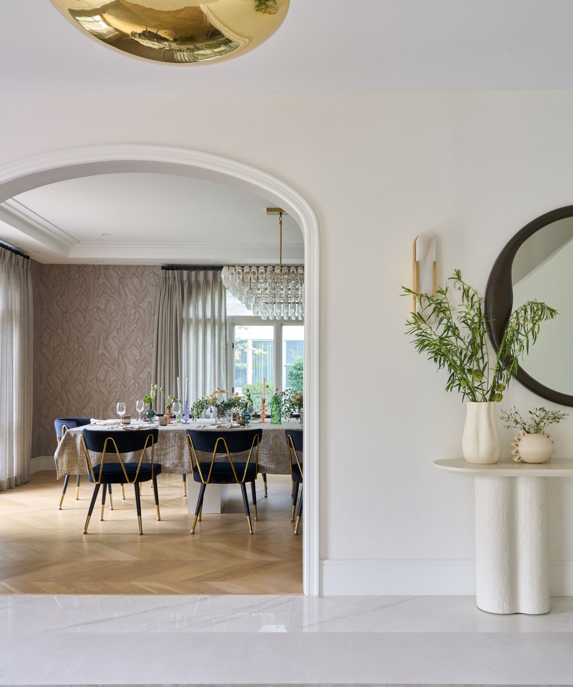
The home's key living spaces now radiate from the central hallway, with arched openings allowing glimpses of the rooms beyond. The hallway lighting fixture is from Restoration Hardware, the console from Lulu & Georgia.
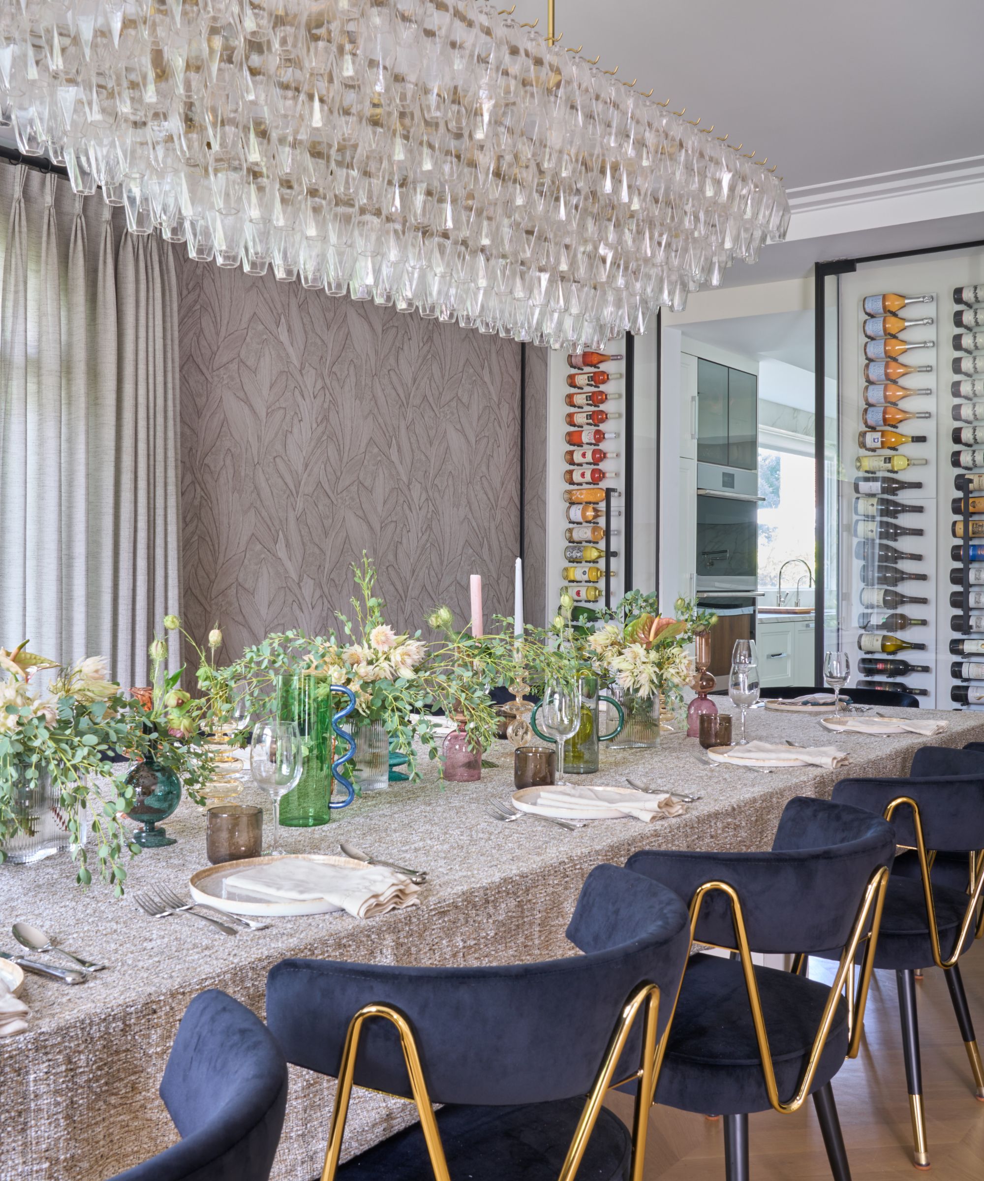
The opulent dining room ideas came about when designer Tova decided to create a showstopper of a formal dining space for this family who love to entertain friends and family. The ornate lighting fixture is from Restoration Hardware, and the wallcovering is from Arte International, a warm-toned taupe, a subtle neutral that gives the perfect calm backdrop to allow the other details their moment to shine. The wine cabinet is a practical touch, but also highly decorative.
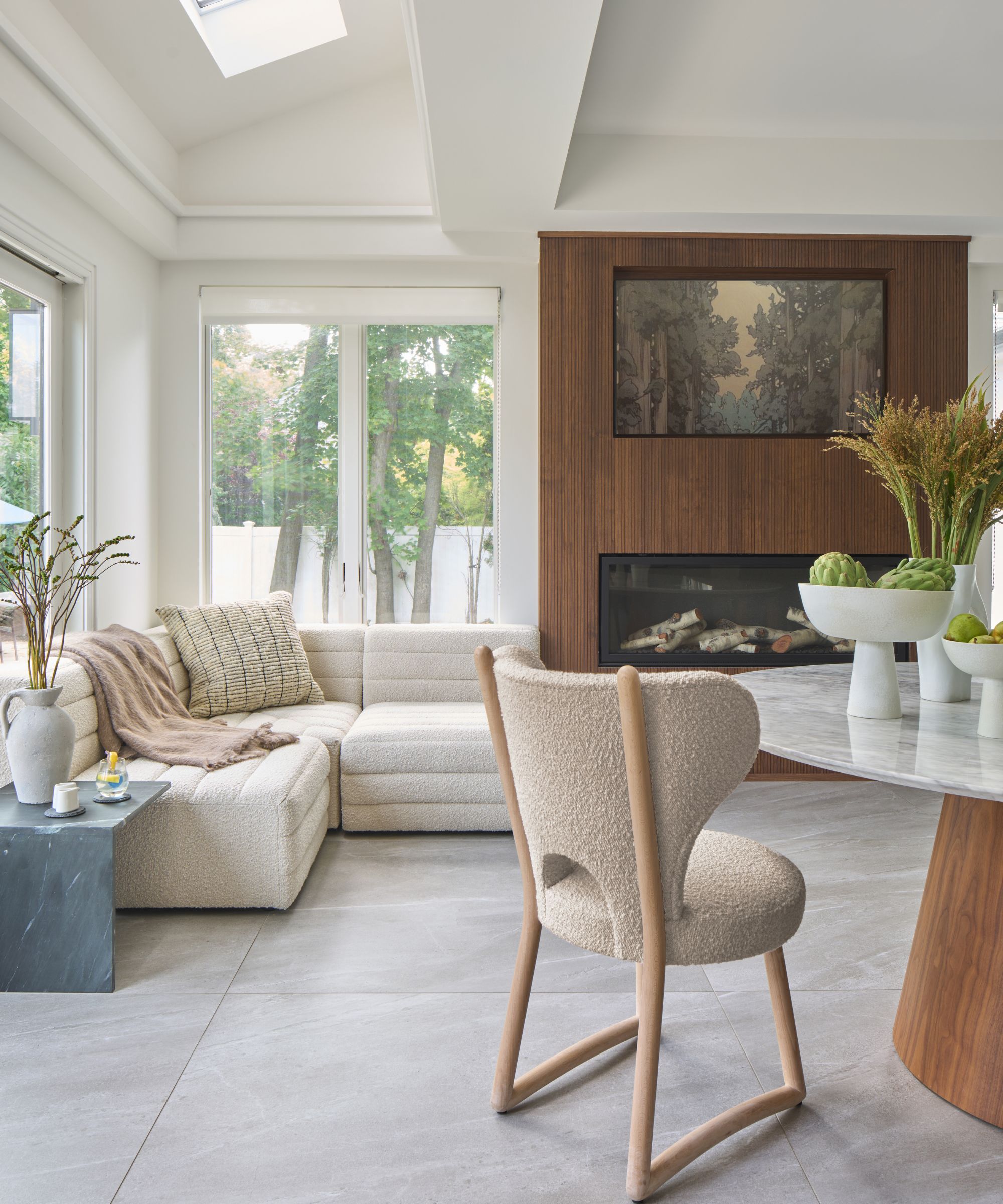
An addition at the back of the house created space for an eat-in kitchen with a cozy family room arrangement of a sectional sofa from CB2 next to the contemporary fireplace. The kitchen chairs are from Artistic Frame, inspired by Pierre Augustin Rose. The table is from Rove Concepts.
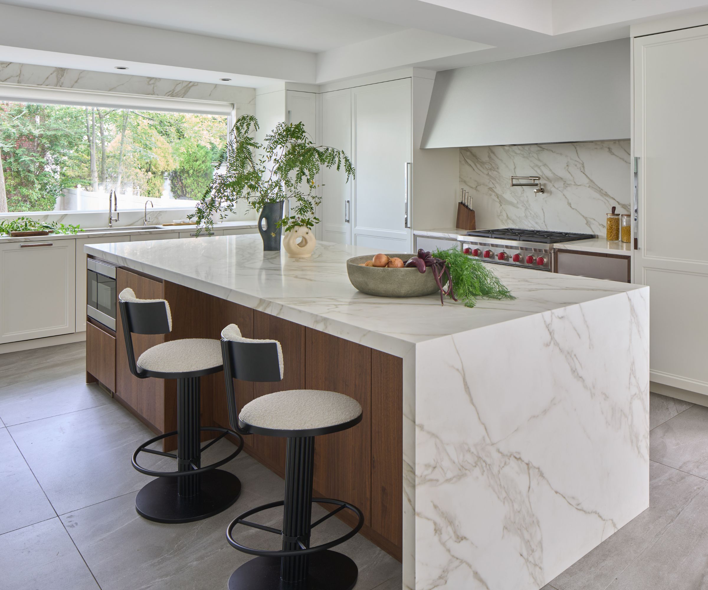
There were compromises to be made before the kitchen ideas could be finalized, as Tova explains. 'The client was set on doing Calcutta gold for the kitchen. Knowing it was going to cost a fortune, and be total maintenance (as marble is), we found an incredible neolith porcelain slab that looks more real than the real thing! She loves it and says it never stains and cleans so easily. I have always pushed my clients to do real stone, but honestly, man-made stones have come far and can look amazing.'
The kitchen itself was supplied by Brookville Cabinets.
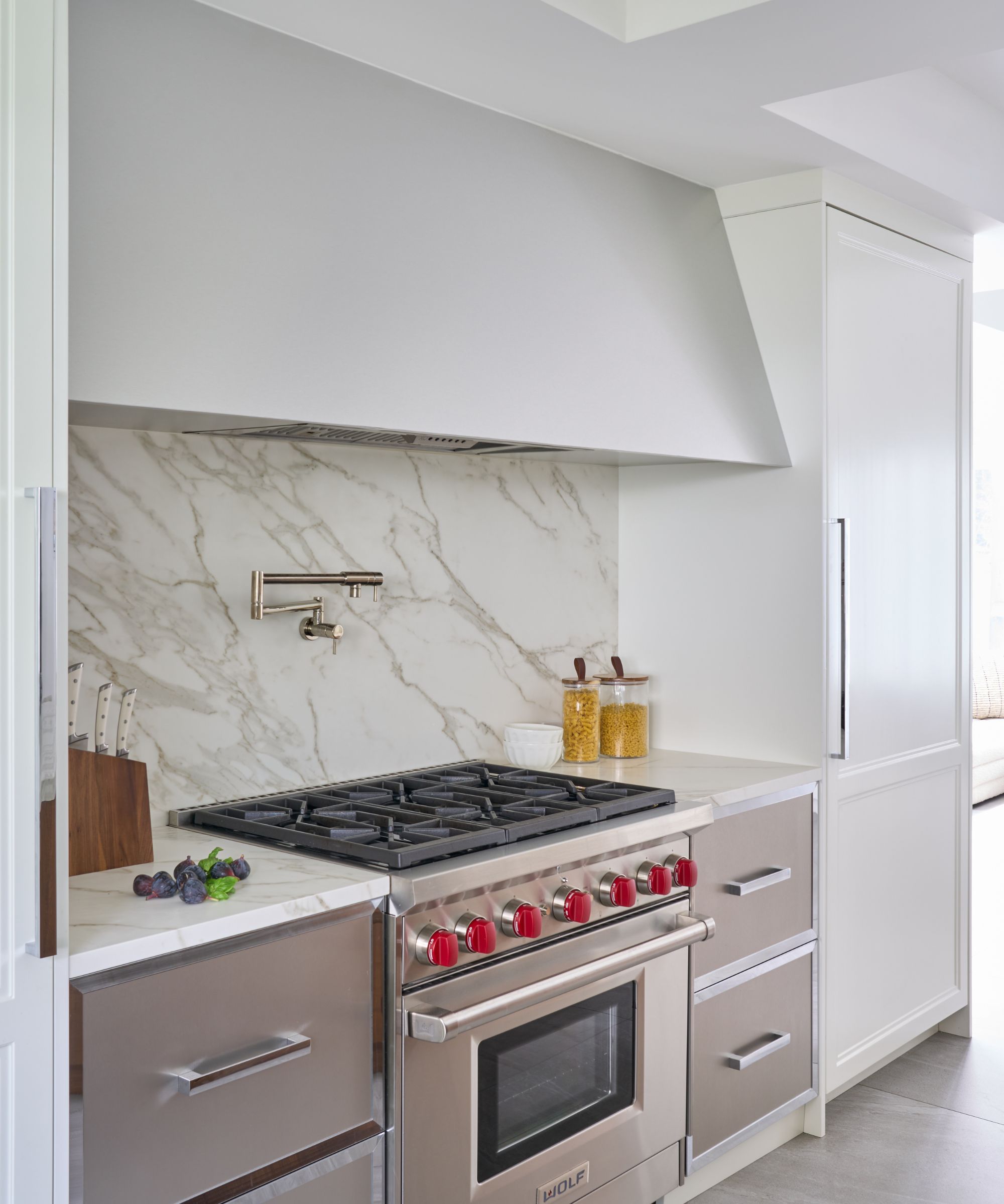
The kitchen color palette takes its cue from the hallway choices, picking out the warm whites, soft taupes, and neutrals from the three tiles used for the foyer flooring.
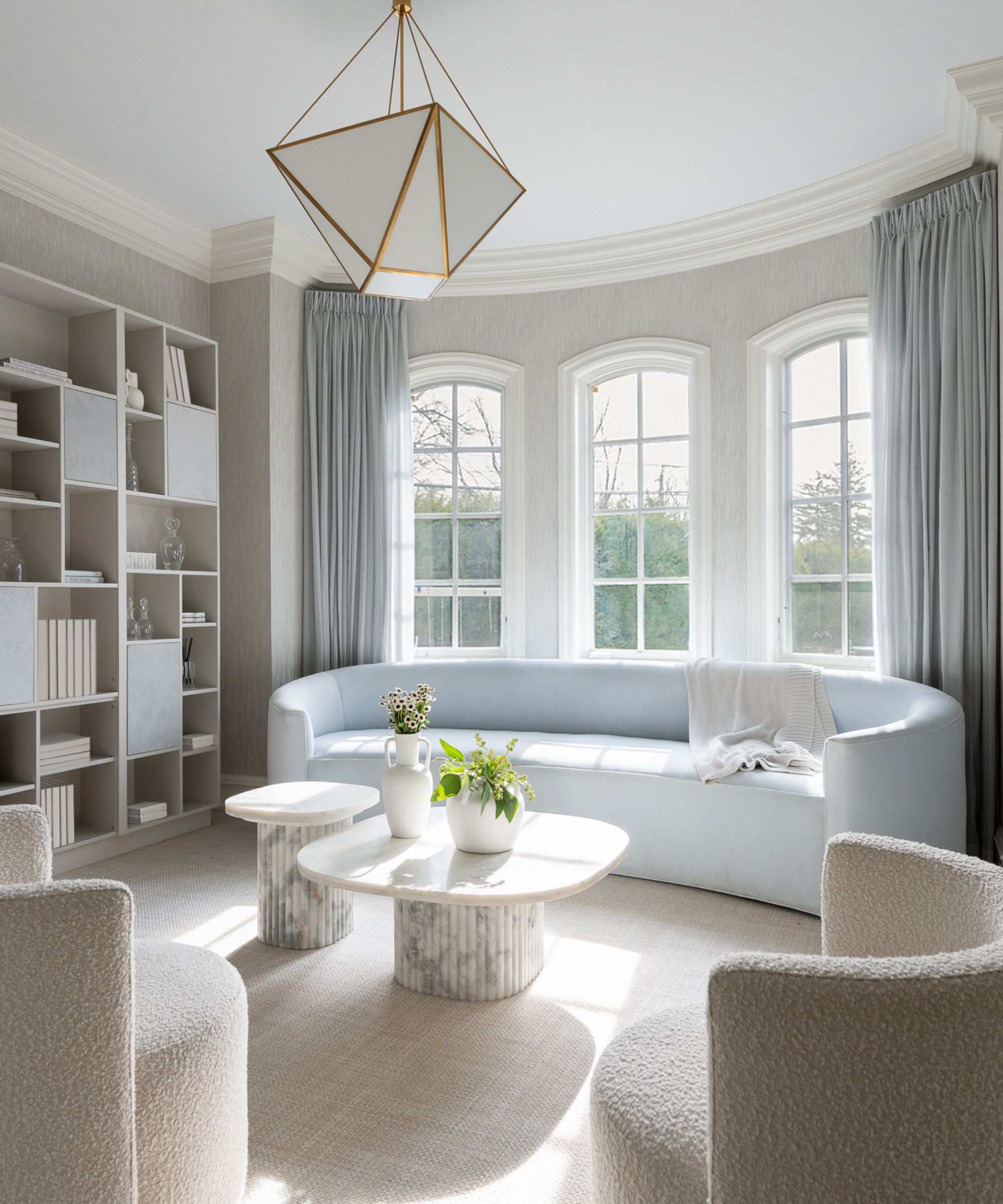
Living room ideas here are relaxed and welcoming, and designed to accentuate the beauty of this historic home's original bay window design. The curved sofa and drapes introduce a hint of icy blue, while calm neutrals anchor the scheme. Marble coffee tables add a further layer of texture.
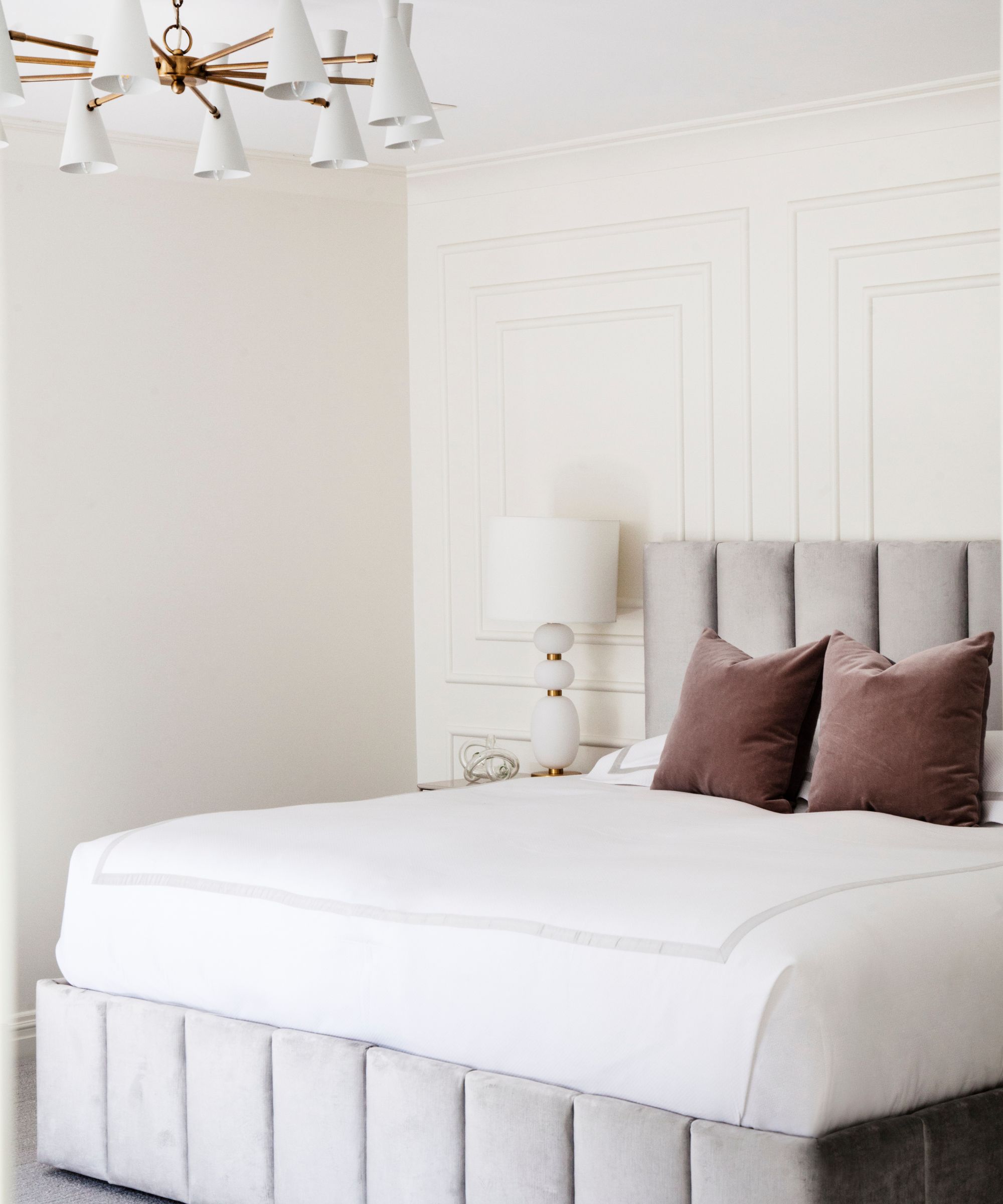
Designer Tova Kook's bedroom ideas for the primary bedroom focused first on creating a relaxing sanctuary to escape the bustle of family life. The clients favored a pale neutral scheme, but Tova wanted to ensure there was texture and interest there too.
A subtle wainscot paneled wall behind the bedhead references the heritage home's origins but with a contemporary lightness of touch. The bed's velvet upholstered frame provides another welcome layer of texture.
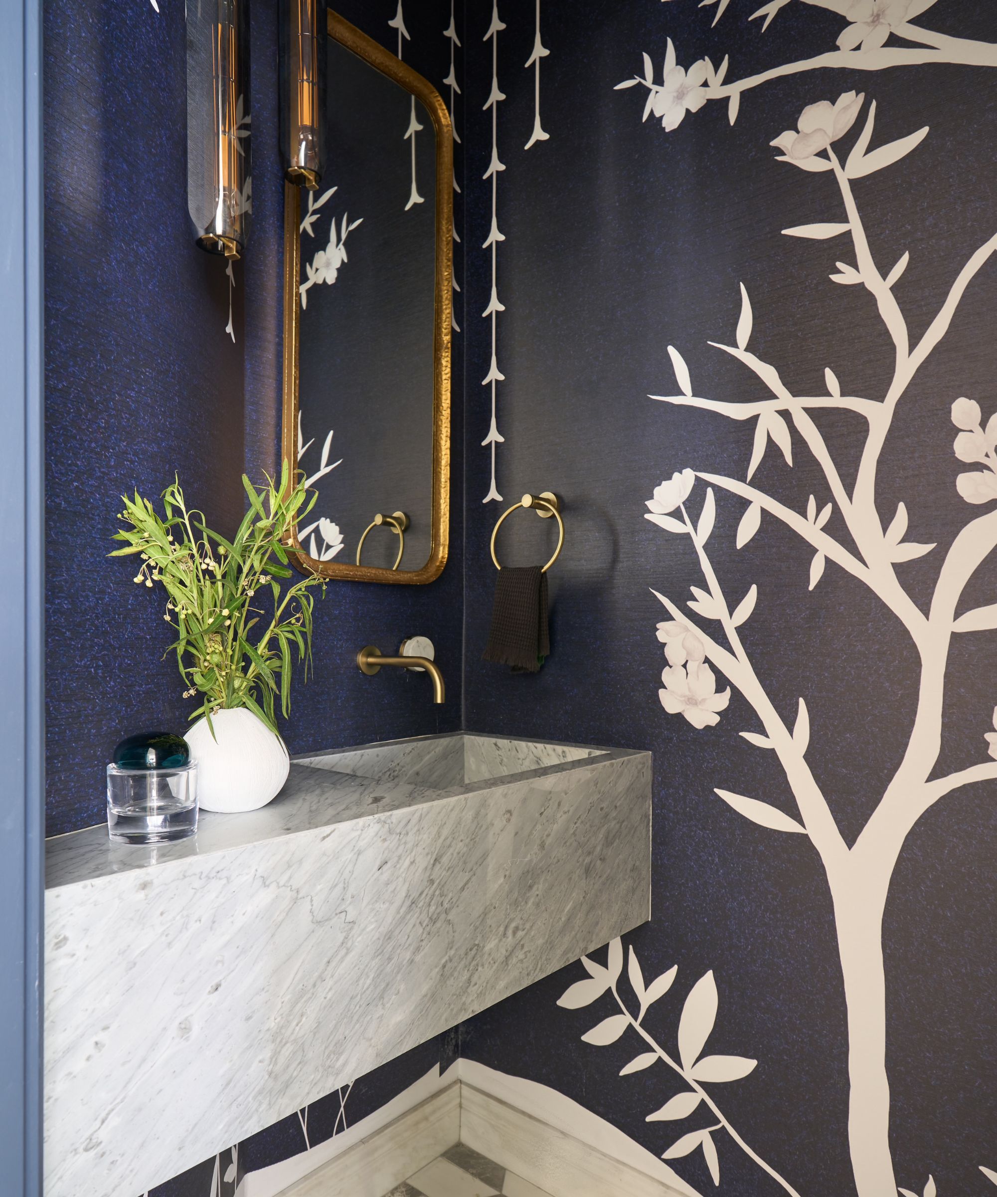
Tova's powder room ideas ensure that this small room packs a big design punch, and in fact the glamorous wallcovering was custom-designed by Tova Kook. A marble vanity slab adds to the luxurious finish.
Interior design: Tova Kook of TK Design
Photography: Marco Ricca

