Movie poster design often falls victim to trends (don't get me started on floating heads), but as a horror fan, I've always held the genre to a higher standard. With classic horror film posters like Jaws, The Exorcist and The Shining demonstrating the genre's creative diversity, I considered it a league of its own, but now I must confess, horror movie poster design is in a creative rut.
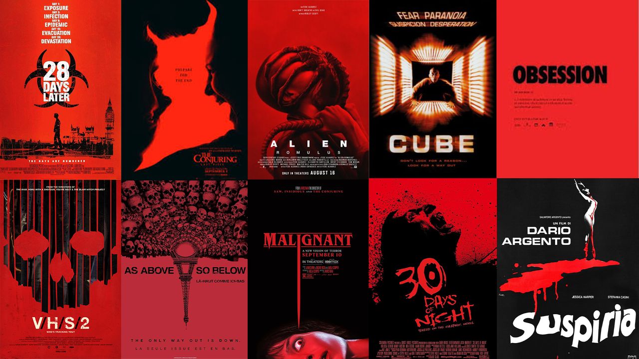
It seems that with each new horror release, there's a poster following the same formulaic pattern. Red and black colour palette, simple but creepy visual motif, and some edgy typography to top it off. While the aesthetic was creepy for a while, the aesthetic oversaturation has lost its impact, leaving me hungry for something (anything) fresh.
Where it began
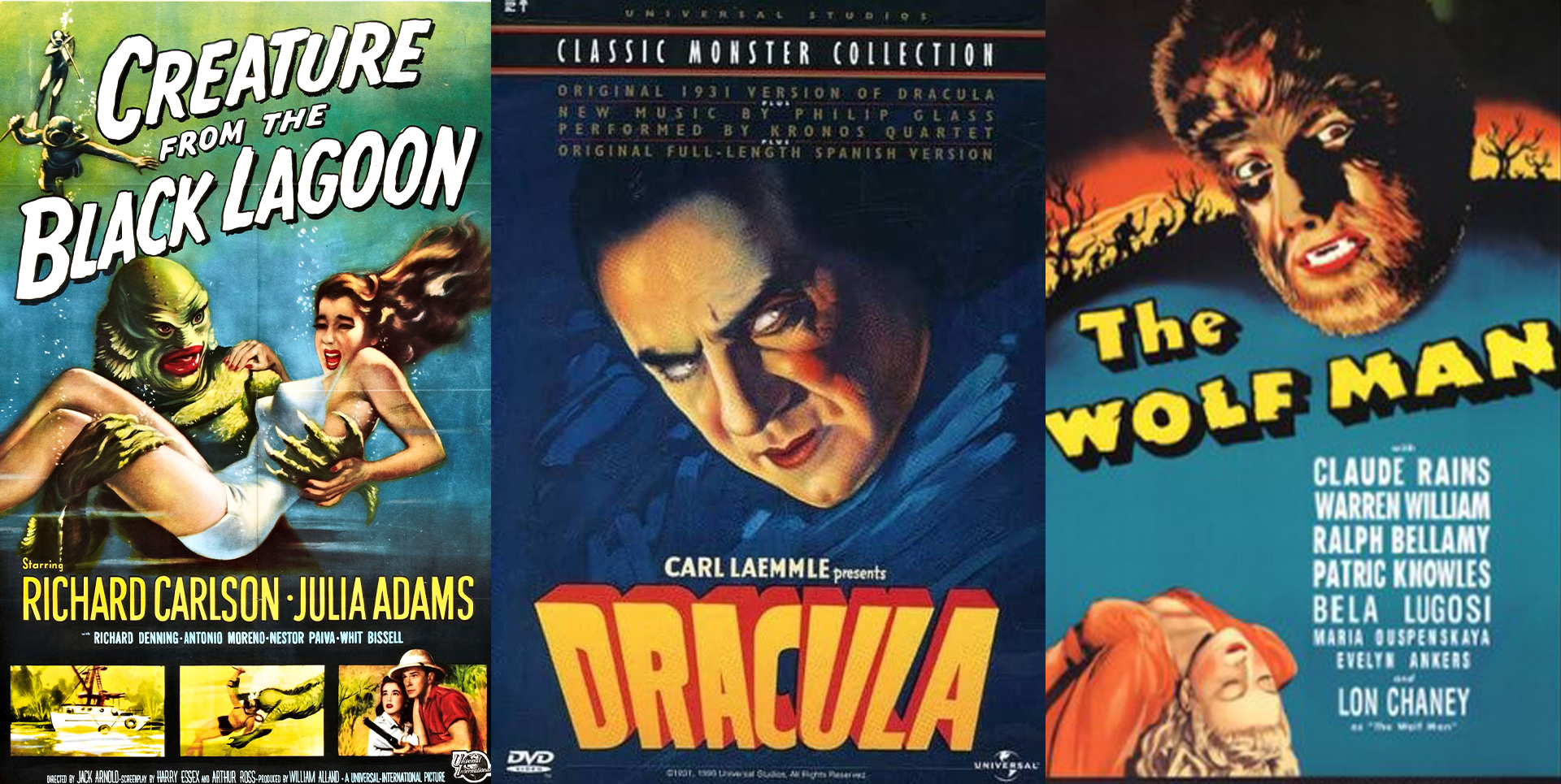
While the first horror movie can be traced back to 1986 with Georges Méliès' Le Manoir du Diable, the genre really found its feet poster design-wise with the popularity of Universal's Classic Monsters in the 1930s. While each poster followed a rough creative formula (comic-style font and detailed illustrations featuring the monster and a damsel in distress), each design had its own signature charm. Designers weren't afraid to play with colour and text – minimalism was not on the menu.
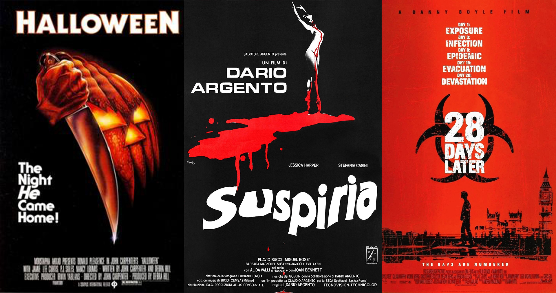
In the '70s/'80s, things started taking a turn, as horror moved to more domestic and abstract themes that took themselves more seriously than the humble creature feature. Argento's Suspiria and Carpenter's Halloween embraced a stripped-back style, making minimalism the new trend. Colour palettes were fine-tuned, and graphics were kept to a few visual motifs, leveraging curiosity and the fear of the unknown.
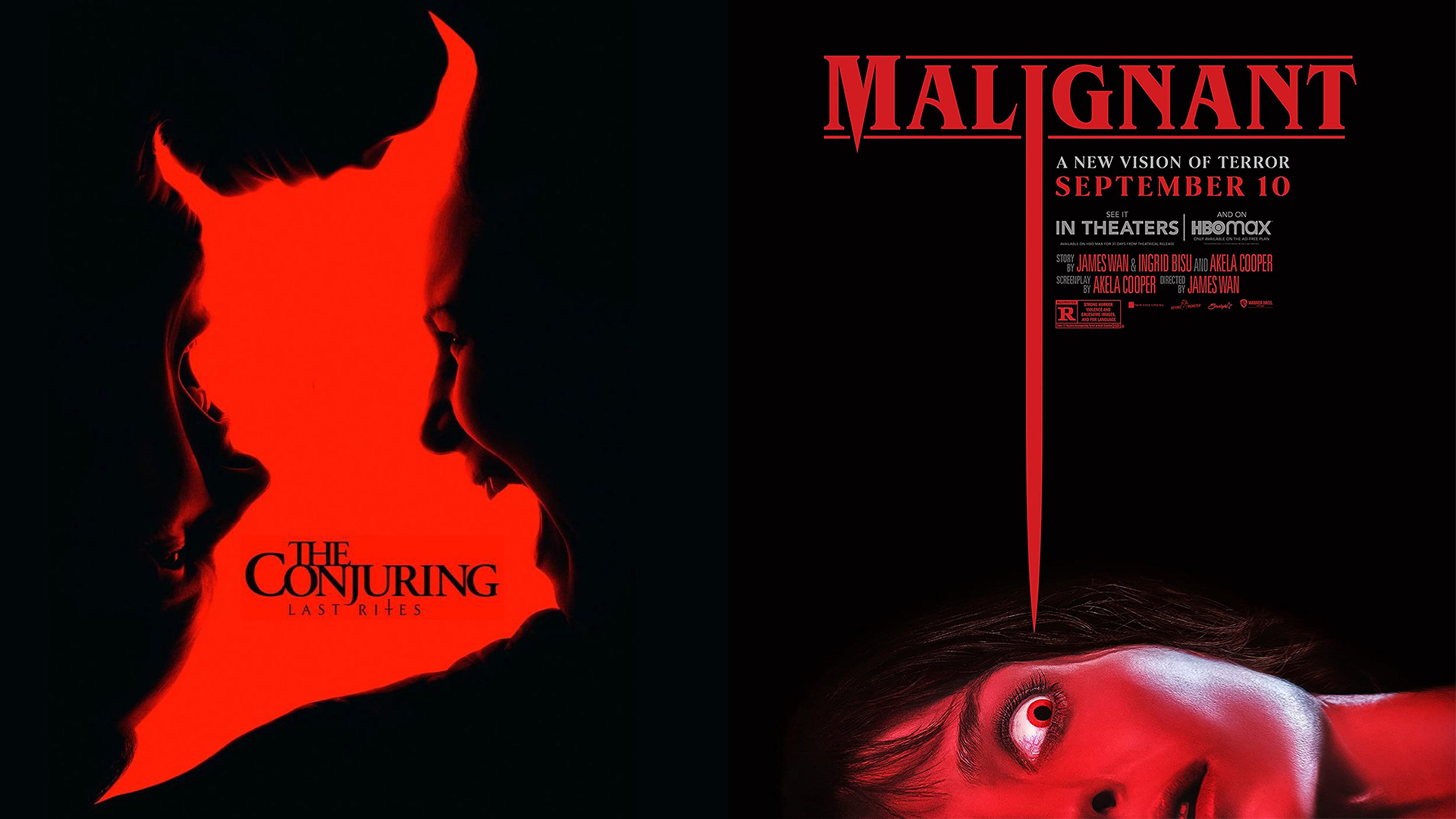
Minimalism and that familiar black-red colour palette really hit its stride in the '90s with releases like Cube and Misery, while the Blair Witch Project carried the trend into the early '00s. Since then, the genre hasn't been able to shift the design formula, as releases like Malignant, As Above So Below and 28 Days Later continued the trend.
The curse continues
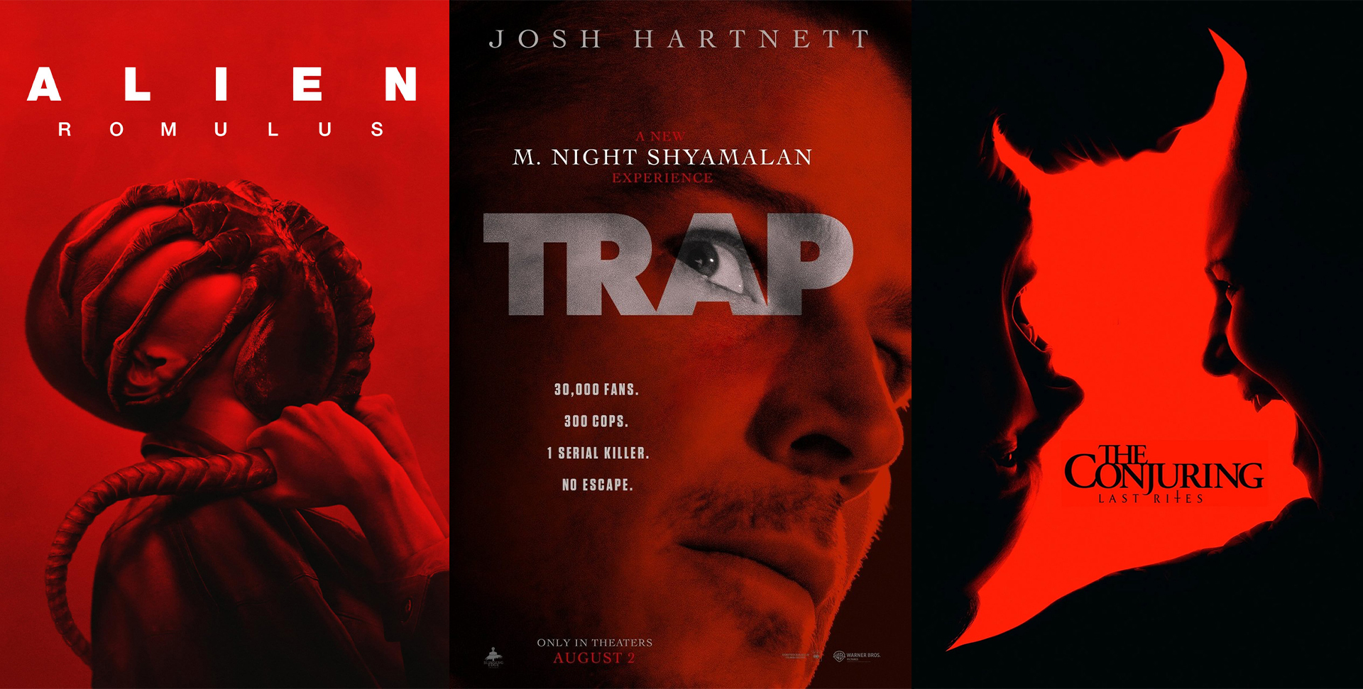
Today, the black-and-red horror movie poster plague is in full swing. While I'm not staunchly against the design trope (see it expertly used in The Conjuring: Last Rites poster), it gets old fast, making each new release feel formulaic.
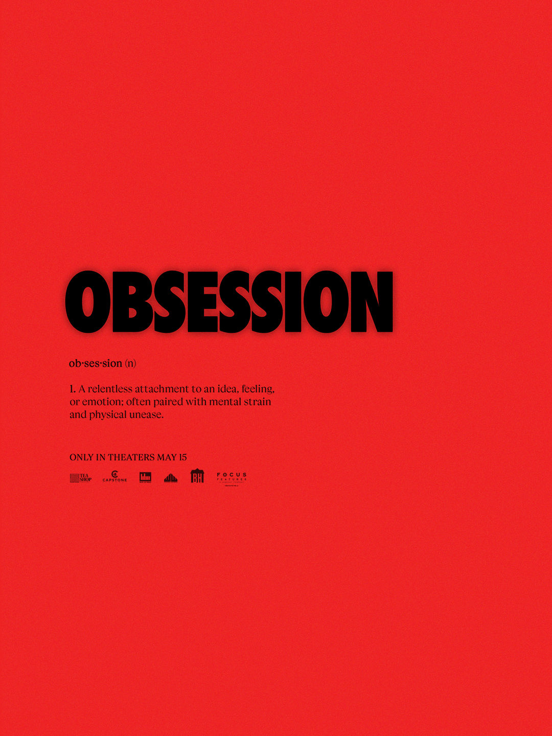
Even beloved franchises like Alien are guilty of committing this creative sin, leveraging high contrast colours with eerie imagery for that instant horror aesthetic. It wasn't until I recently covered the new poster for Obsession that the trend truly came to light. The truth is, smacking the two colours together with a chunky sans-serif title now feels instantly tired and derivative.
Why the formula works
Despite my gripes, the black and red poster aesthetic is, on the surface, an effective horror design trope. From a colour theory perspective, both are great at creating a sense of foreboding, thanks to black's association with death and the unknown, and red's connection to blood, anger and danger. It's textbook horror imagery.
Often claustrophobic, abstractly eerie or subtly strange, the simple imagery gives the viewer little to ponder, making the mind work overtime to demystify the design. Subconsciously, the colour palette already evokes a sense of fear, and the shadowy imagery lends perfectly to our minds playing tricks on us.
Time for a switch up
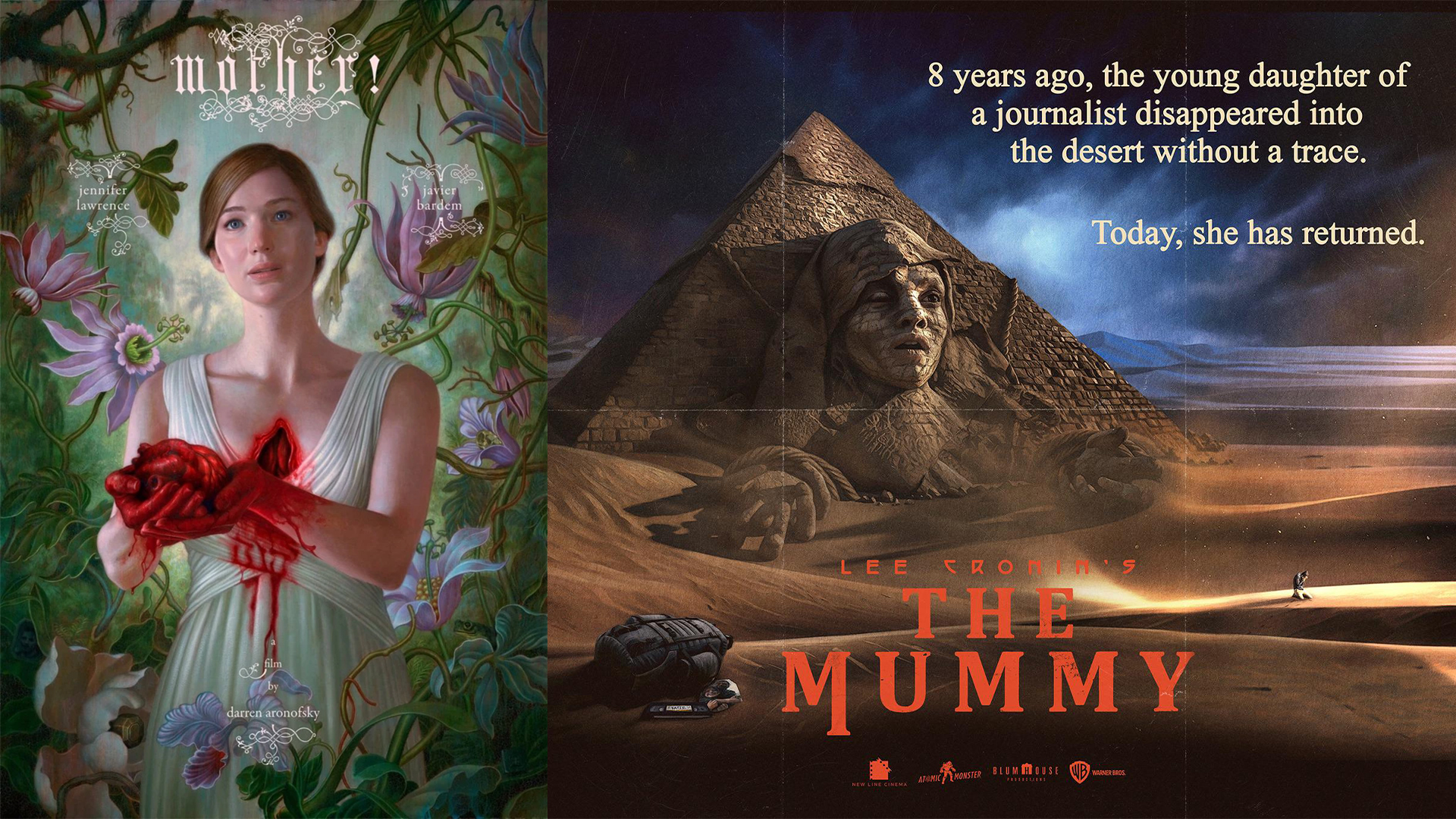
While the formula undoubtedly works, it starts to lose its sheen when every new horror release looks the same. Across the years, there have been some beautiful horror film posters that challenge the genre convention and shine in their unique appeal, proving that bucking the trends is worth the risk.
The poster for Aronofsky's Mother pairs painted botanicals with visceral body horror for an eerie visual contrast. Cronin’s ‘The Mummy’ returns to classic horror form with its retro design details. James Jean's Frankenstein poster was an excruciatingly handcrafted masterpiece that received an outpouring of praise from horror and art fans alike. There's no excuse to say that modern audiences aren't hungry for considered horror poster design. It's time to break up with the black and red formula.