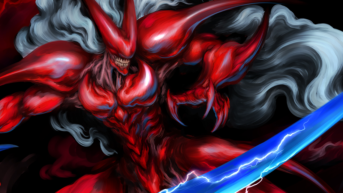
While new games like Dragon Age: The Veilguard grab headlines with a new controversial art style, many indie games are quietly pursuing new ideas and bold art styles. One of these is action game Slave Zero X that champion's a unique 'grotesque beauty' that taps into a 1990s retro aesthetic and has been influenced by the art of Yasushi Nirasawa.
Below I ask Slave Zero X's art director Francine Bridge how influences such as Devil May Cry and shows such as Neon Genesis Evangelion and Ghost In The Shell helped define the visual direction of this unique game. If you're yet to play it on Switch, PC, PlayStation 5 or Xbox Series X/S it comes highly recommended, and has an inspired art direction that blends 2D animation with 3D scenes across side-scrolling levels.
Before you skip below to read how the art behind Slave Zero X was created, Francine offers advice for how to get started in the games industry and game art, beginning with how community is important. "Being able to talk to others with the same interests as you, who can help amplify the joy of creating and push one another to improve, who can help support each other and lead you to projects you wouldn’t otherwise have found – that’s invaluable," says Francine.

"I think finding a way to demonstrate what sets you apart from 'generalists' is something i don’t see emphasised, but that I recommend," comments Francine, adding: "You should always be pushing outside your comfort zone and finding new skills, but I didn’t make serious headway in getting opportunities with the kind of projects I dreamed of working on until I got away from trying to be a jack of all trades."
Finally Francine tells me building a name for yourself as some who can be trusted is important when starting out, saying: "I think building a reputation through freelance work for being someone capable of versatility, but who truly excels at 'X' or 'Y' is a great way to be reached out to. Being 'The biomecha gal' was how Slave Zero X happened for me."
Below you I discuss more aspects of creating expression and original game concept art for Slave Zero X. If you're inspired, read my guide to the best drawing tablets, read our Procreate tutorials, and start creating for yourself. Head over to the Slave Zero X website for more on the game.
01. What was the starting point for the concept art for Slave Zero X?
Francine Bridge: Conceptually speaking, the starting point for all of our Slave Zero X art was the original game (Slave Zero, from 1999). It was key to look specifically at the core palette of influences and flavours that created the original and work from there. When I was first invited to contribute key art to the original pitch, I thoroughly familiarised myself with the original through some existing long plays and then wrangling my own copy for firsthand experience.
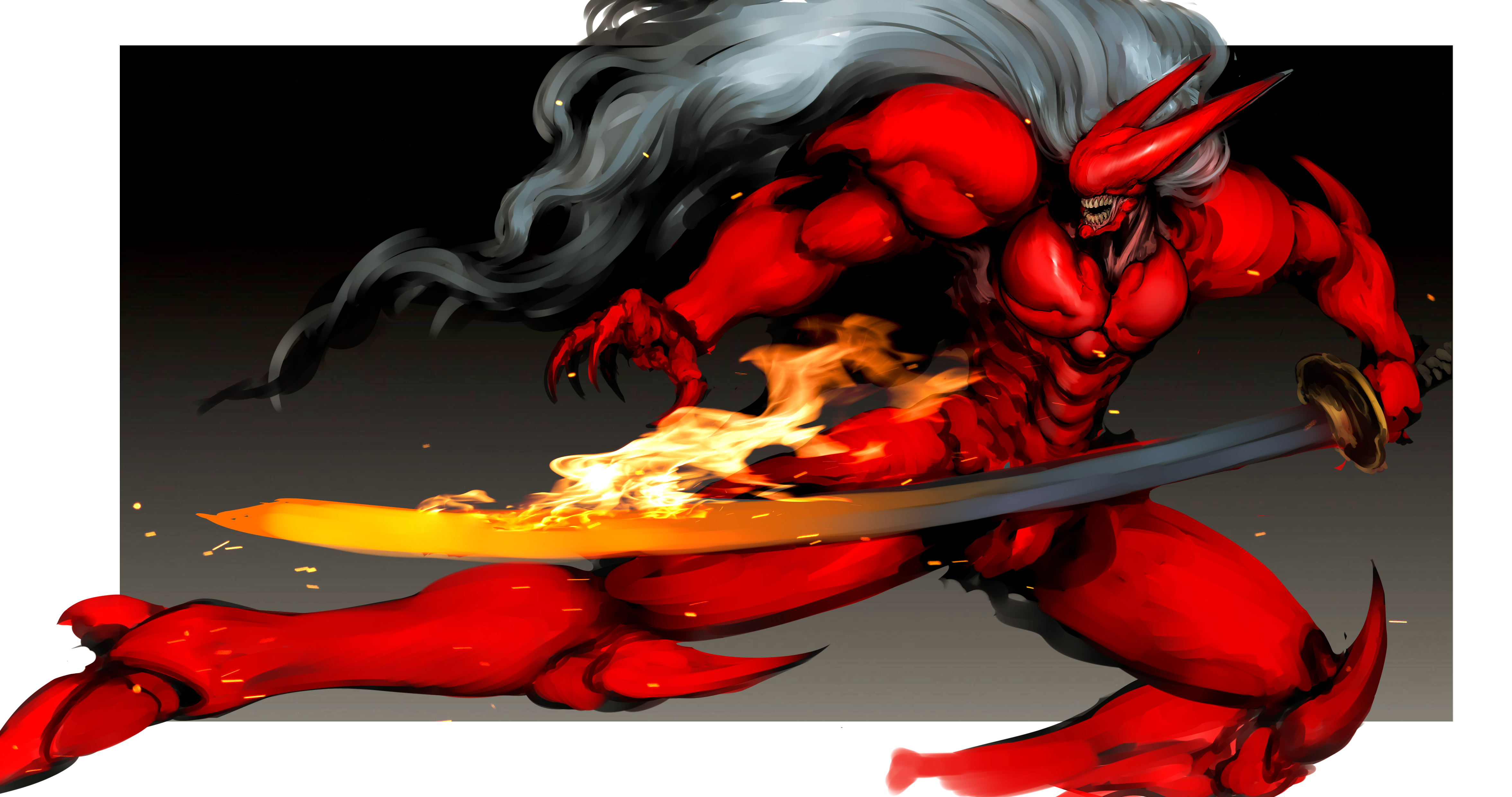
That key pitch art, the very earliest iterations of the then-nameless protagonist, ultimately became the bridging point between the original and Slave Zero X’s own approach – the silhouette of a humanoid swordsman, but in brushed metal like the Zero of the original rather than the organic look we would work towards.
It was about beginning a series of dialogues with the original that would eventually resolve in the finished art for Shou / X, which became kind of a flashpoint for defining the rest of Slave Zero X’s developmental arc.
02. How would you describe the world you've created?
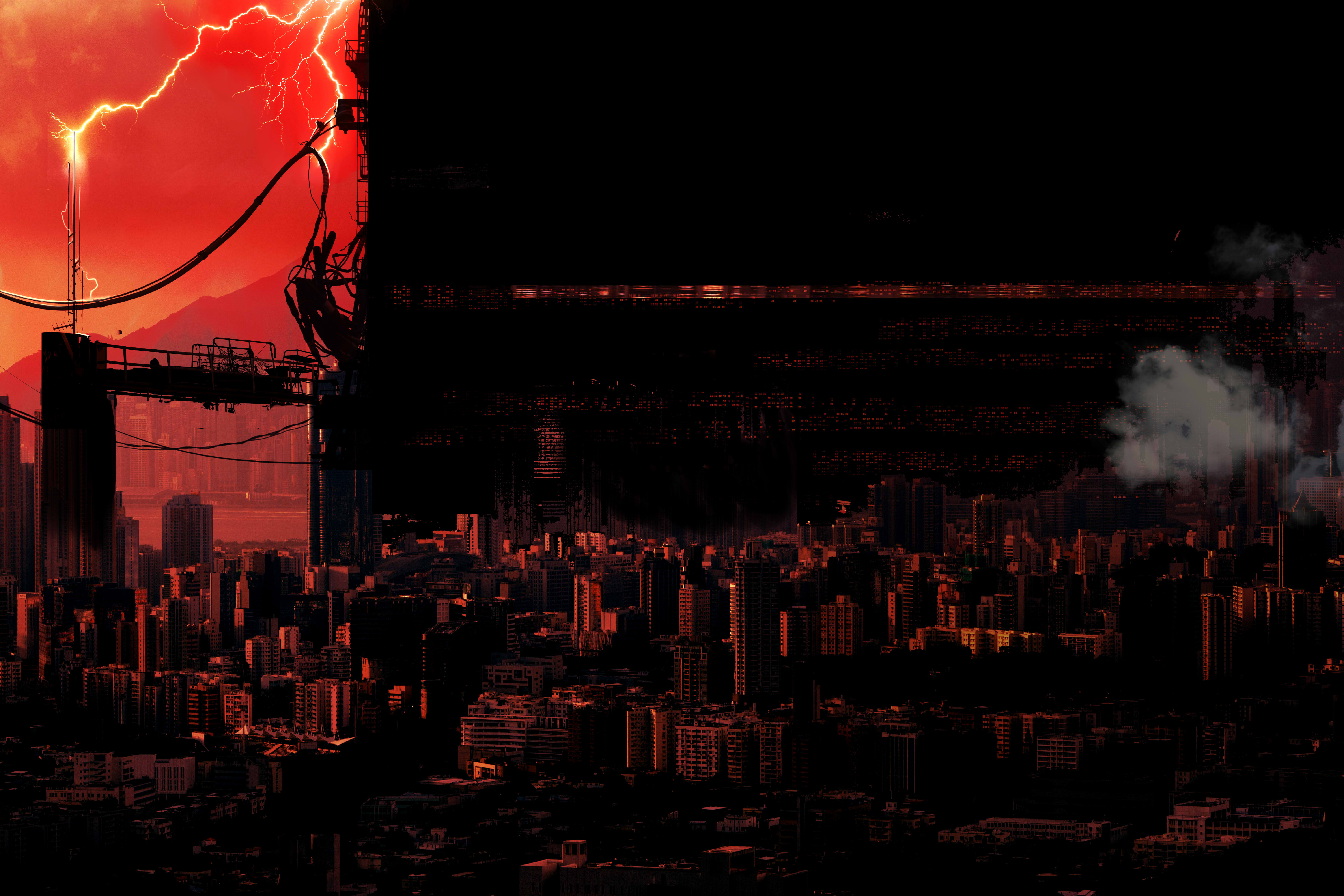
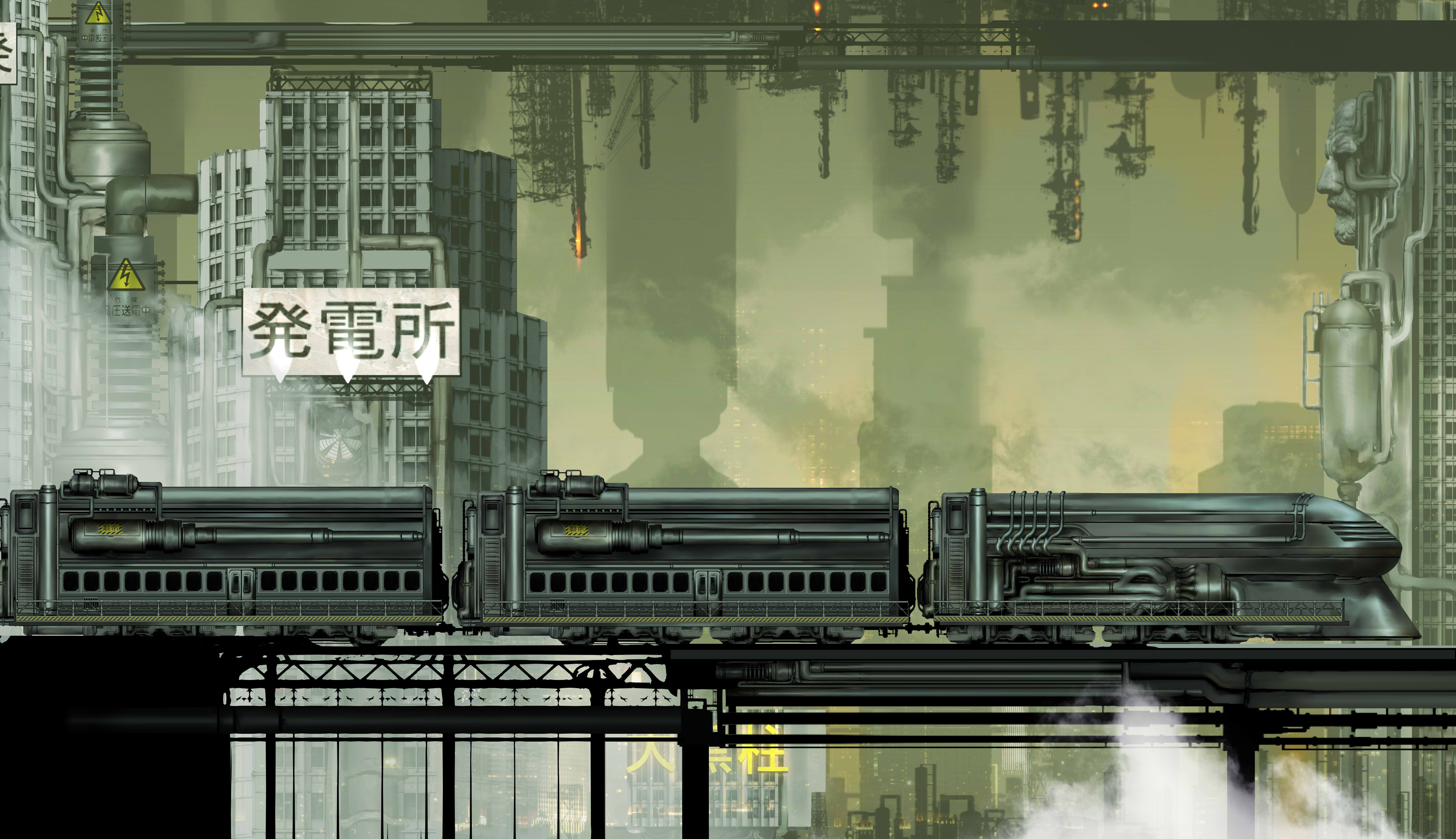
FB: I think we owe a great deal to worlds in the same vein - the 80s and 90s OVA boom and the obsession of the late 20th and early 21st century with the vision of the sprawling 'Megacity' dystopia is the core archetype we built ourselves around - but I wanted to bring in something of the parallel trend in many Japanese titles for these kind of worlds to often resolve themselves into a kind of sci-fantasy as well. It’s a Megacity, a distorted hyperbolic version of the modern urban environment, but it’s also a sorcerer’s castle, a palace inhabited by demons, the evil looming citadel.
When we gave each Zone a corresponding Hell epithet (The Hell of Broken Bodies, The Hell of Many Colours, etc.) coupled with the slow ascent of our Red Devil / Crimson Angel character to an ersatz heavenly palace where he assaults a would-be God, it was very consciously fantastical or mythic.
I would say our vision of the Megacity is less hard sci-fi and more in that dark fantasy vein. That was reflected in how we used religious imagery throughout, the omnipresent statues and shrines to the SovKhan, and the piping that covers every building acting as 'Veins' that carry supplication to him. I wanted more and more dense, maximalist detail and ornament at every level, and the environment team delivered repeatedly.
03. Yasushi Nirasawa is an influence, how did this influence the character, creature and world design?
FB: Nirasawa, who sadly passed in 2015, is a personal hero of mine. Nira’s ability to bring so much character and beauty to deeply grotesque subject matter and his kind of genuinely punk-style sensibility are well known. Nira’s work is also a kind of Maximalism - style supersedes realism, and he continually layers ornament and complex detail in both his garage kit work and his ink drawings. Still, he also brings these vivid acidic colours and contains everything within strong silhouettes.
It feels facile to say Nira’s greatest influence for me is just the drive to try and reach his heights, but he really does exemplify so much of what I want to accomplish with my own art. There’s so much love in his work - like all the best art in his field, it represents an intersection of creature design with fashion, hard surface, character, and every discipline together.
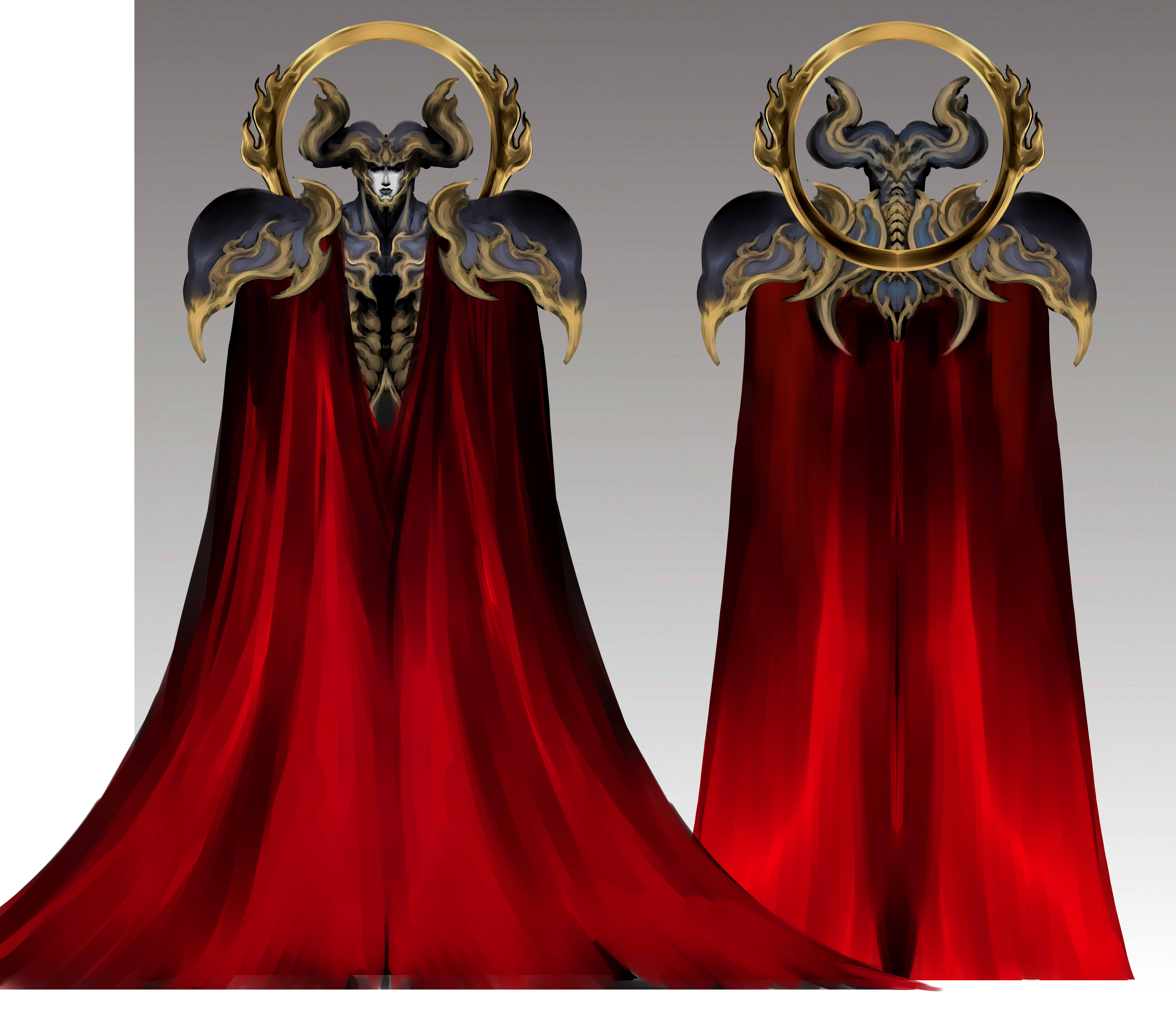
I tried to embody Nira’s ability to put everything he loved into every piece, indulgently. On a surface level, we also have characters that have asymmetrical monstrous bodies, elaborate glossy dark armour, sweeping mantle cloaks, gnarled rictus teeth grins, or even huge shocks of styled hair, the hallmarks of Nira… but it’s that willingness to go beyond and push every design further that I really wanted to capture.
When I caught myself pulling back on a piece because I felt it was too much, I tried to relax and simply enjoy the pleasure of putting everything into it. That joy of creating something for its own sake and seeing beauty in it - that’s Nira, to me.
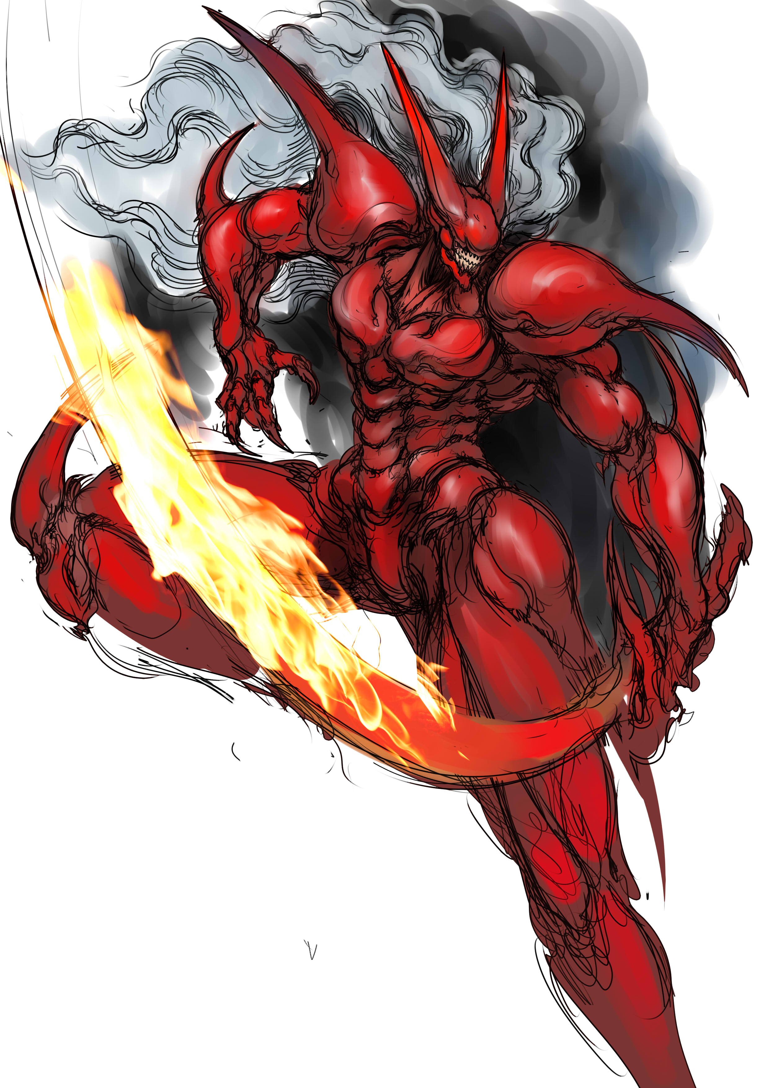
04. What is the process for creating a hero design for the game?
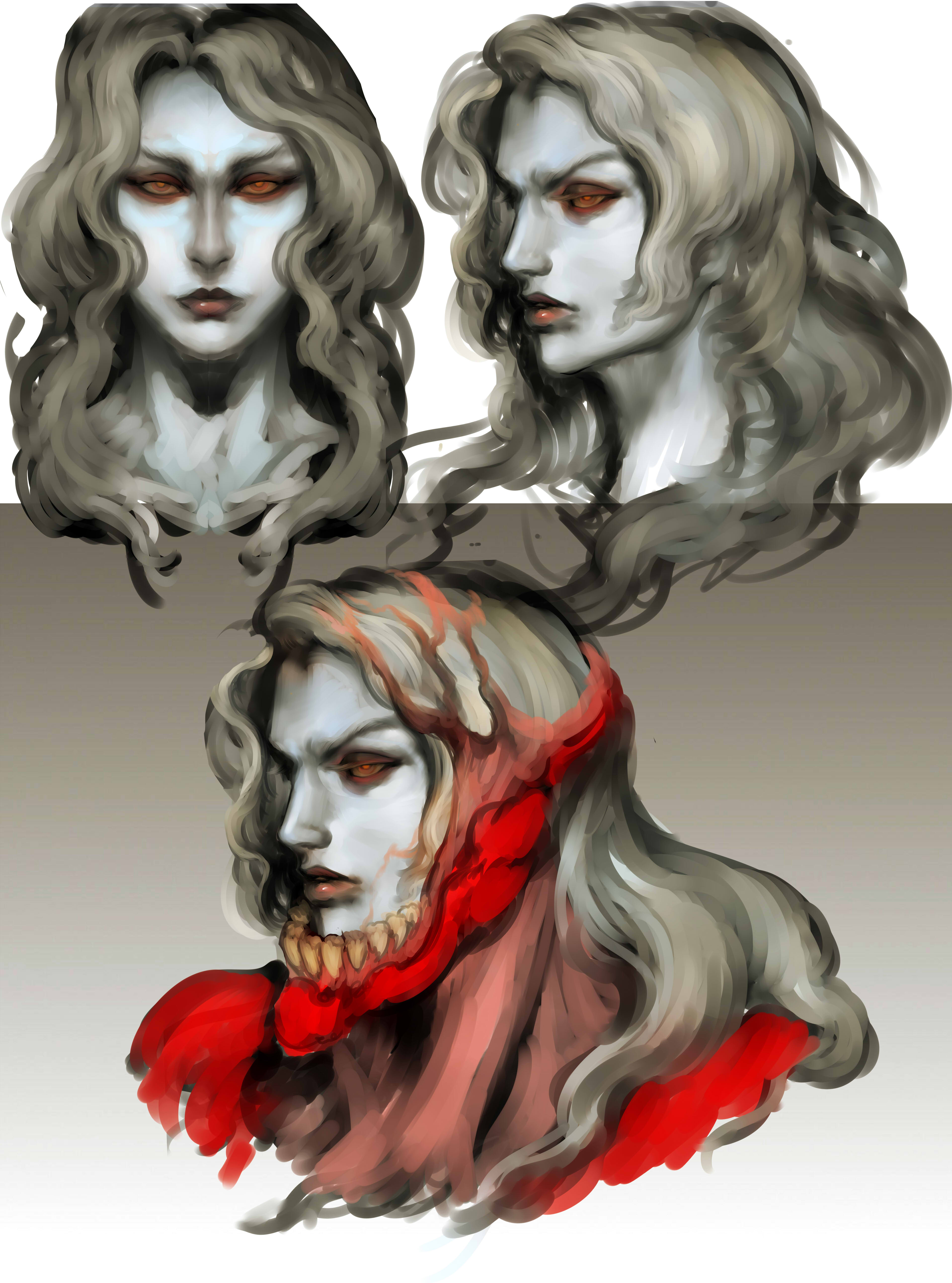
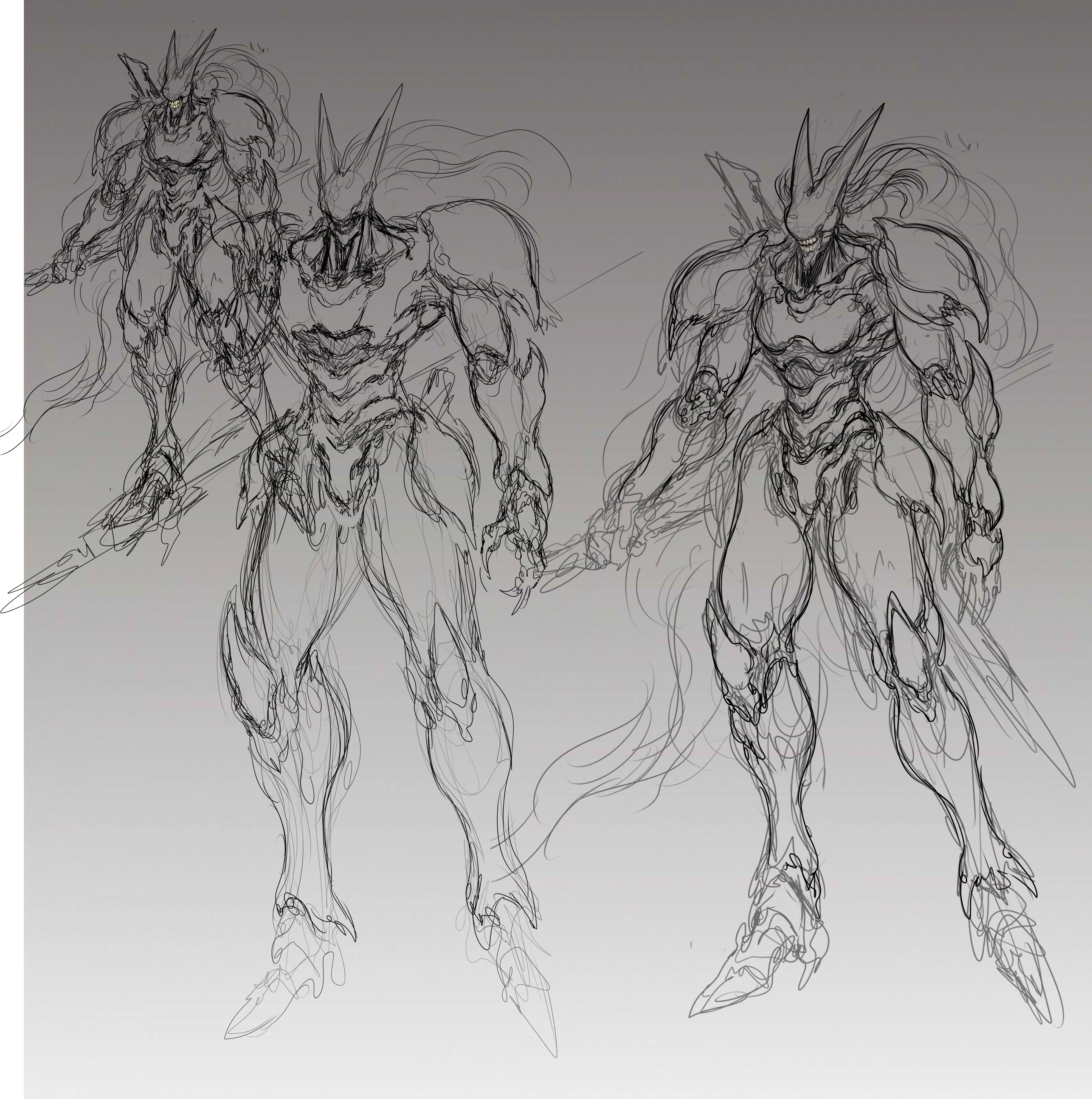
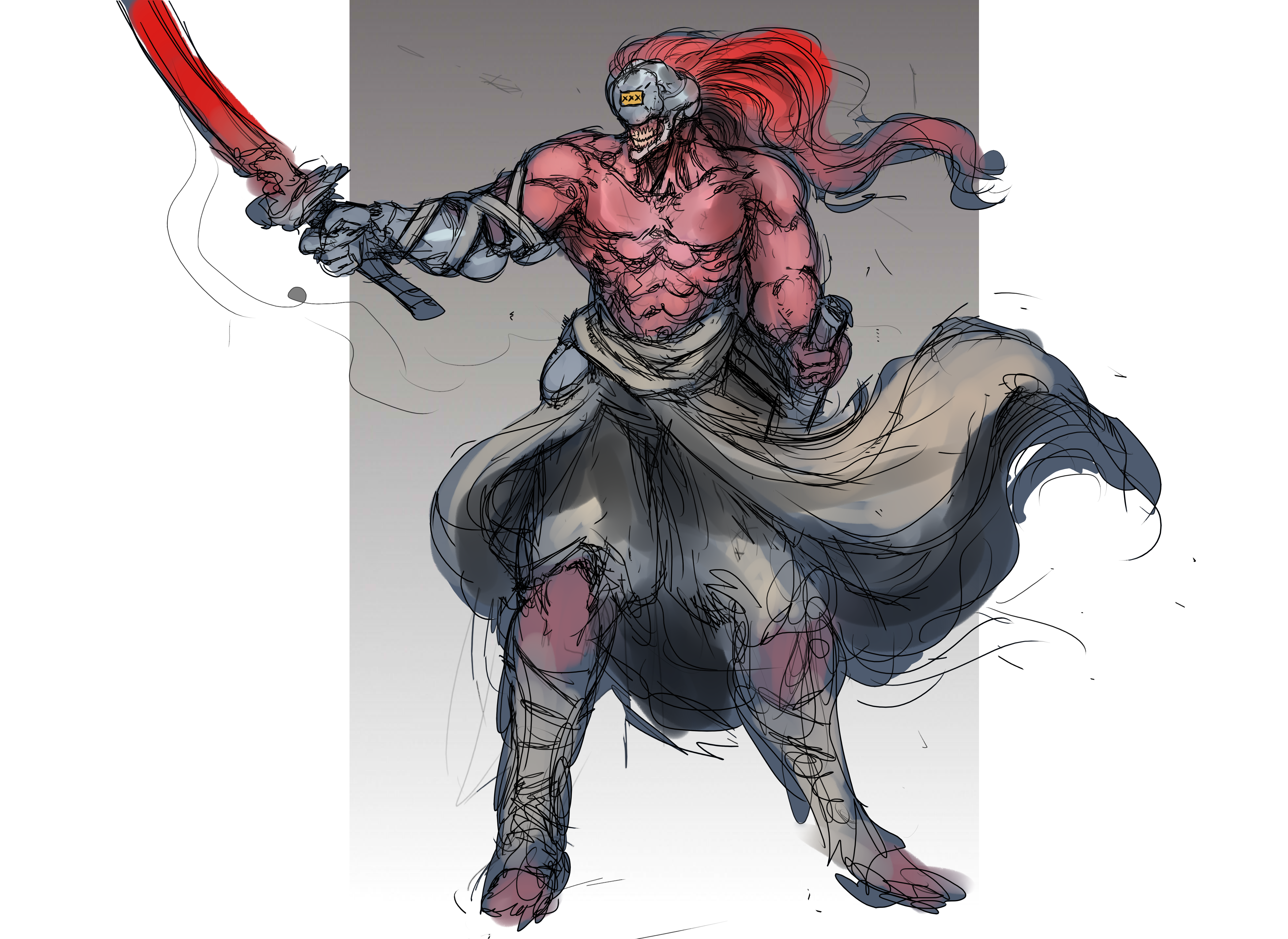
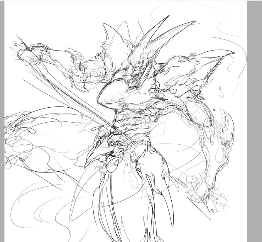
FB: Every major character started as a loosely defined archetype - so Shou, for instance, was a Strider-esque 'Swordsman' type, the very 90s conceit of the lone katana-wielding rebel who somehow takes on oppressors equipped with modern armaments, but nothing else about his character was defined. Usually, I would do a first pass with four or five different rough concepts throwing in different directions - is his armour metallic or fleshlike? Is he slender or more heavyset? Is any of his skin visible - etc. Very simple variations on a core theme, but ones that make a big difference.
After several iterations, we settled on a design that everyone was able to back and that felt distinctive. The team offered more specific feedback on Shou than any other character, which is fitting since he was the center-piece protagonist. Still, it meant he went through a lot of iterations, losing stuff like a kind of half-trenchcoat tasset, hakama pants, and a metallic 'Restraining' helmet over time.
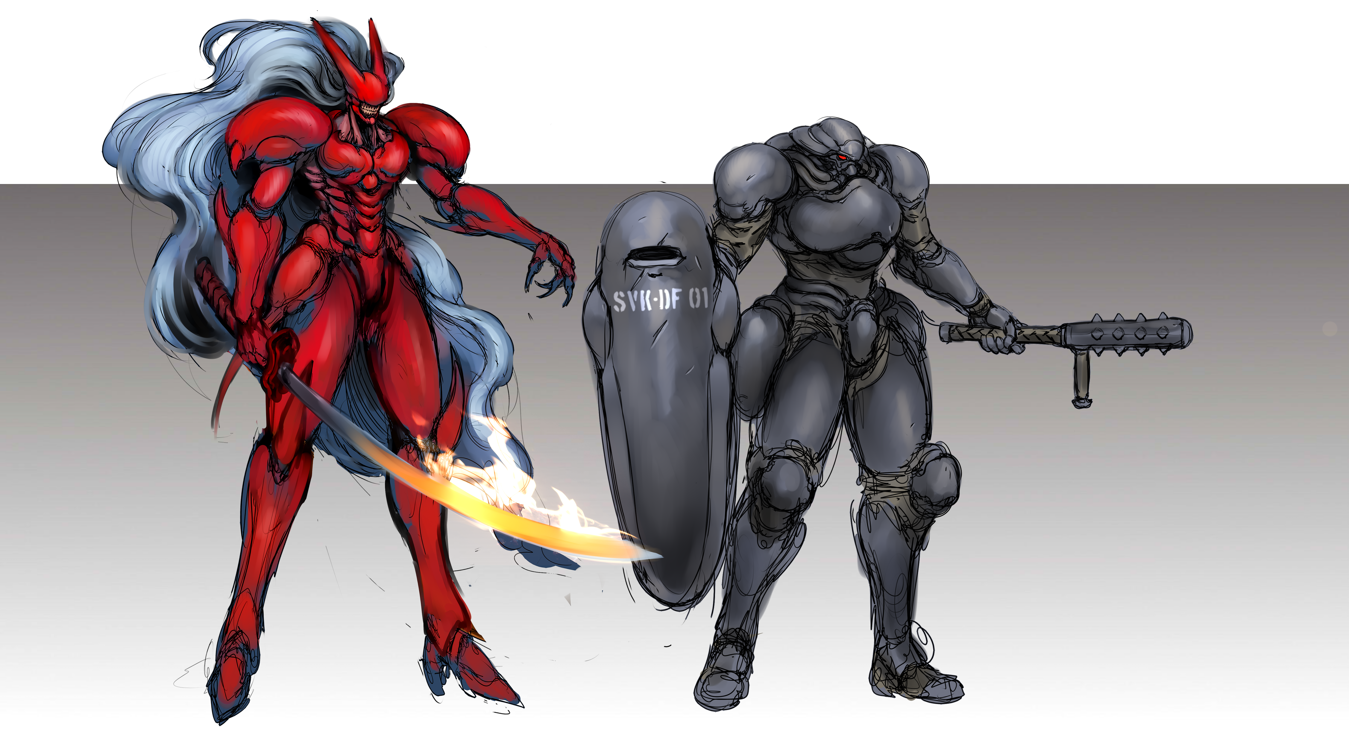
I think the two key moments that defined him as a character were the addition of the huge Justice mane and the solid red hue. There were a handful of variations on that concept, but once it came together and it started to look weird, when we saw a Shou without those features, we were ready to lock in.
Even after Shou was finalised, he continued to develop over the course of production - the earliest Shou art with the final design lacked the solid blue blade. Overall, it is much rounder and projects less in every direction. As different artists and animators got their hands on him, we acquired new traits, like the pauldrons turning into much larger spiny protrusions or the body form language becoming more gnarled and dense. I love that we could have a “living” design like this. Appropriate for a biomechanical being!
05. What software do you use for concept art and why?
FB: I use Paint Tool SAI exclusively. It’s relatively simple compared to other industry-standard programs like Photoshop, but I think the blending engine for painting is peerless. In the modern era of subscription software services and rapidly changing predatory terms of service, I feel very grateful to have a program with a permanent license that only costs 5,000 yen for life. I highly recommend it!
06. I love the moleskine sketches on the game's blog - did the team still rely on traditional media for creating concept ideas?
FB: Those are Erica Rossi’s, not mine, and I am in awe of her ability. Working with her was intimidating (in a good way) – her draughtsmanship is leagues ahead of mine, and her ability to depict these massive panoramic city views effortlessly in pencil is incredible. She inspired me to push myself further every day we worked together.
07. What has been the most challenging aspect of design for Slave Zero X?
FB: This was my first time working on a game from beginning to end, and without a doubt, the hardest thing was learning to let go and understand limitations, especially in a smaller title and with a limited amount of animation assets available. Everything we let go of or every character element that had to be altered for practicality’s sake was painful, but it was the right choice. I learned an enormous amount about how those restrictions can engender further creativity.
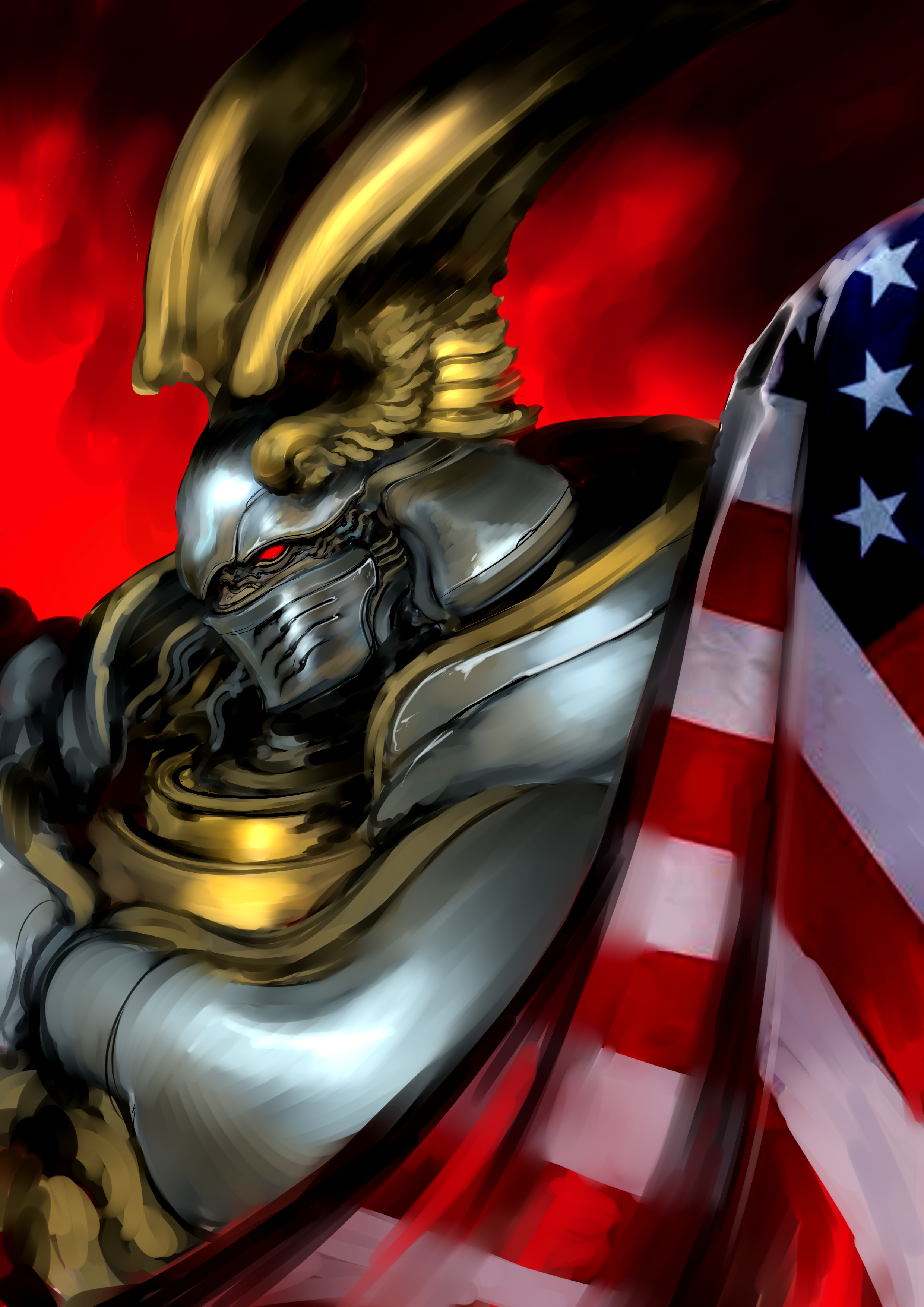
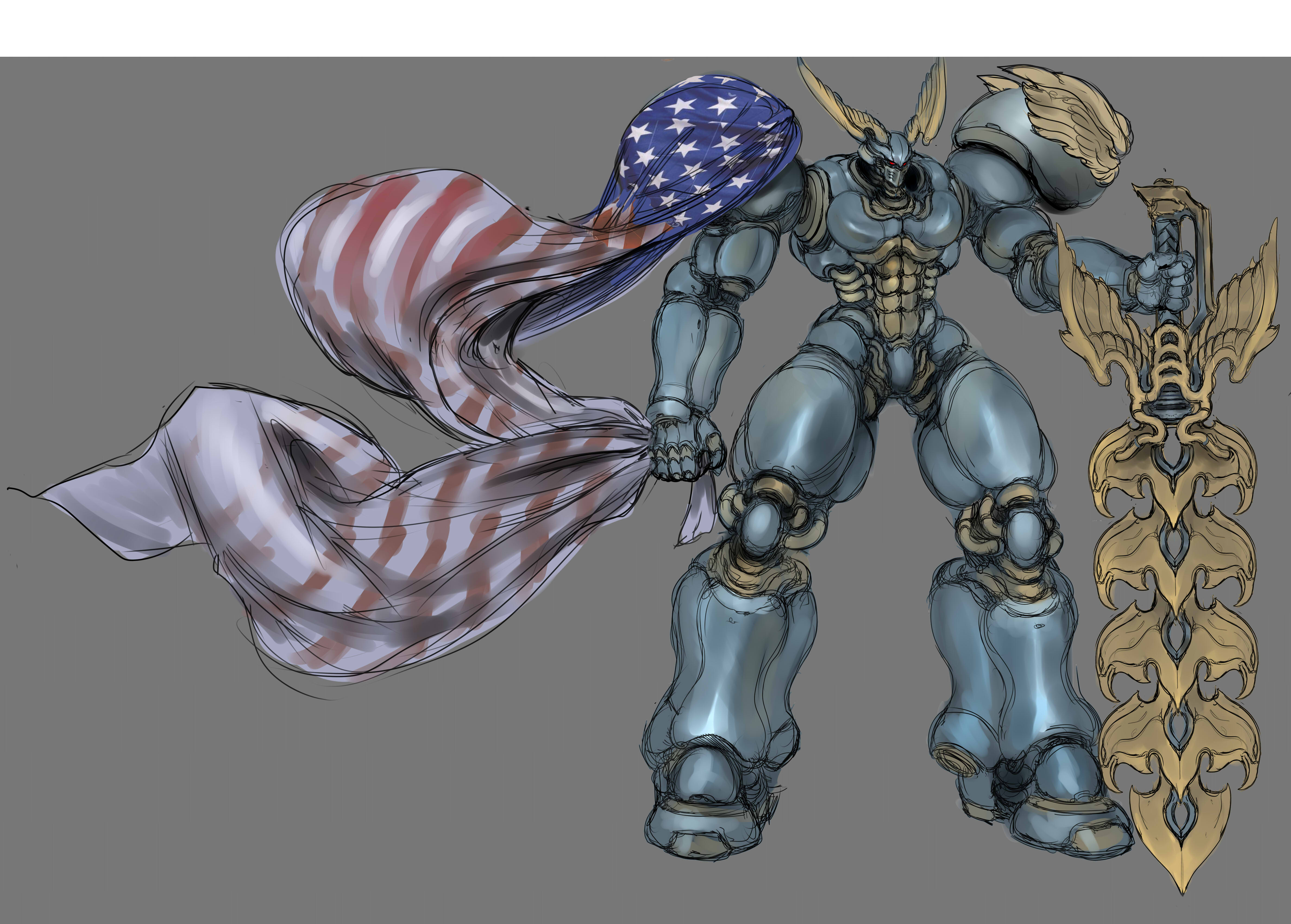
Originally, as an example, Hercules was meant to keep his US flag cape / mantle on the entire fight, but Scott, the animator working on Herc, told me very rightly that animating that much-patterned cloth was nightmarish, and we began working on how to get the cape off him before the fight started.
We tried so many different variations on “he throws it off”, “he tears it off,” “it falls off when he jumps,” etc. until we landed on him igniting his huge fiery greatsword under the cape, and it burning the flag off him. It’s not just a cool reveal for the sword he’s been hiding, but it’s an immensely funny and characterful moment for him - a character defined by his half-understanding of “America” as a concept that wears the flag as a symbol of his worship, but doesn’t know that burning the flag would be seen as deeply offensive to a patriot from the era he idolises. It solved our problem and added a new character note to the game. That’s what I love about the pressure of reality – when it can compact a new diamond out of us.
08. Which character was hardest to get right, and why?
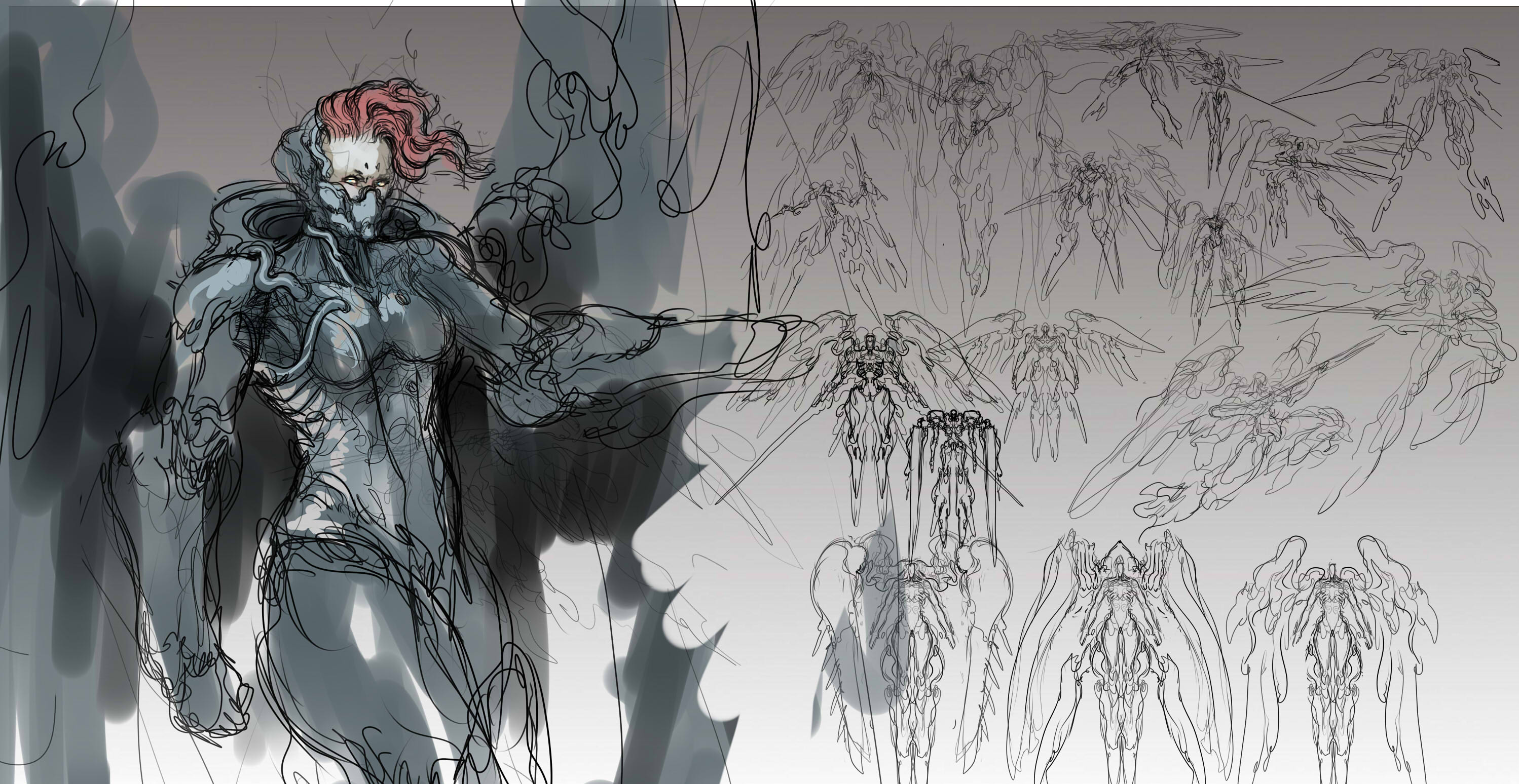
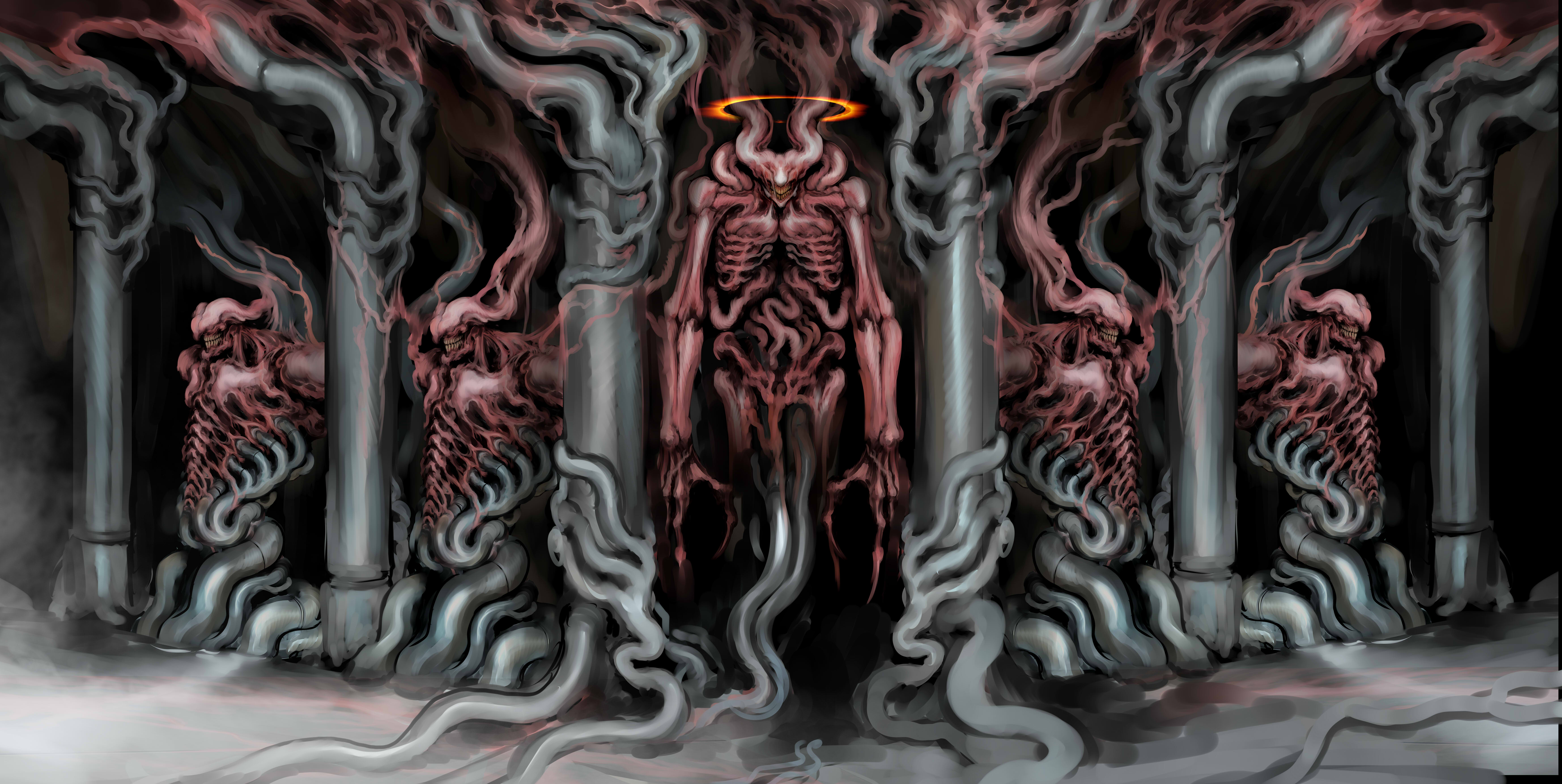
FB: It’s a tossup between Uriel and Sovkhan’s 'God' form, which is ironic because when we began concepting bosses, I assumed that these two, who existed squarely within my comfort zone, would be the easiest designs, just pure pleasure. In reality, when you have an almost unlimited license with the design, and it’s already something that you would pay good money to be allowed to draw in any other project, your own expectations can become a trap unto themselves. On both of these huge, monstrous designs that could have come straight from my personal work, I found myself continually revising and restarting them over and over.
When I approach a piece I think is going to challenge me, something outside my usual field, I often have the pleasure of surpassing my very low expectations for myself, even if the subject matter is difficult. When it’s something I should be able to draw in my sleep, my expectations skyrocket - I wanted both of these to be peerless, and that meant endless debates with myself over what direction to take, whether I was being derivative, whether I could be going further, etc.
Ironically, I never received notes for either of these designs from anyone else on the team - my torture was purely self-inflicted, haha. Both of them, though, but especially Uriel, are designs i’m very deeply proud of, even if I had to fight myself a hundred times to get there. I learned a great deal about letting go from both of these, and I want to strive to hit the balance between pushing myself further and not being self-destructively precious in the future.
09. Was it hard to get the 3D and 2D idea working? Was there a moment when it all clicked and the style worked?
FB: It sounds like a copout, but from an art direction perspective (the technical challenges were something else), the moment it clicked stylistically was the very first time we got our sprites against the level geometry.
The same principles that work when you see cel-animated keyframes on a lavishly painted background in one of those old 90s OVAs applied – characters leap out. They are immediately defined against a background that becomes a dense diorama into which you can work all kinds of details without losing the character.
From a very early point, we knew we had something special. That said, the first time we got lighting rendered, it felt like that moment happened all over again – I was so proud of how our game looked from the first prototypes onwards, and I only got prouder. The team worked so hard to realise that, and I’m still in awe today.
10. Is there a combo animation or attack that you're really proud of?
FB: One of the mutants, affectionately nicknamed 'Handguts', has an attack in which their prone praying body opens up, and a flood of raw skinless hands pours out. It’s a moment that takes a lot of folks unaware and almost jumpscares some people. It also comes up at the moment when the game begins to shift from pure sci-fi into weird sci-fantasy like an Amemiya film. Barbera Boone (2D FX artist on Slave Zero X), the animator who handled the mutants, utterly knocked that one out of the park.
11. Would you recommend the indie game route to artists over, say, a big studio?
FB: That’s very difficult to offer an answer on; I think there’s very little advice in this world that’s universally applicable in industries like games art, and the entire industry space is extremely volatile at present, so I don’t believe indie represents greater security in a real sense.
I also haven’t ever worked on a AAA title, so I can’t speak to that, but it does feel like the indie space (which is so loosely defined) is where experimentation and works of passion are happening, and that excites me. I think the rigidity of a larger budget title that doesn’t have the ability to be indulgent or idiosyncratic or work with friction versus broad appeal is something people should think carefully about - why was it that you wanted to work in games in the first place?
For myself, as long as I can paint monsters for money i’ll be happy.
12. Finally, what's your next project?
FB: I have several things I’m working on that could all, with a little luck, be 'The next project', but I can’t talk about any of them at present, haha. I’m excited for whatever the future brings! I will be bringing out an artbook - 'One Thousand Heavens about a personal cyberspace setting, later this year though!

