Get all your news in one place.
100's of premium titles.
One app.
Start reading
Android Central
Android Central
Technology
Nickolas Diaz

Here's what the redesigned Google Photos and Maps icons look like

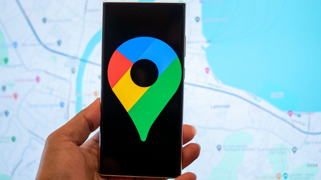
Google Maps logo on a phone screen.

What you need to know

  • Google is reportedly working on a gradient color redesign for its app icons for Maps and Photos.
  • While the Photos' app change is more minimalistic, it seems that the individual petals are a little wider.
  • The Maps icon sees a bigger change, as it appears a little more stout, and as it adopts that seamless blend between hues.

Sign up to read this article
Read news from 100's of titles, curated specifically for you.
Already a member? Sign in here
Related Stories
Top stories on inkl right now
One subscription that gives you access to news from hundreds of sites
Already a member? Sign in here
Our Picks
Fourteen days free
Download the app
One app. One membership.
100+ trusted global sources.