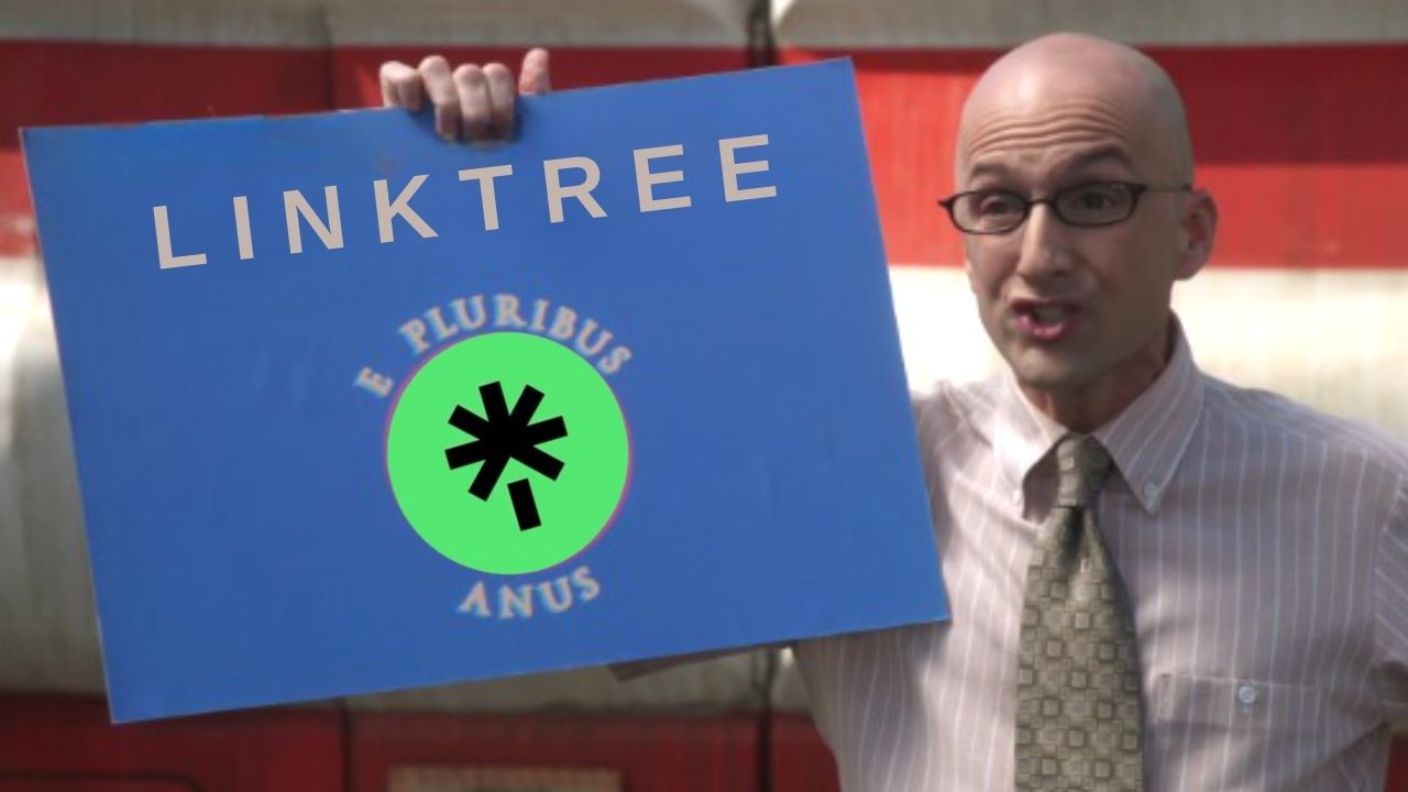
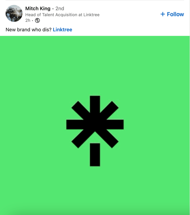
Champion of the link in bio and a lover of a green colour scheme, Linktree, has unveiled its new logo. In doing so, however, the company has revealed that it clearly doesn’t employ gays because the new image looks like a butt hole getting rammed.
Tell me to get my mind out of the gutter all you want but you can’t deny what the new logo looks like. Stare into its void-like gaze. Look into it for at least two minutes and then tell me with a straight face that it doesn’t look like a butthole.
And that little line at the bottom? That’s either a poop coming out or a peen going in. A real pick your poison situation. Who the hell designed this?
This is the blunt they use in the nightmare blunt rotation.
The new design was made by design firm Collins, who made the Spotify logo. Apparently, they pride themselves on drawing black lines over a green background and making millions for it.
If I squint hard enough I can see the vague
Sign up to read this article
Read news from 100's of titles, curated specifically for you.