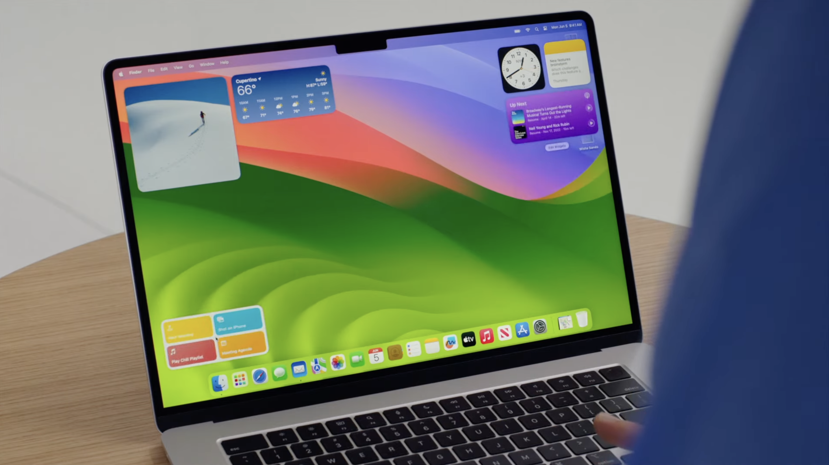
macOS 14 Sonoma: One-minute review
This is a hands-on review of the macOS 14 Sonoma public beta, which means that some features were not available yet for testing, and all new features tested may not be in their final iteration. We will have our full review of the operating system as soon as the final version is out.
Apple opts for epic land- and cityscapes in place of an epic update with macOS Sonoma. While many were hoping for a considerable macOS update in 2023, as it’s been about three years since macOS Big Sur, the last operating system that brought major updates to users, Sonoma, which Apple unveiled during WWDC 2023, is more of an incremental update with useful yet still small changes.
Are many disappointed by this lack of innovation? Absolutely. But this seems to have become Apple’s new normal, as evidenced by the devices it’s been rolling out that feel more indulgent than necessary.
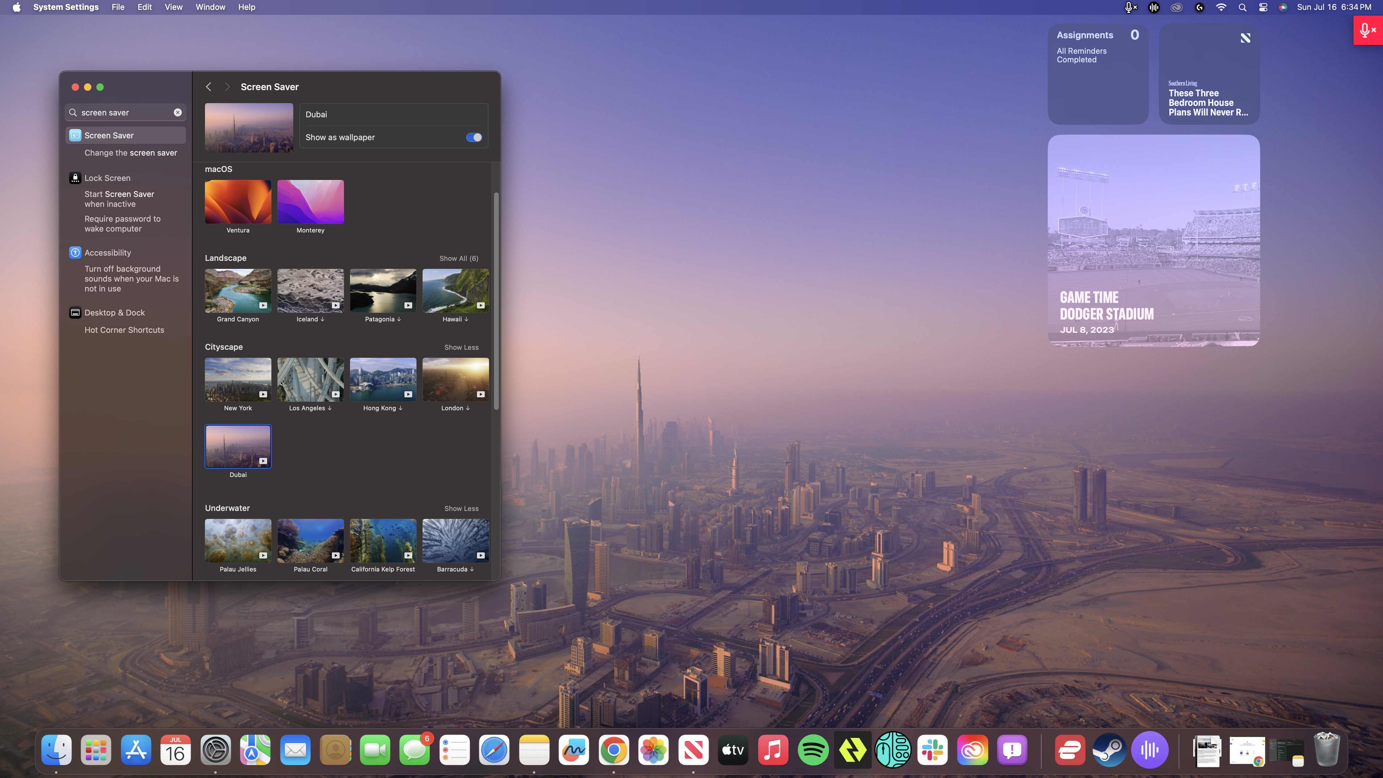
Whether or not Apple has completely lost its mojo is a whole other topic for another time, however. I’m here to discuss the new macOS Sonoma that’s still slated for a Q3 release but whose public beta just went live last week. In all fairness to it, it comes with many nifty, albeit minor in the grand scheme of things, features that give users a more seamless experience and a more simplified workflow. And for that, it deserves a shoutout.
Not to take away from the fact, of course, that this version’s marquee features — namely, the screensaver and the desktop widgets — feel a little late to the party. Third party apps have long been offering similar features. Even Safari’s cool Profiles feature is a little overdue, as something similar has also been around on other browsers like Chrome for a while now. So although I’m glad to have them now, I can’t help but ask, “How did it take Apple so long to get there?”
There’s still a lot to unpack here, however. And while the first iteration of the public beta skips out on some features – I can’t get Reactions to work with Continuity Camera, for example – there are already many that people can utilize now, which is what I’ll be focusing on in this hands-on. That includes the Presenter Overlay modes in Video Conferencing, the new screensavers, and the Widgets now finally on desktop.
macOS 14 Sonoma: Price and availability
- How much does it cost? It's free!
- When is it available? Q3 2023
- Where can you get it? All regions
As we’ve mentioned in the past, Apple has been rolling its operating system available as a free upgrade for anyone with an eligible Mac since 2011. You can now download the macOS 14 Sonoma public beta version for free if you apply for the Apple Beta Software Program. Just bear in mind that as this isn’t the full version, you may encounter some issues while some features may not work well or be available altogether.
If you can wait for the final version of macOS 14 Sonoma, you will have to wait until Q3 2023. There’s no definite date of release yet, however.
macOS 14 Sonoma: Widgets on desktop
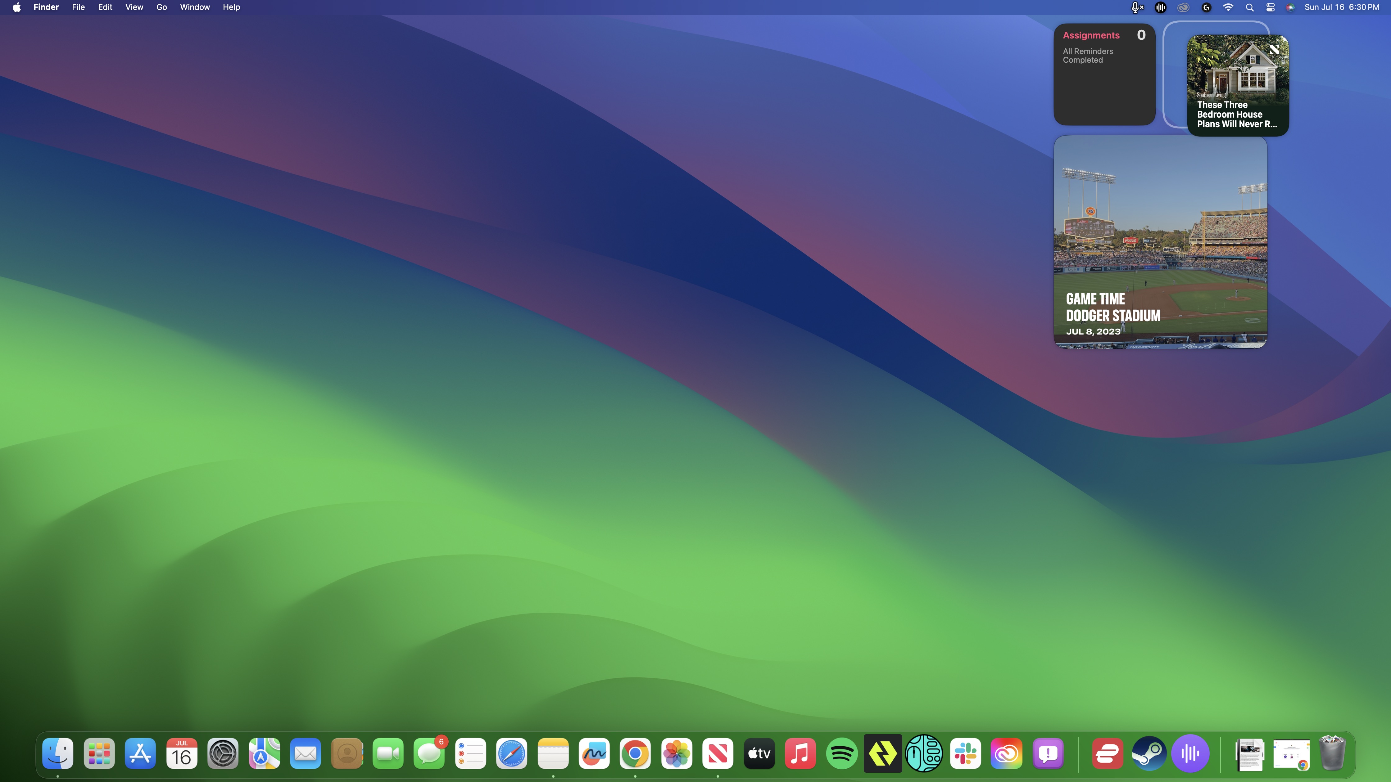
It was a little bizarre that when Apple launched Widgets for macOS, it decided to withhold the ability for users to drag and place them on the desktop, which would have been useful as it would have allowed them instant access to their most used or most important widgets. Instead, Apple decided to lock those widgets to the Notification Center column that users would have to access by clicking on the date and time on the Menu Bar.
It’s only with macOS 14 Sonoma that Apple decided to finally roll it out, which definitely feels a little like the company was trying to ration its updates; which in turn makes you think that it’s running out of innovations to offer its customers and keep justifying its products’ steep price tags.
It might be a little late in the game, but I am still happy that we can now drag and drop our favorite widgets to the desktop. To Apple’s credit, this new feature is implemented well. The widgets are designed to snap onto the desktop – though the first one you drop or move to a different part doesn’t; you’ll have to do that yourself without assistance, not that it’s hard – for a cleaner look.
They also gray out (or as Apple puts it, “fade into the background”) if you have at least one app or window open for a less cluttered look and so that they’re not distracting you from what you’re doing, which I think works pretty well. In addition, their colors adapt to whatever wallpaper you have on for a more seamless look.
So, I guess it isn’t too bad that Apple decided to roll this feature out later.
macOS 14 Sonoma: Screensavers
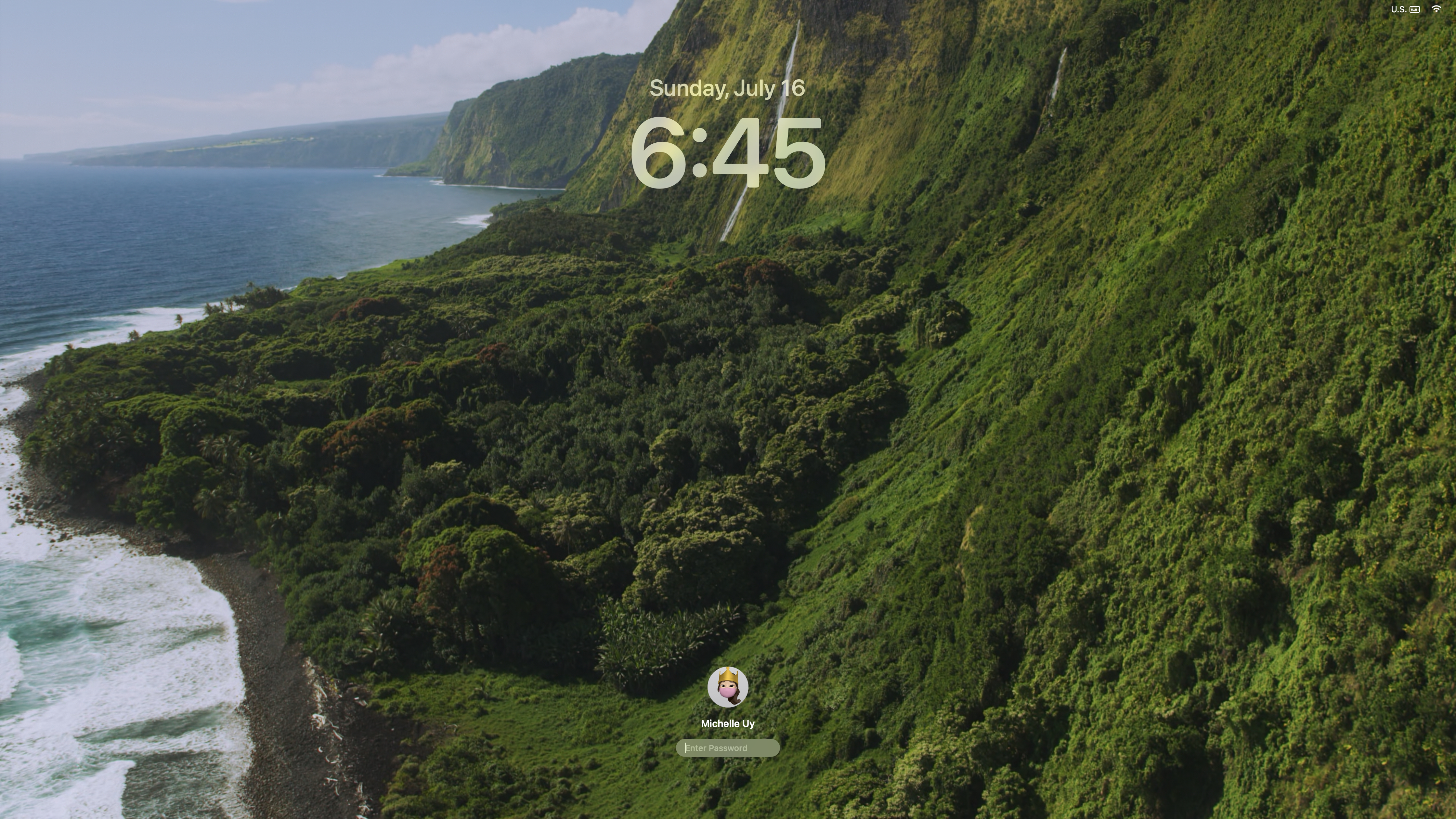
The second macOS 14 Sonoma feature that Apple seems really proud of are its new slow-motion screensavers. There’s certainly a reason to be proud here, as they are incredibly-shot and beautiful. Absolute stand-outs here, out of more than 25 screensavers that were rolled with the public beta, are the Palau jellyfish and humpback whale underwater shots, and the epic Yosemite and Hawaii landscapes.
The downside is that this new feature really isn’t as exciting as Apple made it out to be. First of all, it’s strange how it took Apple so long to roll them out when even third-party apps have been offering such impressive, high-res screensavers for years. And, a lot of the footage that was shot falls flat. Most of the landscapes and cityscapes were shot with just a bird’s eye view, which means you’ll see much more impressive drone footage on TikTok and Instagram.
It’s a nice new feature, but it’s neither the most groundbreaking nor the most creative.
macOS 14 Sonoma: Video conferencing
Video conferencing on your Mac has just become more fun with two new features: Presenter Overlay, which makes even your home presentations during video team meetings a lot more interesting and professional-looking in just a few clicks, and Reactions, which lets you share quick reactions during meetings via hand gestures. These are probably my two favorite features in macOS 14 Sonoma, though the latter is only sadly available on Apple-silicon powered Macs.
The idea behind Presenter Overlay is to keep you from disappearing during video calls the moment you start your presentation while still maintaining a clean, minimalist and professional look. The thing about presenting during video meetings is whenever someone’s doing a presentation, that screen-sharing essentially dominates the window.
What Presenter Overlay does is keep you, the presenter, not just visible but also still in the spotlight by overlaying your video recording on top of what you’re presenting in a seamless and professional way. It simply ensures that people can still see your face when you’re sharing an Excel sheet or a PowerPoint presentation, and you have your choice of being dominant on the screen or appearing in a smaller bubble in the bottom corner.
I’m definitely disappointed that we use Google Meet for our in-team meetings because I love this feature so much. Even if I’m not the one presenting, it just makes that aspect of sometimes boring team meetings more interesting, especially with the way Apple designed it. If I were to nitpick, I am not overly fond of the fact that your actual background is still visible in the large overlay, as that definitely ruins the look if you’ve got a crappy one. I’m hoping Apple will fix that later by offering virtual backgrounds on FaceTime.
Meanwhile, the Reactions feature is just fun, if not the most intuitive. There are only eight reactions available right now, but apart from the heart, thumbs up, and thumbs down ones, it took a while to figure out what gestures I’m supposed to be using for the others. For your convenience since I had to scour the internet for these, it’s double v or peace sign for the confetti, one v or peace sign for the balloons, two thumbs up for the fireworks, and two thumbs down for the rain.
Just bear in mind when you’re using it that it currently takes about 2 to 3 seconds to detect your gesture and display the right one accordingly. Also, in the public beta, it doesn’t seem to work yet when you’re using Continuity Camera and recording from your iPhone.
macOS 14 Sonoma: Other notable new features
While Widgets on desktop, the new screensavers and the new video conferencing features are the definite highlights in macOS 14 Sonoma, there are others that are worth trying out for yourself.
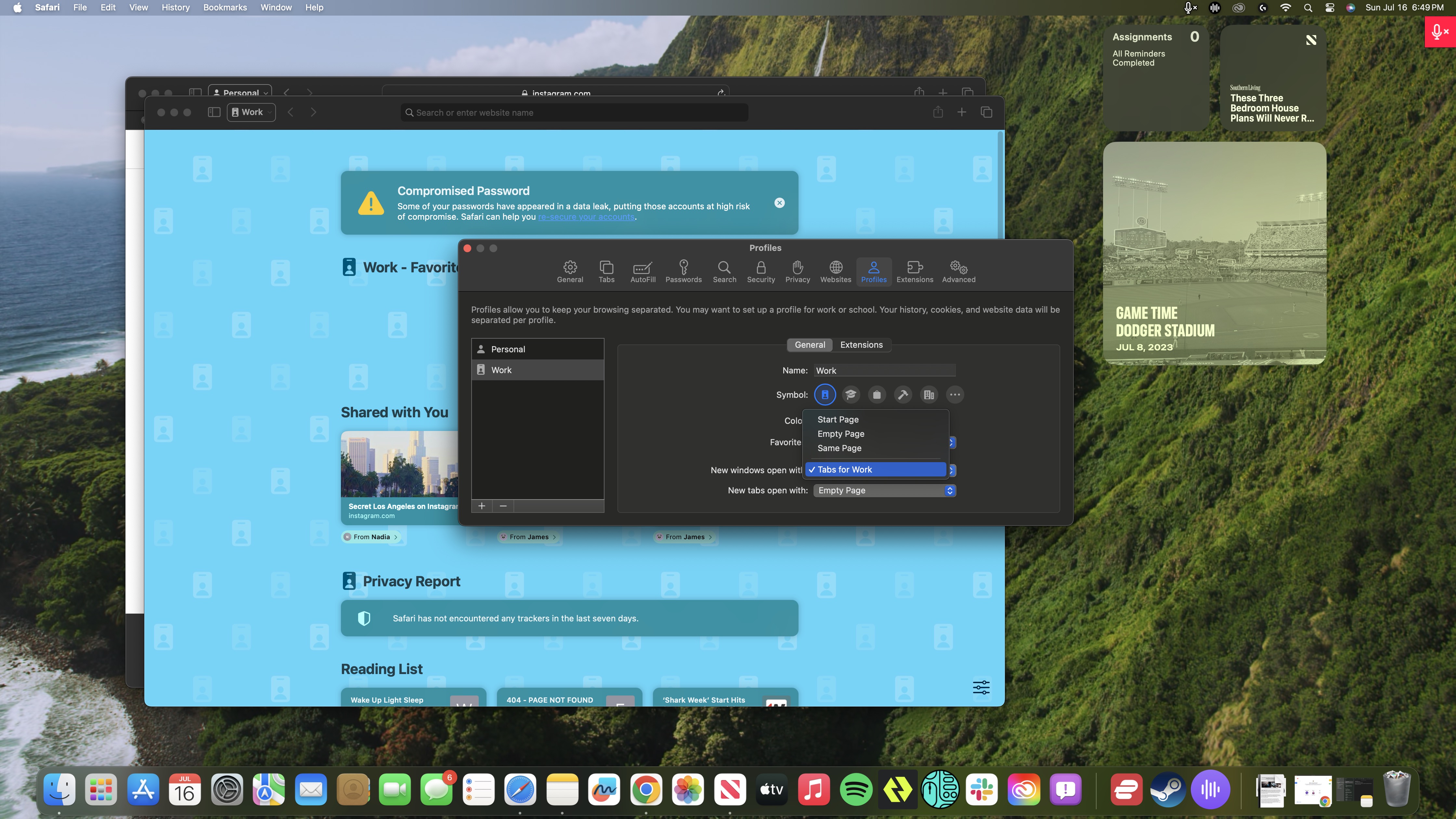
For one, Safari now has Profiles to let you organize your browser history, tab groups, favorites, and more based on whatever mode you’re in. You can have a Profile for everything, from research and work to streaming and shopping, and I found it to be very useful, especially if you want to get a handle on your out of control browser tab usage (we’re all guilty of it). You can even automate things for convenience, like which tabs to initially open and which bookmarks and extensions are made available.
If it sounds similar to what you’re already doing in Google Chrome, that’s because it is. The upside to Profiles, however, is that you don’t need to create a separate Apple account for each profile.
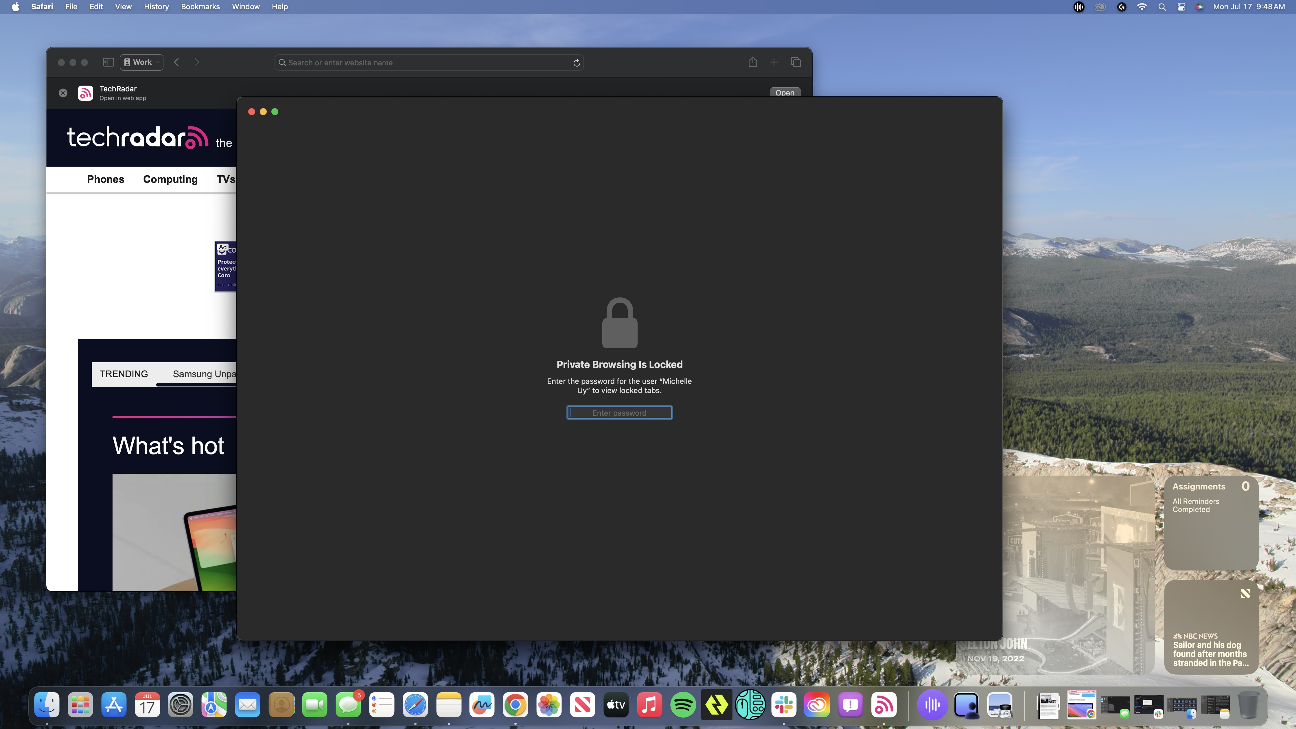
Also in Safari, you now have the option to lock your private browsing windows when you’re not using them, and it works well. That’s on top of the fact that it also completely blocks known trackers and removes any tracking the websites themselves add.
In macOS 14 Sonoma, you can also start adding web apps to your Dock, if you want to access some of your most important web pages much like you would your most used apps. Meanwhile, Siri is even more versatile and easier to use as you can now customize its prompt to just “Siri” or set it to both that and the default “Hey Siri”. Same can be said for the search and catch-up functions in iMessage, as searching for messages and catching up to conversations you’ve missed is easier than ever.
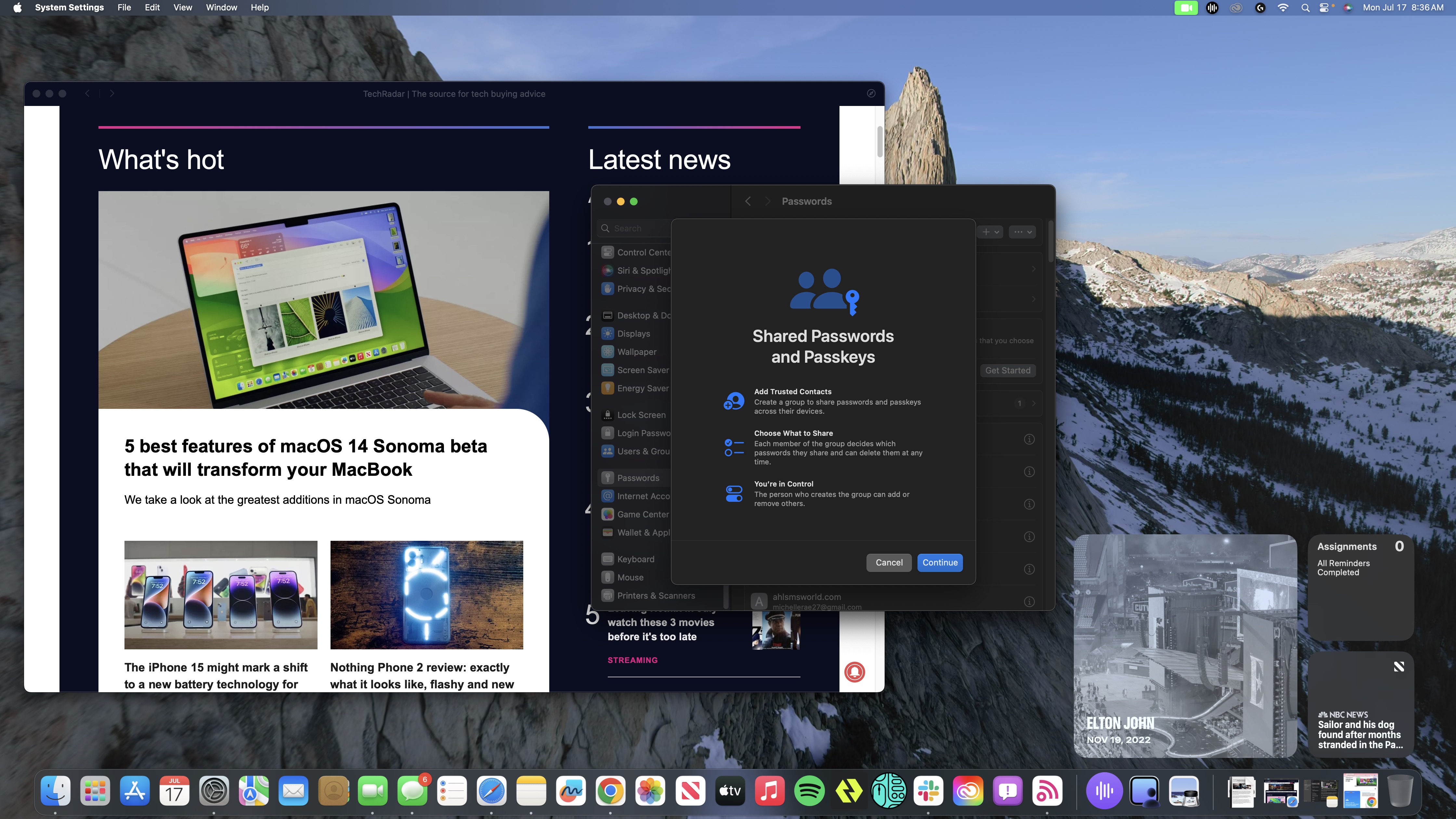
You can now also share Passkeys with individual contacts or a group of them, and it’s really easy to do so. Plus, you’re not limited to sharing your current Passkeys; you can also add new ones and share them with people.
Finally, Notes is worth a proper mention as well as it’s been given more functionality. You can now add full PDF files to your notes and have the ability to click through the pages using the available thumbnails, as well as add links to other notes. In the public beta version, you do have to go through the right-click menu and tap Add Link for that option – it’s not available via the Add Link shortcut on the top.
macOS 14 Sonoma: Early verdict
macOS 14 Sonoma is a small update to its predecessor, macOS Ventura, which itself is a small update to macOS Monterey. So don’t expect any super exciting features that will blow you away. In fact, even the key features here that Apple proudly highlights are overshadowed by the fact that they’ve been around for ages in other apps.
However, that also doesn’t mean that you should skip it, especially if you have an Apple SoC-powered Mac. Just like Ventura before it, it brings in some new features and refinements that improve how you utilize your Mac for work. Even some of those minor features like Notes now offering the ability to link to other notes and Safari now giving you the option to create Profiles will prove useful to your day-to-day, as they’ll help keep you organized and minimize the mundane bits of the job, allowing you to simplify your workflow even more – which is the inherent nature of the Mac ecosystem.
I wouldn’t call these necessary updates, to be clear. You can definitely live without things like having the ability to overlay your face while presenting during a video call and a screensaver of an epic drone footage of Yosemite’s peaks in slow-motion. However, many of the features macOS 14 Sonoma has will prove vital to your workflow and experience, and it’s worth checking out at the very least when its final version rolls out.


