What you need to know
- Google Weather for Android looks like it's headed for a Material You redesign.
- The change does away with the three-tab viewing currently available on the live build.
- The top temperature and other elements seem to pull from your desired Material You theme color on your phone and may fully support dark theme.
Another Google-made app is set to gain some new Material You-style changes and updates soon. 9to5Google spotted some changes coming for Google Weather on Android that a Googler posted on Twitter.
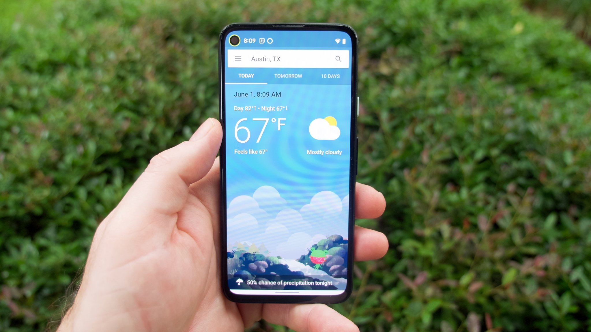
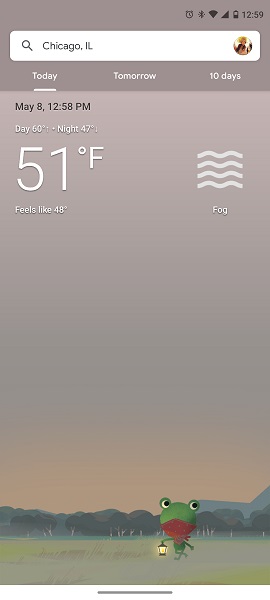
One of the most notable changes is the new weather within the Google app does away with the current three-tab view. Right now, this view displays options for today's weather, "tomorrow," and a "10-day" outlook.
The proposed change seemingly merges the three views into one streamlined, vertical view. Material You's influence is quite prevalent considering the rounded corners on the boxes and the temperature appearing as though it'll take influence from your phone's designated theme color.
The overhauled "Now" section at the top will offer information like the current temperature, weather details (sunny, cloudy, etc.), and the day's high and low. Beneath the cute little artwork will be a scrollable hourly forecast which you previously needed to swipe up on the "Today" tab of the current Google Weather design to see. Followed by that is the 10-day forecast, which, as previously mentioned, has its own tab on the current live build of Google Weather for Android.
Oddly enough, the proposed change does remove the current date and time from the header that the current weather experience provides. You can see below the new look versus the older tabbed view.
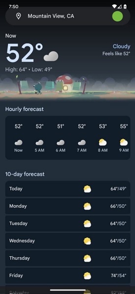
9to5 notes the grey, pill-shaped search bar at the very top of the weather section. The bar should contain the location for which it's delivering the weather information. But the look of the bar could indicate full support for dark theme if you have it active.
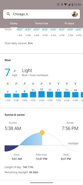
Google Weather for Android offers information about possible precipitation, wind, and the day's sunrise and sunset times. These are accessible by swiping up on the current "Today" tab. It's unclear if those are still involved with this Material You design — and, if they are, to what capacity? Perhaps tapping on individual elements will unearth these bits of information, or maybe there's more to scroll on this single view for weather inside the Google app.
It's not clear at the moment when users can expect the Material You update for the weather experience within the Google app. However, the proposed changes do offer a cleaner, more modern take on the design language Google has been trying to push with other apps.
There's been some buzz surrounding Google's changes and updates to its slew of apps with the Material You design. A look at the potential bolder color options for Material You were teased by the Google Design team on Twitter. This would enable users to fine-tune what they'd like their phones to look like in terms of richer colors, getting away from the typical pastel, pale schemes we have today.
Google I/O 2023 is just two days away (starting at 10 am PT, May 10). The company's sessions list provides all the details about what viewers and developers can come to expect. While we are sure to hear more about new devices, there is also a piece on Material You and what more Google could be thinking of.


