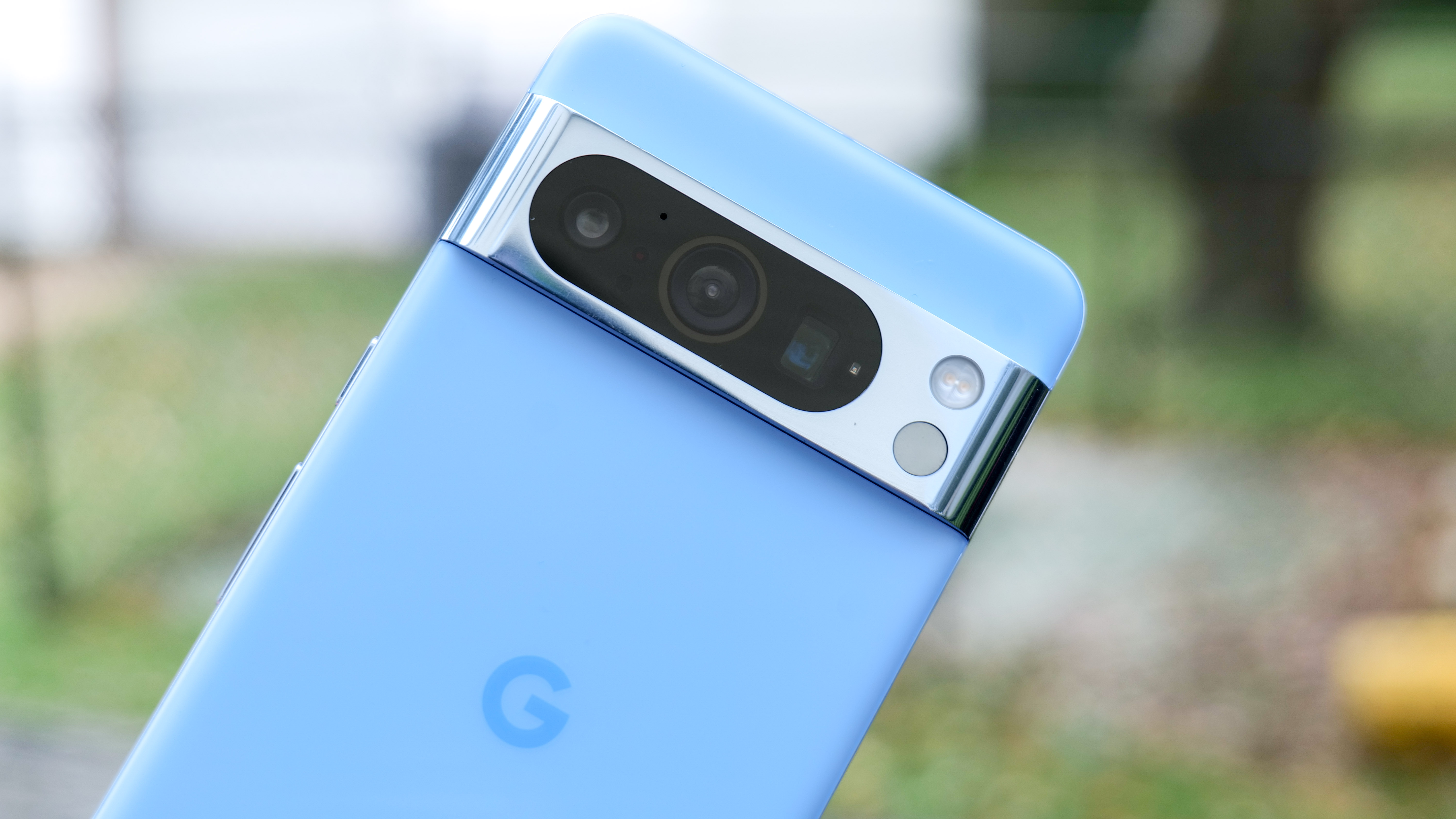
One of the Google Pixel’s defining design choices is the full-length camera bar. It’s a striking design choice that helps the phone stand out from its rivals, but it also causes its fair share of problems. Least of which is the fact it’s a giant bump that crosses the entirety of the phone.
According to the latest leaked images the Pixel 9 Pro is set to change this design, but in the process seems to be making those problems even worse. Rather than having a full length camera bar, Google has cut off the edges and opted for a oval-shaped camera bump. And it looks so much worse.
The Pixel camera bar wasn’t perfect, but it had its charms

The concept of rear camera setups on phones can be a sensitive topic. That’s especially true in an age where camera bumps are not only the norm, but can grow to pretty extreme sizes on a regular basis. Not to mention the fact that there are only so many ways to lay out those camera lenses, which means there often isn’t a great deal of creativity involved.
The Pixel camera bar showed that Google was at least trying to do something different with those rear cameras — and offer a unique and attractive design in the process. In the Pixel 6 series, that would also translate to a two-tone design, using the bar itself as the divider between the two colors. While interesting, Google seemingly scrapped this idea pretty quickly.
Of course the unique design, and the fact no other phone company did something like that, had its drawbacks. The fact the bar stretched the full length of the phone could pose a problem with accessories like grips or stands, and I found using the Razr Kishi with a Pixel 6 Pro was impossible since the camera bar was in the way.
Likewise, the single piece of glass uses the Pixel 6 and Pixel 8 poses a durability risk, because any damage would affect all the camera lenses rather than one or two. Considering how prominent the camera bar is, it could be the most at risk from damage — especially if the rest of your phone is protected by a case.
The good news was that no matter how prominent that camera bar may be, the fact it stretched the full length of the phone meant there was a level of symmetry to everything. It also meant putting your phone down on a flat surface didn’t come with an awkward wobble you’d see with other asymmetrical phones.
Though the size and positioning of the Pixel 9 Pro’s new camera suggests that this won’t be an issue. Certainly not on the triple-lens Pro model. The dual-lens Pixel 9 may be a different story.
Google’s changed the Pixel 9 Pro camera for seemingly no reason

The key benefit of the full-length camera bar was that it was pretty sleek. The leaked Pixel 9 Pro images are anything but. The main problem is that the main camera module is still in the center of the phone, albeit with the edges shaved away. Not to mention the fact that it sticks out pretty prominently compared to previous designs.
How much more prominently isn’t exactly clear, since we can’t currently tell how deep the camera bump actually is. Maybe it’s an optical illusion, aided by the new straight-edged design of the oval-shaped module, but it definitely looks more striking than previous Pixel iterations. Combining the phone with a case, as any sensible phone owner should, and maybe it won’t look so bad. But there are people out there who don’t want a phone in a case, for one reason or another, which is why the design has to stand on its own.
Granted, the leaked Pixel 9 Pro's design is not as bad as some phone brands, with their giant hockey-puck-looking phone cameras. You only need to look at the likes of the Honor Magic6 Pro and Xiaomi 14 series to see what I’m talking about there. But it doesn’t change the fact that Google is willingly choosing to have a large, obvious camera bump.
This could have been an opportunity for Google to make a more drastic change to the camera on the Pixel 9 series. Fix the mistakes of the previous 3 generations and give Pixel users a camera module that’s practical and good looking. For instance, a design that lets you place your phone down without the camera glass coming into contact with the adjoining surface — which could be covered in who knows what. Or split off the camera glass so it’s not a single pane covering all 3 lenses.
Instead Google seems to have changed things for the sake of change. And that’s never a particularly wise thing to do. Just ask Coca Cola about that.
Bottom line
The problem with leaks is that they don’t always tell the full story. We don’t have Google explaining why it’s changed the camera design in the Pixel 9 series, or what that might mean for using the phone. But having all the context in the world is not going to change the fact that this design just does not look good. Nor does it look like it’ll solve the issues the previous camera bar design had.
I’m still looking forward to the Pixel 9 series. The Pixel 8 Pro wasn’t quite enough to make a worthy upgrade from my Pixel 6 Pro. The 9 Pro, on the other hand, has the potential to offer a lot more. Maybe not everything I want to see, but enough to make the jump between the two phones even better. It’s just rather sad that the design might be one of the things that puts me off, and makes me wish I had a thick durable case. Not just for protection, but so nobody has to look at the bulbous camera module.


