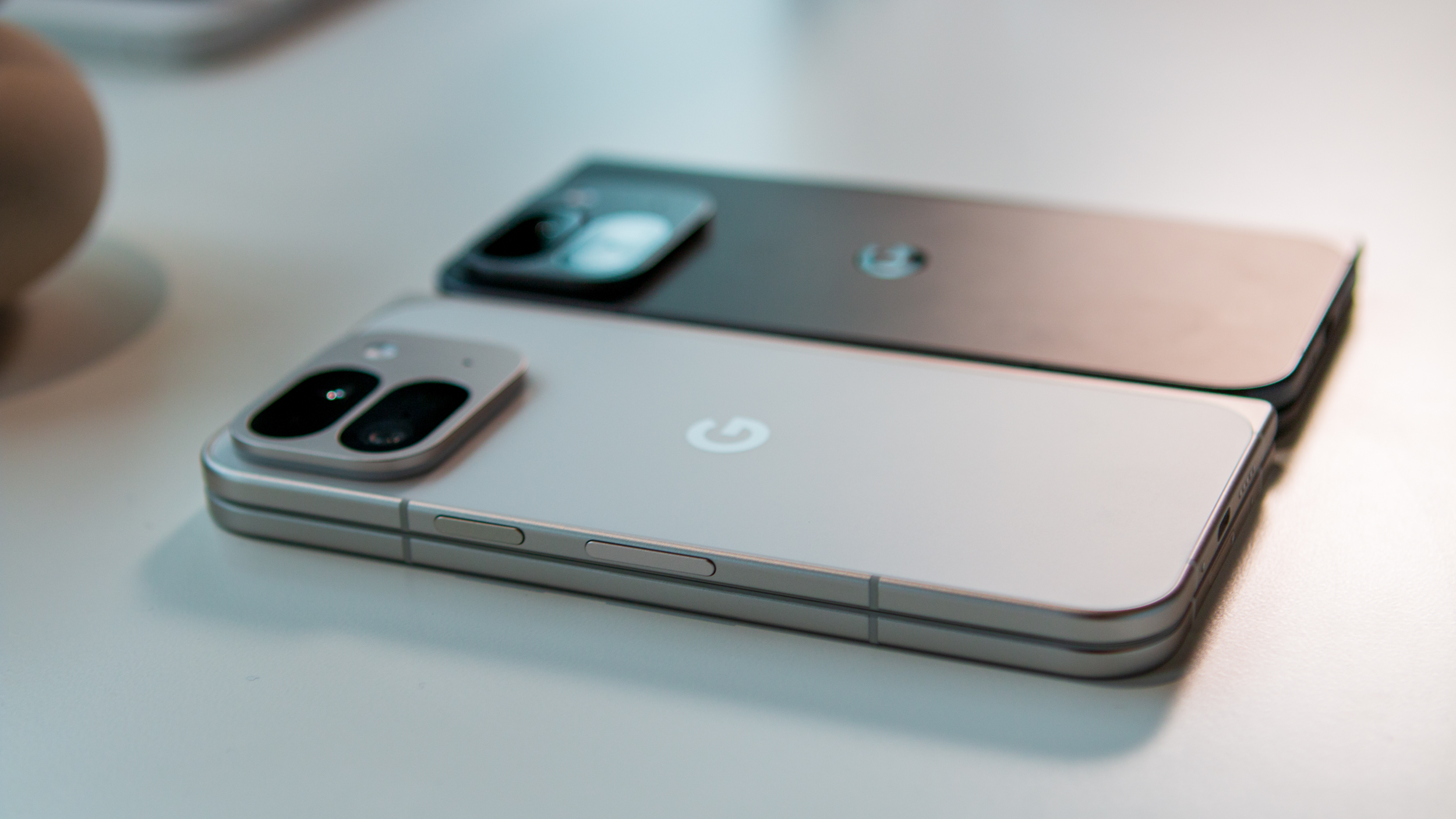
When the original Pixel Fold was released, it garnered a ton of praise for "breaking the mold" previously set by the Galaxy Z Fold series. Instead of a device that's tall and thin, for lack of a better phrase, the Pixel Fold was short and fat.
Google is throwing all of that out the window with the Pixel 9 Pro Fold, introducing a complete design overhaul akin to when the company went from the Pixel 5 to the Pixel 6. Gone is a phone that looks and feels like a Moleskine notebook; in its place, it bears many similarities to the OnePlus Open.
Google Pixel 9 Pro Fold: Design and displays
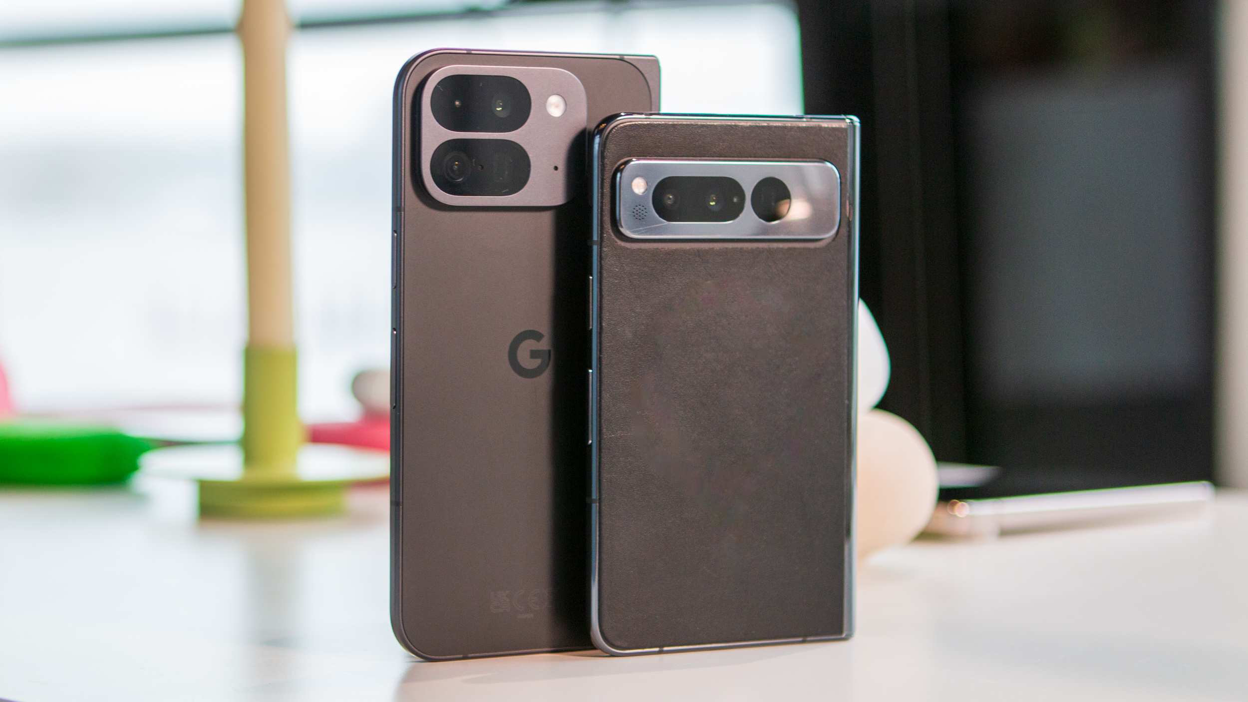
When asked about why this decision was made, Google told us it had more to do with the app experience. Starting with the Cover Screen, the 6.3-inch "Actua Display" sports a 20:9 aspect ratio. In fact, this is the same screen size as the Pixel 9 and 9 Pro, something else was immediately obvious in our time with the devices.
Unfolding the phone presents you with an 8-inch "Super Actua Flex" display, which provides an almost 1:1 aspect ratio. In doing so, Google is able to reduce potential issues regarding app compatibility. However, this doesn't help solve the issue of an app looking odd because the developer hasn't updated it to support the tablet-like aspect ratio.
Although Google might be taking a leap by introducing a design that's no longer all that unique, it could pay off in the long run. On the bright side, I'm happy to see that Google didn't adopt Samsung's way of thinking with the tall and narrow Cover Screen. As someone who has used the OnePlus Open extensively for the better part of the past 10 months, I definitely prefer an outer display that acts and feels like a slab phone.
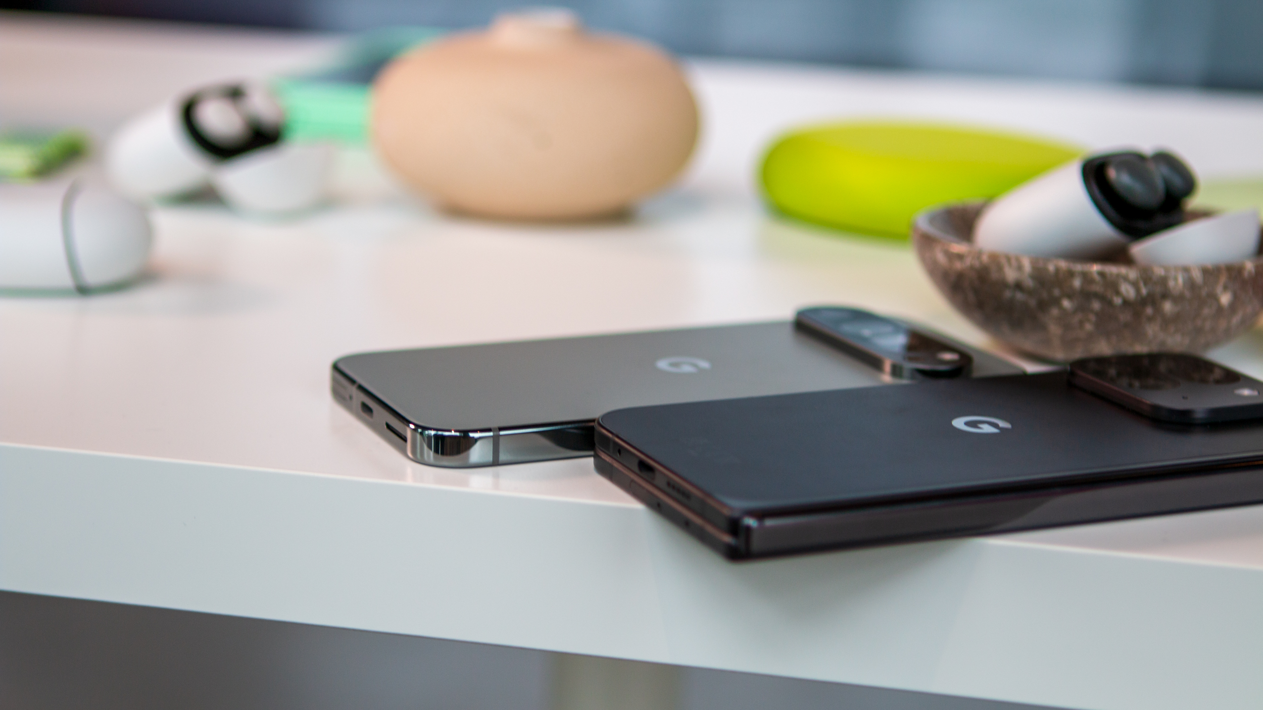
Adding more credence to that, when folded, there's actually not much of a difference in the depth between the Pixel 9 Pro and the 9 Pro Fold. The former is 8.5mm, with the Fold coming in at 10.5mm. But again, that's only one piece of the puzzle, as Google is taking pride in how thin the 9 Pro Fold is when it's unfolded.
Google has managed to beat out both Samsung and OnePlus in this regard, as the 9 Pro Fold is just 5.1mm thin when unfolded. In comparison, the Galaxy Z Fold 6 is 5.6mm, while the OnePlus Open is either 5.8mm or 5.9mm, depending on the color variant that you get.
Although that makes the Pixel 9 Pro Fold the thinnest foldable phone in the U.S., it falls quite a bit short compared to other global offerings. At the time of this writing, the award for "thinnest foldable" goes to the Honor Magic V3. When folded, it measures 9.2mm thick, but when unfolded, it's a mere 4.35mm.
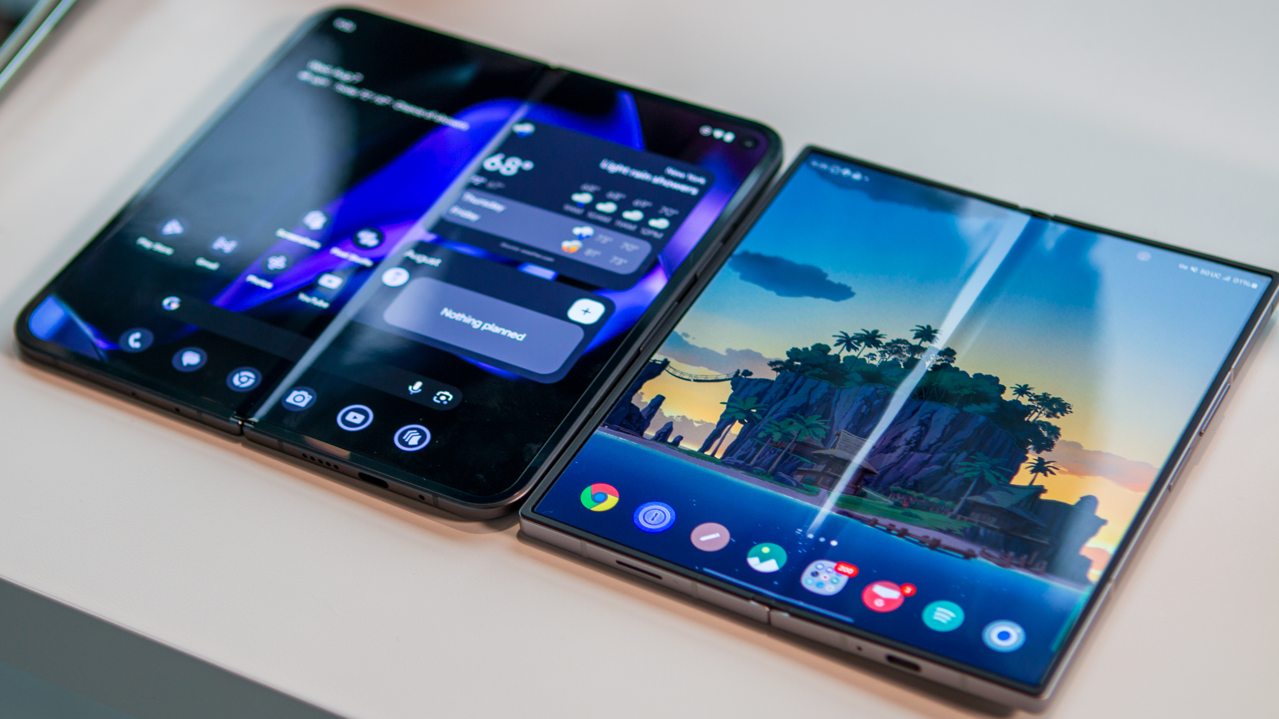
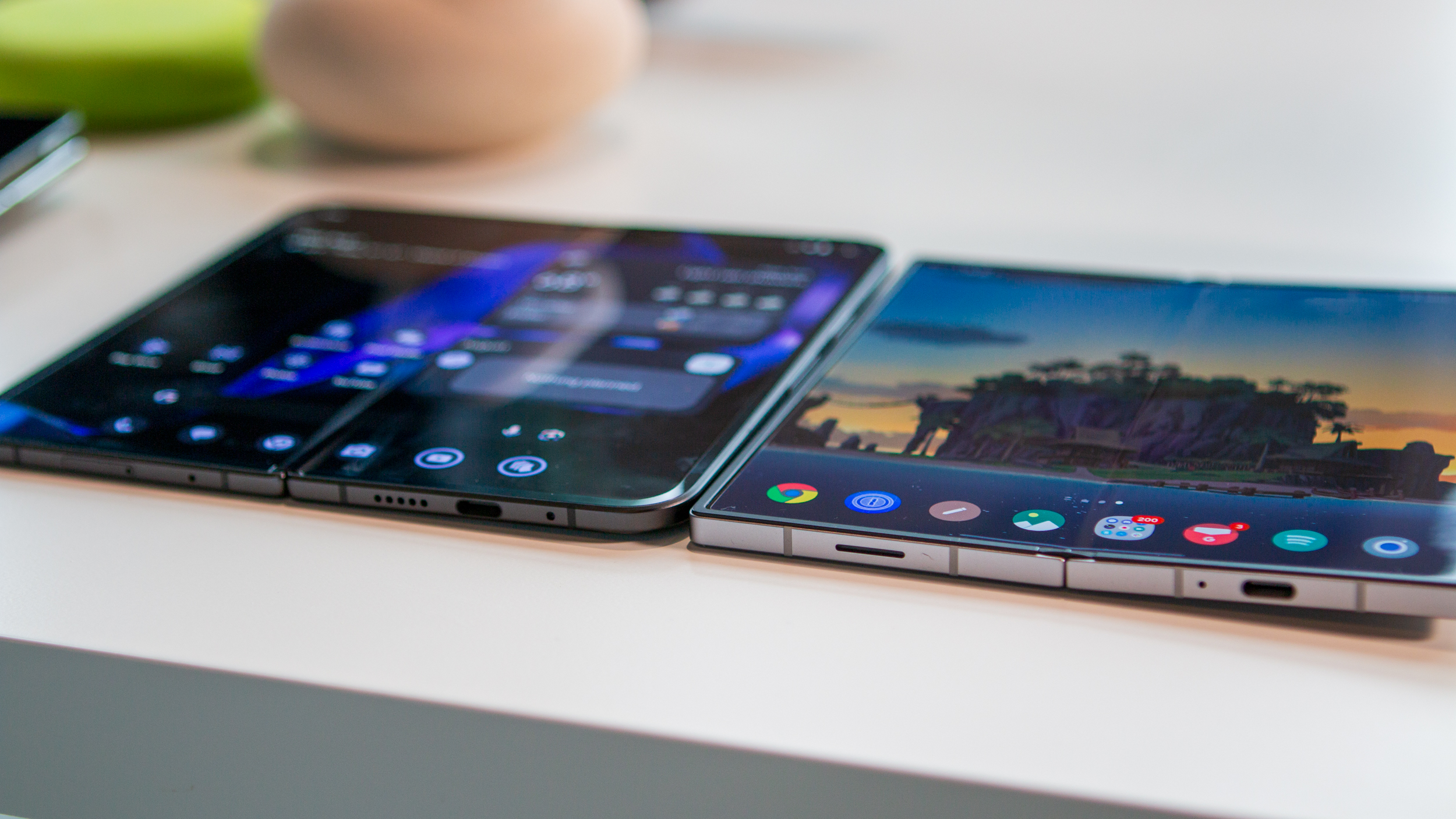
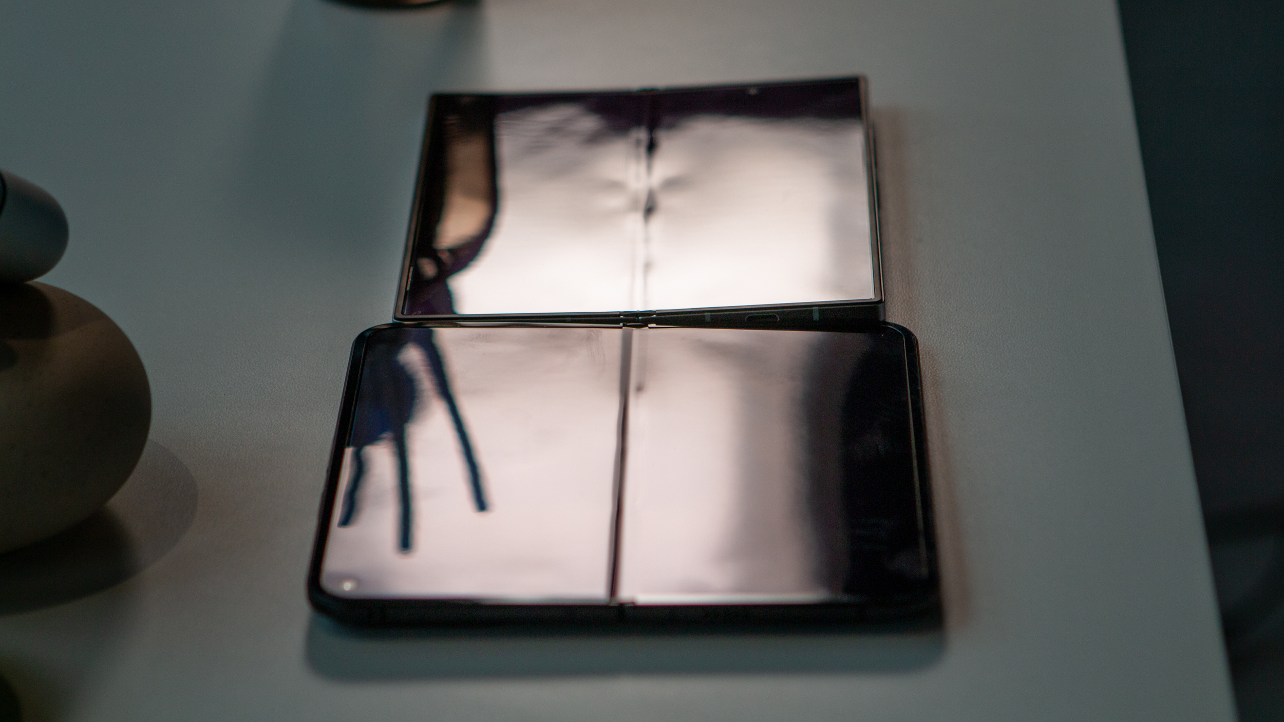
Even still, I have to give Google its due. The company went back to the drawing board and implemented a complete redesign that looks quite a bit more modern than its predecessor.
Another change that I quite enjoy is the way that the 9 Pro Fold feels when actually using it. Google moved away from the glossy finish on the back shell and the shiny frame in favor of a matte finish across the board. I can't stress this enough; to me, it feels like a OnePlus Open powered by Google's Android flavor.
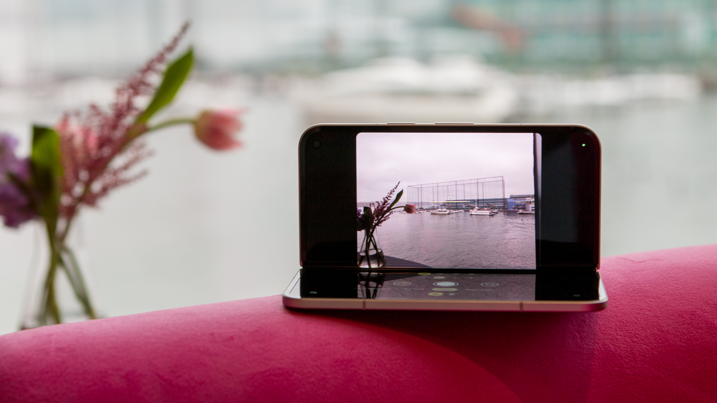
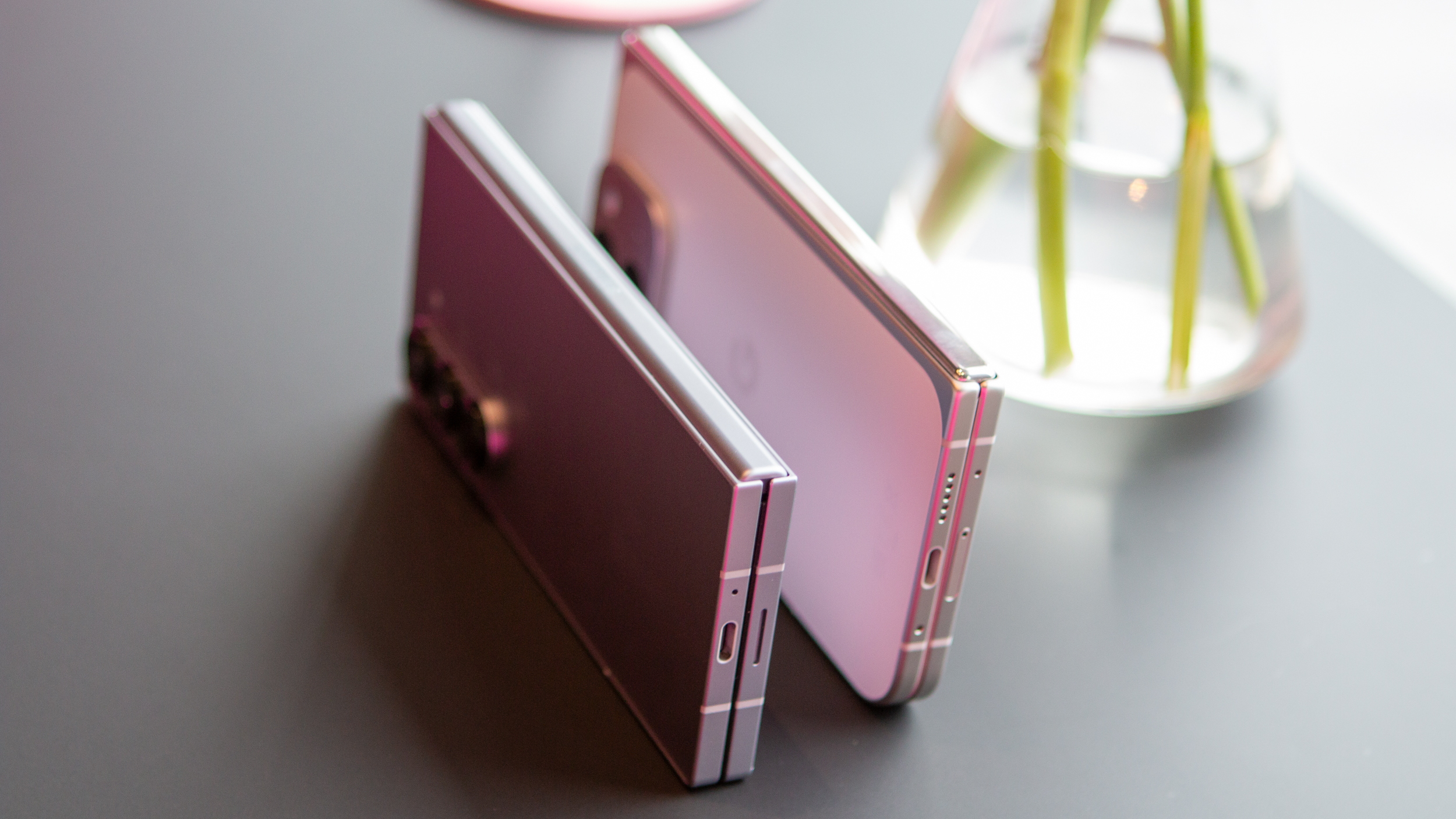
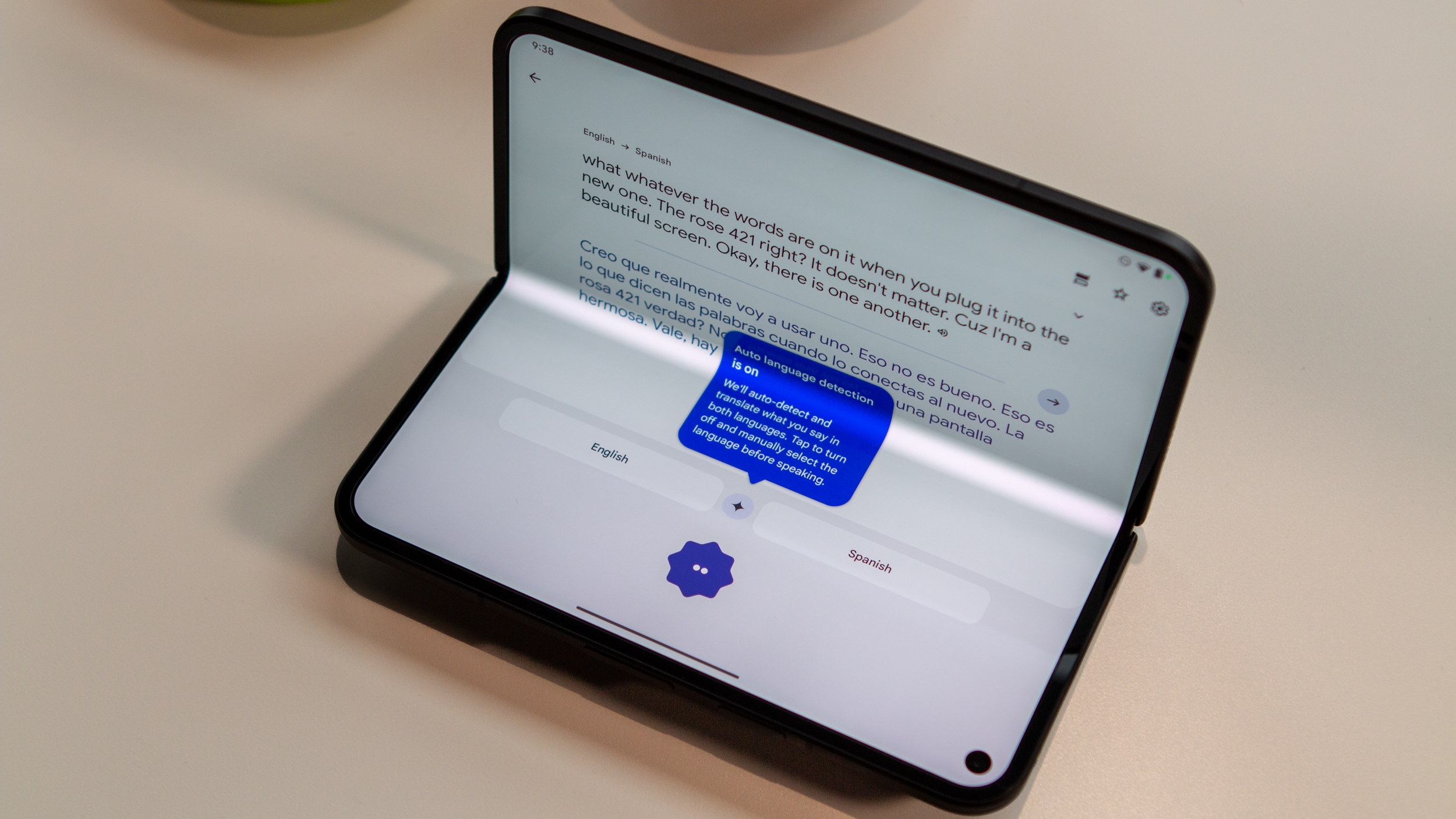
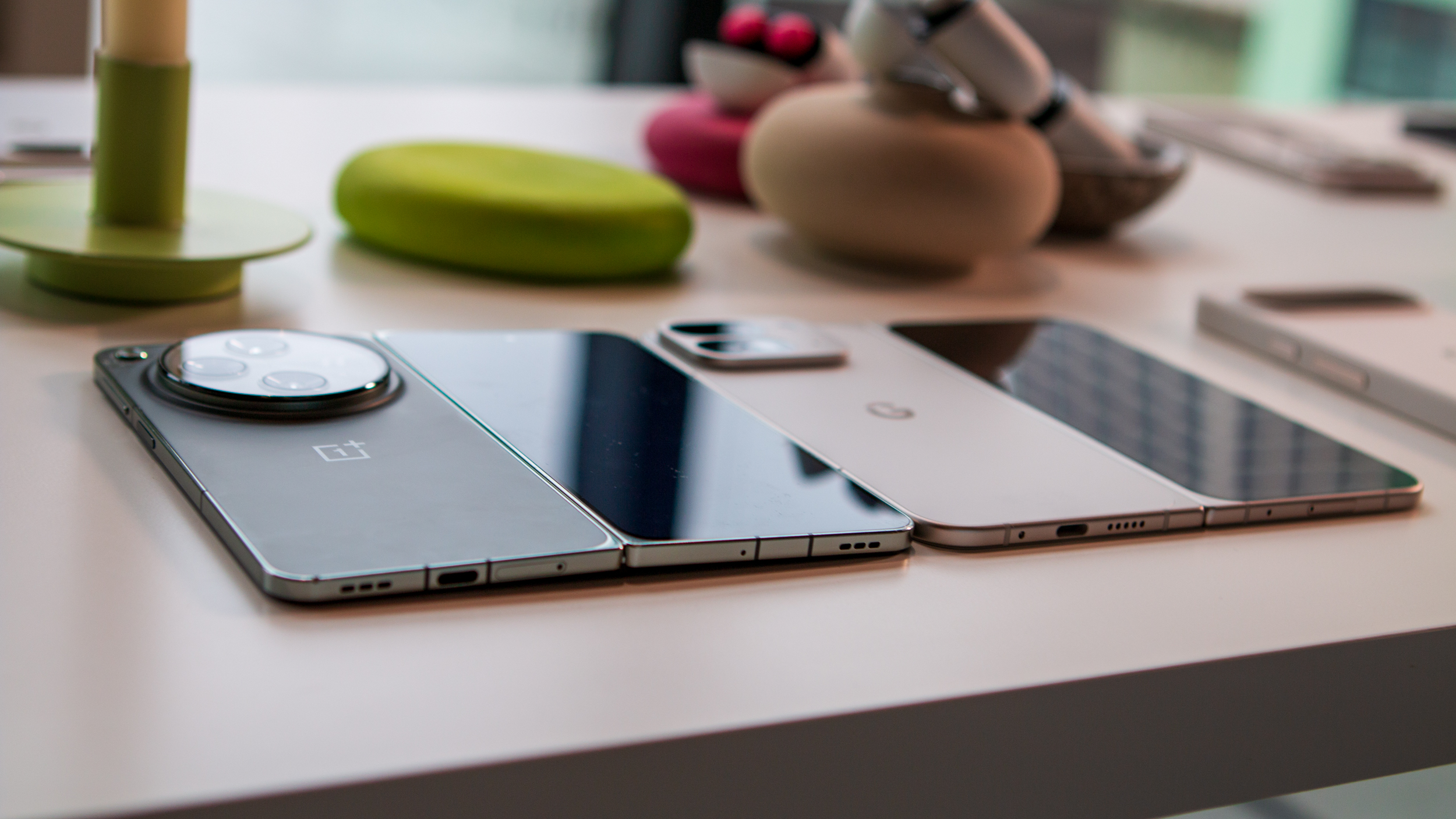
One area of concern with the original Pixel Fold was related to the hinge, as many found that it wouldn't naturally be flat when unfolded. It was only a couple of degrees off, but it was an annoyance for those affected. Thankfully, those problems have been solved with the 9 Pro Fold, as it lays completely flat when unfolded.
There's even a satisfying feeling when unfolding the phone. I wouldn't go so far as to say that it's a "snap" or "pop," but whatever it is, it is quite satisfying.
To be clear, we spent little more than a couple of hours on Google's new hardware lineup, which means that I can't tell you what it feels like to use this over the Galaxy Z Fold 6 or OnePlus Open just yet. However, if it weren't obvious by now, I'll just say it—I came away incredibly impressed with what Google has done.
Google Pixel 9 Pro Fold: Specs
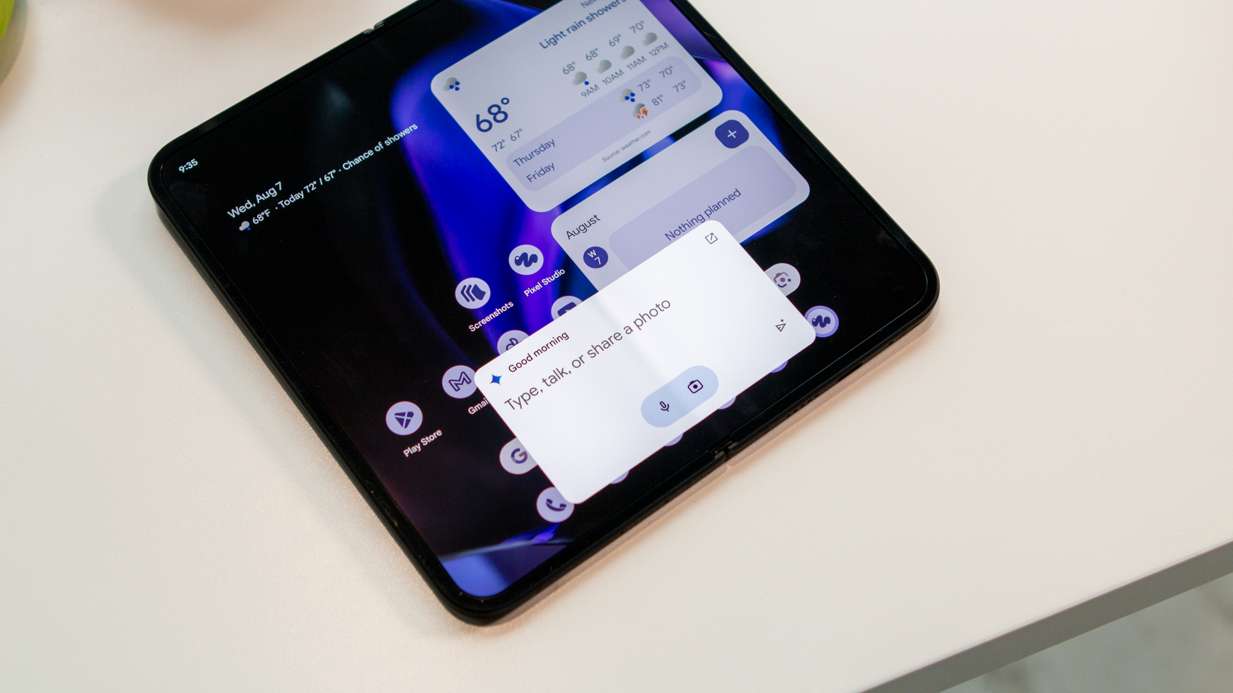
If there was one area of confusion with the original Pixel Fold, it was that Google released just a few months before the Pixel 8 series. This meant that the company's most expensive phone was swiftly outdated, missing out on some of the awesome AI features included on much cheaper devices.
Thankfully, that's not a mistake that Google made twice, as the 9 Pro Fold is using the same Tensor G4 SoC from the rest of the Pixel 9 lineup. And if you're wondering what else can be found under the hood, we've got you covered.
Google Pixel 9 Pro Fold: Software
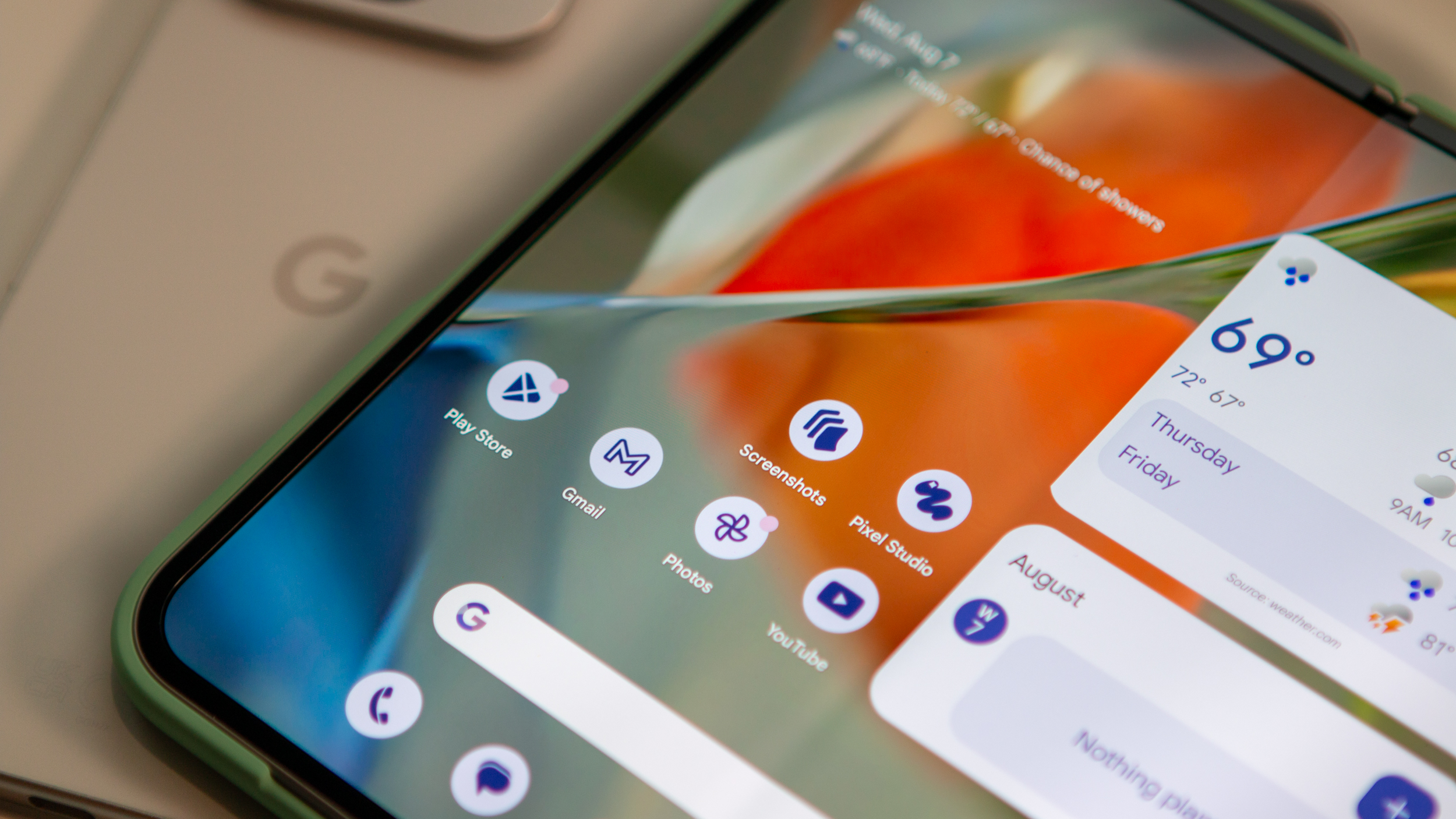
By altering the design and introducing screens with different aspect ratios, Google aims to improve the multitasking experience. Specifically, when using apps side-by-side, we basically have two "regular-sized" apps on a split screen. I can only assume this is part of the reason why Google hasn't really pushed the envelope in the same ways that the Galaxy Z Fold or OnePlus Open do.
One nice addition is the ability to pin the taskbar to the bottom of your screen. This was possible on last year's Pixel Fold, but you could only do it from within the Settings app. With the Pixel 9 Pro Fold, you can swipe up to view the taskbar, long-press, and tap the checkbox to keep it pinned. I definitely appreciate the attention to detail, but I also can't help but wonder if implementing the long-press-to-pin gesture would have been the better move.
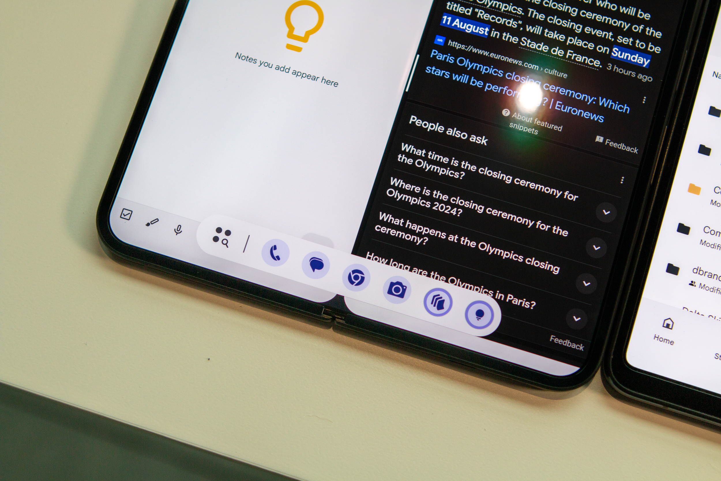
That trend continues when it comes to the software experience, whether it be when the phone is folded or unfolded. At first glance, you probably won't notice too much of a difference, but Google has implemented more than a few goodies this time around.
With such a stark change in the design, it shouldn't come as much of a surprise that Google is making some much-needed improvements.
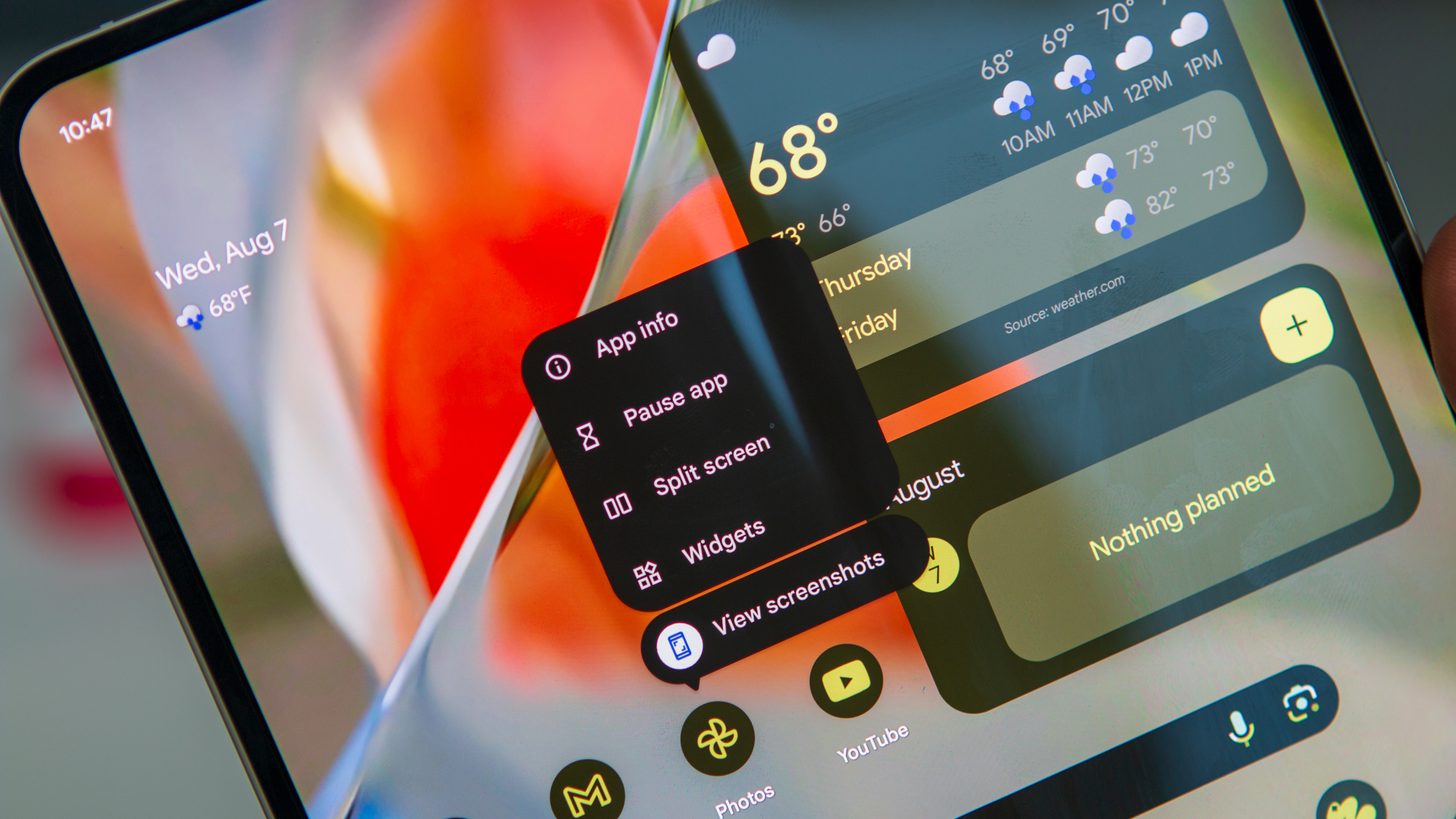
We already knew this was coming, but the Pixel 9 Pro Fold also introduces app pairs, allowing you to quickly open a pair of apps that you regularly use. You can even go so far as to long-press an app icon on your home screen, tap Split screen, and then select the second app that you want to use in tandem. Unlike the "kitchen sink" approach, Google is really focusing more on implementing quality-of-life improvements.
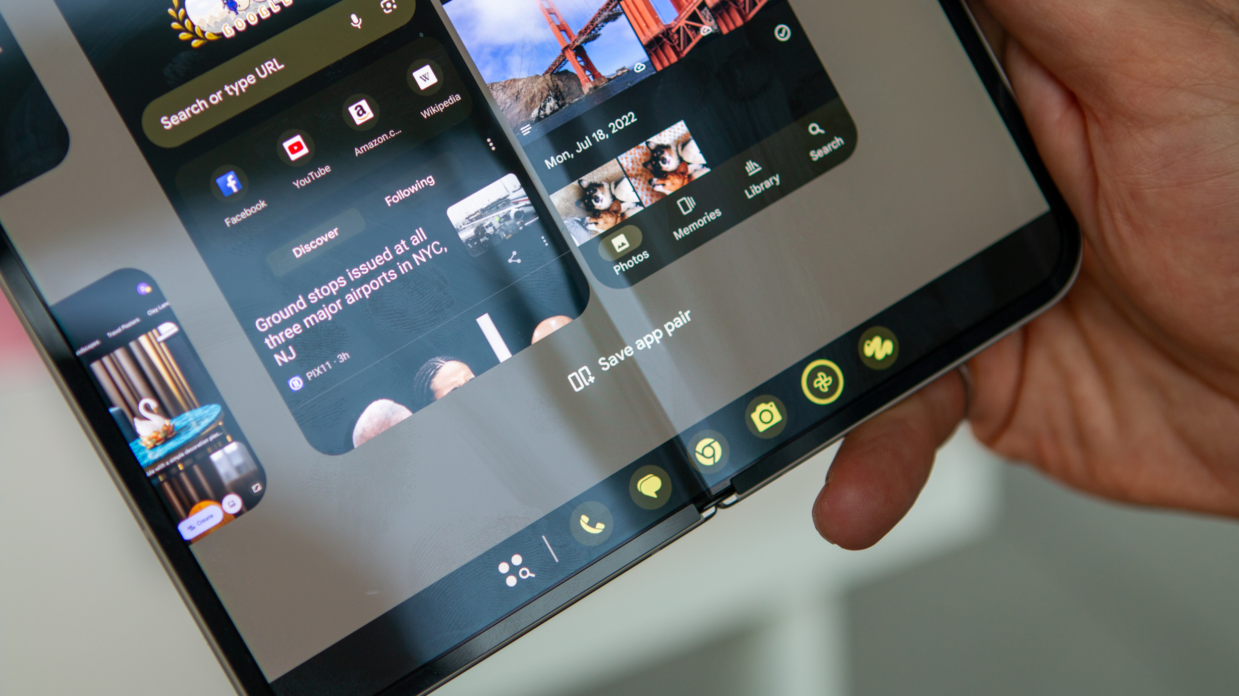
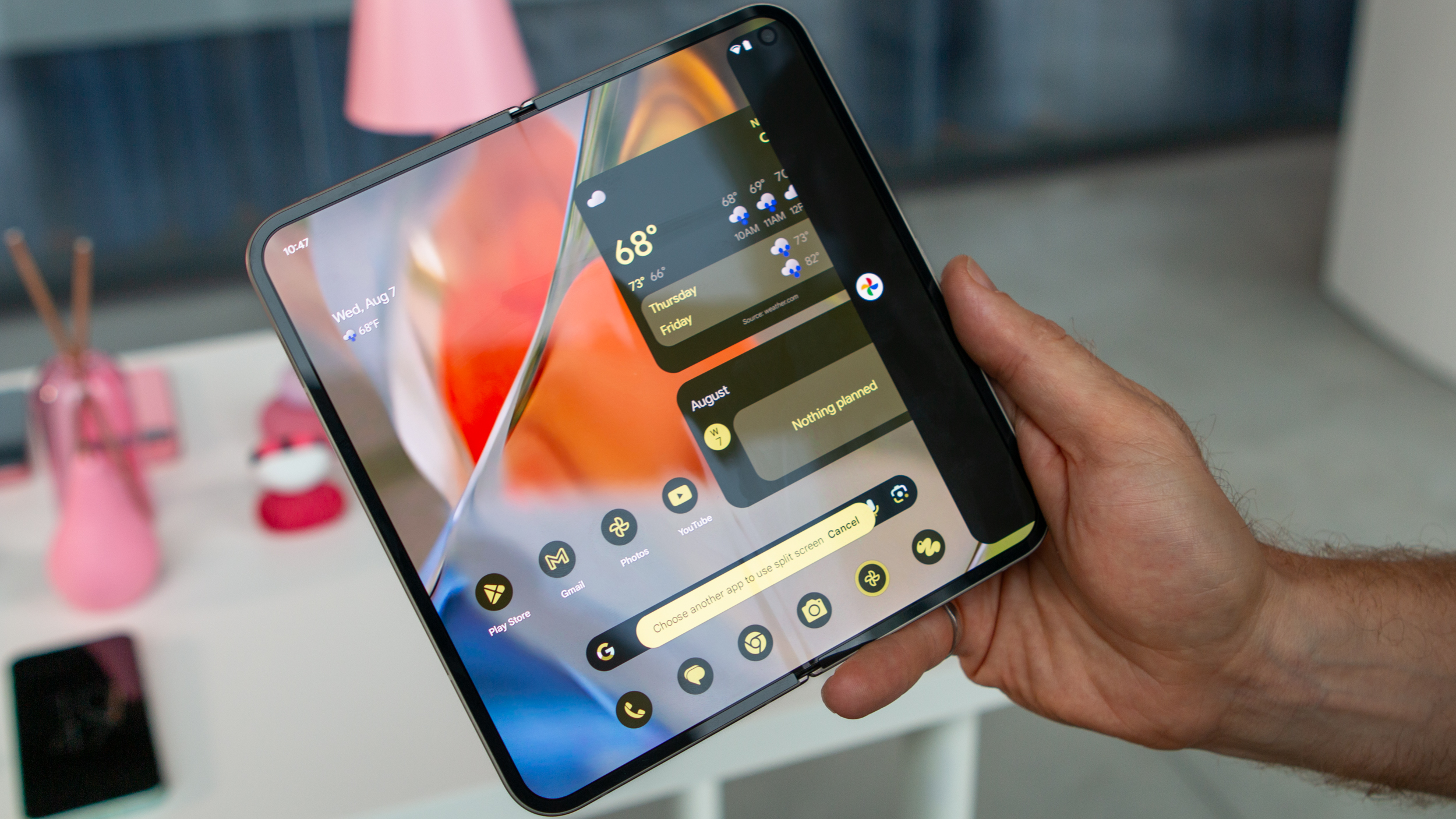
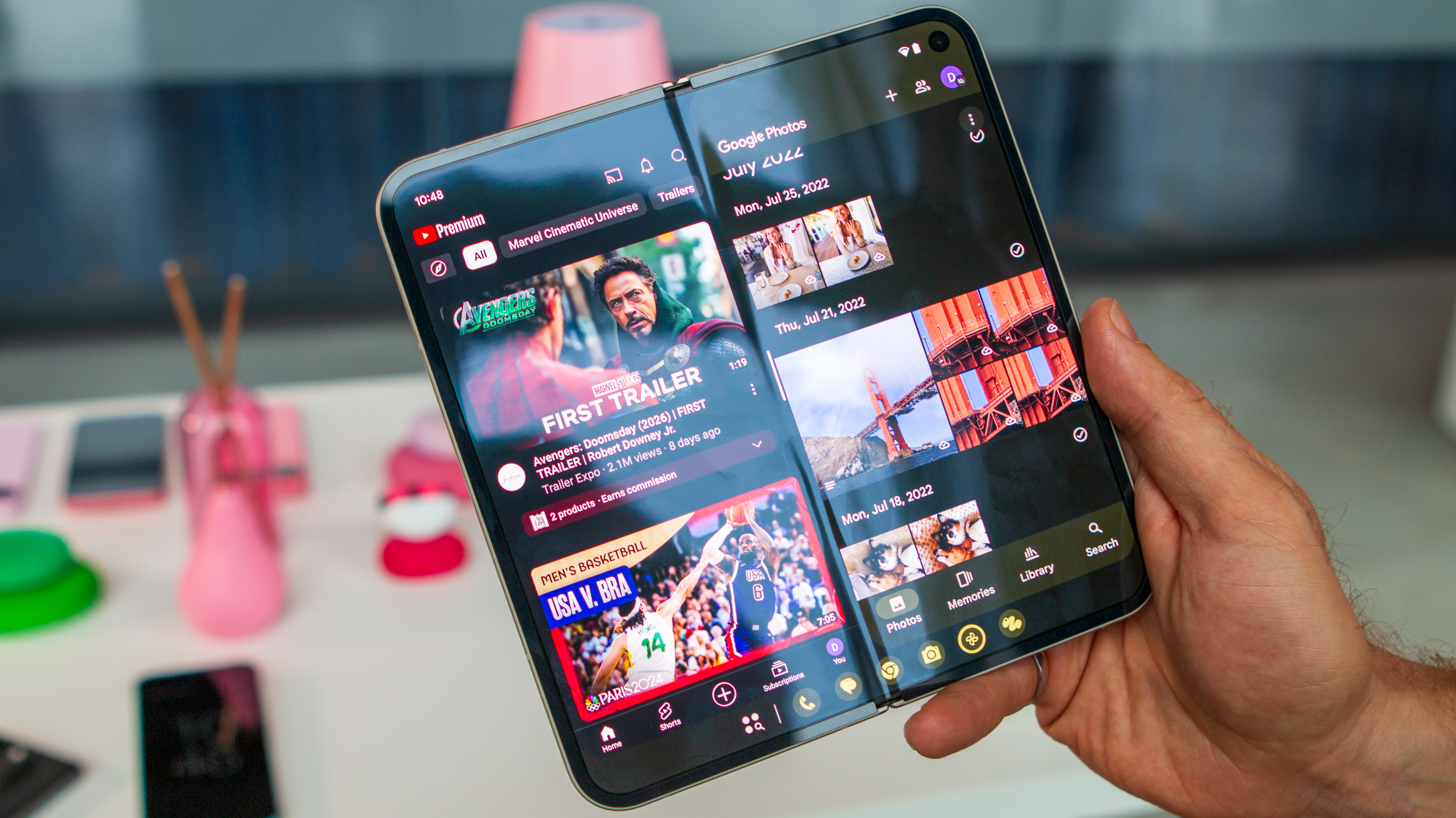
It's for this reason, from what was explained to us, that you can't use more than two apps in split screen mode at a time. You can add a third app to the mix, provided it supports floating windows, but that's it. That means we don't have something like Open Canvas or what's possible with the Galaxy Z Fold 6 when using more than two apps.
Google Pixel 9 Pro Fold: AI is everywhere
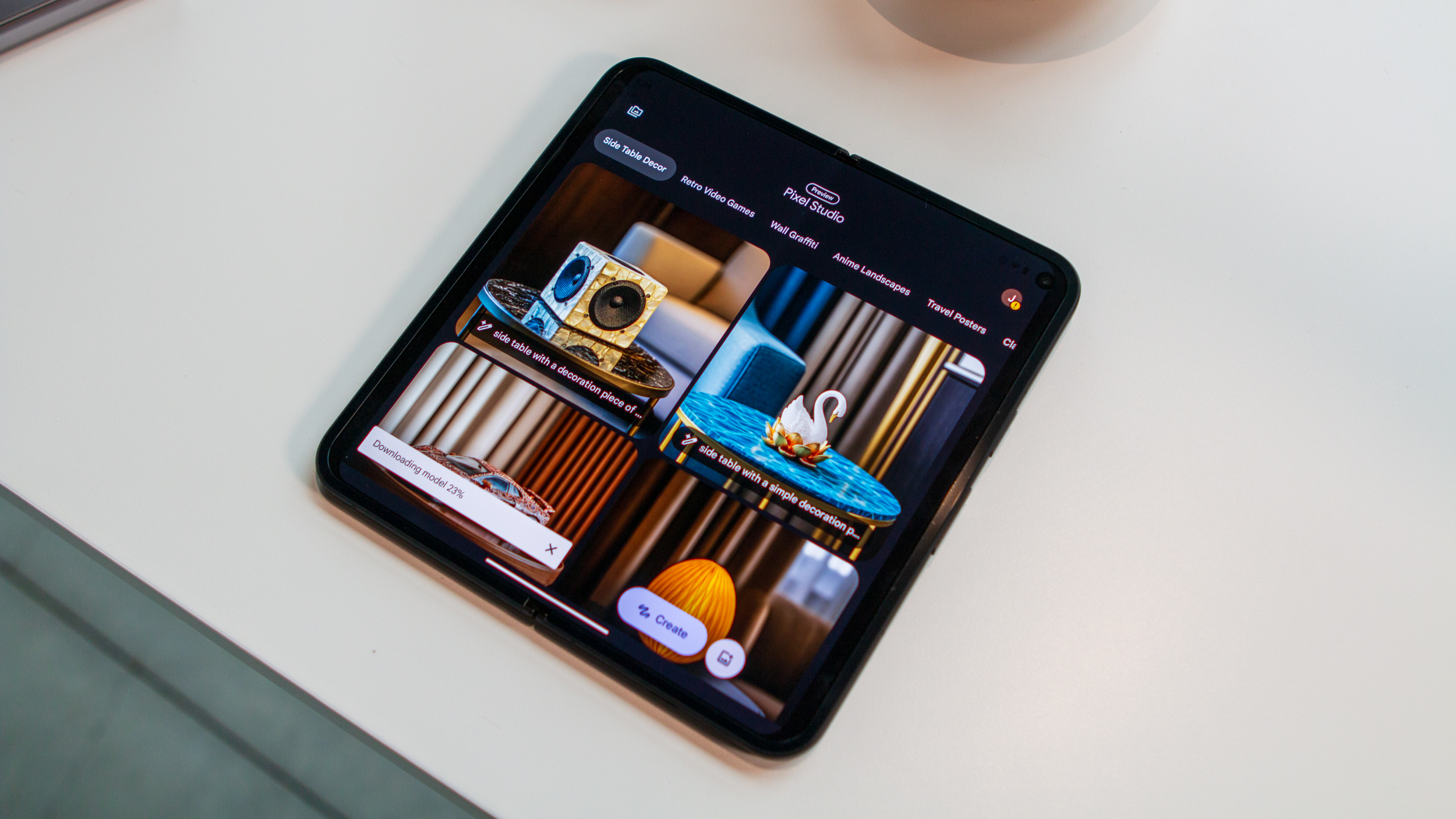
Besides that, the Pixel 9 Pro Fold is also equipped with a few new apps, as there's a new dedicated Pixel Screenshots app, and Pixel Studio has arrived. If you're someone who takes a bunch of screenshots as a form of trying to remember something, this app is going to feel as though it ascended from above.
Not only does it put all of the screenshots you take into a single location, but that's just the start. Thanks to improvements made to Gemini, you can search for specific items, places, phrases, and more. But wait! There's more!
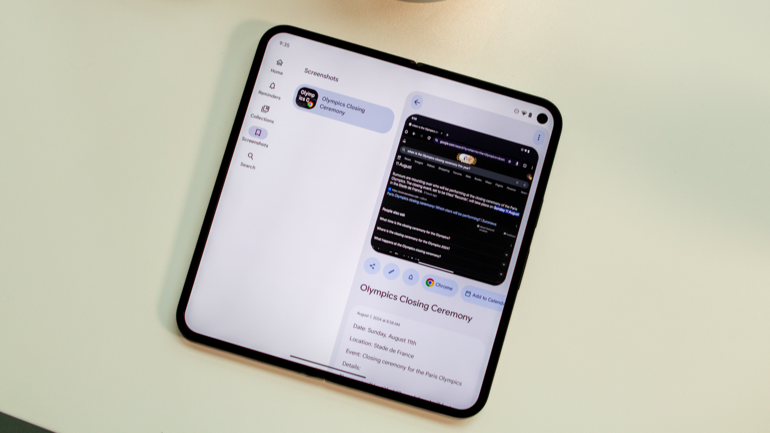
As pointed out by Senior Editor Nick Sutrich in his Pixel 9 hands-on, when you take a screenshot, you're now greeted with "actionable chips." These include things such as being able to add an event to your calendar or set a reminder. If analyzed properly, this could make the days of having thousands of screenshots a thing of the past.
Moving onto Pixel Studio, think of this like having Dall-E or Midjourney without needing to download another app or pay for another subscription. With Pixel Studio, you just input a text prompt, wait a few moments, and then voila! You're presented with four different AI-generated images based on the prompt that was used.
From here, you can either select one and use it, pick an image and continue fine-tuning it until you get the result you're looking for, or just go back to the drawing board. Something I didn't realize, but Nick picked up on, was that Pixel Studio will even generate words correctly. Hopefully, this means that we're finally past the days of seeing a garbled mess of junk when prompting Gemini to generate an image, but we also want a phrase to be added.
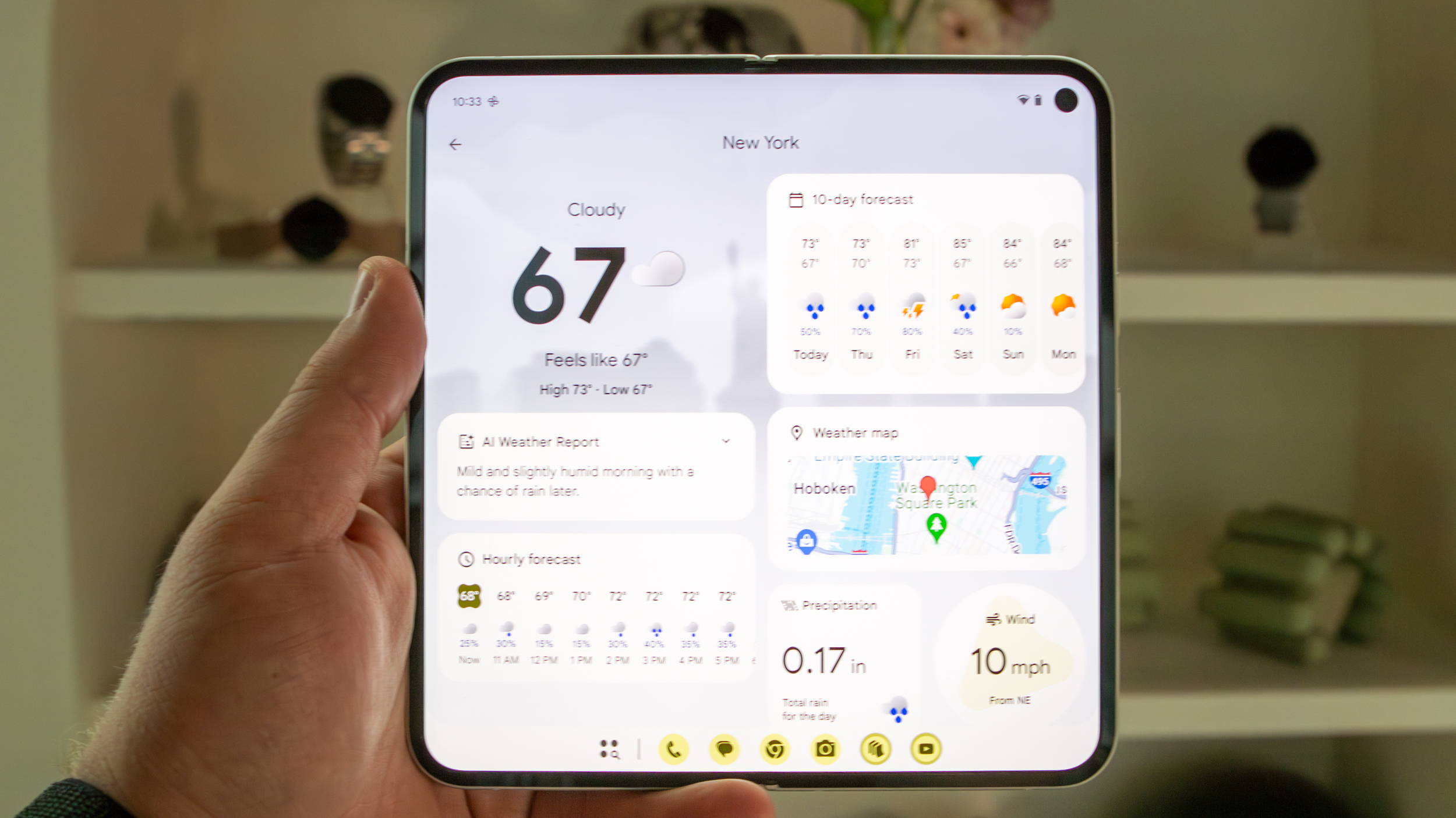
AI and Gemini integration has even made its way into Google's new Weather app for Pixel devices. In addition to the Material You redesign, this new Weather app provides an AI-generated summary near the top before presenting you with other tidbits of information. Unfortunately, it doesn't seem like this will be making its way to non-Pixel phones.
Speaking of which, just as is the case with the Pixel 9 series, Google is including one free year of Gemini Advanced with the 9 Pro Fold. Along with the AI features, this includes 2TB of Drive storage and other features found in the Google One Premium plan. Once that year is up, you'll have to pony up $20 per month, although we wouldn't be surprised if a similar promotion will be available with the Pixel 10.
While it's clear that Google is leaning more and more into Gemini, I still can't help but feel as though we're kind of stuck in limbo. Assistant is still baked in, and there are some features that Gemini can now handle. Google is also introducing "Gemini Live" with the Pixel 9 lineup, which is essentially the company's response to ChatGPT's Advanced Voice Mode.
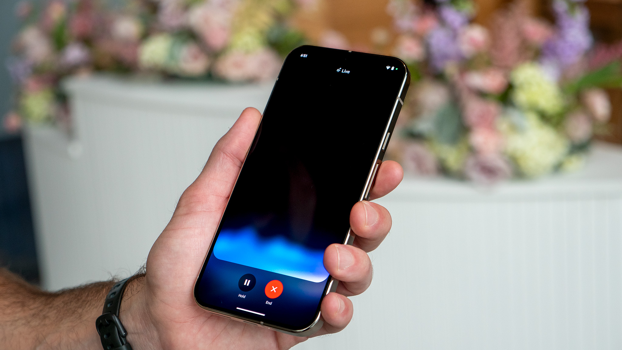
With this, you're able to have a conversation with Gemini, complete with the ability to choose different response voices. You can even interrupt Gemini mid-sentence, making for an experience that feels much more realistic than before.
However, Google also shared that there are plans to integrate various services into Gemini Live through "add-ons." When these arrive, you'll be able to ask Gemini to add things to Keep and perform various tasks based on an email. The catch here is that this is all done within the confines of Google's umbrella of services.
We did ask about whether it plans to open things up for integration with third-party apps but were told that there's "nothing to share" on that front. Despite an unsurprising answer, it's not as though the door was slammed shut on that idea. Instead, Google is likely more focused on getting its own integrations and add-ons out the door first and working out the kinks before involving partners and third-party services.
Google Pixel 9 Pro Fold: Cameras
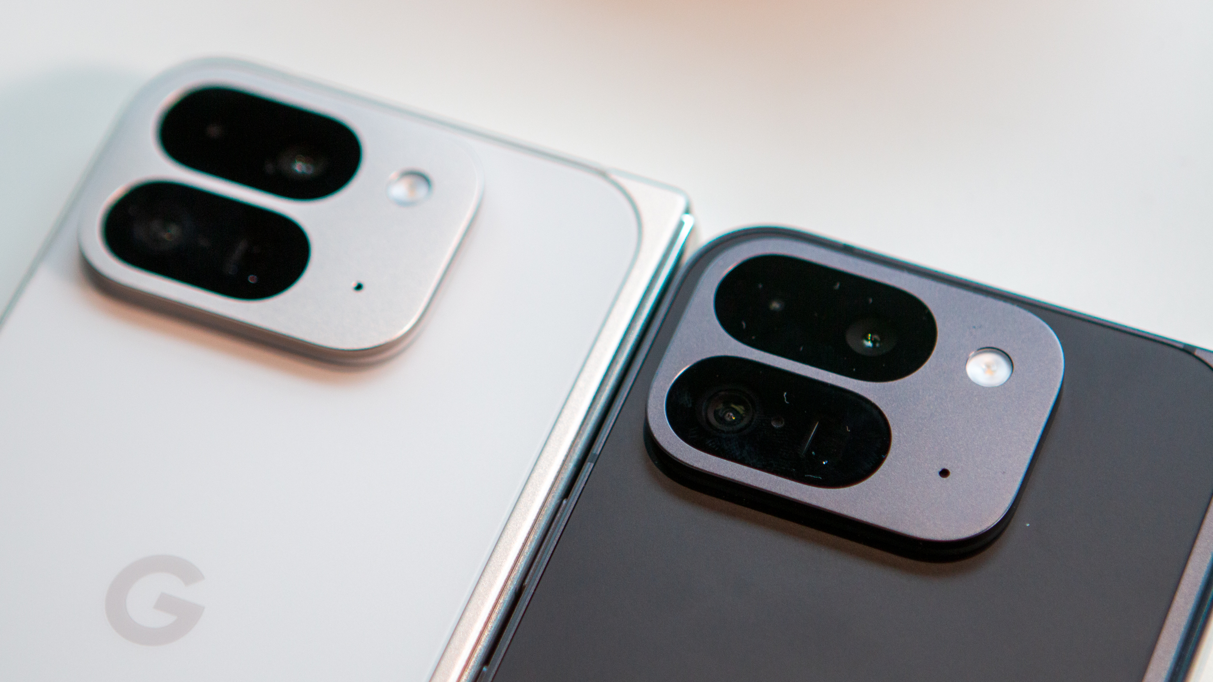
I would be remiss if I didn't at least talk about the Pixel 9 Pro Fold cameras. In reality, there's not much to write home about. Much like the Pixel 9 series, the only camera that's been "upgraded" here is the ultrawide lens. Instead of utilizing a 10.8MP ultrawide camera, the 9 Pro Fold brings along a 10.5MP ultrawide lens with the same f/2.2 aperture. The only discernible difference, on paper, is a wider 127-degree FoV, up from 121.1 degrees.
I can understand why Google would want to hold off on introducing brand-new camera sensors, as that's not really ever been its thing. Pixel phones compromise using "older" cameras in favor of the on-device processing, which is still quite incredible.
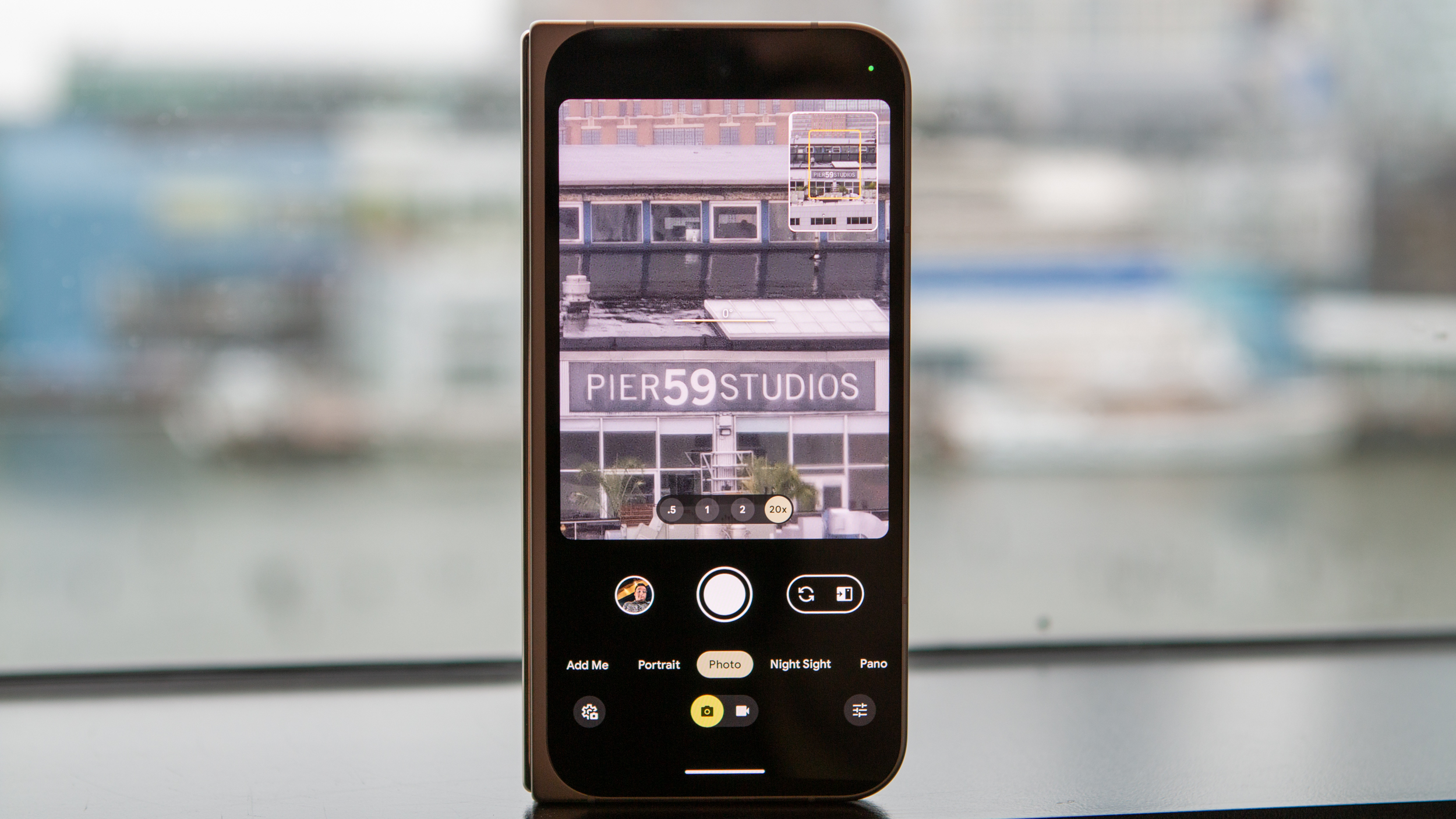
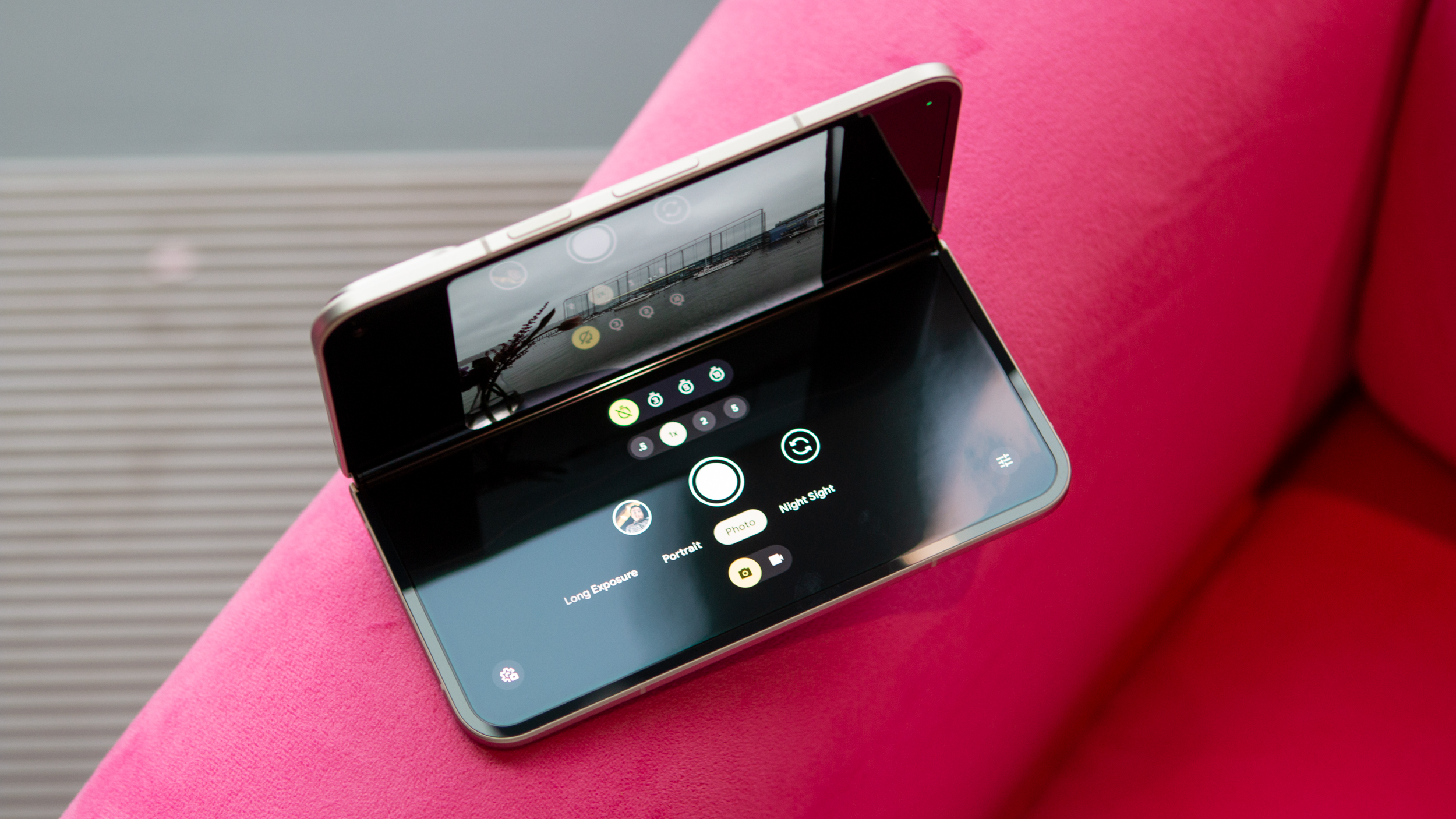
However, I really wish Google would have come out of the gates swinging. We already have a design overhaul from top to bottom, and there's even a new camera housing. Why not push the envelope all the way forward, introducing an all-new camera array that's specific to the company's foldable phones?
Instead, we end up with a camera array that falls short of the Pixel 9 Pro and 9 Pro XL. This means that you can save yourself at least $800 by deciding against getting Google's latest foldable—all for the sake of keeping the 9 Pro Fold as thin as possible. I suppose you could look at it as leaving room for growth with a potential Pixel 10 Fold Pro, or whatever Google will call it, but that doesn't leave me feeling great.
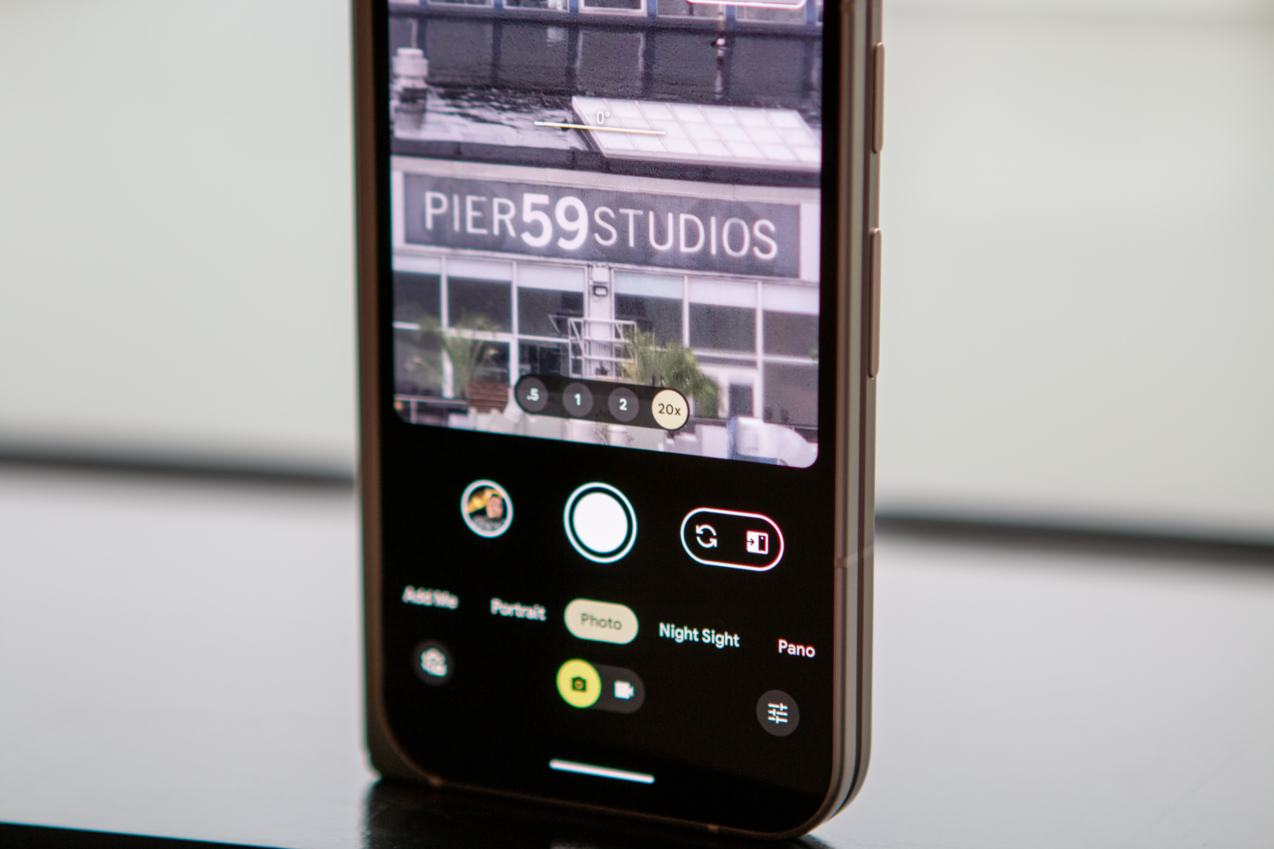
Now, with all of that being said, it's not like Google isn't doing anything new with the cameras on its latest foldable phone. All of the same great features from the Pixel 9 series are also onboard here. That includes things like Add Me, Reimagine, Auto Frame, and more. Be sure to check out our Pixel 9 hands-on to learn more, but I came away rather impressed.
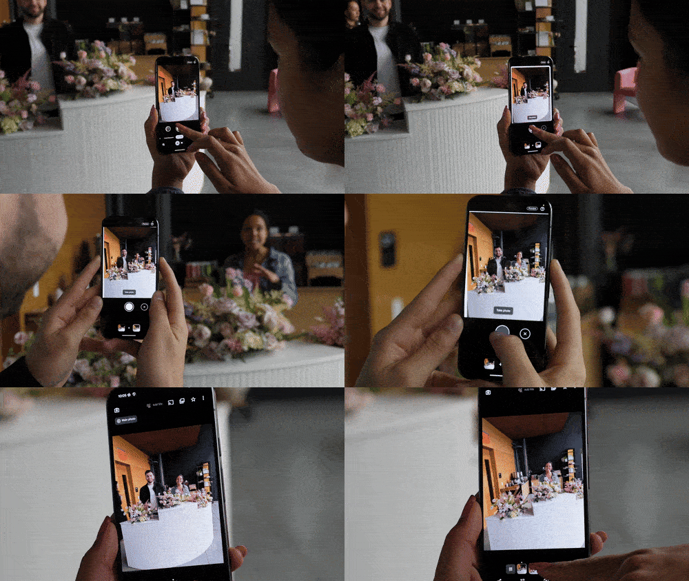
Some of these might feel like gimmicks more than anything. However, if there was one that stood out to me, it was "Add Me." I can't tell you how many times I've tried taking a group picture, only to see my phone fall as soon as I try to rush into place. Foldable phones have solved this, to a certain extent, but Add Me makes it so I can still be in the picture, even if I was the one holding the camera for the initial shot.
That feature alone might be enough for me to give up my iPhone 15 Pro Max as my go-to choice for snapping pictures while I'm out and about.
Google Pixel 9 Pro Fold: More than a Pixel Fold 2
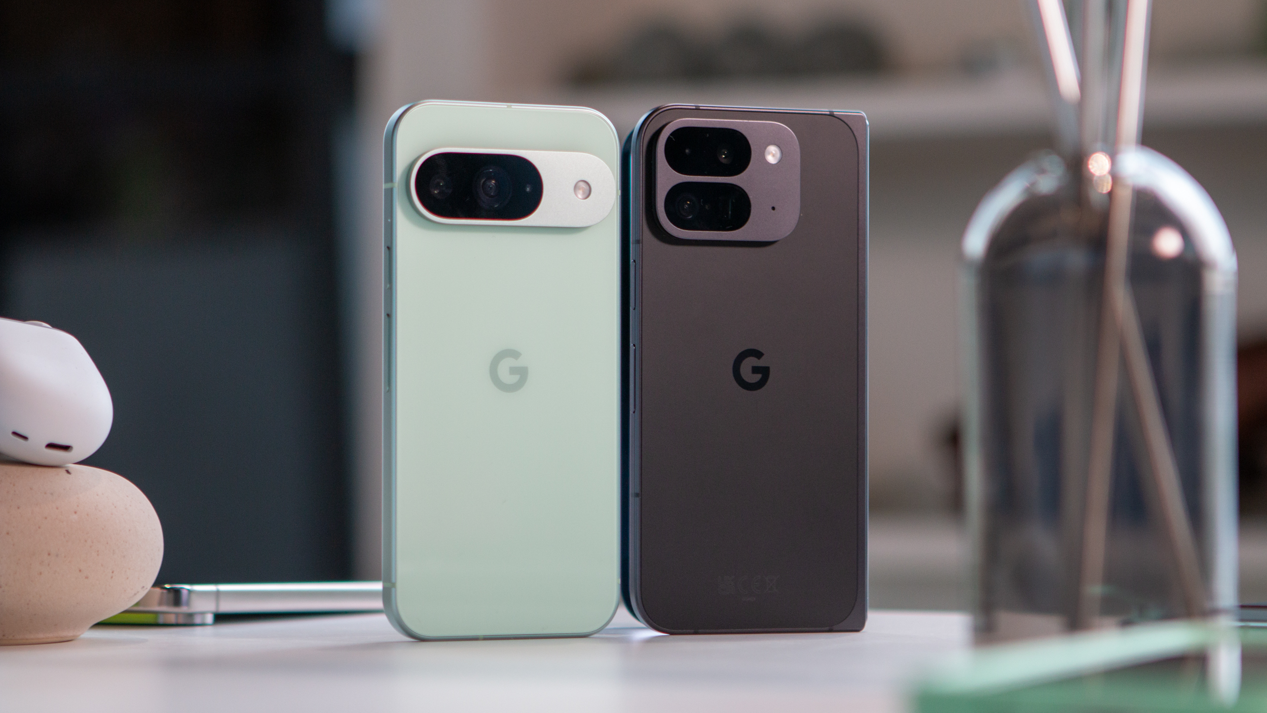
I know that Google wanted to go with a different naming convention, bringing it more in line with the rest of the Pixel lineup. But I can't help but feel as though this is the embodiment of a true second-generation device, which would warrant the "Pixel Fold 2" title.
After seeing the Pixel 9 Pro Fold in person and putting it up next to the Pixel Fold, I found myself being surprised and impressed at the stark differences between the two. Google really went for the "Pixel 5 to Pixel 6" upgrade path, and if it weren't for the "G" on the back, I'd go so far as to say these were made by completely different companies.
Naturally, I'm going to reserve my final judgment for after I'm able to spend more time with the Pixel 9 Pro Fold. But as long as there isn't something hiding in the shadows, things are looking pretty good for Google's upcoming foldable.


