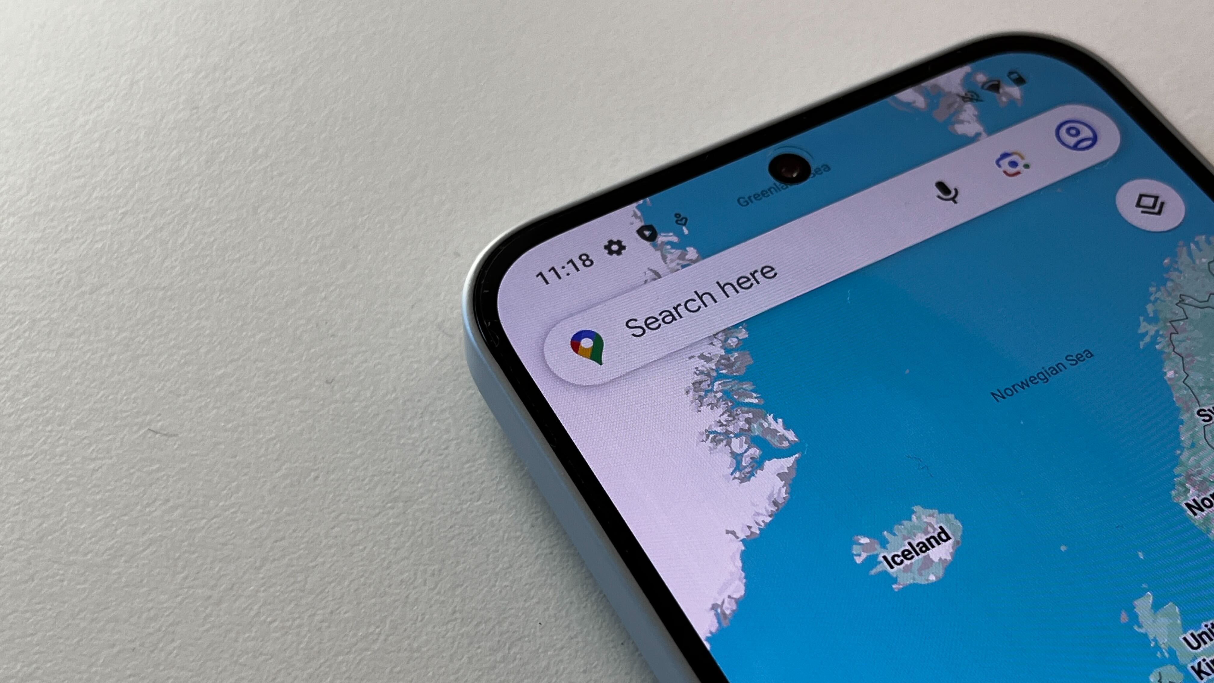
Google Maps is becoming a bit simpler, as an update starts to roll out.
It reduces the number of options on its bottom menu from five to three.
Google Maps is rolling out an update that was promised during this year's Google I/O conference, simplifying the app's core navigation.
For the avoidance of doubt, that doesn't have anything to do with its route-finding – rather, this is about how you get to different parts of the app. For a long while now, Google Maps has had five buttons at the bottom of its screen for you to tap on.
These have been Explore, Go, Saved, Contribute and Updates – but moving forward there are only going to be three. This will now be simply Explore, You and Contribute.
This works quite simply – trips and places you've Saved will now be available in lists under the You tab, while the notifications and messages that were collected in the Updates section are now located in a notification icon at the top-right of the display.
It might take a little getting used to, but Android users should have the chance to try out the new layout very soon, as it's apparently rolling out on that platform now. Apple iPhone users have a slight wait on their hands, though – it's seemingly not yet available on iOS or iPadOS devices.
In theory, this should all make for a cleaner experience, and given it's Google at the wheel you can imagine that everything's been tested endlessly to see how users actually interact with it all.
It comes hot on the heels of a change that might make more of a real-world difference, as Google rolled out further updates to how Maps displays live wildfires.
The system makes it way easier to see where fires are raging in order to avoid travelling through affected areas, which could end up helping to save lives.
Both updates serve to underline how apps that are this widely used rarely stay still – there's always another change around the corner, whether a big one or small. Keep an eye out for the new layout in your Google Maps app to see whether you think this one's meaningful or not.


