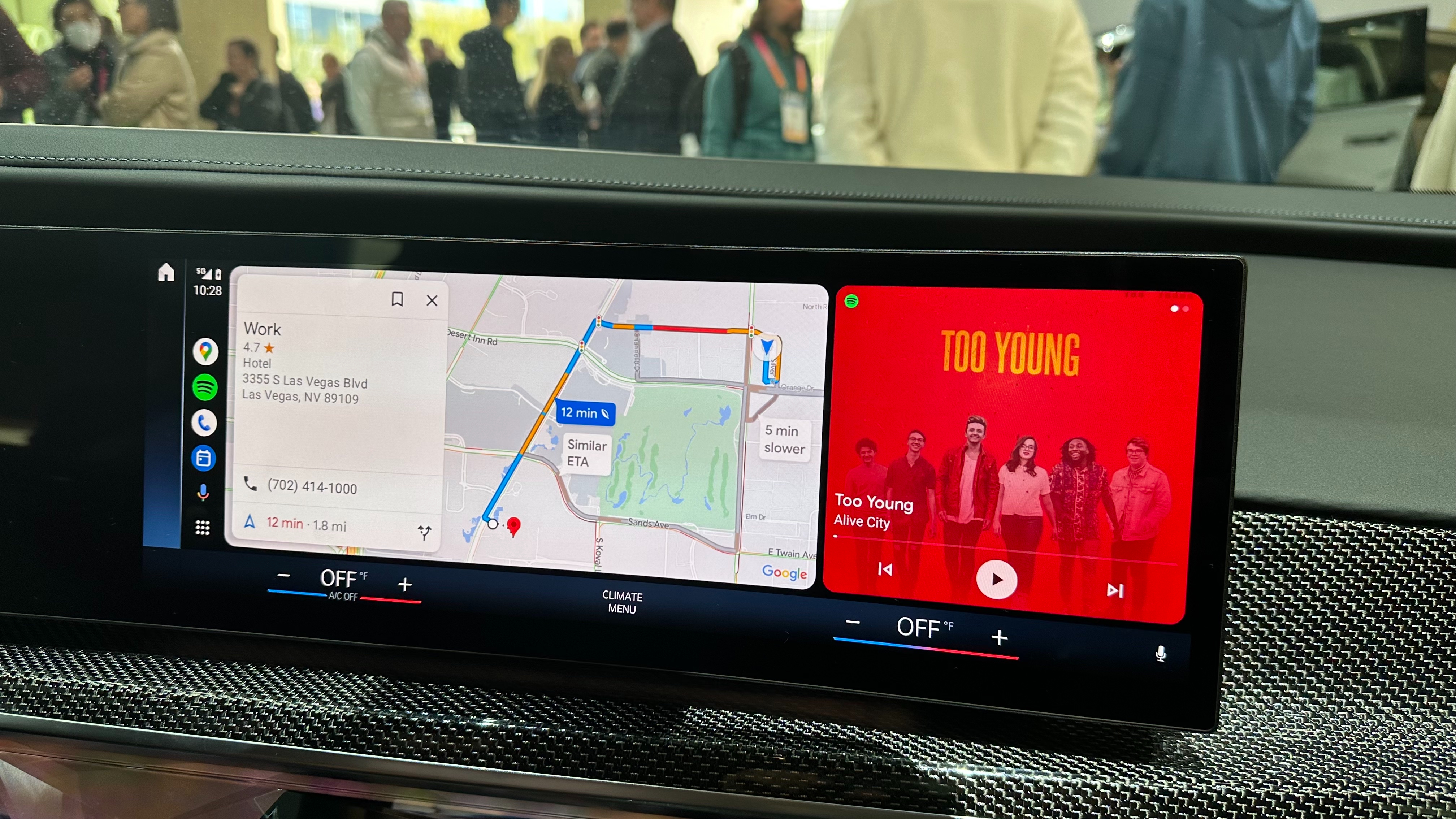
Anyone that’s used Android Auto in their car will be pretty familiar with Google Maps. But as useful as the navigational app can be on the open road, the interface can be a little troublesome. Fortunately Google is rolling out some changes to make Google Maps a lot nicer looking when you’re connected to Android Auto.
According to 9to5Google, Google Maps on Android Auto is set to get brand new button designs and a design overhaul that ensures your screen isn’t quite as busy. Because all the information on screen can get in the way of your directions, which is no good if you’re supposed to be concentrating on the road ahead.
The changes appear to have happened on the server side right now, but appear to be rolling out to users as part of Google Maps v11.104.0100 and Android Auto v10.8.

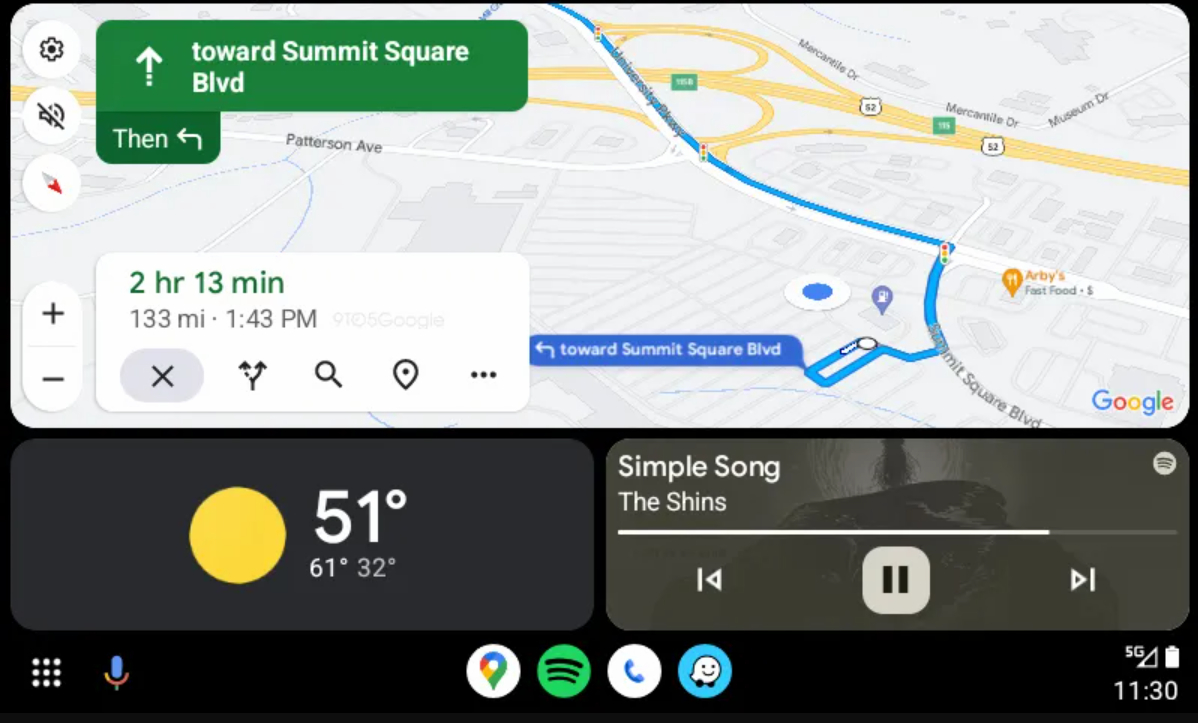
The changes might seem pretty minor at first glance, but it does look like they’re putting the important information front and center. Estimated travel time is now more prominently displayed in bold,, followed by your distance and ETA below that. Because, let’s be honest, the latter two aren’t nearly as important when you’re driving.
The end navigation button has been moved down to live next to the buttons for alternate routes, search and additional stops. These look pretty much the same, but a dividing line has been removed that gives this window a much sleeker look overall. That means there’s more space to see the on-screen map, and should make it easier to view at a glance.
Drivers with smaller screens may still have issues, especially since the Android Auto taskbar can feel like it takes up too much unnecessary space. But it show Google is still taking in-car navigation seriously, and is striving to make it a better overall experience.
Combine these latest changes with the new sidebar that launched in July, the option to use Google Maps on your phone while driving and Android Auto’s relatively new design refresh, driving with Android Auto is only getting better.


