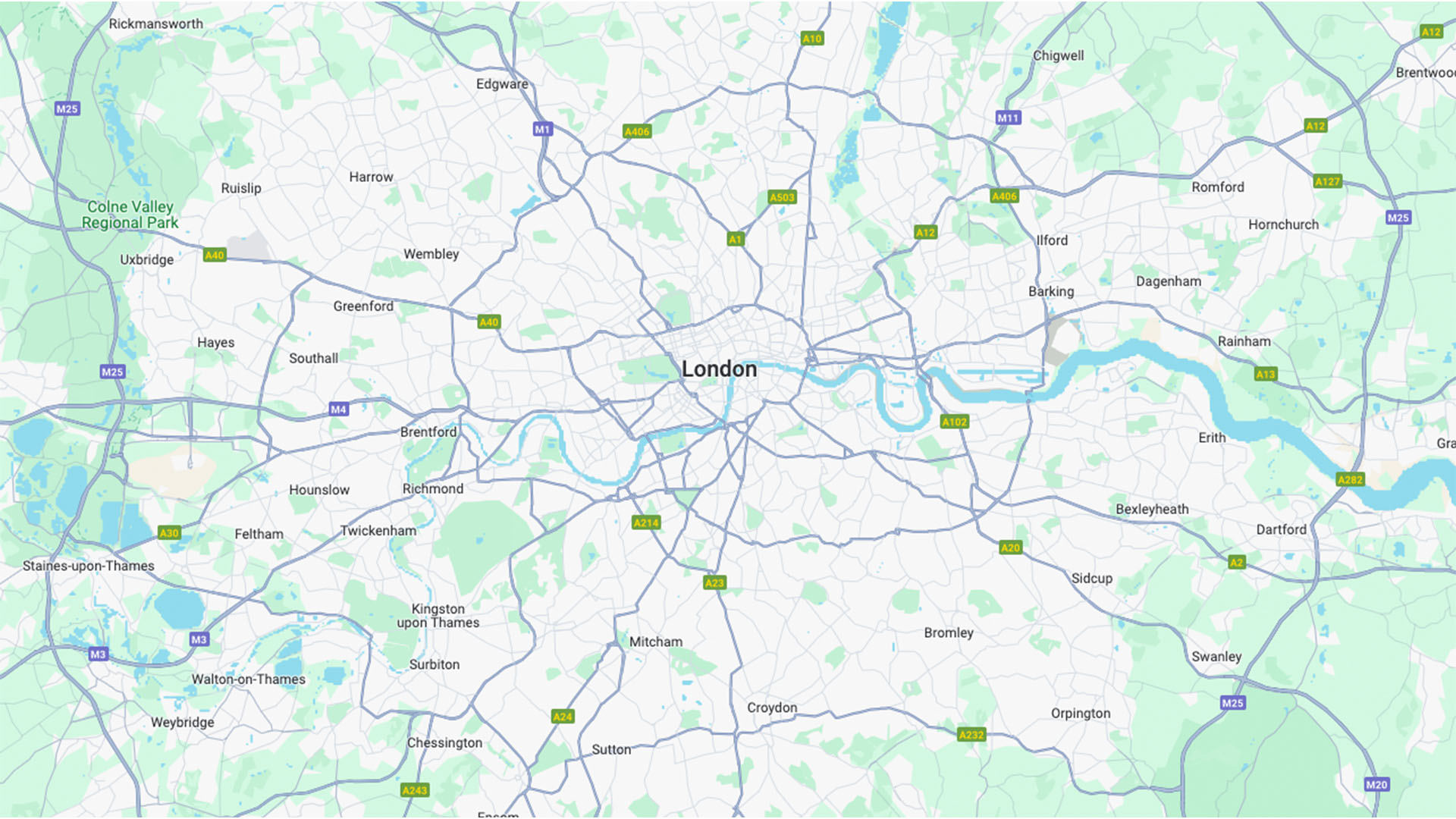
The internet is once again upset, and this time it's about maps. Google Maps in fact, as the app has recently updated its colour scheme to a lighter and brighter hue, much to the dismay of passionate users who are threatening to migrate to the directional hellscape of Apple Maps.
If you can cast your mind back to the old colour scheme, it's a subtle but confusing difference, replacing the perfectly functional colourway with a new, less visible alternative. (To avoid a similar colour-related scandal, check out our jargon-free guide to colour theory).