What you need to know
- Google Play Store has seen some changes in UI.
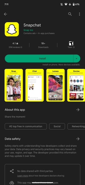
- It includes the popular green UI elements like the "Install" button turning blue.
- The change could be temporary and part of a broader Dynamic color rollout.
Google is rolling out a new hue for its Play Store, which has been using the signature Dynamic color scheme for a while now.
As noted by 9to5Google, the new blue accent color is noticeable across the Play Store, where previously, the search field, top tabs, and bottom bar were utilizing Dynamic colors from the UI. The change can be seen across other UI elements of the Play Store where previously Dynamic colors weren't present; instead, Google used green colors.
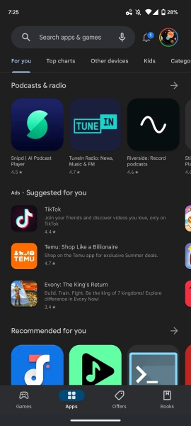
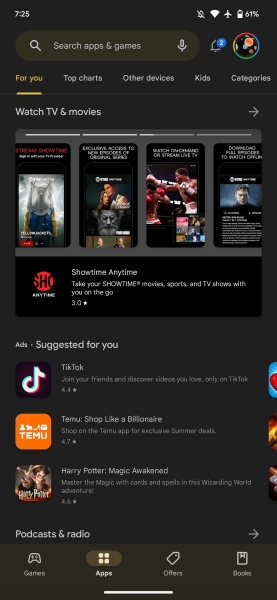
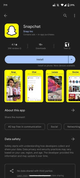
They included parts of the app listing, install/update/open buttons were green, and the "Manage apps and device" also had a few elements with green colorways. They seem to have changed to blue hues and the buttons to blue colorway as well notes 9to5. It further notes the move may be temporary and in preparation for full Dynamic color adaptation across the app.
For some users, the app update rollout started last week and seems complete on the server side. This new feature comes alongside the minor change, which arrived back in April (via 9to5) featuring a shorter bottom bar and the pill-shaped tab indicator of respective "Games," "Apps," "Offers," and "Books" tabs also was shrunk a bit.
Google also began introducing a new "Sync Apps to Devices" feature for its Play Store in March. This feature is included in the "Manage apps & devices" section. When users click on it, a page showing all of their devices linked to their Google account will load.
In addition, it enables those devices to install all their apps simultaneously across all of their devices rather than doing it one at a time. The synced devices can include Android handsets, like the Pixel 7, and smartwatches, like the Pixel Watch. Users must bear in mind that this feature allows only new apps to sync to all devices and not all previously installed ones.


.jpg?w=600)


