What you need to know
- Google Drive is getting a makeover on the mobile app's homepage.
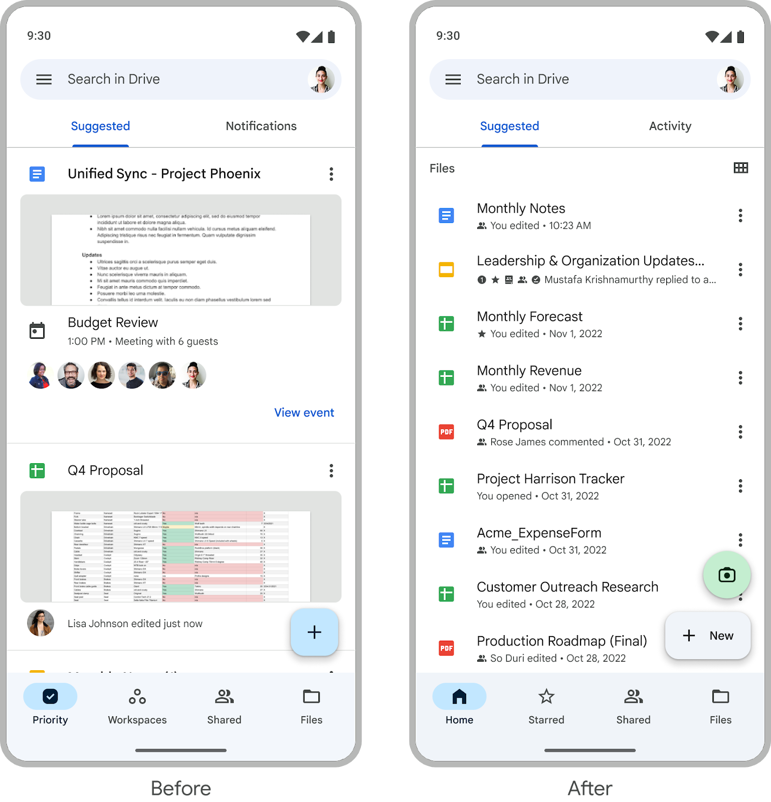
- The facelift includes a refreshed suggested view and replacing the notifications view with the activity view, mirroring the recent web launch and introduced a more consolidated experience.
- The updated design is rolling out to Android and iOS users of Google Workspace, including those with personal accounts.
One of the latest improvements that Google Drive users will spot on their mobile devices is a visual refresh to the app’s homepage to make it easier to access your files on the cloud storage platform.
In a Google Workspace blog post, the search giant announced a makeover to the mobile app’s homepage on Android and iOS devices, as part of ongoing efforts to streamline the file management experience for users.
The facelift includes a refreshed suggested view that “will allow you to see even more recommended files at once, such as those that have been recently opened, shared or edited,” the company said. This will make it easier and faster for users to locate the files they need.

The file management platform is also replacing its notifications view with the activity view, which mirrors the recent launch of the feature on the web version. This new consolidated view simplifies the user experience by amalgamating critical details, including pending access requests, recent comments, and items awaiting approvals, in one place.
It’s also worth noting that users don’t have a specific setting to enable or disable the feature. For those who do not wish to see the revamped home tab, the app will simply open on your last-used tab, be it Shared or Files.
The recent TLC that Google Drive received is merely the latest in an array of updates and improvements to the platform, which has also seen a visual refresh to the app on Android tablets. The tablet-friendly redesign was part of Google’s goal to take advantage of the available real estate on tablet screens and make files easier to spot.
As for the latest redesign, the company notes that the update is rolling out on Android and iOS devices, and it will be available to all Google Workspace users and those who have personal accounts.


