
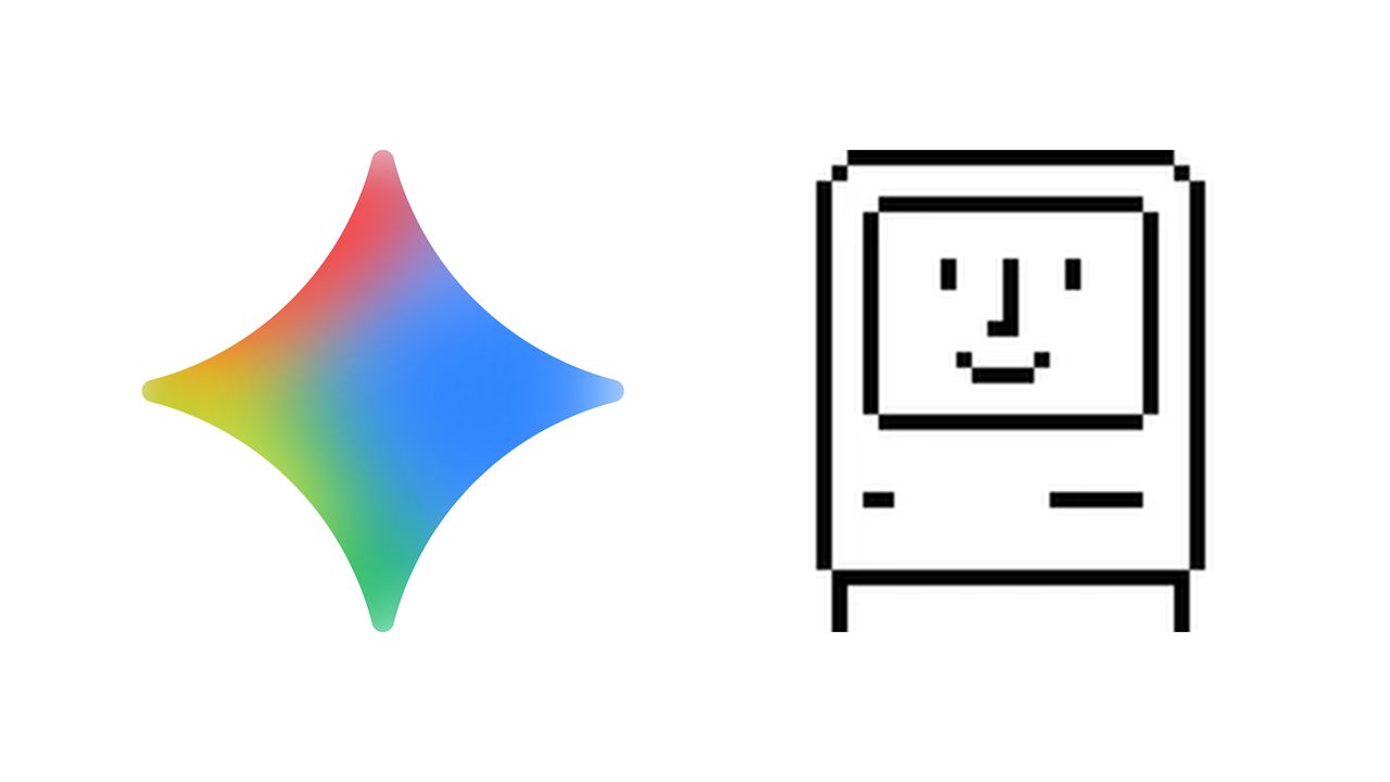
For rival tech brands, Google and Apple have seemed awfully cosy lately. Earlier this month it was announced that, in a huge blow to OpenAI, Google's Gemini will be powering the much awaited (and much delayed) enhanced Siri assistant on every iPhone. And now, Google has compared its UI design with that of Apple. Apple of 40 years ago, that is.
In a comprehensive new blog post detailing the illustration of the Gemini app, Google explains how designers have found themselves "navigating uncharted design territory," citing a very specific piece of Apple design as an equivalent touchpoint from the 1980s.