What you need to know
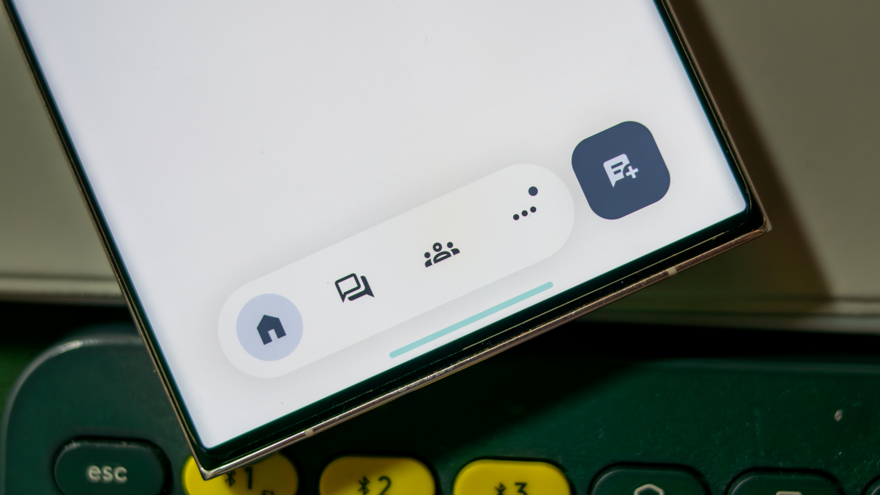
- The floating bottom bar in Google Chat now has a pill shape instead of a circular design, along with a bit of extra width.
- The color scheme has been upgraded with Dynamic Color, enhancing contrast and overall look in Google Chat.
- Plus, the last icon switched from the @ symbol to three dots.
After introducing a floating bottom navigation bar to Google Chat around a year ago, Google is now sprucing it up to match the Material You vibe.
The floating bottom bar, which debuted about a year ago as part of a bigger Google redesign, just got a fresh new look. Spotted by 9to5Google, this refresh makes everything feel more cohesive and visually appealing in the app.
Prior to this update, the floating bottom bar had a circular shape that helped you spot the active feed. It featured four icons and a button to start a new message. Now, it’s been reshaped into a pill-like design and widened a bit.
While this change might take up a little more screen space, this refresh gives it a style that jives better with how other Google apps work.
The fresh design debuted along with Gemini summaries, which are now popping up in Google Chat's Home view. Just long-press a thread on your phone, and Gemini summaries will help you get up to speed on any missed conversations. The AI assistant will provide three bullet points summarizing the key points.
For those using Google Chat on desktop, a 'Summarize' button shows up when you hover over a conversation thread. Clicking it works like the long-press on mobile, giving you a quick summary of the chat.
Another upgrade is the new color scheme. The background of the floating bottom bar now uses Dynamic Color, letting it blend in nicely with your device's color palette.
This change boosts its contrast with the rest of the Chat interface, making everything look nicer together. Also, the last icon has swapped out the @ symbol for three dots. All these tweaks come together to create a more stylish and unified user interface in the app.
Right now, though, the floating bottom bar design is unique to Google Chat, but at least the recent updates have made it look good enough to hang out with the other Google apps.


