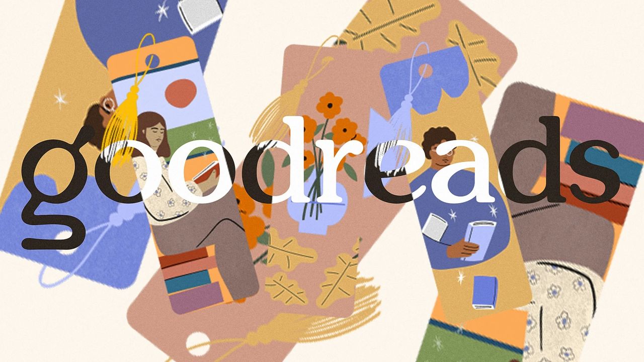
Goodreads has always seemed like it might be in on the joke. The Amazon-owned social reading platform has for a long time looked so clunky and dated that it sometimes felt as though it might be a wilful choice on the part of the designers. Not so, it seems – Goodreads has just launched new branding, and it actually looks kind of... good? While hardly one of the best rebrands of the year, if this one signals that more visual improvements are coming to the whole platform, it might just be the most welcome.
The new logo and wordmark still feature a lowercase 'g', but one that's much softer and more stylised than the previous bland sans serif offering. Typography across the platform now looks both more friendly and more literary, and the whole thing looks a lot less like a Wordpress blog from 2011.