While red might be a hue with fiery connotations, earthy red, its far gentler counterpart, is a color that couldn't be more grounding, and I am noticing it everywhere in 2026 so far.
Okay, if I were to envision a serene color scheme rooted in nature, I'd imagine deep khakis, warm browns, and faded terracottas long before any red paint. A hue that, on paper, couldn't be further from a neutral, red might usually be thought of as a bold choice, but these interior design projects prove that earthy red (a subdued take on red as we know it) can feel as tranquil and grounded as any neutral.
Falling somewhere between red and terracotta, earthy red feels warm enough to cocoon, yet stripped-back enough to enrich without overwhelming a room. Able to dance beautifully in natural light, the organic hue is the new way designers are decorating with red paint.
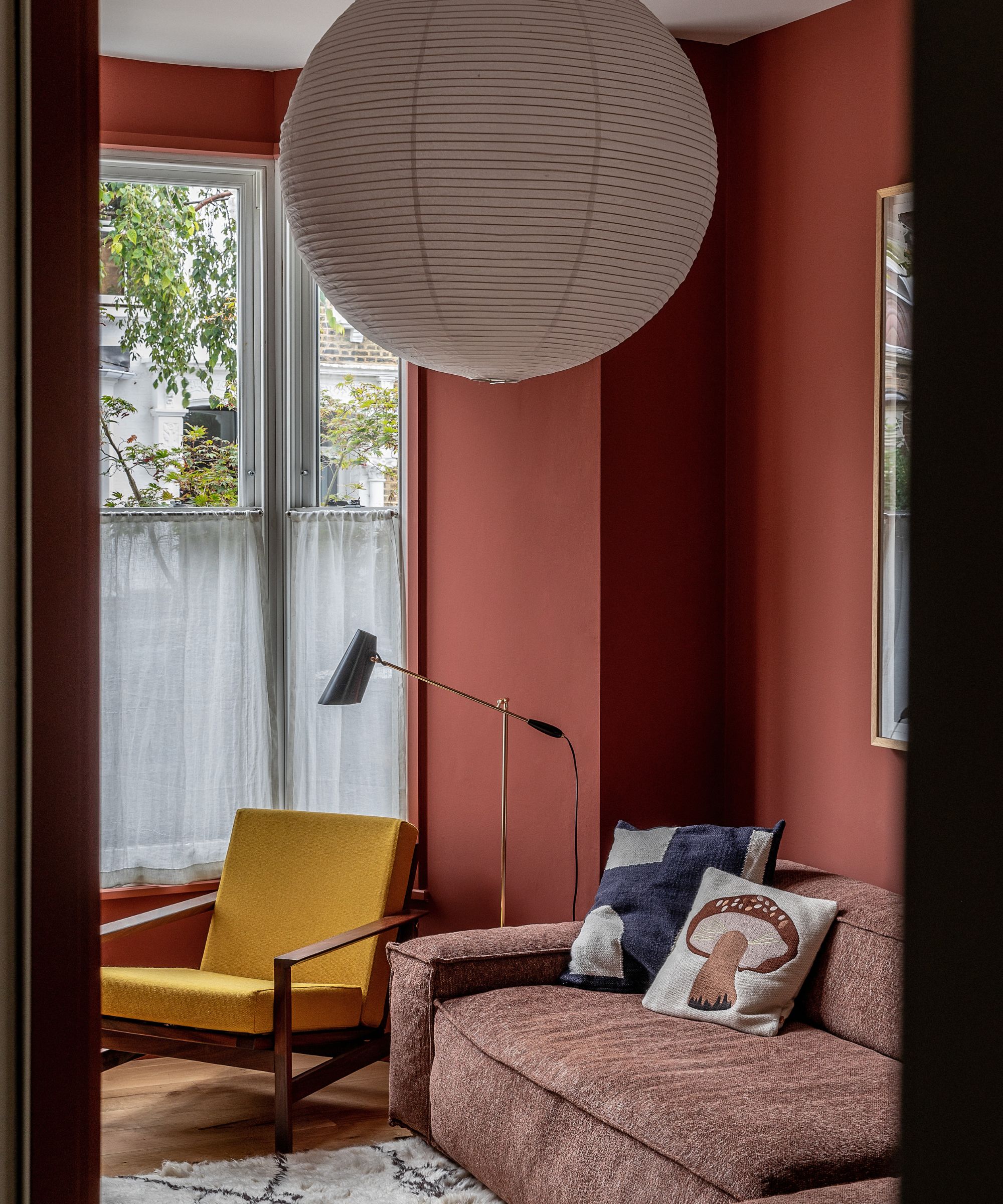
This cozy living room edges on the more vibrant side, but the earthy red is subtle enough to gently enrich the space without dominating.
Interior designer Polly Ashman explains decorating with earthy colors isn't limited to neutrals. 'We chose an earthy red to create a warm, enveloping atmosphere that feels both grounding and inviting. In a country house, these natural tones connect beautifully with the surrounding landscape and shifting light. The color brings depth and richness to the room while also creating a sense of comfort and intimacy, particularly in the evening when the light softens, and the space takes on a lovely golden glow.'
'Earthy reds pair beautifully with softer, balancing tones and natural textures,' suggests Polly. 'We layered warm woods and woven fibres to keep the palette relaxed and harmonious. Antiques, patterned textiles, and greenery help soften the richness of the color and give the room a collected, timeless feel.'
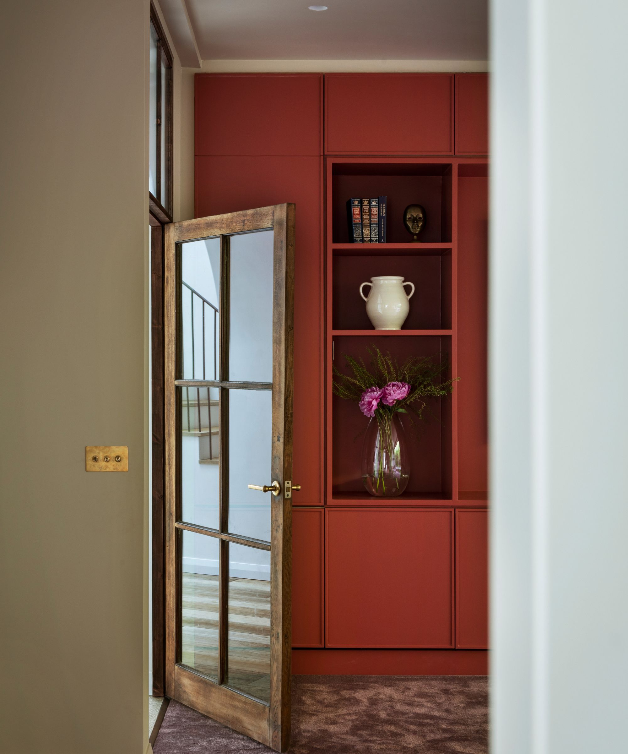
Charles Tashima, Founder of Studio Tashima, used Little Green's Tuscan Red in a recent project, using it on the bespoke built-in in the family room.
He explains, 'The color emerged through conversations with our client. We had a great collaboration with her. We find these the best projects and most fun to work on. We chose Tuscan Red to bring something warm and deep, but also bright and strong – working well during the day as a definitive colour but also working well at night, giving the room a fiery, cosy atmosphere.'
Charles adds, 'This was particularly important for this family/TV room, which we deliberately put in the darkest part of the house: on the ground floor facing northeast. The high garden fence made light levels even more challenging. We felt an earthy red would bring warmth and presence to the space during the day, pulling you away from thinking of it as a dark room.'
'These reddish hues, together with the earthy red of the room, act as accents within the house, reinforcing a palette rooted in natural materials. While earthy interiors often remain within muted browns, beiges and greens. We offset these with reds and rusts, which introduce a sense of warmth, depth and character.'
A terracotta meets red, Farrow & Ball's Red Earthy is a classic choice for the home, loved for its flexibility and its ability to work beautifully alongside daylight.
Rich and encompassing, Benjamin Moore's Tuscon Red will bring depth and vibrancy to any room, perfect for enveloping a small space or a large, light-filled room.
Infused with warm red tones and a chalky finish, Farrow & Ball's Picture Gallery Red is a cocooning choice for walls and ceilings.
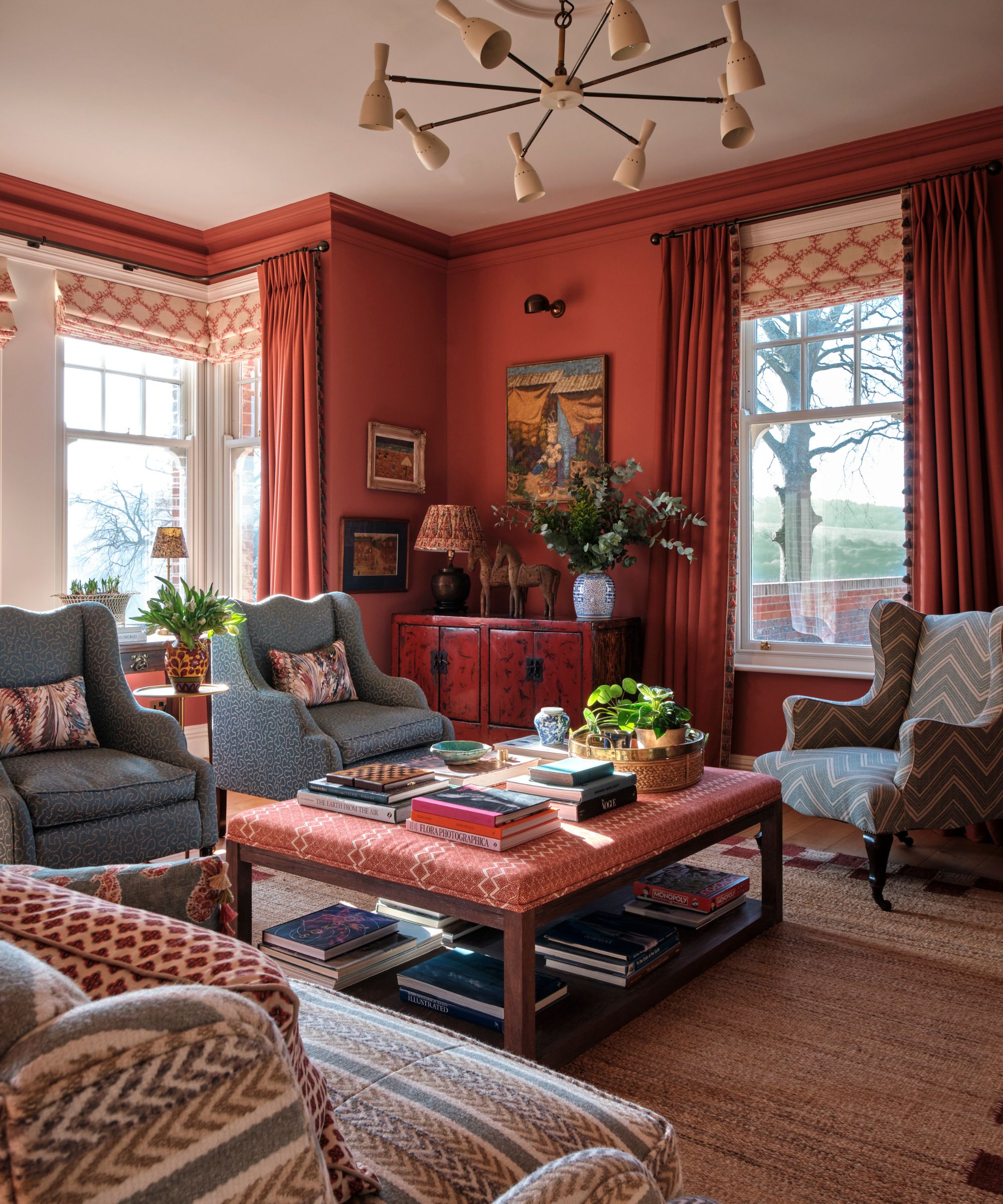
While decorating with red can feel a little bold, this charming (actually quite dark) living room couldn't feel more serene and inviting. Laura Hanbury, co-founder of Vanrenen Hanbury, explains, 'We chose Red Ochre by Edward Bulmer for this room, which is a double-ended drawing room, and although it has north, south, and east-facing windows, it can sometimes feel quite dark. We needed a color that worked just as well during the day to feel warm and grounding without being too dark, but that would really come alive in the evening when it is mostly used.'
Laura recommends colors that go with red, such as creamy tones and warm neutrals, when using the earthy hue. 'Earthy red hues look great with a soft woodwork color to frame them and keep an element of lightness. Here, we used Milk White on the ceilings, skirtings, and cornices, and we applied a similar principle to the window dressings, using plain cream linen to punctuate the stronger color on the walls.'
A paint color that works beautifully with natural light, earthy red elevates dark rooms as well as those flooded with daylight, providing a golden glow that grounds a scheme.
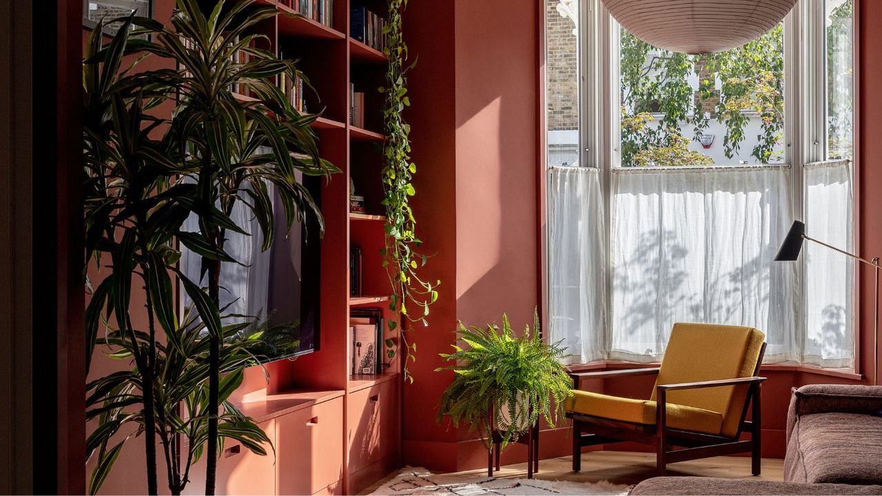
Emma Perkin, Director of Emil Eve Architects, used earthy red in this light-filled modern living room. 'Terracotta was the signature material for this house, which featured two quarry tile-clad extensions. We wanted to carry that rich color into the interiors, and the living room was the perfect space to fill with this earthy red – it creates a lovely sense of warmth and being cocooned.'
Emma continues, 'It's always important to consider the quality of light the room gets when choosing a color – this room is east facing, so the walls work well with the golden morning light, and then bring more richness and warmth as you move into evening.'
She adds, 'These reds look great with other earthy tones. In this house, we used ochre and different greens. Muted neutrals also work well, and these hues pair beautifully with natural wood.'
Earthy Red Decor
Perfect for elevating a bookcase or coffee table, this earthy red-fired urn is best paired with dainty white flowers.
For a dose of earthy red that doesn't overwhelm your space, try the Fenwick table lamp. With a pleated shade and tiled base, it's sophisticated yet playful.
Bring some vibrancy into your kitchen with the Amelia latter cereal bowls. A classic shape, you'll want to reach for these every morning.
Woven with earthy red stripes, Piglet in Bed's Pembroke stripe duvet cover brings a hint of playfulness into the bedroom.
Perfect for pies, Emile Henry's classic rouge dishes will make baking even more fun. Featuring a scalloped rim, they're a charming kitchen staple.
Best paired with a neutral sofa, the Teagan pillow is timelessly classic. It combines red richness with warm orange undertones.
A color that feels grounded and connected to nature, earthy red couldn't be further from all the usual reds we're used to. While cherry red feels striking and burgundy feels dramatically rich, earthy red's warm undertones and a lack of vibrancy make it the perfect choice for spaces that need some depth and a little saturation.
Love beautiful design ideas, expert advice, and inspiring decor trends? Sign up for our newsletter and get the latest features delivered straight to your inbox.