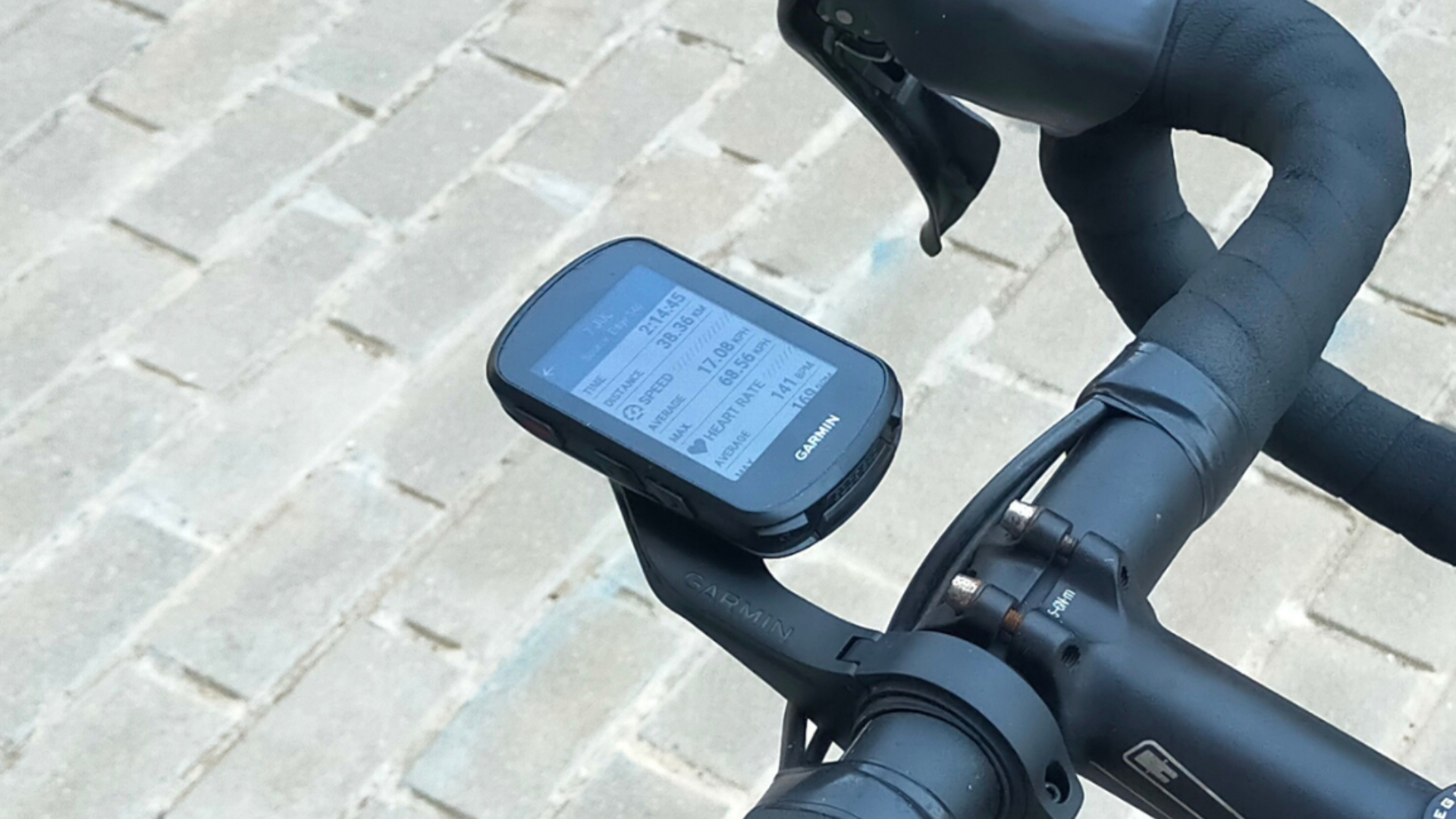
For more than a decade the various guises of the Garmin Edge have been the go-to head unit for cyclists around the world, and the latest version in the 800 series is aiming to further embed itself as one of the best cycling computers in today's market.
The 840 (along with its non-touchscreen sibling, Edge 540) has been updated for the first time in four years, and as well as adding another '10' onto the previous iteration, the 830, it marries together many of its much-loved previous features with that of the newer and larger Garmin Edge 1040.
Garmin’s aim is to “dramatically elevate any cyclist’s training” with the 840, and users can expect more data insights (including an expanded climbing assist tool) and on-screen workout prompts than ever before. The head unit also boasts a significantly longer battery life of up to an advertised 32 hours; when in battery save mode that can be extended to a claimed 60 hours.
For a little bit more money, buyers can upgrade to the Solar version which, as its name indicates, reflects the fact that the unit self-charges when powered on and under direct sunlight.
I had the Garmin Edge 840 on test for over two months and was really impressed by pretty much everything.
Garmin Edge 840: construction
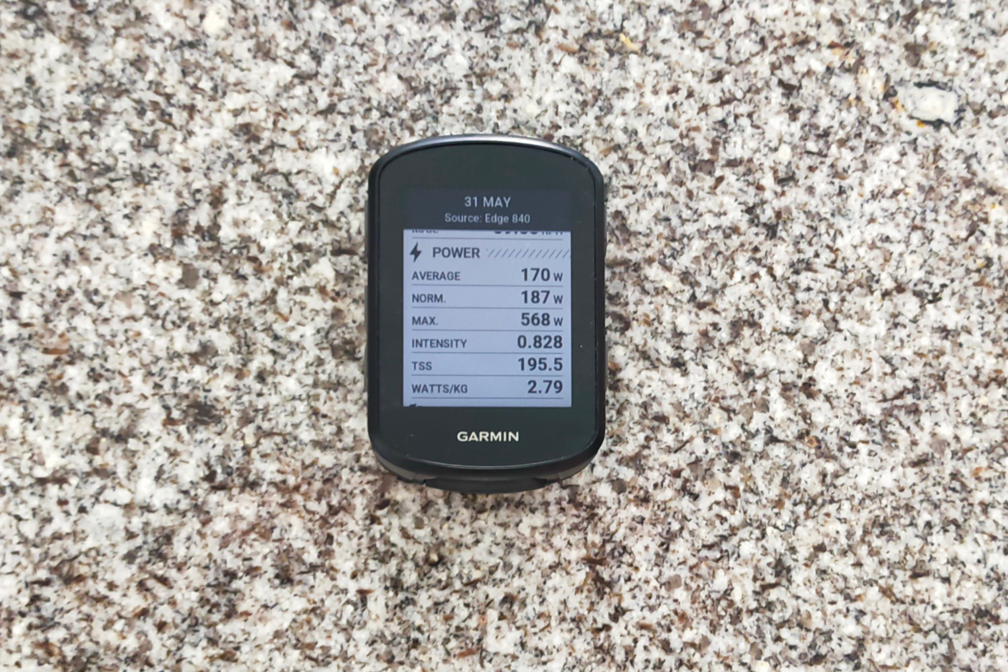
The first thing to say about the Edge 840 is that it retains the previous model’s compact size, measuring 5.8cm x 8.5cm and 1.97cm. The size of the color display screen is 6.6cm, with 246 x 322 pixels. Its weight, meanwhile, is just 89 grams. It is, put simply, a handlebar-friendly size.
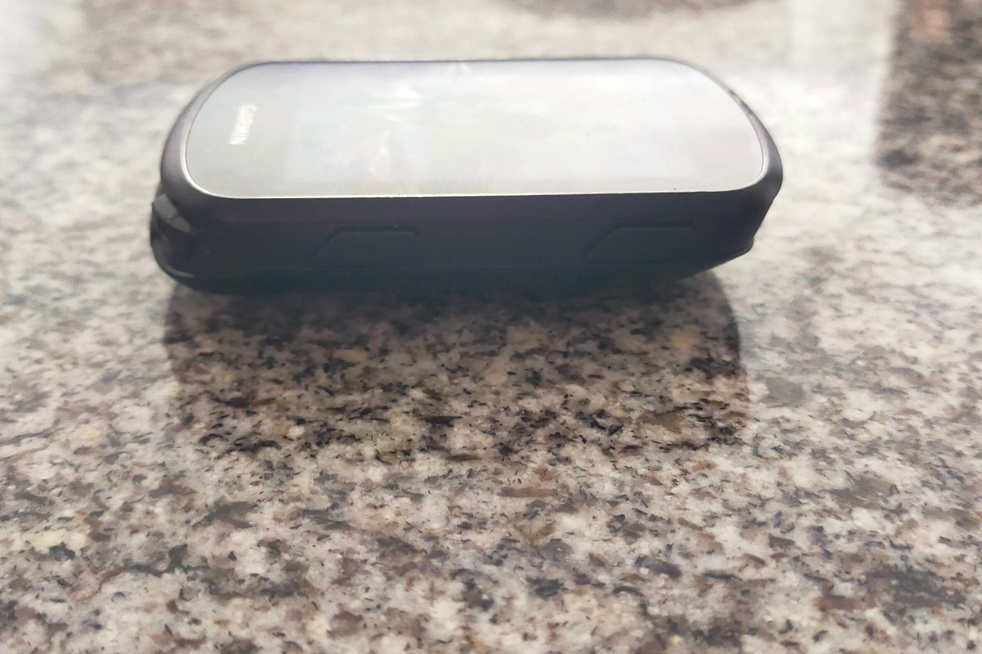
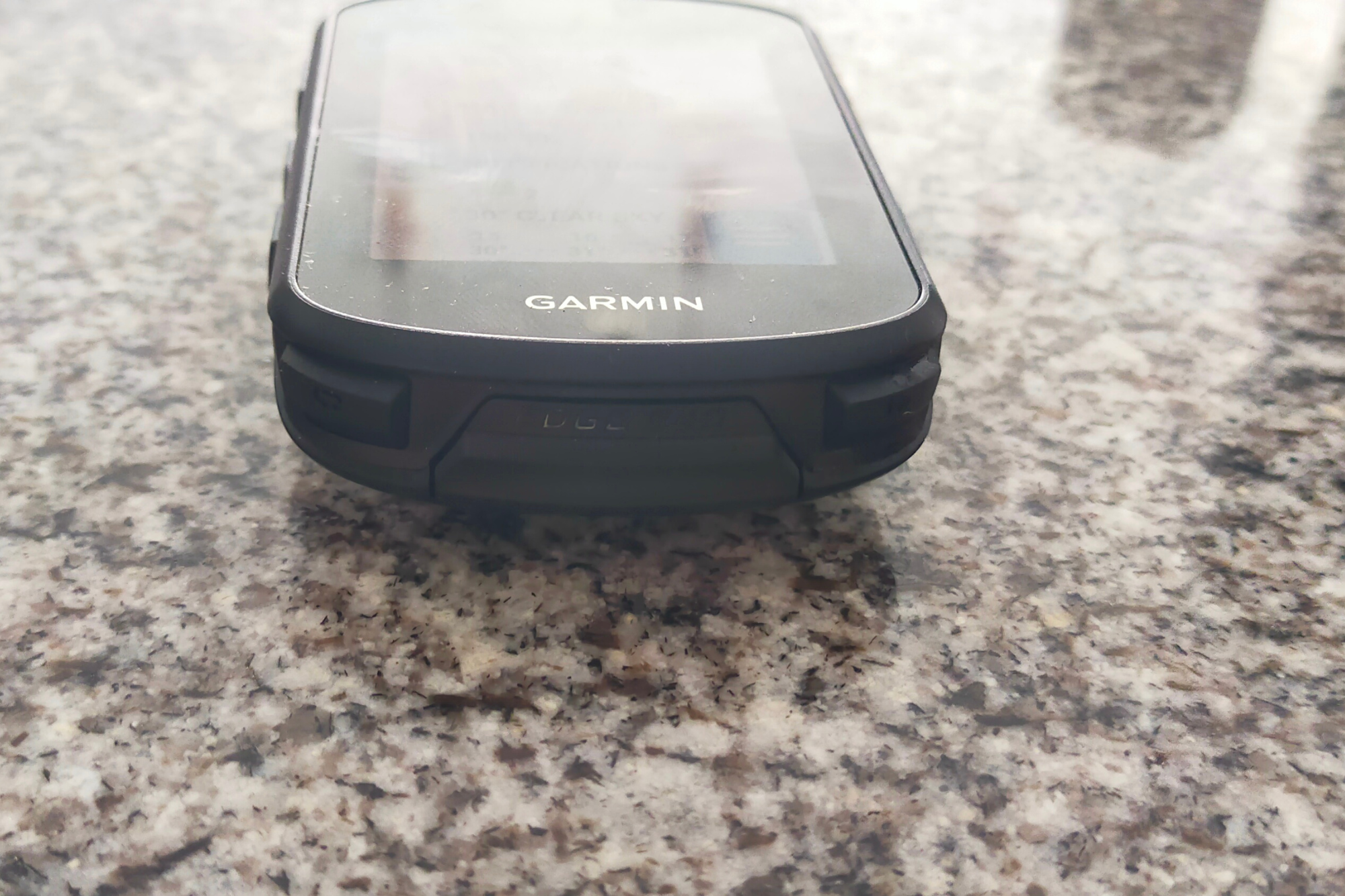
There are seven buttons on the head unit: the left side has an ‘on/off’ option, and two ‘scroll up/down’ toggles. The upper right side has a ‘select/ok’ button, and lower down there is a ‘back’ option. On the bottom of the head unit there are ‘lap’ and ‘stop/pause’ buttons, from left to right, respectively. All are easy to use, although occasionally the bottom buttons can be pressed accidentally.
It is not, however, necessary to use the buttons, for the Edge 840 is also touchscreen and it is as sensitive and reactive as that of a modern-day smartphone. This makes selecting, scrolling and swiping a simple affair (it should be noted I never tested the head unit using gloves). Personally, I preferred to use the touchscreen as opposed to the buttons as it meant I could swipe through pages much quicker.
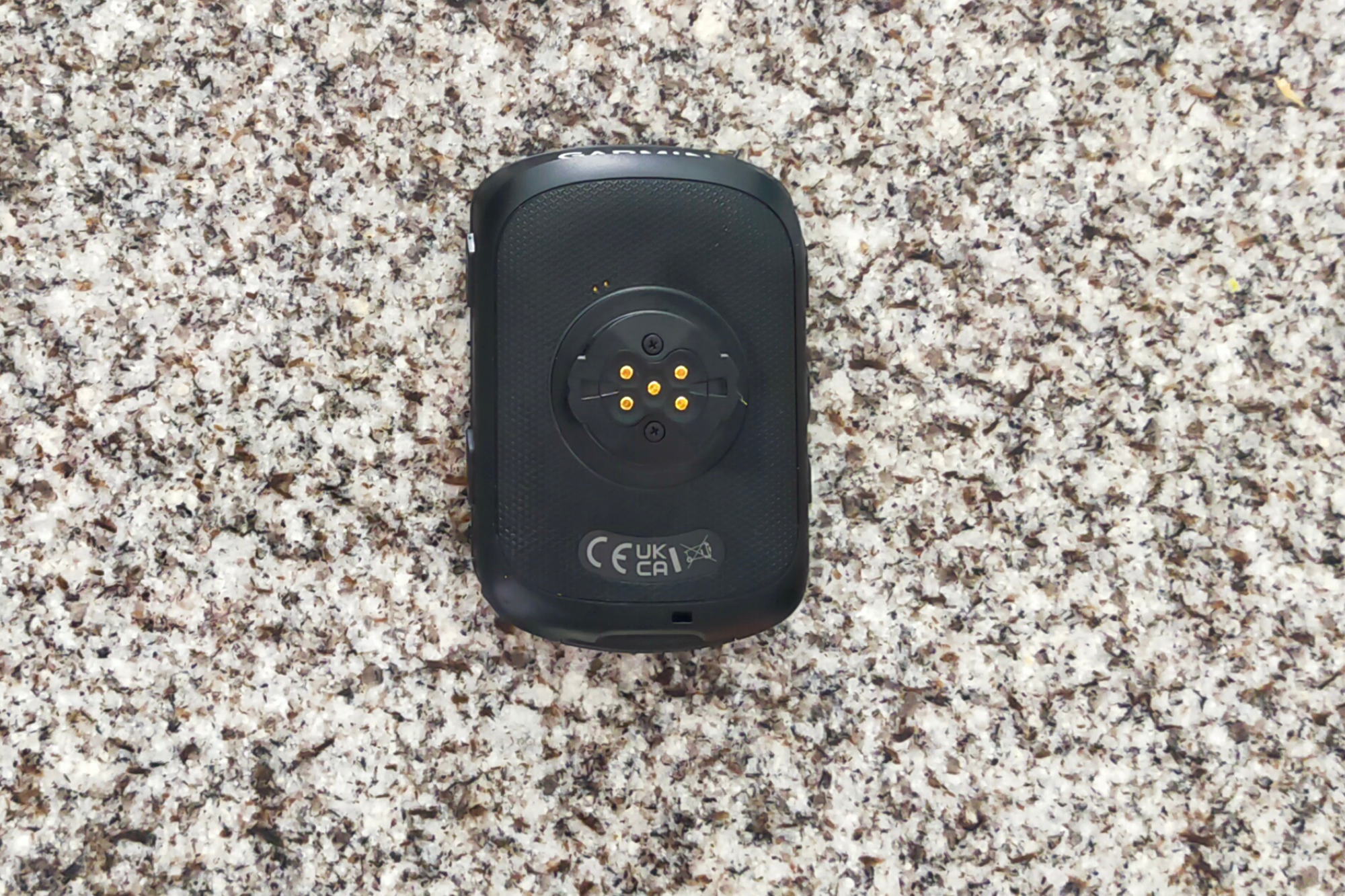
There are various mounting options onto the handlebar and stems, but I preferred the handlebar mount that sits in front of the handlebars. It’s an easy twist and click to sit the head unit in place, and there were never any issues with stability, even when going over bumpy terrain.
Garmin Edge 840: set-up, features, connectivity
To set-up the device, users must download the Garmin Connect app, and the whole process of having the Edge 840 ready to head out the house takes around 15 minutes. If you are a previous Garmin user, all previous sports data will automatically load onto the device. When powering up the unit, the user can select multiple profiles to use, including road, indoor and MTB options.
The home screen is simple and user-friendly, although at the beginning I did have some trouble in learning how to get back to a ride - and the sheer quantity of options means it’s not so easy to find exactly what you’re looking for.
If I was to list all of the training, planning and analytical features that come with the Edge 840, it’d develop into a 'too long; didn’t read' type list. But, briefly, the basics (distance, time, speed, elevation, etc.) are all there alongside the training essentials (power, heart rate, cadence). And then there’s countless more, further cementing the perception that Garmin have become the experts in providing an apparent limitless amount of data fields and page options.
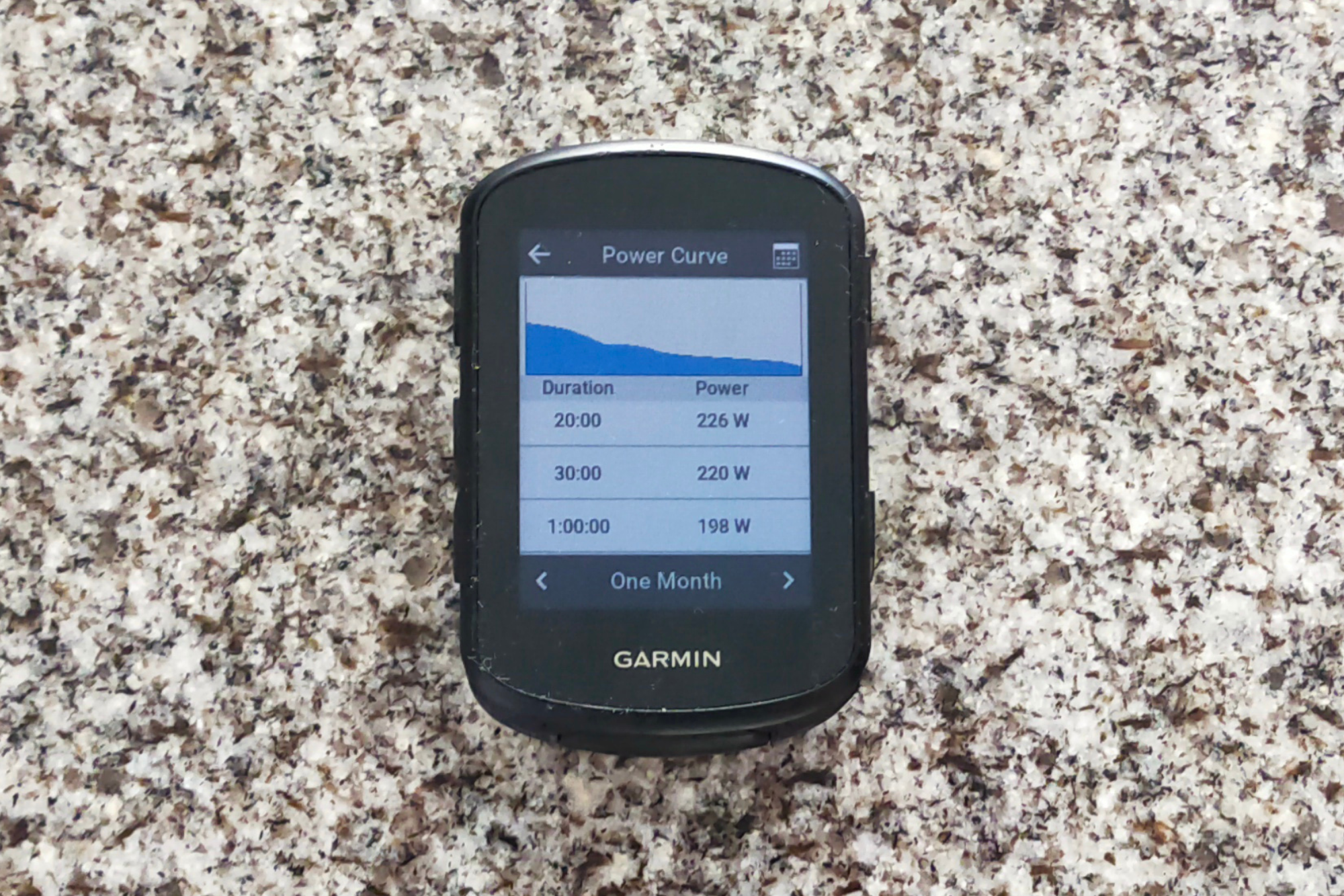
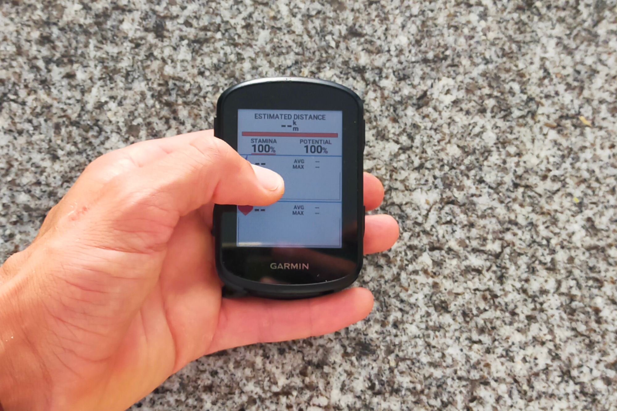
Rather than talk about all the training metric features, the two that caught my eye were the ClimbPro and Real Time Stamina features. The former loads up a dedicated climb screen for an ascent (even if there is no preloaded course) with gradient, distance and other pieces of information visible. Elsewhere, the Real Time Stamina feature is a really clever addition that estimates the rider’s stamina and potential, with their heart rate and power figures from the last few minutes visible. It’s a tool that can help a rider monitor their effort.
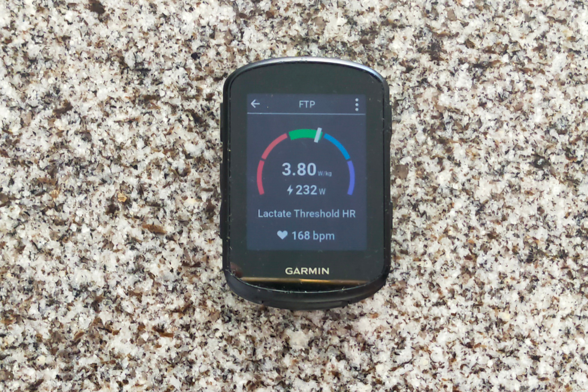
Talking about measuring performance, as with most Garmins, users can monitor their VO2 max and FTP, with lots of loaded profiles available on the unit to do so (you can also download training sessions and follow them on screen). Frequent personal best notifications pop up, and each rider has a training dissection page which shows the impact of training on one’s anaerobic or aerobic levels, for example. The Garmin Connect app further details the effect of training, including how much time was spent pedalling in and out of the saddle.
As soon as a ride is complete, it can be loaded onto Strava and other riding apps within seconds. Coming equipped with Bluetooth, WiFi and ANT+, the connectivity between the head unit and Androids and iPhone was excellent, as well as speedy. I design my routes on Komoot, and they’d appear on my Garmin Edge 840 within 30 seconds.
There are equally fantastic connectivity links with heart rate monitors, lights and cameras, and almost all types of power meters. The drop down bar on the home screen shows the current battery level of such connected features.
Garmin Edge 840: mapping and navigation
The new version comes equipped with the multiband Global Navigation Satellite System (GNSS) that enhances positioning accuracy. The maps are as detailed and thorough as we have come to expect from Garmin and the GPS accuracy was correct to a few metres. Connection to satellites is almost instantaneous, and certainly significantly quicker than any other cycling computer I have used before.
The head unit also takes a feature from the 1040 and highlights popular roads and trails for users, as well as points of interest. Living in Spain and always being conscious of dwindling water supplies, I particularly loved the fact that water fountains were highlighted.
While the Edge 840 has plenty of prompt signals and navigation is very straightforward with a very responsive pause and ride option embedded, it is in the mapping where I have my biggest grievances with this head unit.
Firstly, I grew ever more irritated by the computer reverting back to its default position of 80m on the screen. At times, I want to zoom out to a wider view of maybe 500m to see what is up ahead navigation-wise, but it would change back to 80m quite quickly.
Similarly, if I was on a separate page to the map and I had to change direction but didn’t do as instructed, it would linger on the direction page for around 20 seconds. This would mean that the route I was continuing on was not immediately obvious, and I could no longer accurately ride to power as I had been, for example.
I have to be honest and say that I found the ClimbPro feature good (although I understand why for some people it would be an annoyance) but I was disappointed by the climbing gradients and map in general. On many occasions, the pages didn’t update well enough. For example: on a road I regularly ride on, the climbing page would say I was climbing a gradient of six percent when it was in fact flat, and though that can be put down to an error on one stretch of road, on many occasions the Garmin would tell me I had completed a climb - only for me still to be pushing my bike up positive digit gradients. What’s more, the gradient map on the main mapping screen often doesn’t make sense with a random allocation of greens and oranges that don’t provide any helpful information.
If I was riding without a preloaded course but wanted to be navigated to a spot, I could select a location on the screen and click ‘Ride’. A sip of water later and it would have loaded up, but when I tried this for anything over 50km away, the Garmin really, really struggled to compute the task, and repeatedly crashed and froze. Now, it is rare for me to do such a thing (I pretty much always design routes before leaving the door), but it was interesting to note the head unit’s limits in self-navigation.
Garmin Edge 840: value and conclusion
Garmin’s intention in making the Edge 840 the must-have device for all cyclists seeking to improve their training is mostly a resounding success. There are so many performance and training features that any seriously committed rider has no excuse for bettering their performance using the Edge 840.
So many features and training metrics, however, can be daunting, and it is for that reason that I still prefer Wahoo cycling computers as I find them much friendlier. While that is just a personal choice and many will disagree, I cannot get away from the fact that Wahoo also reports gradients on a climb significantly better. The problems with the mapping as outlined above were the only real disappointment for me in what is otherwise a truly excellent piece of kit.
Possessing so many hours of battery life makes the Edge 840 the industry leader on affordable head units for those who are heading out on multi-day rides. Even if the time spent on the bike is just a few hours, though, all users will be satisfied with what is staring them back in the face.
The only tangible difference with the Edge 540 (see review here) is that the 840 is touchscreen capable - although you will pay an extra $150 / £100 for this luxury. Would I choose the 840 over the 1040? Personally, yes, because I don’t need a much bigger head unit in front of me, but others have different preferences.
In conclusion, the features offered by the Edge 540, 840 and 1040 are now almost identical, and what you choose depends on how much you want to spend, whether or not you want a touchscreen, and how big you want the head unit to be. Aside from that, they all do the same job.
Garmin Edge 840: specs
- Size: 5.8cm x 8.5cm and 1.97cm
- Display size: 66mm
- Display type: 246 x 322 pixels
- Weight: 89 grams
- Water rating: IPX7
- Memory: 32GB
- Battery life: Up to 32 hours (60 hours in battery save mode)
- Connectivity: Bluetooth, ANT+, WiFi
- Smartphone compatibility: Android, iPhone


