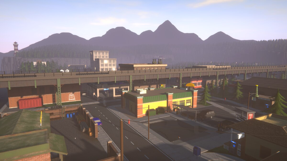
I like how Schedule 1's menu is styled like a smartphone. It makes sense with the setting and has a useful built-in clock. But even if it makes for a cool UI, it's not quite the peak user experience if you want to see everything at once.
The normal map is crammed into a small central portion of the screen, making it hard to zoom in and see the details without losing track of where you are. That’s why we created a giant, full-screen version of Schedule 1’s city of Hyland Point, complete with symbols indicating the most important locations in the game.