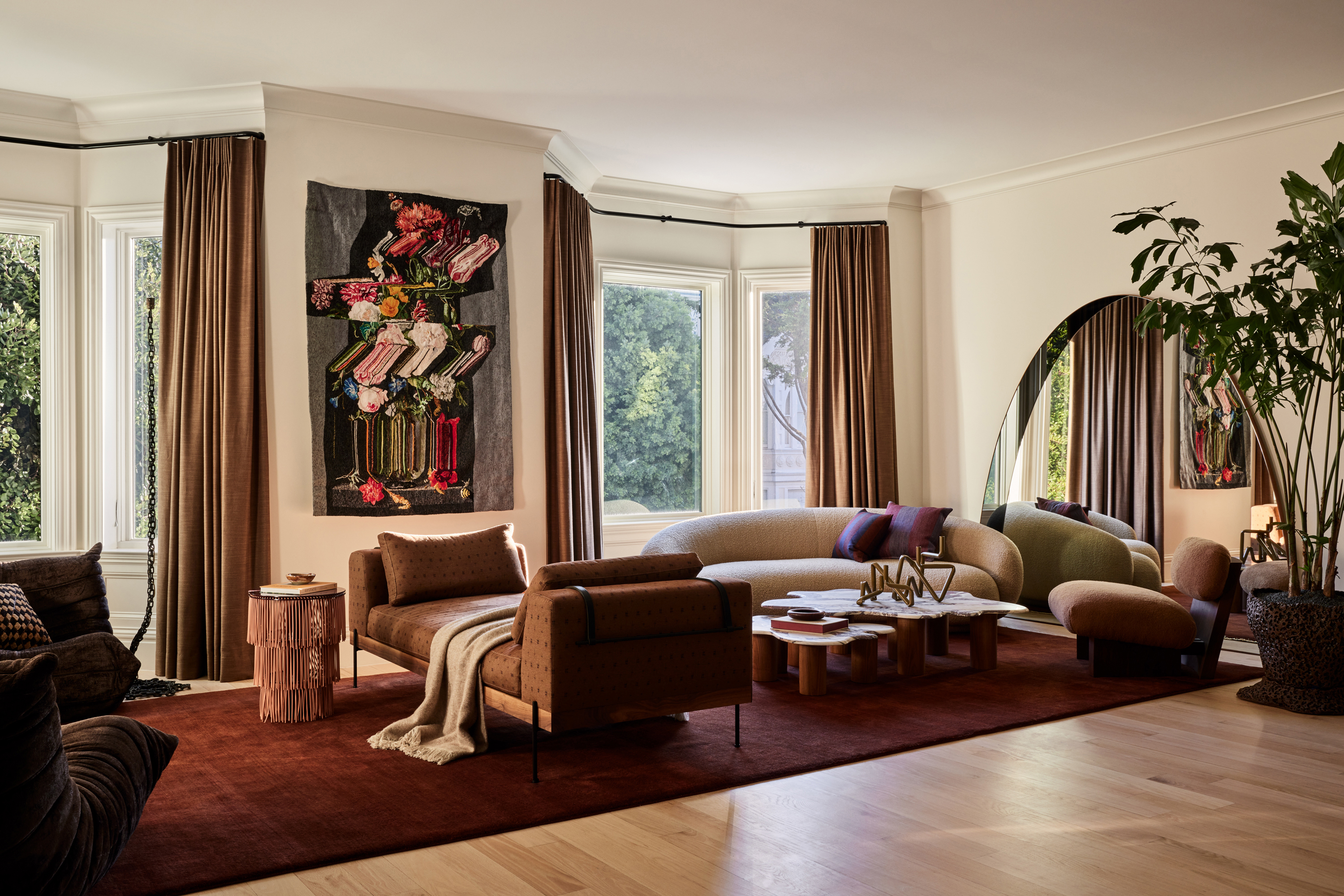
This classically styled 1920s San Francisco house – located in the charming Pacific Heights neighborhood - was first renovated in the early 2000s. So, when its new owners asked architecture and interior design firm Studio Plow to come on board for its latest revamp, those noughties interiors were feeling quite dated.
Because the family needed to move in quickly, there was no grace period to ponder different options and instead, the studio had to hit the ground running. ‘One of our biggest challenges was the timeline,’ remembers Brit Epperson, founder and chief creative officer of Studio Plow. ‘In the initial renovation, the interior finishes had to happen immediately.’
Brit and her team set to work updating key aspects of the home first. This involved the likes of sanding down and lightening the oak floors, repainting walls from a cool blue-gray to a warmer ivory, and changing all the hardware, plumbing, and so on. 'We also wanted to be mindful of wastefulness so, where we could, we salvaged or reframed elements,' she says. 'Over the following year, we added layers of furniture, curtains, wallcoverings, and art.’ Here, we take a closer look inside to see the finished result of this characterful and creative modern home.
Kitchen
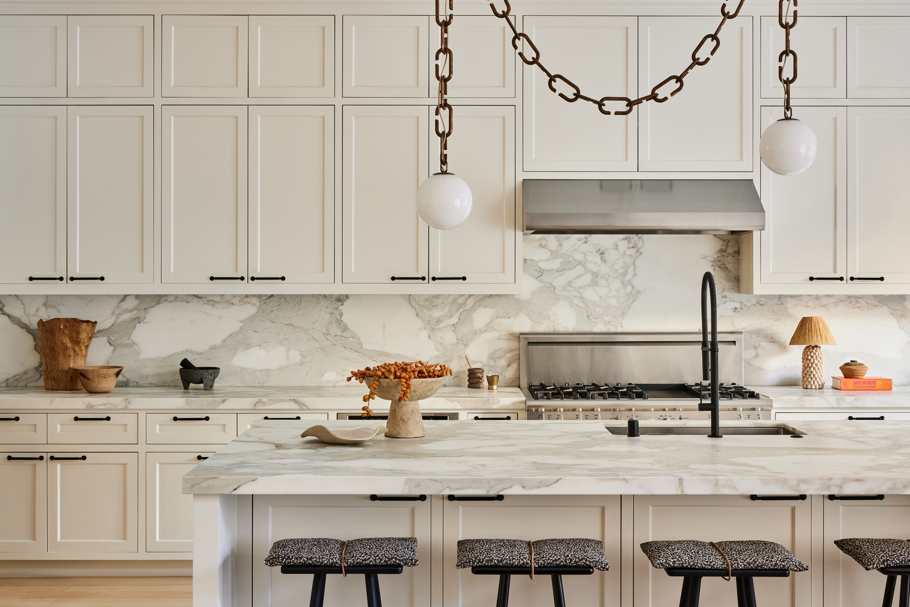
Only small updates were needed in the kitchen. ‘We reworked the floors, faucets, fixtures, handles, and lighting to give the room new life,’ says Brit Epperson of Plow Studio. The Serif double pendant lights by Trueing are one of a kind, connected by a gold strip to give a chic vibe. The black Georg stools by Skagerak look minimalistic when accompanied with the cushions in Raf Simons fabric from Kvadrat.
Living Room
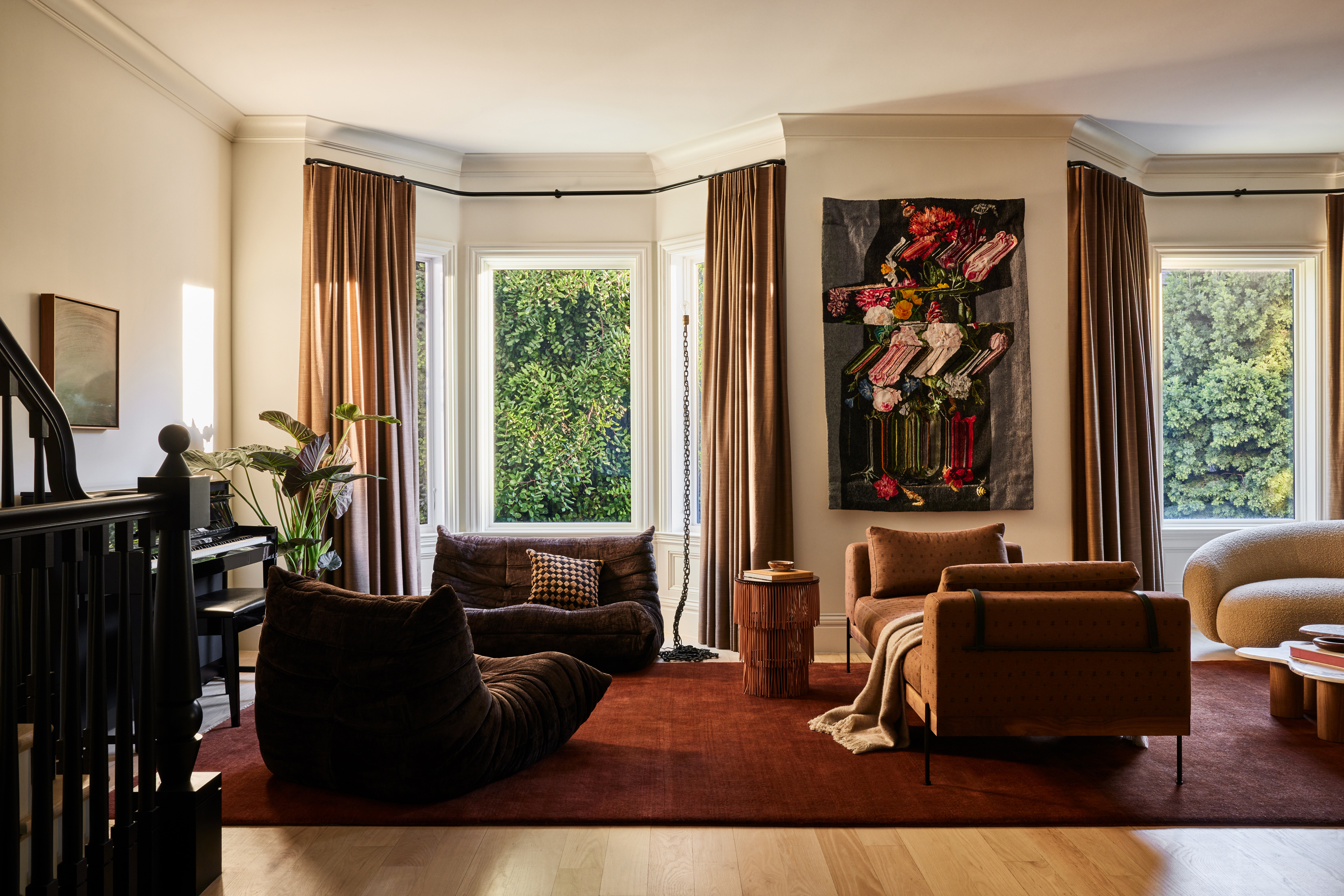
The color palette for each space was based around its functions, so the living room is anchored by a deep wine-colored rug to emphasize the social use of the space. The wife, in particular, inspired the project thanks to her twin passions for art and fashion. ‘She has a strong cultural connection to many of the pieces featured throughout the house,’ says Brit. 'To date, this has been the most art-intensive project for us'
A large arched mirror at one end makes this space feel larger than it already is. A combination of several different kinds of sofas is used to symbolize the different spaces within the living room. The spotlight is on the Julep sofa by Tacchini, covered in boucle fabric from Dedar. The Jia chair from Atelier de Troupe also stands out, while the custom rug from Armadillo binds the whole room together.
To create the harmonious atmosphere the couple desired, as well as providing a sense of balance, the Plow team carefully combined bright, warm touches with more moody moments. Despite that element of practicality, the addition of art was a significant part of the couple’s brief for the interiors. ‘The collaborations we developed with artists and artisans were key to the success of it,’ notes Brit. 'The art pieces that were selected had to have a story related to the homeowners.' It is those kinds of thoughtful details, she adds, that succeeded in ‘turning the house into a home’.
Family Room
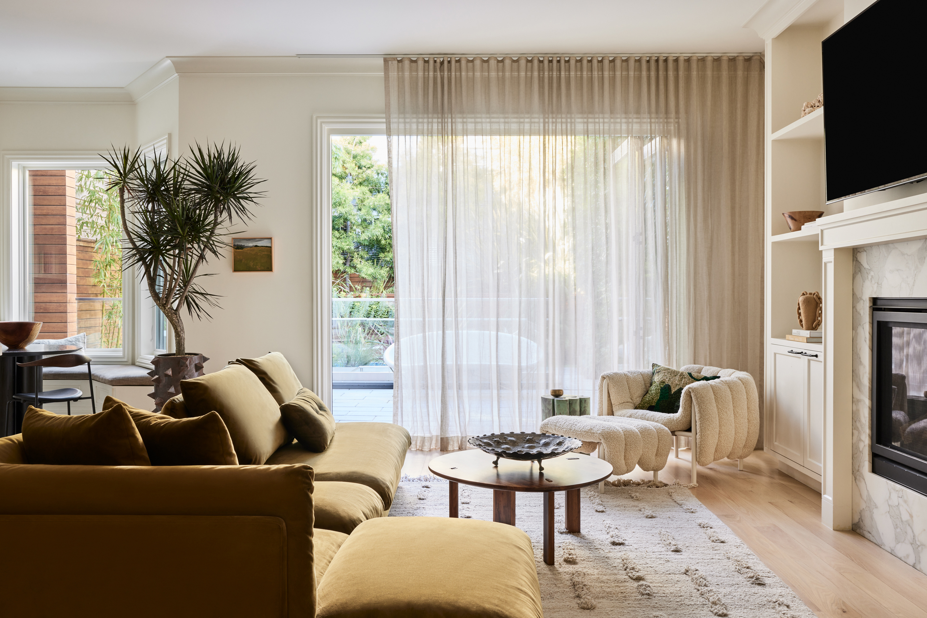
This bright family room still feels ultra cozy because of the wonderful materiality – from the texture of the lounge chair to the soft folds of the floor-to-ceiling curtains. The olive green accent hues in the family room exude a sense of calm.
The Laine rug from Sera Helsinki goes perfectly with the puffy lounge chair by Faye Toogood, Hem, while the Tenon table by Akron Street works in contrast to the olive green sofa.
Playroom
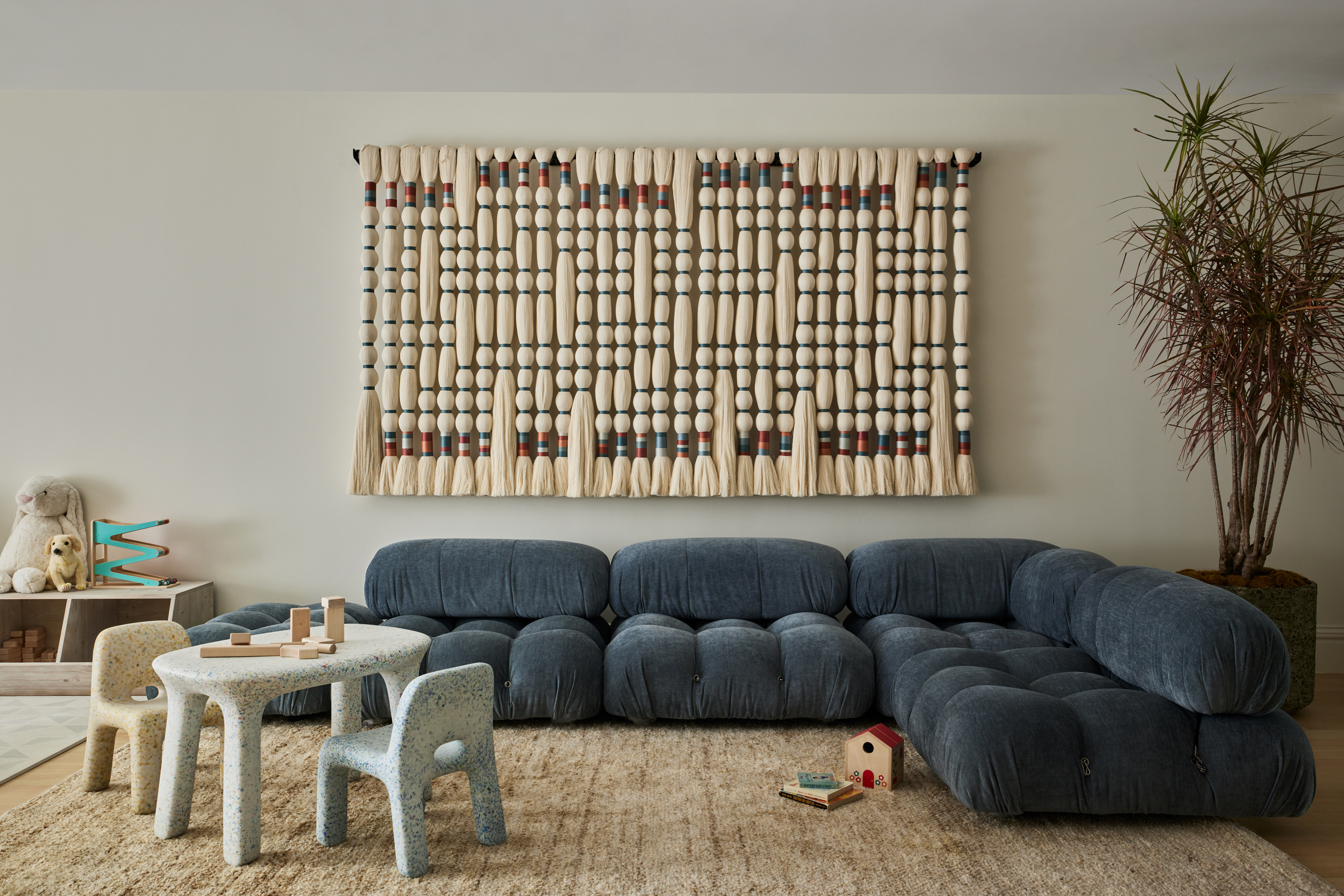
Even the playroom is wonderfully curated. ‘The walls here were originally covered in Dr. Seuss murals,' explains Brit. 'It was a vibe, but not the one we were looking for. It was important to our client to have a room that was both comfy and inviting for adults as well as kids, so we created this soft, art-filled space to foster play and creativity without sacrificing the calm aesthetic of the rest of the home.’
In the playroom, the blue sofa from Eternity Modern injects some fun to contrast the neutral tone. 'The raw cotton braided tapestry in the playroom was made in Querétaro, Mexico, close to our client’s childhood home,’ elaborates Brit, in reference to the tapestry that hangs above the blue sofa, blending in well with the cream-colored Kalahari rug from Armadillo. All Bright tables and chairs for kids are from ecoBirdy, while the storage bench by RH maintains the minimalist look of the room.
Main Bedroom
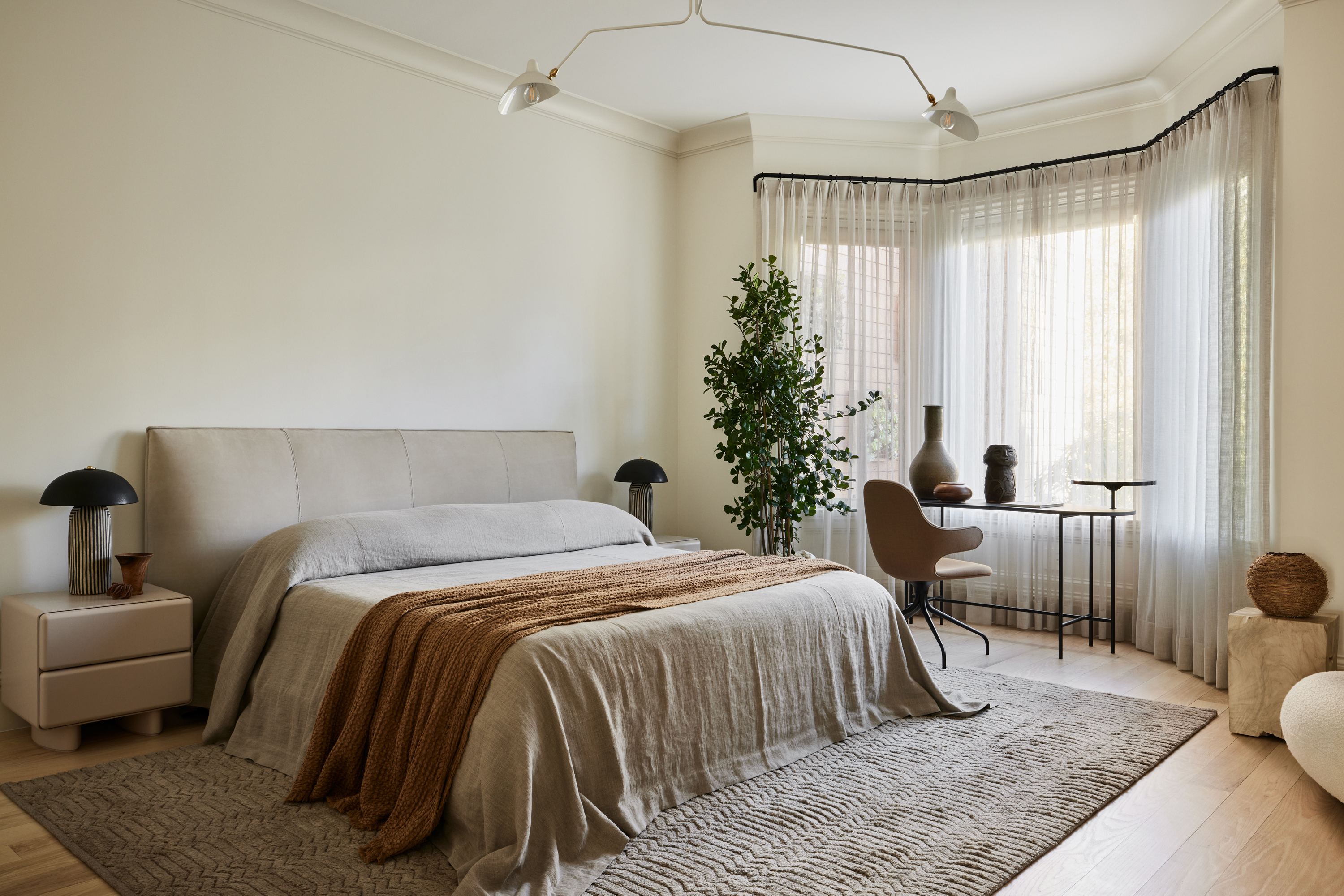
‘We jokingIy say that this duvet is “not your granny’s coverlet”,’ says Brit. ‘We designed the Summerlet linen coverlet to drape all the way to the ground for this particular room. We loved it so much we made it a part of our exclusive line, available at Haus of Plow.’
The primary suite has a much more introverted mood thanks to its earthy palette. Natural and tactile materials such as wool rugs, wood surfaces and recycled fabrics prevail in different areas. ‘It was important that nothing felt too “precious”,’ says Brit.
Highlights of the bedroom include the Wythe bed by Maiden Home seen with a brown throw from Hale Mercantile Co. The rather unique-looking Tera Stripe bedside lamp is from Ceramicah while the patterned Rug is from Armadillo.


.jpg?w=600)


