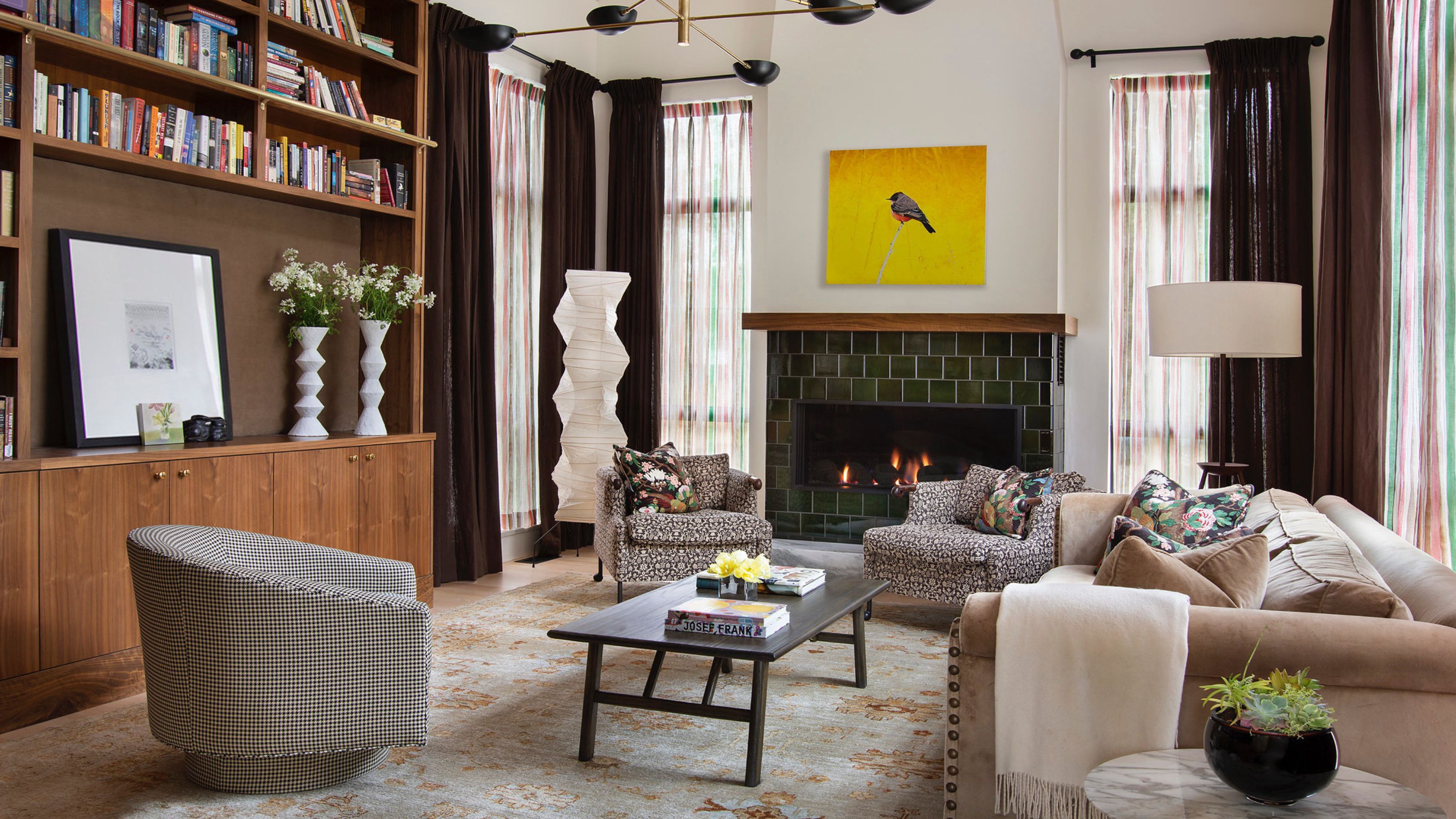
With a growing multitude of configurations, coming up with living room layout ideas can feel like a never-ending puzzle, at times. Understanding your space and its function is a great place to start, as this will drive not only your layout, but your choice of furniture, lighting, and finishes too.
Taking the time to consider how you will use the room and how you will move through it on a day-to-day basis will allow you to better visualize your living room ideas, and how the space will work. It’s key to consider where you want to direct the eye to. “You respect and emphasize the focal points of a room. There might not just be one," says Jeremiah Young, owner and creative director of Montana-based studio, Kibler & Kirch. "Direct your major furniture at those focal points and then add one odd or random element to make it more visually interesting."
To give you a better idea of how to navigate the pitfalls and dangers of living room layouts, we’ve discussed ideas and advice with the experts so you can pick the perfect option. Here's what they recommend.
1. DESIGN A MULTI-PURPOSE LAYOUT

"Creating a living room layout that remains open and flexible allows the space to adapt to various needs over time," says Berenice Curt, founder of Berenice Curt Architecture. "By avoiding rigid furniture placement or a strictly defined function, the room can easily transition between activities like entertaining, relaxing, or even working from home.”
The French designer’s advice is brought to life in the modern living room furniture in her Deauville apartment project (shown above) where the minimal and clean lines of the sofa and dining room keep the space connected but equally separate. The homeowners can seamlessly move from one moment to the next; this freedom of movement is an essential element in crafting a layout that celebrates both aestheticism and practicality.
2. USE YOUR FURNITURE TO FRAME THE WINDOWS
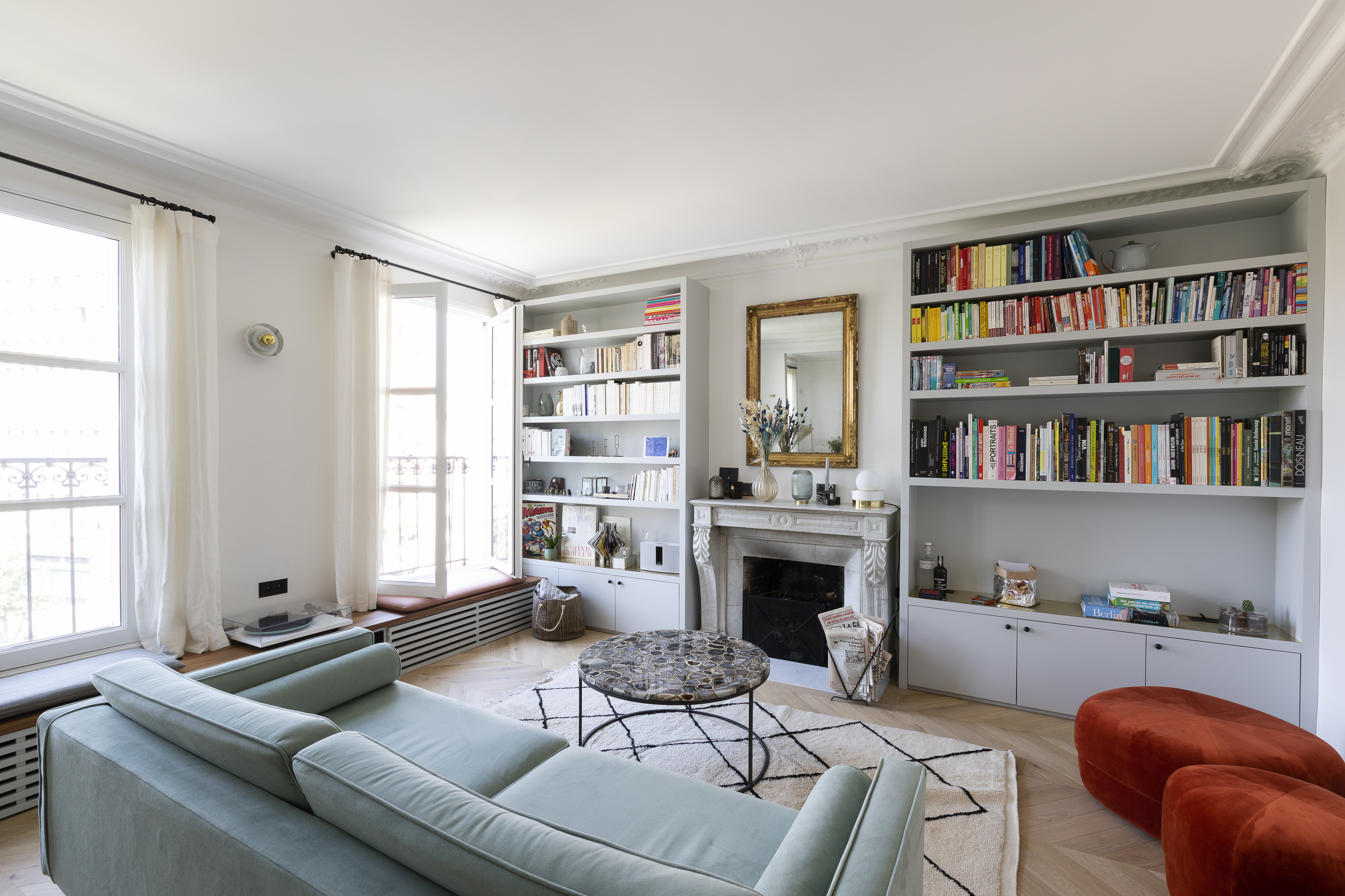
This open-plan Parisian apartment designed by Archipelles shows us why the window is such a prominent factor to consider when thinking about your living room layout. You want to choose a layout that makes the most of the natural light and keeps the space well-lit throughout the day.
The bespoke window seats that sit beneath each not only offer additional seating in this design, but also encourage conversation and congregation around the fireplace. More than that, though, they also “Cleverly conceal the radiators while providing elegant access to the terrace,” says Hélène Paoli, founder of design studio Archipelles.
3. DOUBLE UP ON YOUR SOFAS AND ARMCHAIRS
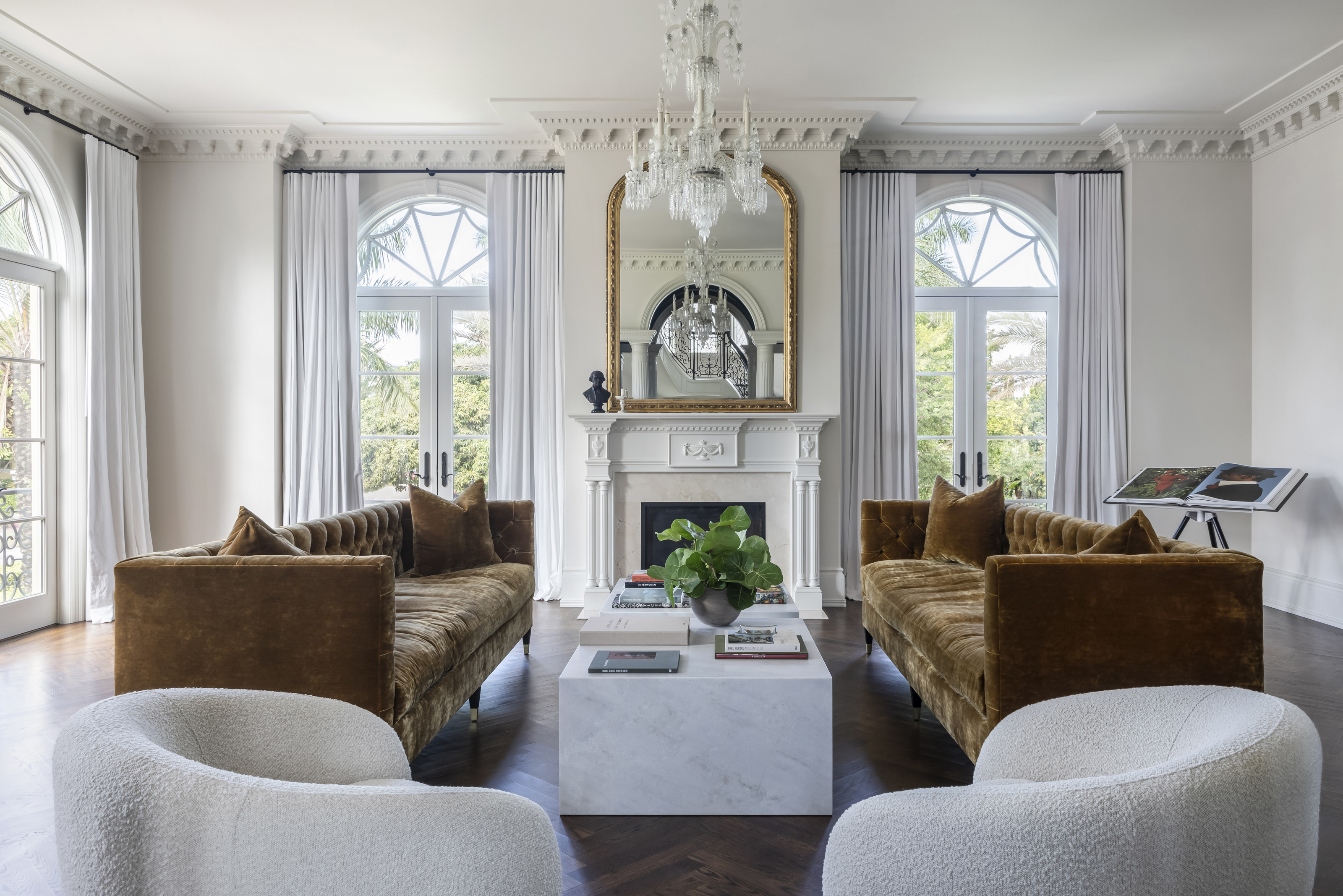
As humans, we love symmetry, so this layout designed by Sherry Shirah Design is beyond easy to fall in love with. As the fireplace and coffee table create a focal point, the sofas and armchairs running parallel on either side bring the scheme into balance.
This is a layout that’s perfect for those seeking calm and a sense of order in their environment as it’s organized yet inviting. “The interior design of the house is classical in nature, so it was important that we have a classic but modern touch for the furnishings marrying the old world with the new world," says interior designer, Sherry Shirah. "We chose to create two long tufted back sofas, by Grant Trick, that would allow you to take in the views inside and outside of the room. The club swivel chairs were chosen for this reason as well."
4. OPT FOR A WELL-PROPORTIONED MIX OF FURNITURE AND LIGHTING
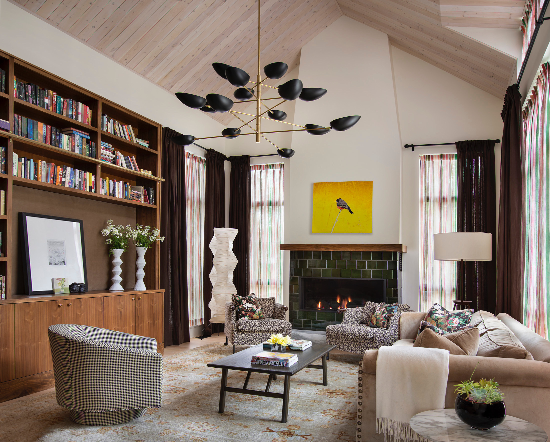
For this project, design studio Kibler & Kirch balance character with calm in their living room layout. The pair of armchairs by the fire, the soft caramel sofa, and check covered seat all sit around the coffee table — each retaining its own flavor but contributing to the bigger picture.
The secret to this layout lies in its perfectly balanced proportions, as the firm's owner and creative director Jeremiah Young explains. “First of all, your furniture has to be in scale with the room’s height and floor space, but also with the mass of the architectural elements. You find out how to stand up to the scale of the room or adapt to smaller-scale furnishings when it’s not a big room."
He goes on to say that too often, people mistakenly fill large living rooms with small furniture. "Here we have a really large bookcase that covers most of one wall of the room and that required a very large sofa to weight against it on the opposite side," he says. "The green Heath tile fireplace needed something to ground it and stand up to its scale, so a pair (every room needs at least one pair of something) of comfy chairs frame the view and provide the proverbial 'seat by the fire'.”
5. CREATE AN INVITING NOOK WITH YOUR SOFA AND TABLE
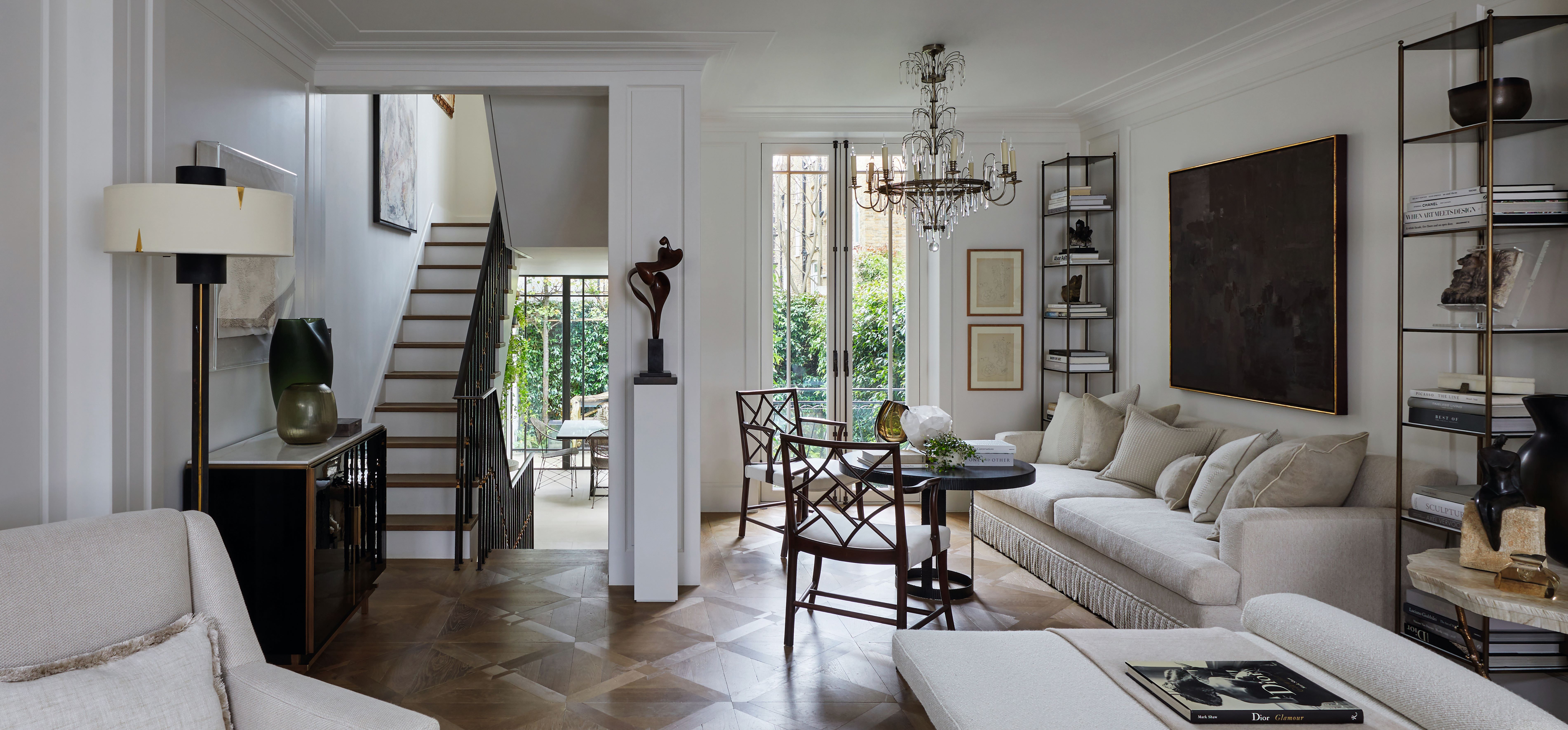
The thread of scale runs through in this example from award-winning designer Louise Bradley too but her execution is a little different. For this charming Chelsea townhouse, the designer blends formality with comfort by pairing a sofa, table, and chairs. Her clients can easily use this recline into the upholstery or choose to enjoy their cup of coffee in a more structured setting. It’s wonderfully versatile and welcoming.
“When visualizing a living room, the most important factor to consider is the scale of the space and how you want to use it. A living room should always include a comfortable and inviting sofa," she says. "In London townhouses space can be limited, however running the sofa along a wall, and in this instance with the paneling framing it, it created a calming nook for relaxing. Its position next to the French doors meant that it was the perfect place to spend time in the morning with coffee or in the evenings. To complement the design, I placed a large contrasting artwork behind the sofa and added textures using my new fabric collection of neutral-colored cushions to lead the eye across the room."
6. USE RUGS AND LIGHTING TO BREAK UP THE ROOM

Australian designer Greg Natale offers a lesson in the art of an open-plan living room layout in this project. The expansive kitchen/living and dining area is one room, but the use of rugs and lighting gives each area a sense of privacy and atmosphere.
“In a large, open-plan layout, we use rugs and pendant lights to help visualize how we will create designated living areas that feel separate from one another despite being in the same space," he explains. "A dynamic, eye-catching pendant light hangs above each furniture setting to anchor it in place, and a rectangular rug cordons off the formal lounge. It becomes a kind of threshold; once you step off that rug, you feel like you’ve left that room.”
This approach can work in small living room layouts too, as you create scenic vignettes rather than distinctive zones.
7. CREATE A FOCAL POINT WITH YOUR FURNITURE
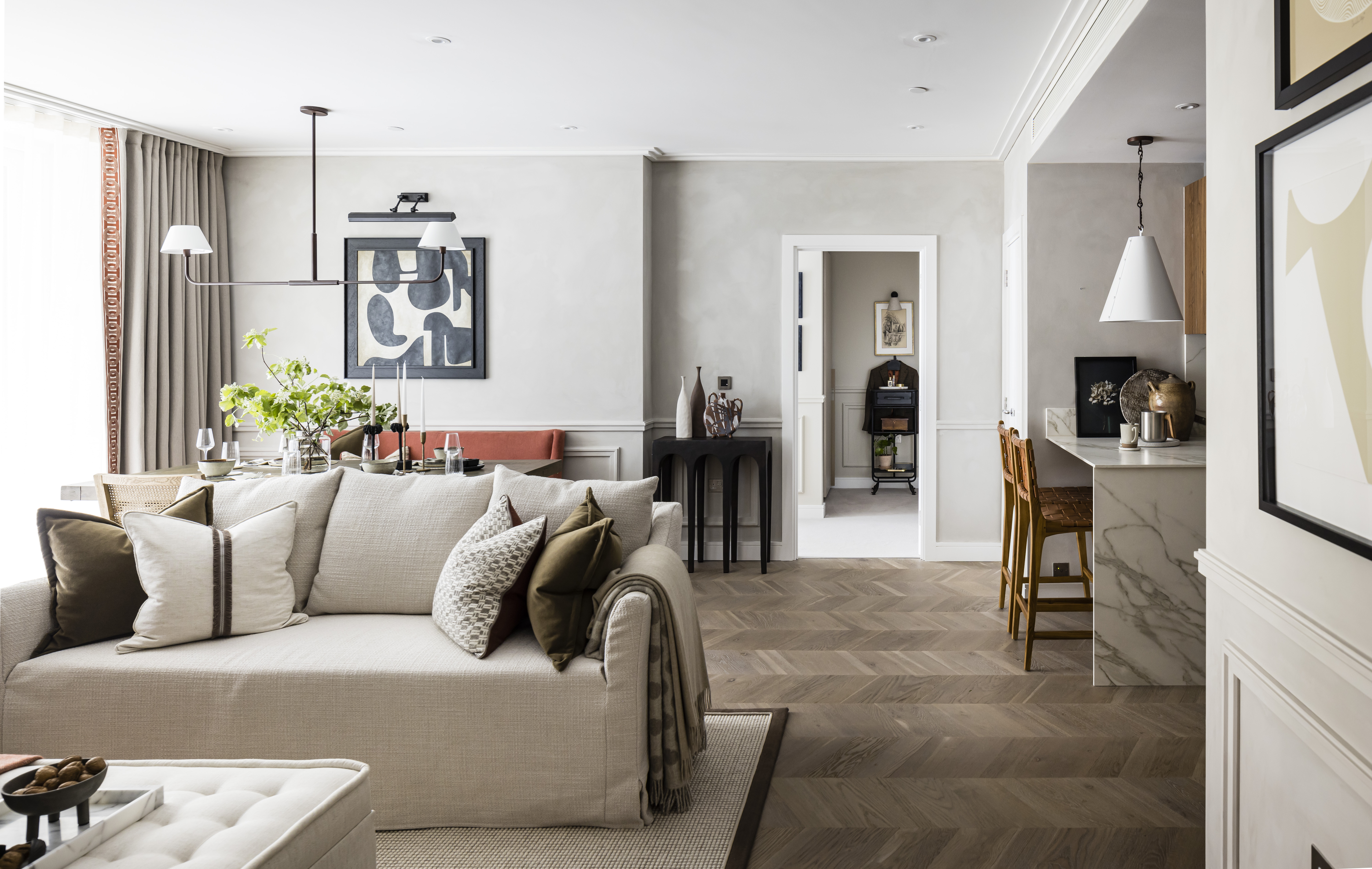
Much like people, layouts can also make memorable impressions. When designing your interior, carefully consider how the room function aligns with the layout. This modern home created by contemporary studio Honky seeks to elevate the experience of a family connecting around the fireplace. The pair of bright russet armchairs and soothing grey day bed and sofa all anchor around this feature.
The studio echoes the importance of considering function first. “Think about how you will use the room. Is there a view you will enjoy facing? Is there a light-filled spot for reading that you want to take advantage of?" says Paul Dawson, the studio's design director. "In this interior, we were blessed with a large and spacious room that allows easy walkways around the perimeter of the room and the coffee table.”
8. SURROUND YOUR SEATING WITH EXPRESSIVE DECOR
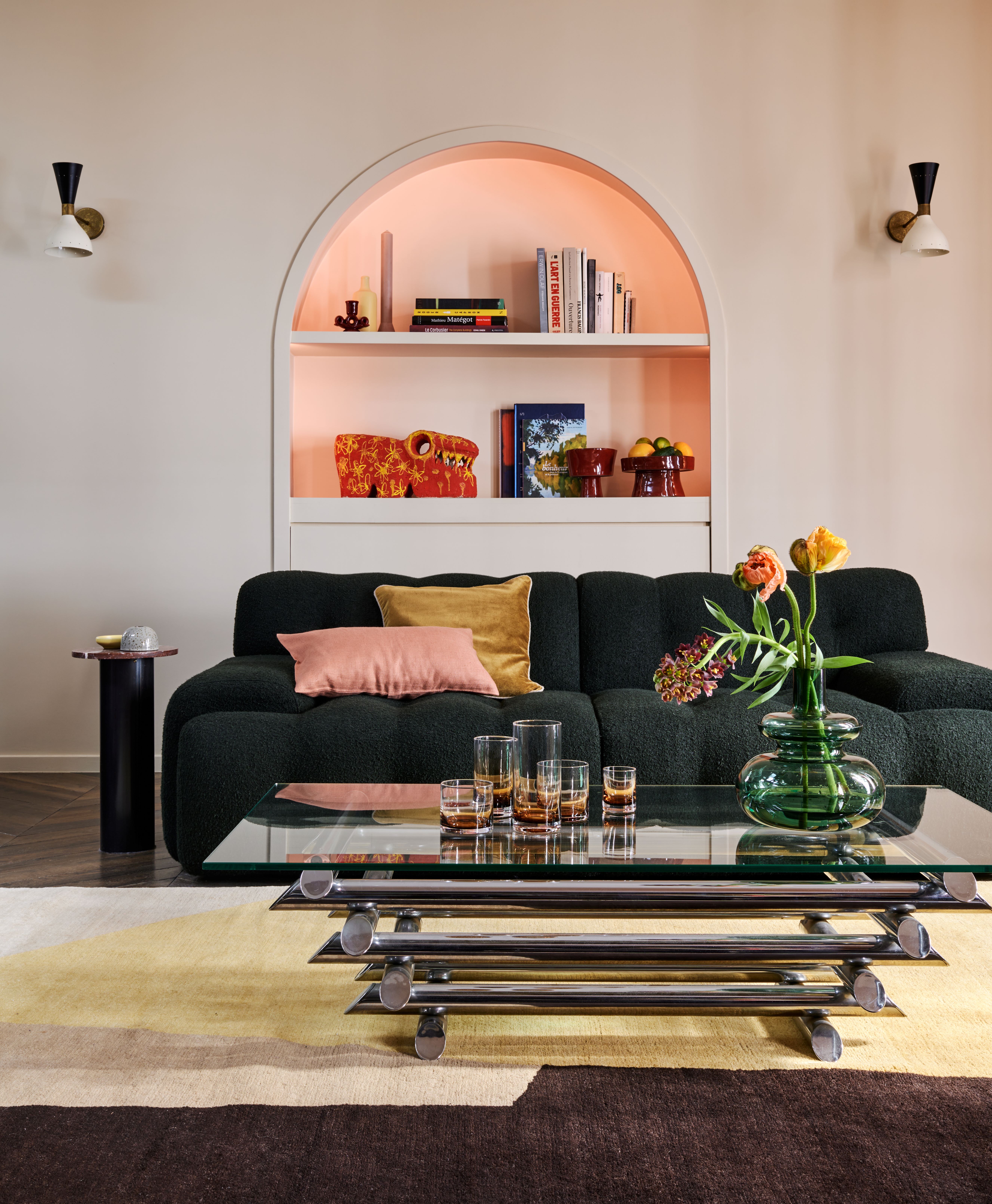
For his eclectic and mesmerizing Le Marais' apartment, French interior designer Thibaut Picard created a layout that celebrates reverie and beauty. The basic ingredients of a sofa, coffee table, and armchair are all present but fascinating objects give the room added intrigue.
“The color scheme was strong and the objects and works of art had a prominent place. We wanted to create a sofa that would have a presence while at the same time highlighting the objects around it," says Thibaut. "The green velvet complements the icy brown walls. This piece of furniture communicates with its surroundings and contributes to the overall coherence."
The important lesson here is also to remember that your layout is more than just the trinity of traditional living room staples and therefore, your decorative elements deserve to be factored into the design from the beginning.
FAQs
HOW DO I FIGURE OUT HOW TO LAYOUT A ROOM?
Akin to climbing a mountain, approach your layout one step at a time and it will be much easier. It’s always best to start with accurately capturing the footprint of your space and then considering in depth what purpose this room will serve and how its contents can fulfill that.
“We start by trying to understand how our clients want to live in a space, and then create a floor plan,” adds Sherry Shirah. Whilst finding the purpose of your room might feel like more of a philosophical exercise, the next step is rooted in the numbers.
“First, get a floor plan of the space. Viewing a room from an aerial standpoint always helps you see where there is or isn't symmetry, a focal point you want to emphasize, or a sight line that needs attention," says Melissa Welker, founder of Melissa Lacy Design. "Start by finding those points, then decide where to anchor the sofa and how the club chairs will fit. Mixing different heights makes a room more interesting as well, so always pay attention to back heights, arm heights, and how the scale of the room will work and feel. I'd also stress the importance of capturing the best light in a space. Never underestimate natural light needs.”
If in doubt, there are some easy wins too — rely on symmetry and grouping items. “You plan on pairs of things. Generally, the more traditional a room, the more pairs of things you use, but even in contemporary settings you need to use some pairs. The basis of beauty is symmetry first, then balance,” says Jeremiah Young.
HOW CAN I VISUALIZE LAYING OUT A LIVING ROOM?
Whilst interior designers and architects can create a detailed drawing of your living room layout ahead of the reality coming to life, this is not always accessible to everyone and also doesn’t always reflect the tactile nature of your scheme. So the question remains, how do we visualize a living room layout?
The answer depends on what works best for you. You can create your own scaled drawing or map out the space with masking tape but at its core, this exercise needs to help you make decisions and give you a sense of what the room will look and feel like with everything in it. It will take some time but well worth it when your room feels cohesive and not cluttered.
“Once your plan is finalized on paper, begin measuring in the actual space — lengths, depths, and heights. Create templates if necessary. Tape off the furniture plan, throw down the fabrics and focus on what each piece will look like with that fabric and in that room. It will come together,” says Melissa Welker.
If there is a single lesson to remember, it’s to always consider the scale of your items, as no piece of furniture is an island — they all have to work together. “Scale is so important when determining the size of furniture pieces. This is what contributes to making a room sing,” says interior designer, Sherry Shirah.


.jpg?w=600)


