Unexpected red theory brought home the power of an accent color to completely transform a room’s palette. An injection of that bold hue, however small, instantly elevates and dramatizes a scheme – it’s no wonder the internet went wild over it.
While red continues to be a huge color trend, we’ve noticed another color coming through in interior designers’ work that similarly energizes a room, even if it’s used in the smallest way: aqua. This vibrant blue hue is the equivalent of a cold bucket of water, adding a hit of coolness and instantly making things more interesting.
Still, aqua isn’t the easiest of shades to introduce – which is why we asked some of our favorite designers to talk us through how to use this accent color to great effect.
Why should you use aqua as a color accent?

The cool undertones of aqua are exactly what makes it an effective accent color – it’s a shock to the system for a room’s palette. ‘Using aqua in a color scheme can significantly enhance the energy, mood, and overall ambiance of a room,’ says Lauren Lerner, CEO and founder of Living with Lolo, an interior design studio based in Scottsdale, Arizona.
She explains that aqua’s effect is twofold. ‘This blend of blue and green is reminiscent of water and nature, bringing a soothing, calming effect that helps reduce stress and promote relaxation, ideal for bedrooms and bathrooms’ – and yet those cool undertones, she adds, ‘can refresh and invigorate a space, making it perfect for kitchens and home offices. It pairs well with neutrals and vibrant colors, allowing for creative design schemes. Aqua imparts a light feel, making smaller spaces appear larger. Its modern, fresh look suits various design styles, promoting clear thinking and creativity in creative spaces and study areas.’
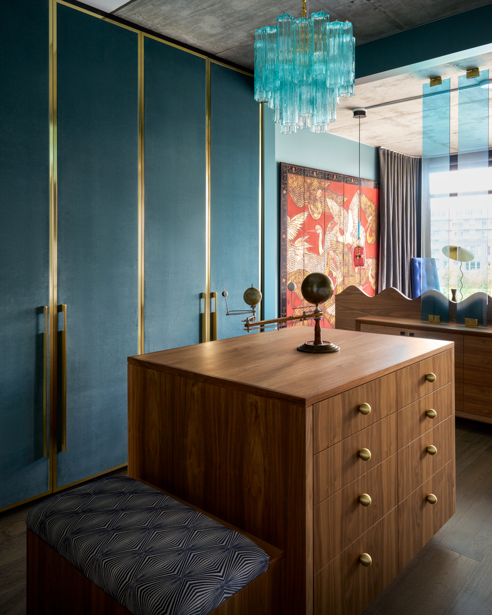
For this bedroom color idea, Lauren McGrady, founder of Chicago interior design studio Rider for Life, brought aqua in through a glass chandelier and colored acrylic panels. ‘We selected aqua for this bedroom for reasons similar to its namesake: the bedroom is where we go in the evening to recharge and reset, and similarly, a dip into water, especially when it is ice cold, can be exhilarating and refreshing!’ she explains. ‘We chose to thread the color throughout the bedroom in various hues and textures to invite the sense of calm felt while swimming in a sea of blue.’
Which colors pair well with aqua accents?

Aqua is actually surprisingly easy to pair with other colors – but there’s one combination in particular that stands out. ‘I love pairing aqua and other various shades of blue with their complementary counterparts, red and orange,’ says Lauren McGrady. ‘The color wheel is essentially a roadmap for anyone who wants to dabble in color theory ideas. Orange and blue might sound like an odd pair, but they are complimentary colors, meaning they sit opposite each other on the color wheel, and amplify each other when placed side by side. We all know the saying "opposites attract" and while this may be true in our personal relationships, it is undoubtedly the way to create an unexpected, yet harmonious, color story in the home.’
There are more pared-back color matches available, too. ‘Aqua pairs well with neutrals like white, gray, and beige,’ says Theresa Butler, owner of her eponymous interior designer in Atlanta, Georgia – although she also recommends coral, yellow and navy as potential color bedfellows. Lauren Lerner, on the other hand, suggests ‘earthy tones like taupe and olive green for a natural vibe – [and] metallics like gold and silver add glamour.’
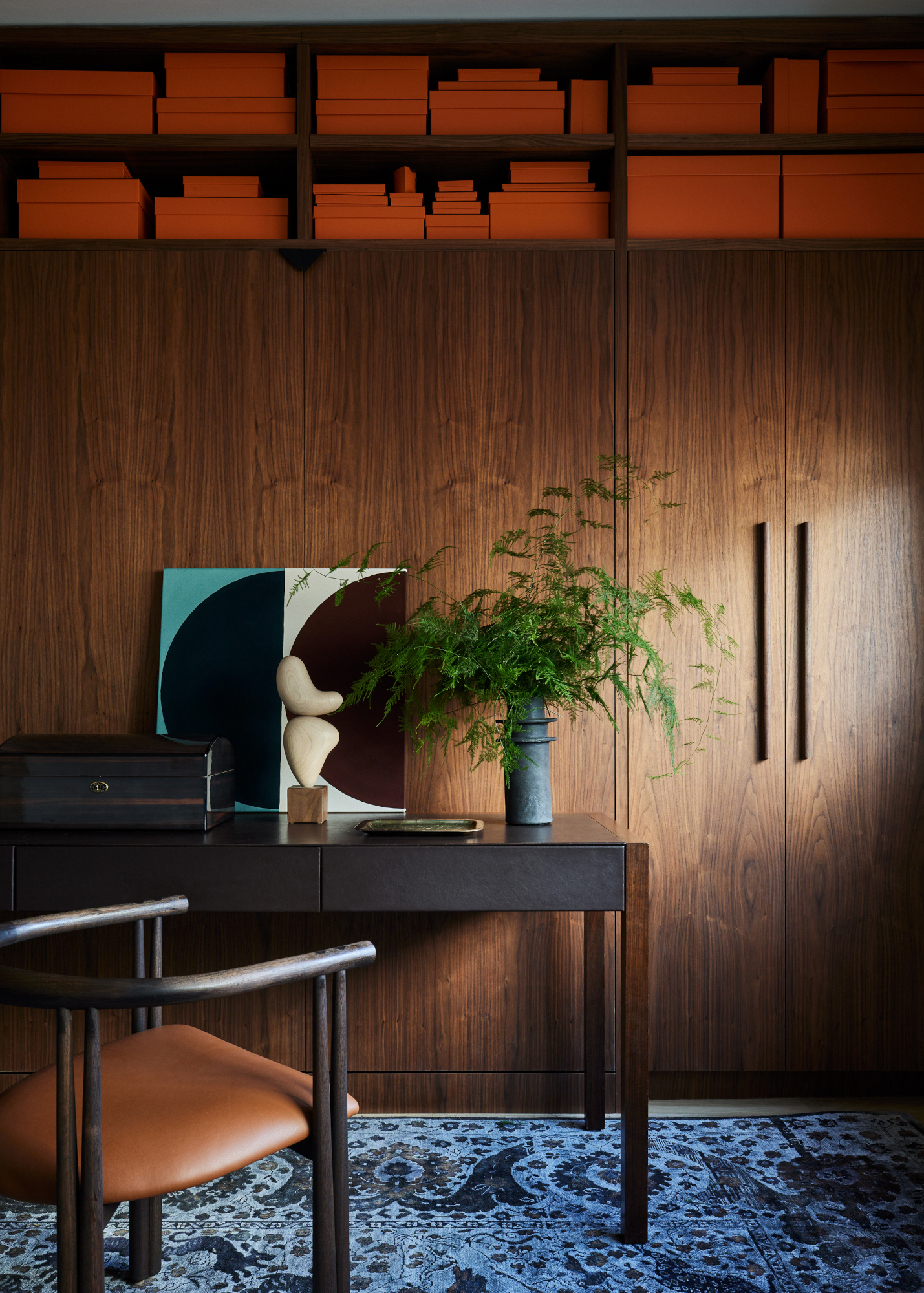
As a general rule, aqua will always look better paired with warmer shades. 'In this wood lined office, we used warm and cool colors to add dimensionality,’ says Corey Kingston, founder of New York design studio Le Whit, of the space above. ‘The blue of the rug and aqua of the artwork contrasts nicely with the orange storage boxes and dark wood cladding.'
How can you introduce aqua accents into a scheme?

Aqua isn’t exactly a color we see often in interiors – so it can feel like a tricky one to incorporate into a scheme. ‘Aqua is one of my favorite colors but it can skew badly if not handled correctly,’ says Westport, Connecticut interior designer Caroline Kopp. ‘Aqua is a strong, summery color so it feels right in a place with tons of sun, heat, and water. If you are in Florida, Hawaii, or the Caribbean, run wild and put it all over the place. I would love to have a house in Palm Beach so I could use this color everywhere!’
For those of us not lucky enough to live in these places, using aqua as an accent is a subtle way to harness the color’s energy. Take inspiration from unexpected red theory and ease in with pieces like artwork and accessories that feature the shade in small doses. ‘Start subtly with smaller decor items like throw pillows or vases,’ says Lauren Lerner. ‘Textiles such as curtains or rugs are another soft way to infuse color.’
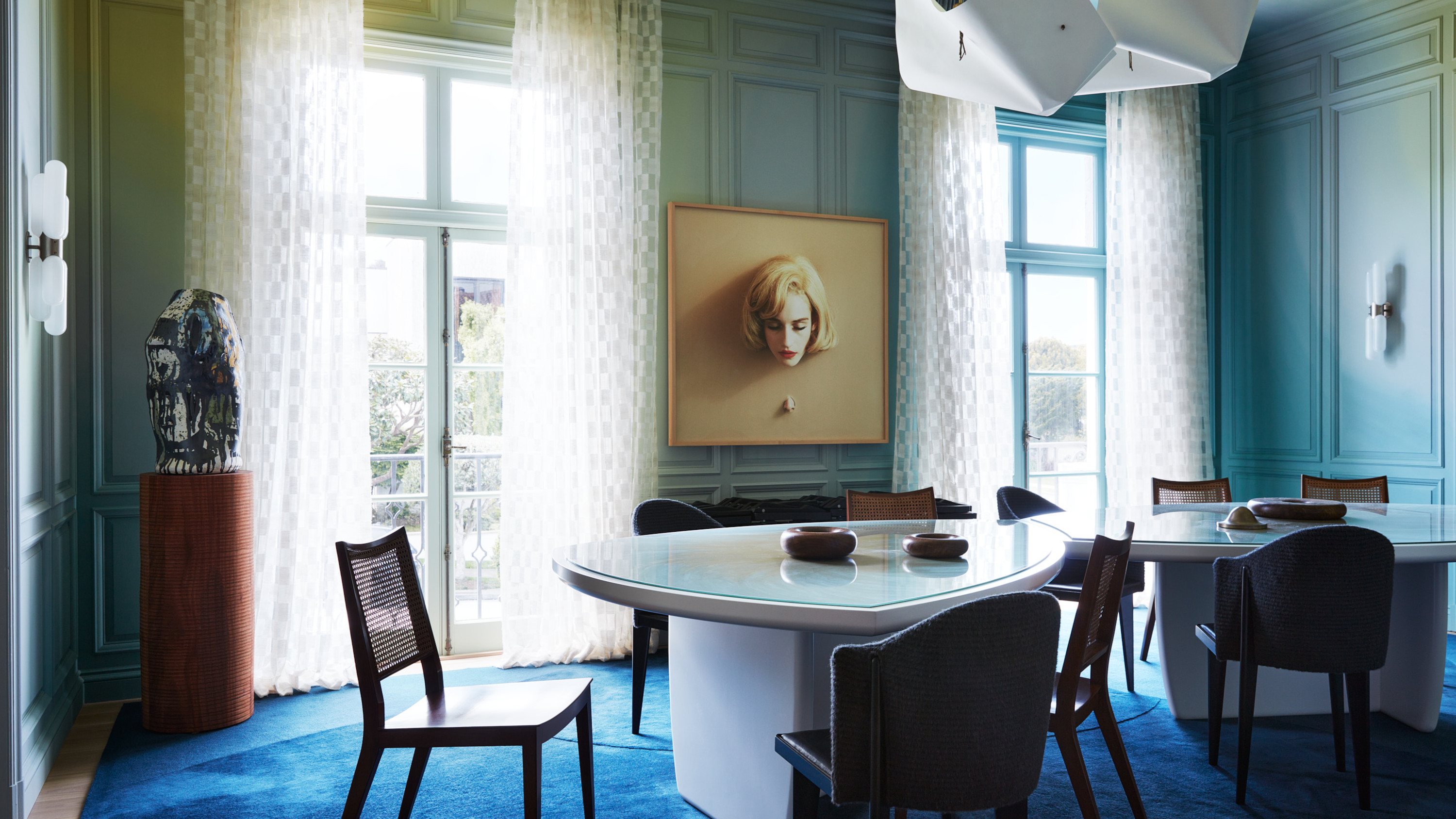
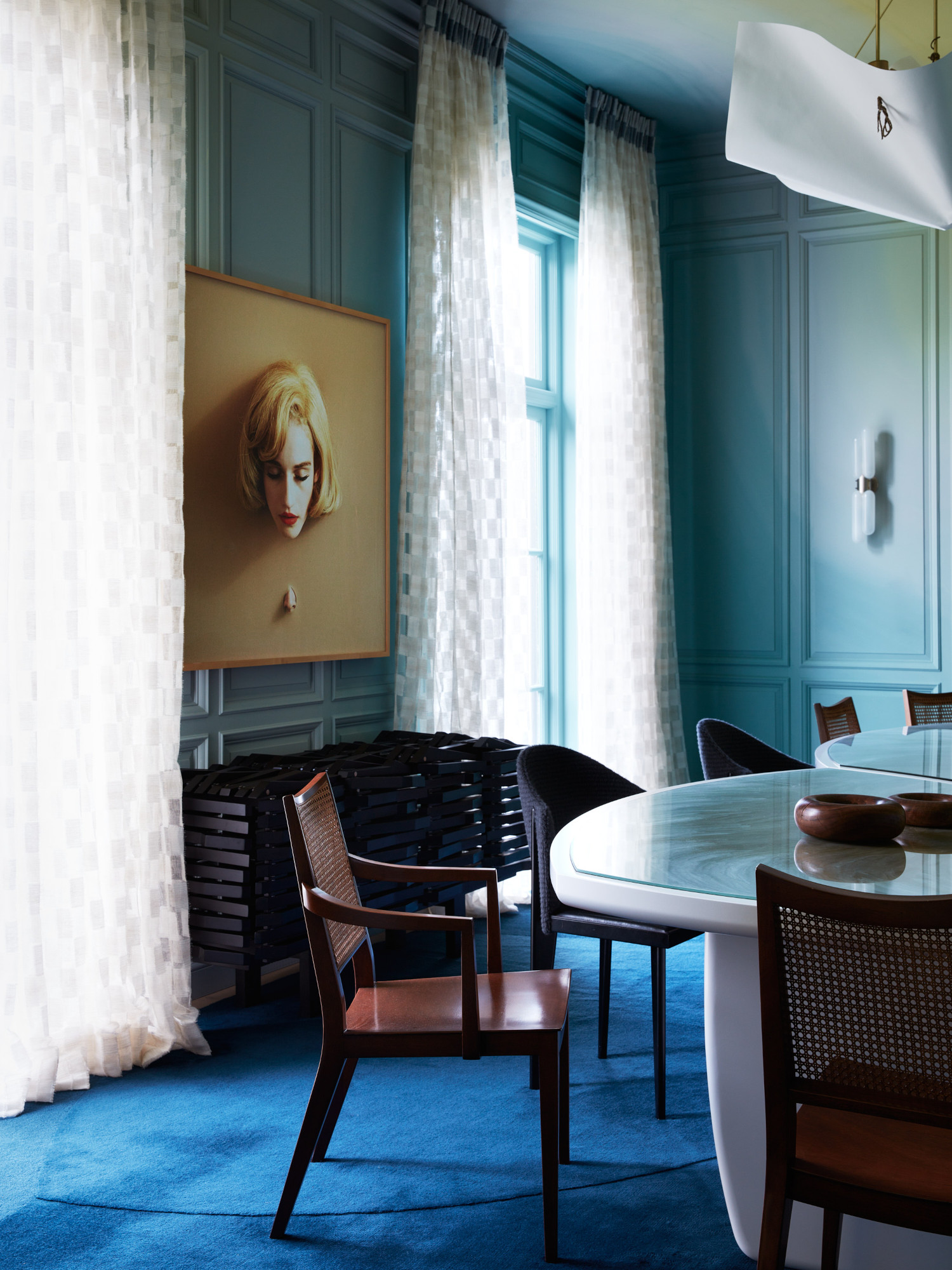
For a bolder approach, turn to the walls – as the scheme above by San Francisco design studio Chroma shows, it makes for a striking paint color idea as an ombre effect. Side note: pairing it with an electric blue carpet is a stroke of pure genius. Lauren McGrady recommends using a bathroom to experiment if you are looking to employ the color over larger areas. ‘If you aren't ready to wrap the primary bath in such a bold statement color, consider starting in a small space like the powder room,’ she says.
And finally, pay attention to the other accents you’re using. ‘Combine aqua with natural materials like wood and plants to create a harmonious look, and use it in patterns like stripes or florals for a more dynamic and interesting aesthetic,’ says Theresa Butler. ‘By thoughtfully incorporating aqua into various elements of your home, you can create a vibrant and cohesive look that enhances your overall decor.’


