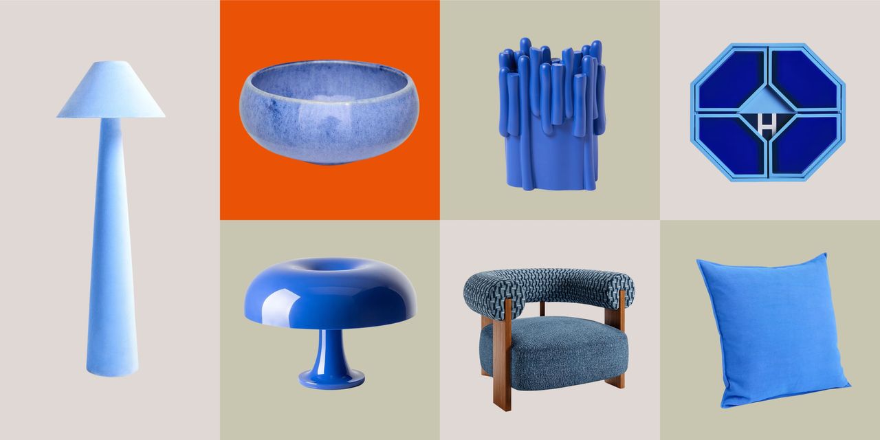
There’s a reason I keep returning to The Devil Wears Prada. Not just for the fashion, but for that one scene. You know the one. The cerulean sweater. The idea that even when you think you are opting out of trends, you are still part of the system that shapes them. And honestly, I see the same thing happen in interiors all the time.
When I talk about decorating with blue with clients, it’s rarely about making a bold statement. It’s about understanding how a color like this moves through design. Cerulean, in particular, has always carried that duality. It was loved by impressionist painters in the late 19th century, like Claude Monet, for the way it could capture light in the sky. Soft, atmospheric, but still vivid enough to hold attention. And now, it’s having another moment. Not loud, not overpowering, but very intentional.