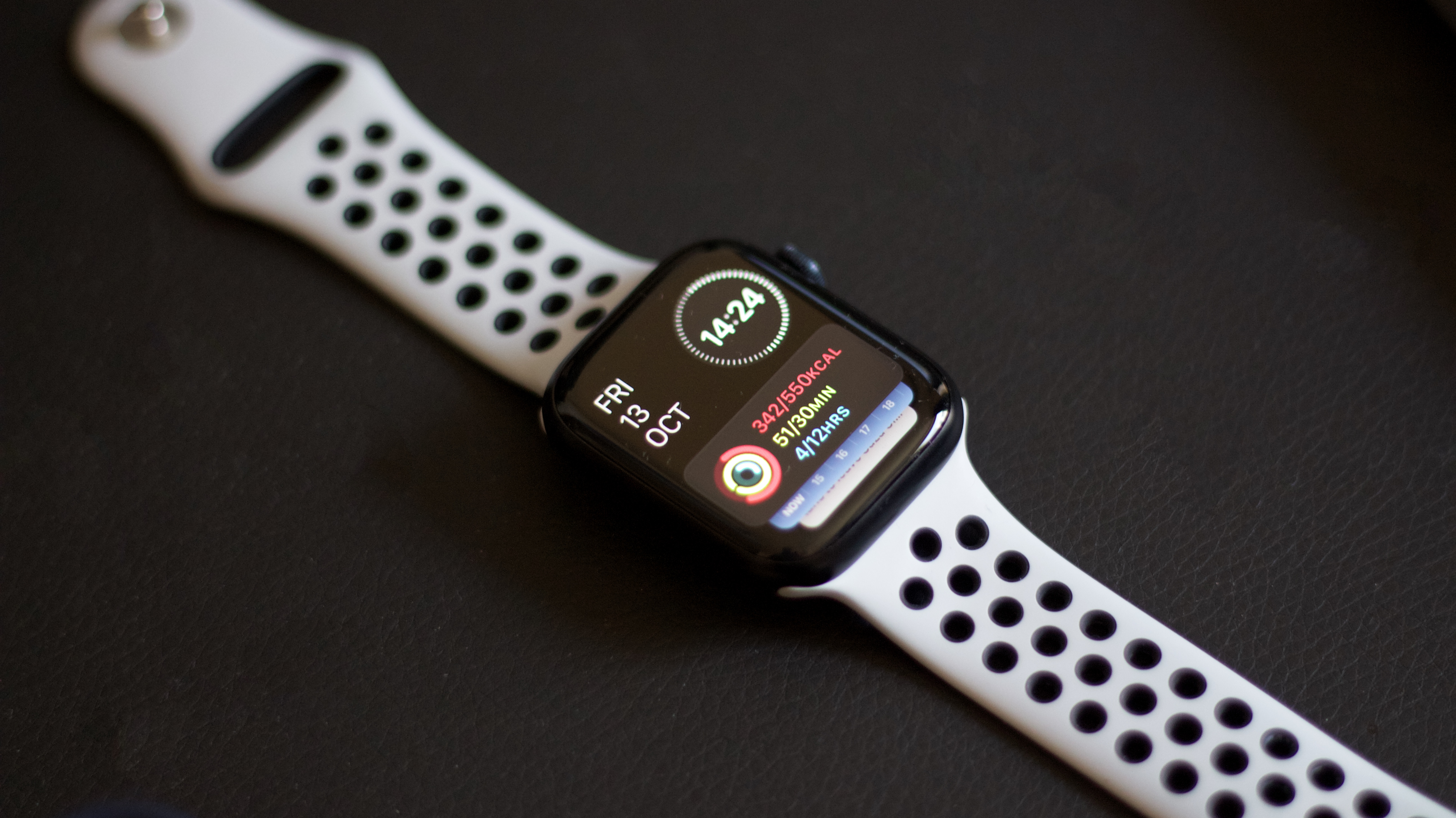
The Apple Watch Series 9 has landed, and it’s an exceptional smartwatch for those after the latest technology on their wrists, with on-device Siri and double-tap functionality to ensure you can interact with your device in a number of useful ways.
But for those of us who don’t need every feature under the sun, there’s a clear market for a simplified Apple Watch, one that does without a huge medley of apps, notifications, and tracking found on other models, and focuses on the very basics of what a sleek smartwatch can offer.
My partner recently purchased an Apple Watch Series 9, as a celebration for a new job they started last month. But within days, it was packed back in its original box, being returned to the big Apple store in the sky – my partner citing the overwhelming amount of menus, apps, and interfaces to grapple with when they mainly wanted a way to receive hands-free calls on a lunchtime walk. (Also, notifications that tell you to stand up every hour – we get it, but have you heard of an office job?)
The Apple Watch does a huge amount. It can make audio calls from your wrist, track your heart rate, count your daily steps, and send you regular reminders to stand every now and again. It has fall detection for more elderly users and comes with a huge range of WatchOS apps from Strava to Citymapper. It syncs with your iPhone and can let you make contactless payments with a flick of the wrist.

Lots of this is useful, and every feature will be useful to some portion of users. But there isn’t a single Apple Watch model out there designed for a truly streamlined experience – offering a few key smart features for those after a slight upgrade from their regular wristwatch, and nothing more.
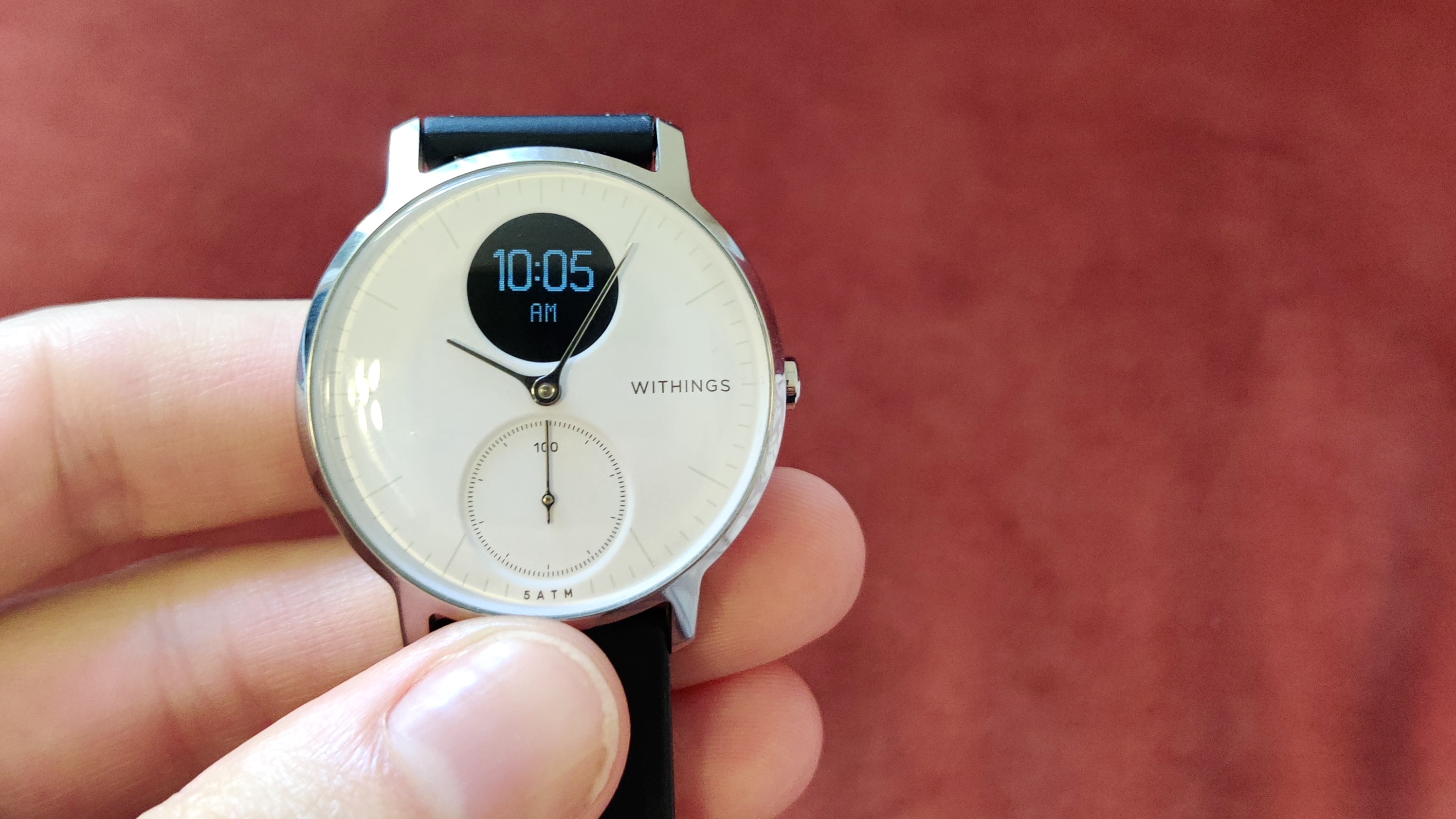
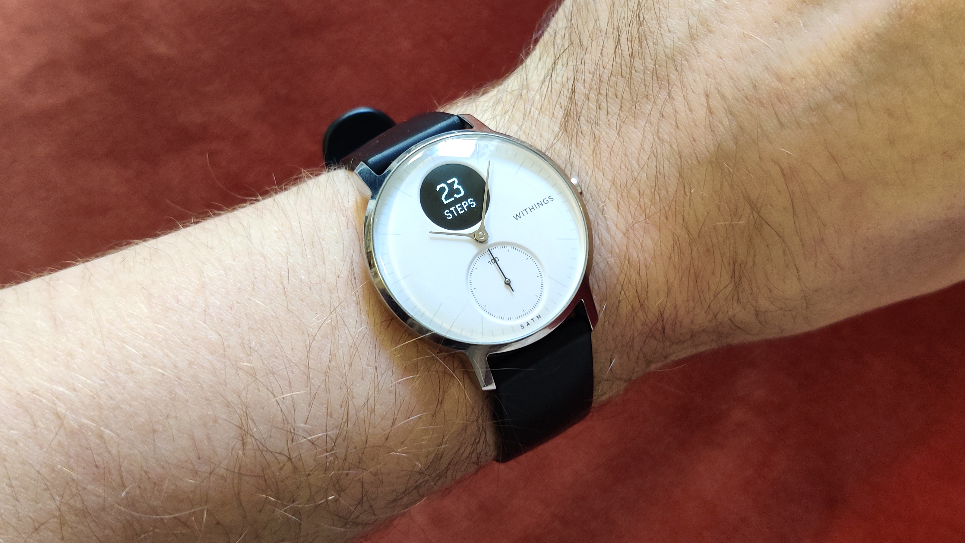
That’s the reason I’ve been wearing the hybrid Withings Steel HR smartwatch for the past year. It has an analog clock face that auto-syncs the time to my phone (no resetting for me!), alongside an analog step-counter and a compact LED screen that can digitally tell me the time and date, my step count, distance walked, heart rate, calories burnt, remaining battery life, and nothing else.
It looks like a regular watch, just jazzed up for the 21st century with no added fuss; I get compliments on it regularly, and am constantly in the position of explaining what it does and doesn’t do.
Crucially, this Withings watch only has one button. One! It can cycle through a few features on that micro-screen, but it’s stubbornly minimalist, and while there is a companion app, it’s not necessary to use after setup. The battery life is so long that I’m actively surprised every time I need to charge it.
Compare that to any current best Apple Watch model, with its sprawling settings menus and an App Store interface that needs to be crammed into a 40mm-diameter screen. Yes, it packs in a huge amount of functionality, but for those of us who want a feature-light experience, buying a fully-fledged Apple Watch and then not using 90% of its capabilities feels like a huge waste – even if it’s the lower-cost Apple Watch SE.
I would love to see an Apple smartwatch that ditched complexity for a streamlined software design, narrowing down to a few core features for casual users, with gentle enough power needs that it can outdo the 18-hour battery life of the current fleet of Apple Watch models. An Apple Watch that, like the sleek AirPods, ditches needless interfacing options, and doesn’t burden the user with too many options or busywork.
The problem is that the Apple Watch is designed for continual back-and-forth interactivity, requiring it to message you regularly for a host of different metrics – effectively functioning as a second phone, with all the admin that entails. It recreates a form of the iPhone’s operating system, alerts, and app selection to do this

This is brilliant for those looking for a surrogate iPhone they can keep tethered in view, using most of the phone’s features while keeping their hands free for other things. But it limits the Apple Watch to a mini-phone, with all its complications, ignoring the use cases for a simplified accessory at a reduced price. (Knowing Apple, still $199, but I like to think it could be lower.)
There must be a few core features that most Apple Watch users, well, use – things like the pedometer, heart rate, audio calls, and maybe even contactless payments, which could be crammed into an Apple Watch Mini with a more limited interface. You’d lose the host of other WatchOS apps and services, and likely the ability to type text messages (badly) on its tiny screen, but it would offer some basic functionality for users that don’t need extra complications or busywork from their devices.
A smartwatch is inherently a limited device – it’s a fraction the size of a smartphone, and can’t necessarily do everything a smartphone can, at least not nearly as well. Focusing an Apple Watch model on its core feature set, and getting rid of software bloat, would be a good start towards making an Apple Watch that even more of us would use.
It’s clear that the Apple Watch is selling enough already, with over 50m units shipped in 2022 and iMore itself admitting back in 2018 that the Apple Watch had won a firm place in the smartwatch market. But when higher-end models like the Apple Watch Ultra 2 retail for £799, it’s clear that not everyone is being catered to, and a sub-£200 simplified Apple Watch could do a lot to get more models onto people’s wrists.


