Nowhere does the iconic Spanish Colonial Revival architectural aesthetic feel quite as, well, iconic as Santa Barbara. The cute, coastal Californian city is awash with white stucco walls, arched doorways, exposed wood beams, courtyards, and a distinctive Mediterranean flavor, where period charm is the currency and historic detailing is the fairy dust that makes the area feel as magical as it does.
And charm was exactly what interior designer Katie Labourdette-Martinez of the Santa Barbara–based studio Hearth Homes Interiors was looking to uncover in this historic Spanish Colonial Revival home, built in the Arts and Crafts era and very much true to that style. ‘There were small pieces of charm here already that are usually hidden by bad paint jobs,’ she says of the exposed wood door frames and beams that adorn the ground floor. ‘Everything in the home was architecturally already there, and I wanted to add beautiful elements that highlighted them.’
Unusually, she was setting her own brief. This four-bedroom house (with an additional house in the yard that has its own bedroom and kitchen) was to be remodeled as a guest house, managed by Hearth Homes and rented out to groups of families and friends as a vacation cottage. As a result, Katie was able to flex her design skills as much as she liked, adding modern elements and decorative flourishes at will. The result is a scheme that honors the original time period the home was built in, yet has a contemporary edge that’s easy to relax into.
‘It’s meant to be that you walk in and just feel cozy and like you’re at home,’ Katie says. ‘We want people to instantly feel like this is a place where you can have fun.’
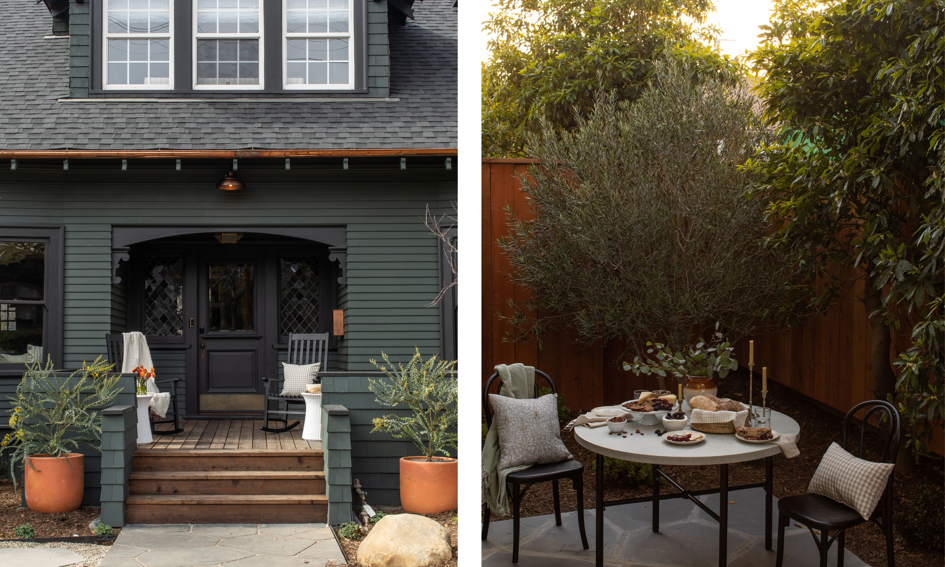
With its shingle roof and curlicued veranda frames, homes don’t come much more charming than this. Going dark with the exterior color was a very considered choice.
‘There is a certain Santa Barbara color palette,’ Katie says, referring to the whites and creams the area is known for. But because she wanted to set the tone firmly for modernity from the moment you arrive at the property, she chose black and dark green for the exterior. ‘The black was a little bit bold for the area, but the green plays with the tones of the re-landscaping we did around the yard.’
In fact, the yard is just as much of a draw as the interiors. ‘It’s amazing, a wonderful space to hang out in, and we chose olive trees because they’re both low-water maintenance and because the dusky green tone is just so appealing.’
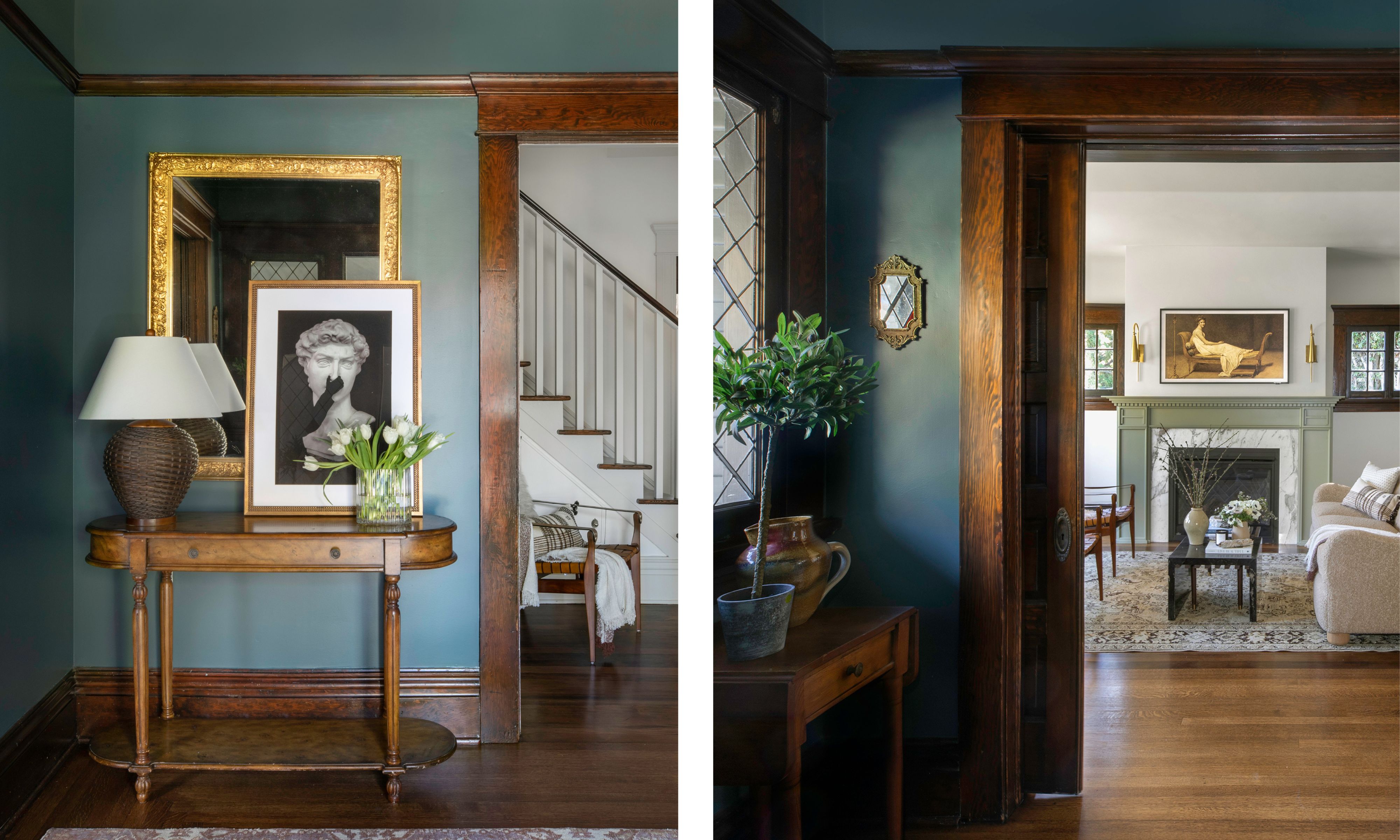
Katie chose this rich, inky blue for the entryway walls as a way to set out her design statement the moment you enter the property. ‘It’s a wow moment that really highlights the original windows,’ she says. ‘I wanted to give the house a true welcome, setting the tone right away. You see this, and you just know that you’re going to go through a bunch of color and experience true beauty and character.’
Were the historic wood door frames a hindrance to her modern approach? ‘Not at all,’ Katie says. ‘It wasn’t that challenging to work with them because the overall color palette is fairly earthy and muted – other than a few wow moments, of course – and that ties in nicely with wood. You know, the home is gorgeous, she’s a craftsy girl, and I wanted to honor that in every way that I could.’
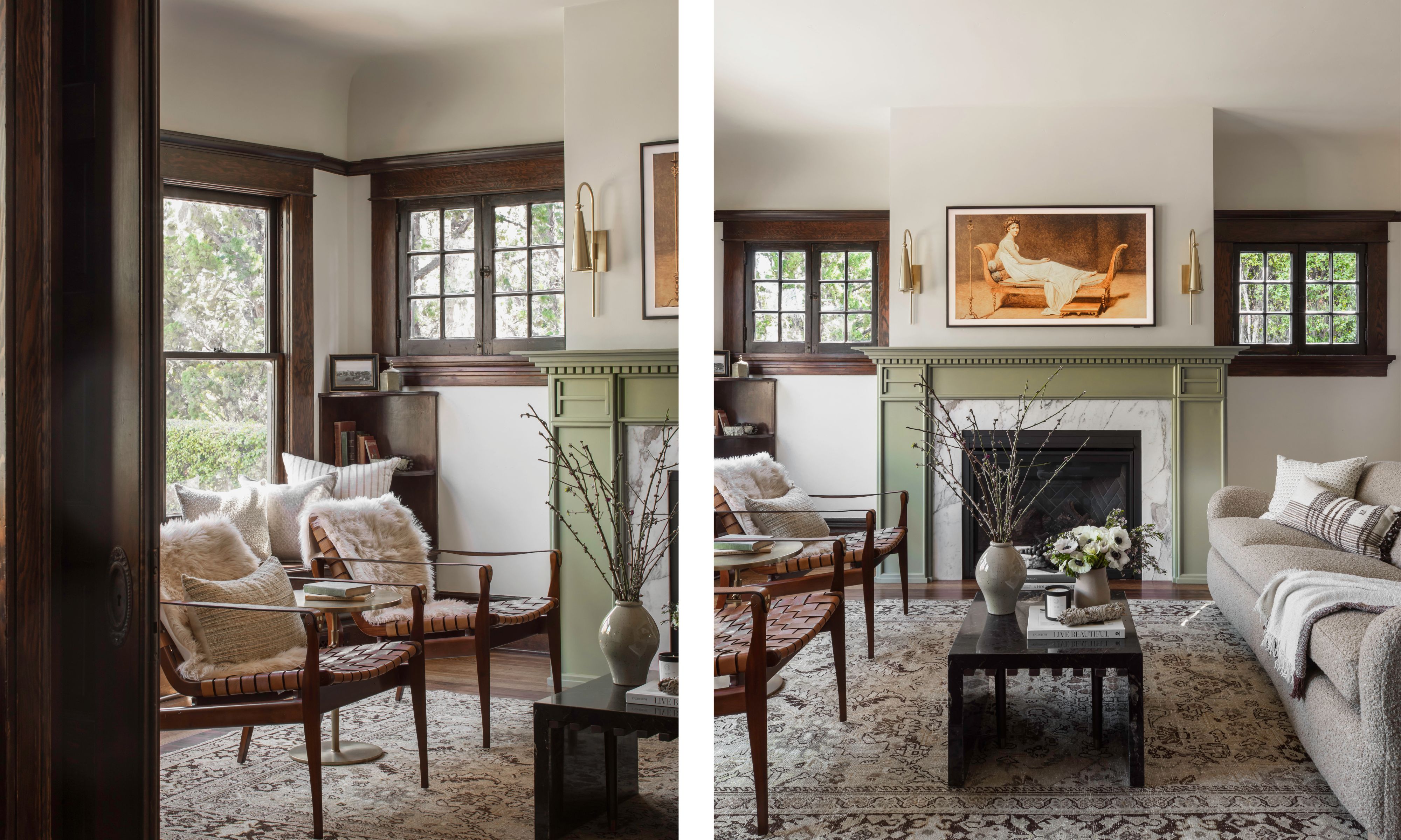
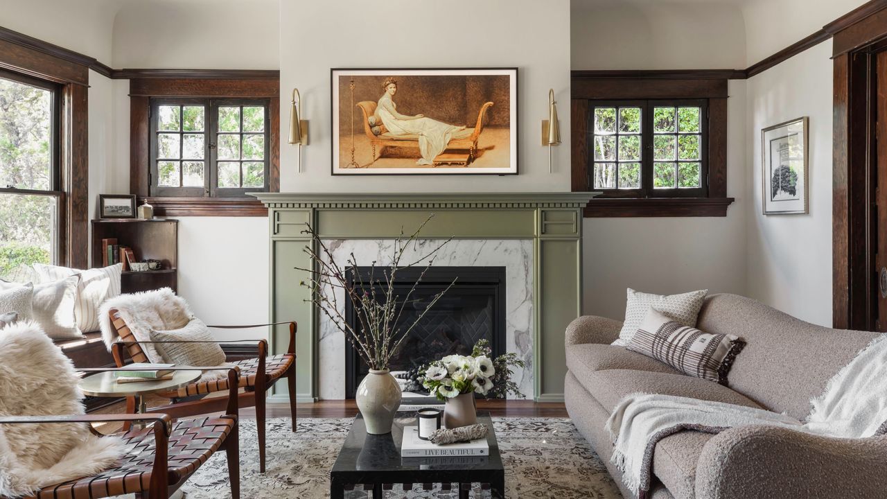
Just off the entryway is the large living room – a masterclass in transitional design where Katie has contrasted the period details with sympathetic modern furniture. Nothing too modern and avant-garde, but contemporary enough to enliven the whole space.
‘I love boucle,’ Katie says of the sofa. ‘I chose it because it adds a modern touch subtly, without shouting about it.’ She chose a sage paint for the fireplace because ‘it ties into the wallpaper used in the dining room.’
Her clever way with soft colors and textures tones down the wood frames of the windows – details that could seem heavy if it weren’t for this decor juxtaposition.
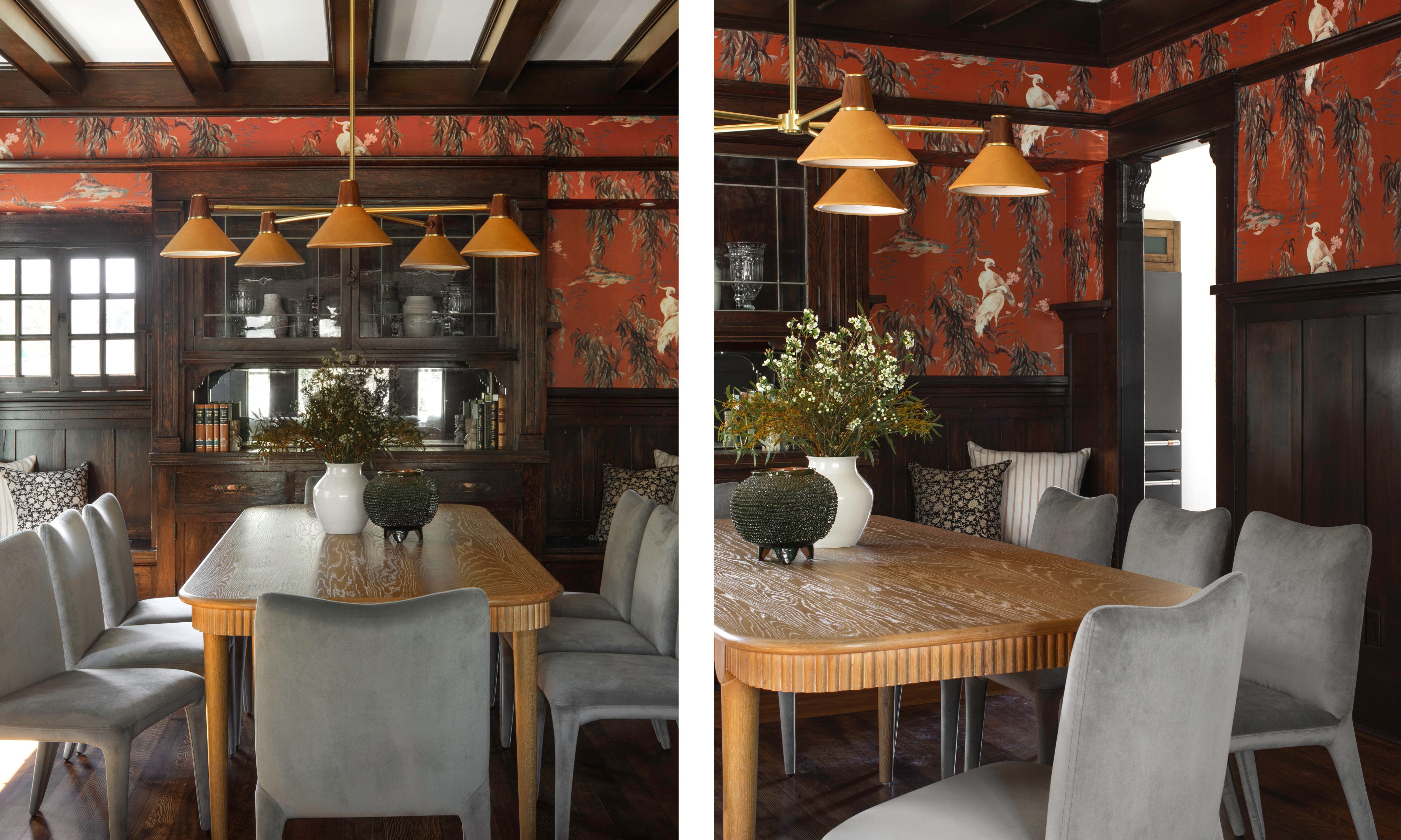
‘For just a moment, I was like, “Is this too modern?!”’ Katie says of her bold wallpaper choice for the dining room. ‘Because in other spaces I’d gone more traditional with William Morris prints. But because this had nature and animals in it, it felt like a nod to more classical decorative themes, and I felt like I could stretch the boundaries of design a little in this room – be a little braver.’ The result, she says, is an instant sense that you’re going to have fun in this space the moment you walk in.
Beyond the vibrant wallpaper, there are plenty of other considered details that you don’t notice until you look a little more closely. From the softness of the suede on the dining chairs to the ridged, curved edge of the table, each choice was made because it softens and tones down the impactful wood beams. ‘The room is wrapped in hand-carved moulding, so it needed modern pieces to counter it,’ Katie says.
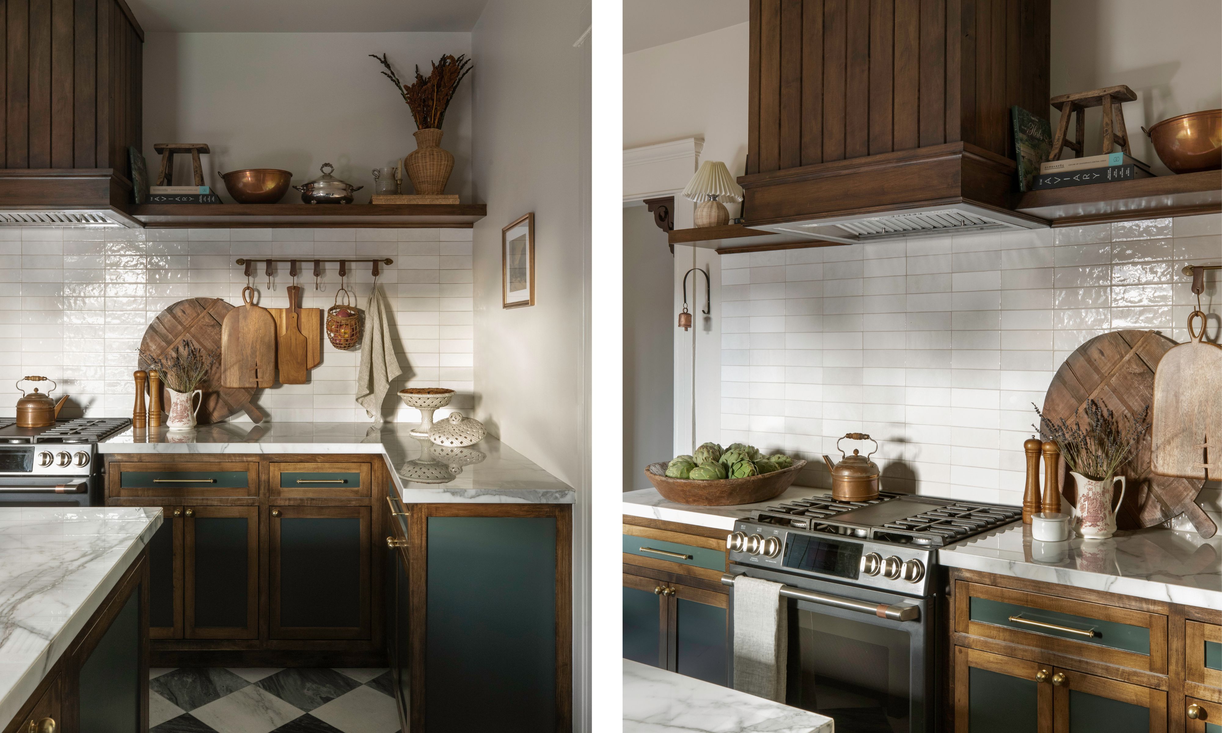
For such a historic home, it would have been jarring to walk into the kitchen and be met with sleek, shiny appliances. ‘We really didn’t want to show any steel appliances,’ Katie says of her smart decision to wrap the hood above the range in strips of wood. It’s a nod to the beams seen elsewhere on the property – but still with a more modern edge. ‘We also did that same wood panelling idea on the back of the island,’ Katie says, showing how every choice links to another.
The checkerboard floor was a new addition. ‘The floors had been too damaged by previous owners, so we had to go with something completely new,’ Katie says. ‘But it’s gray and off-white, so it’s much softer and not as bold as black and bright white would have been.’
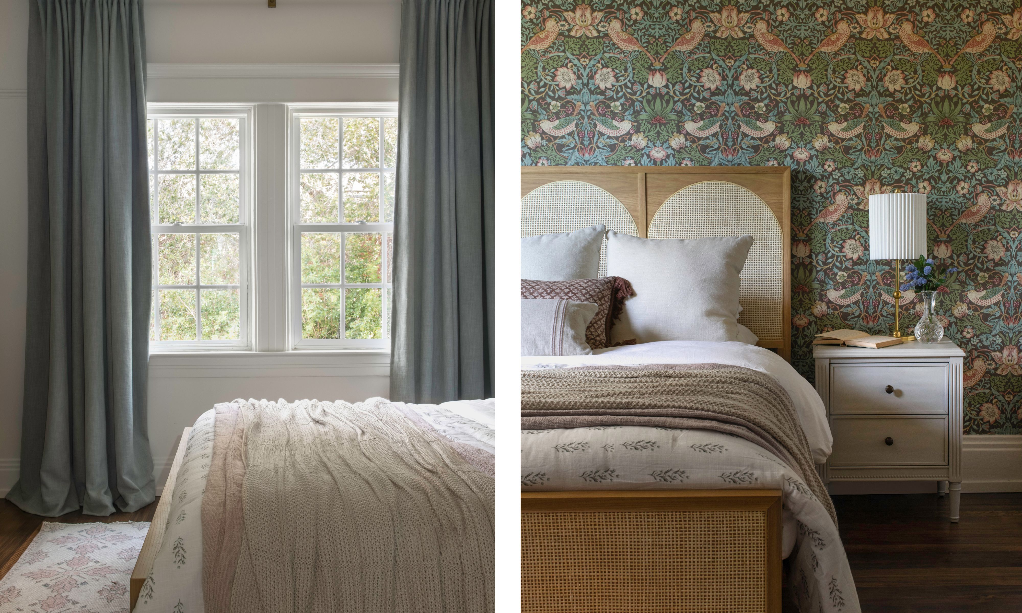
The beauty of transitional design is the ability to dance between contemporary and more classic decorative themes. And so, while Katie went for a modern wallpaper in the dining room, she chose a heritage William Morris print to go behind the bed in this space.
‘This bedroom is our love letter to the Arts and Crafts era,’ Katie explains. ‘I knew I wanted it to be soft – with a nod to the natural world – and I felt like, because of the light that pours in through the large white-framed windows, it could hold a heavier print.’
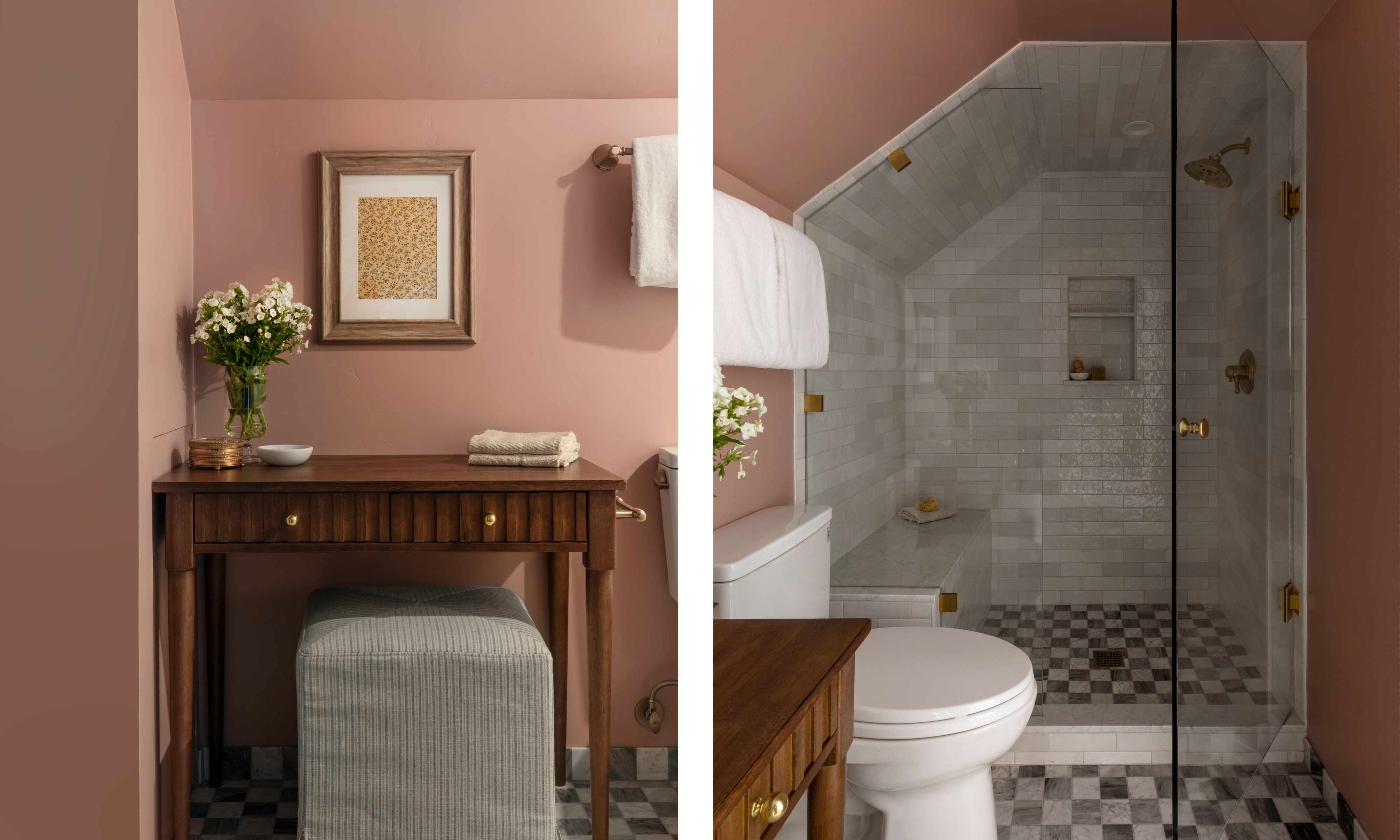
Just off the William Morris bedroom is this pink bathroom – the color chosen because its adjoining bedroom was originally called the Rose Room. ‘The wallpaper that had been in the bedroom when we arrived was too damaged, but I saved a square, framed it, and hung it in this bathroom,’ Katie says.
Tiling at the end of the bathroom shows how to make a neat, luxe-looking shower niche out of a potentially awkward space – zoning it from the rest of the room.
With confidence to mix eras and styles, Katie has kept the historic nature of this home in mind at all times – always finding ways to enhance its original character instead of overpowering it. By making the wood beams a hero piece and choosing soft textures and – mostly – soft colors elsewhere, she has put together a perfect balance of old and new: a showcase for how liveable and luxe transitional design can be.