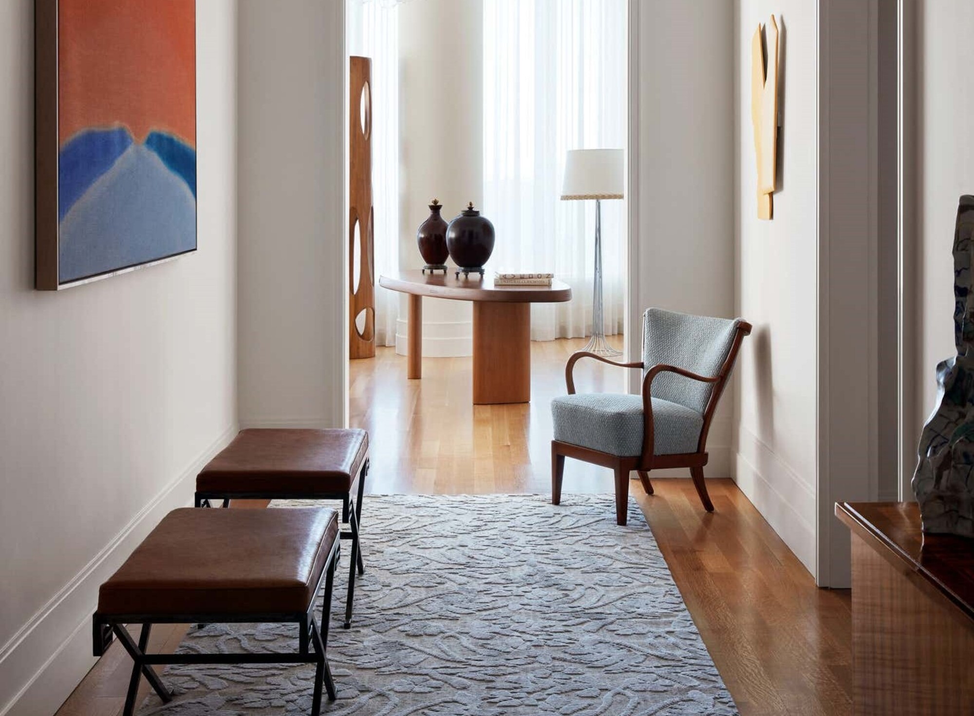
Your entryway actually plays a pretty vital part in your home. It's the first space where you greet guests, and it's your first chance to introduce your personality and individual style. All too often disregarded as mere transition zones, it's a room in its own right.
The best entryways will feel warm and inviting, with key items of furniture that play their part, bridging functionality with the aesthetic. ‘A well-designed entrance sets the stage for the overall character of a home, offering a captivating sense of arrival,’ says Amy Hart of The Little Brick Studio. I've spoken to the designers to find out their favorite ways to introduce some life and character to their entryways.
1. Establish a mood
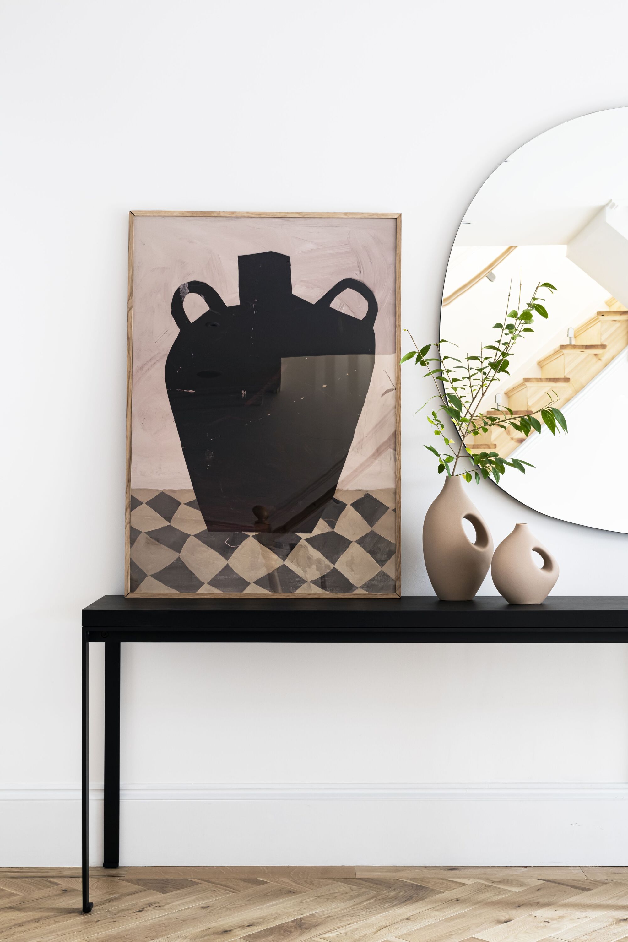
First things first, think about what you want from the space and how you want people to interpret your home on first arrival. Decide what style of interior to go for, as both maximalist interiors and more minimalist styles can create bold impressions.
'One approach is to embrace a maximalist style, utilizing vibrant colors on the walls and complementing artwork to infuse the space with a dramatic atmosphere - a bold statement for your arriving visitors,' says Amy Hart of Melbourne-based The Little Brick Studio.
'Alternatively, a more minimalist approach can be taken, featuring open and light-filled areas - white tones, light oak floors, and understated artworks, resulting in a calm entry area to welcome your guests.' A little entryway table decor can go a long way.
2. Consider color
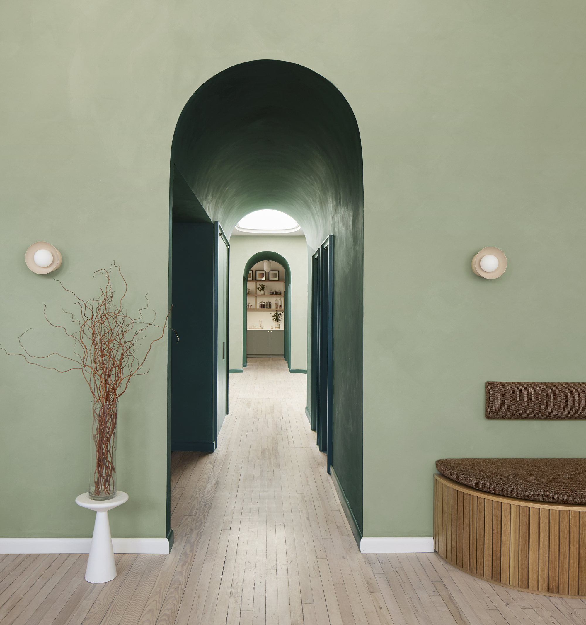
First impressions count and the biggest impression you can have on your entryway is color. 'Off-white neutrals work with most color palettes and will make a space feel bigger,' says Lucia Galeano of New York based, women-led architecture design firm, Studio Galean, 'This is perfect for entranceways without a lot of light.'
'If you want to introduce some warmth - opt for colors that have an underlying red or yellow base,' advises color expert at Farrow & Ball, Patrick O'Donnell. There is no right or wrong answer either. 'You can also go with the flow and consider darker colors. Halls are transitional spaces so making a bold statement can be great fun - dark blue, greens or near blacks will add drama and create a great backdrop for pictures.'
Choosing between the best colors for entryways is a practical choice as much as it is an aesthetic one. 'Entranceways can be high-traffic areas with busy families. Use a wall color with enough of an undertone to hide the occasional dent or bash,' says Lucia.
You might also want to think about how the color relates to the rest of the home and establishes a theme. 'Consistency in the use of color is crucial as visitors navigate through the various spaces,' says Amy. 'This ensures that the entryway serves as a preview, hinting at the forthcoming areas within the house.'
3. Create an entryway moment
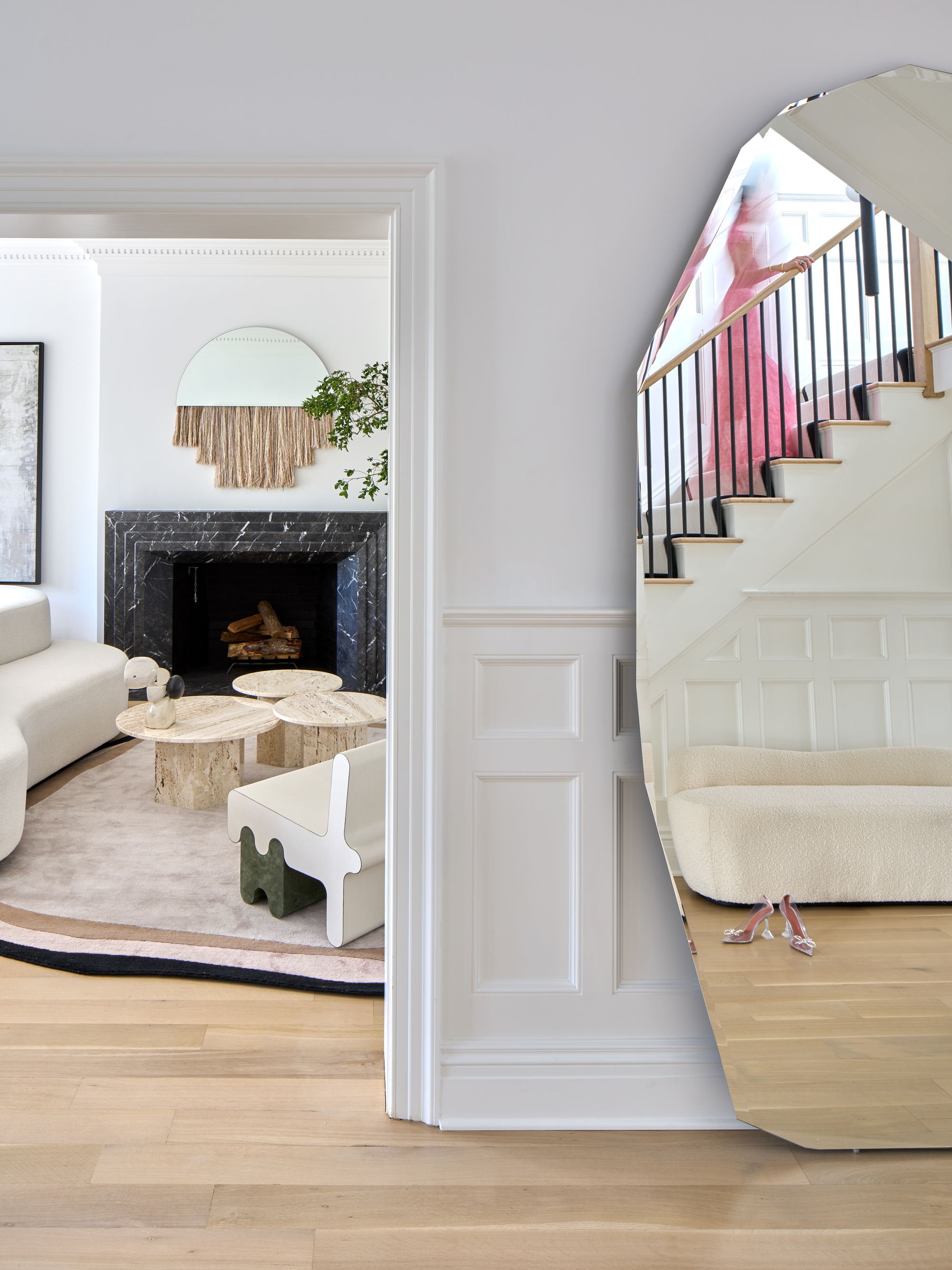
Entryways can be quite long and narrow, so you might not think about them as spaces ripe for loitering or hanging around, but actually, it's the place where you check yourself in the reflection before leaving, and it's a space to establish a routine.
Help yourself out with a well-placed mirror just by the doorway, a console table, or if you don't have the width for a table, even just a radiator cover will do. Long and narrow, these are great for small spaces like apartment entryways that you can decorate with a glass bowl for keys and those bits and bobs you always forget before leaving the house. A spare surface is always a great place to introduce some decor, so bring in some candles and a plant to freshen up the space - both you and your guests will be glad for it.
'Give the entrance life by adding a console table with art, plants, books and pictures,' encourages Lucia. 'Introducing a large mirror in a small entranceway is a great way to gain some nice light reflection and make the space look bigger.'
4. Remember the personal
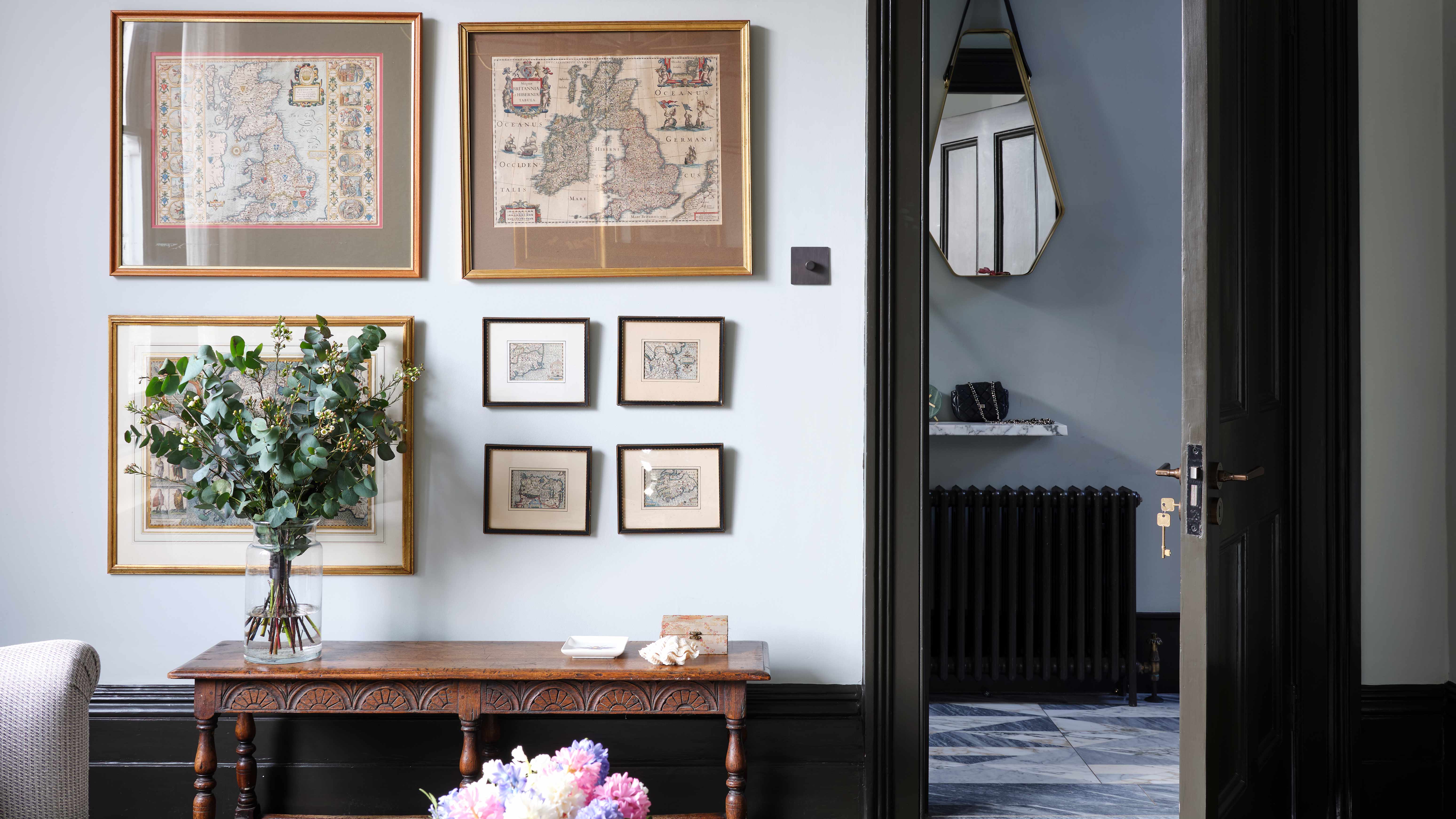
A house should feel like a home, so whether you've gone for a minimalist or maximalist look, making it feel homely and personal can go a long way. Introduce who lives in the home with framed photos in an array of different frames and mixed in with art prints to add interest, or keep things uniform for a more minimalist look.
A gallery wall that works its way up the stairs can be a nice way to lead people through the home. 'The staircase is usually the first thing people see when they walk into your home and a great way to inject your personality,' explains Natascha Dartnall, founder of ND Studios.
5. Make the most of the architecture of the space
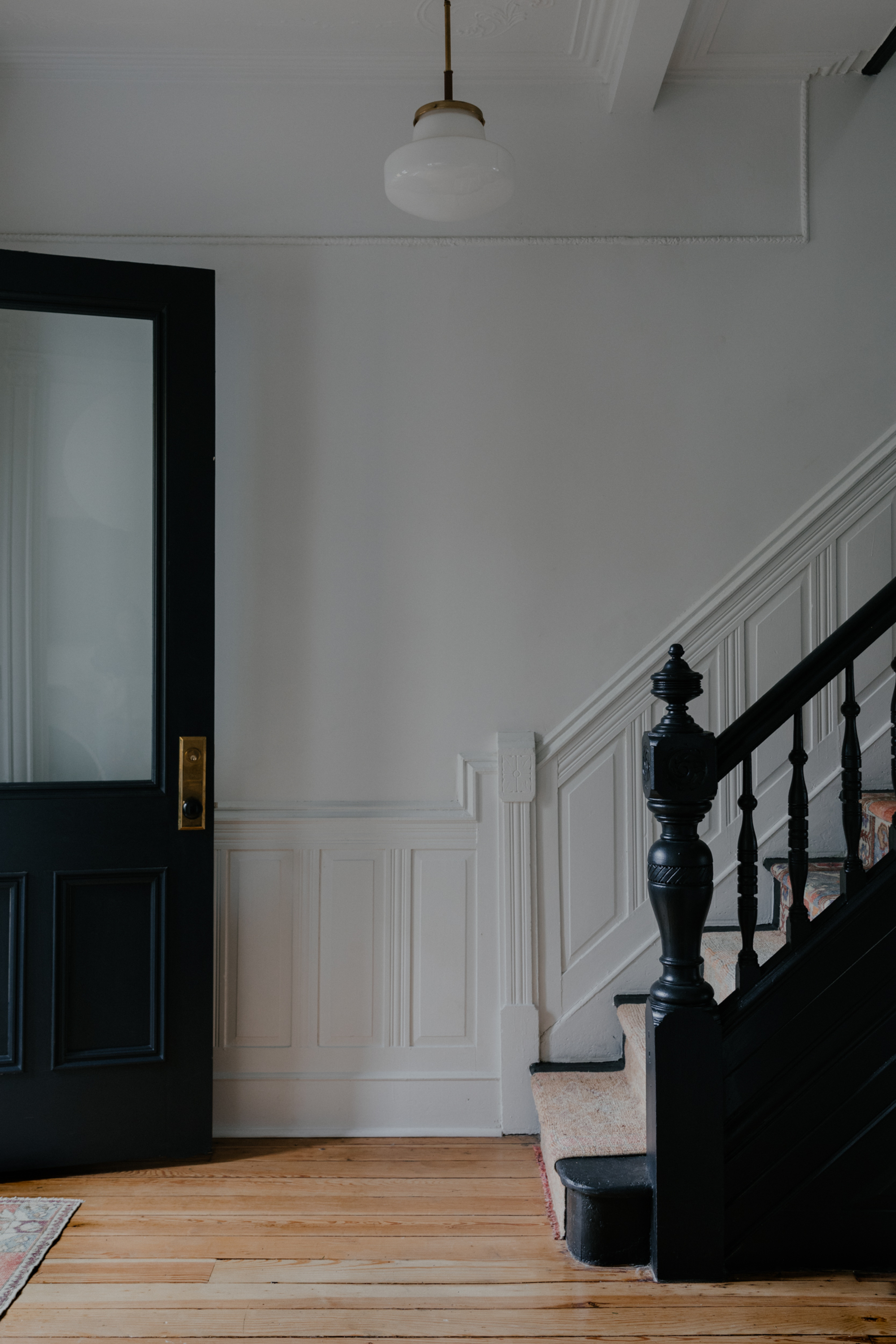
Your entryway might have some significant architectural details that you can embrace to add interest and texture. Look out for crown molding, dado rails and skirting boards that you can play around with. 'If the entrance is small, consider painting skirtings, architraves and coving a couple of shades lighter than the walls. This will expand the look of the space,' says Lucia.
Your dado rails should also make sense in the broader context of the room. ‘It's vital to harmonize their profiles with the other period features to avoid them still feeling out of place,’ says Uwe Schmidt-Hess, architect and designer at Patalab Architects. ‘For example, an ornate dado rail would be at odds in rooms without cornice or taller more profiled skirting board.’
The most common look is a clean, white dado rail with the same color above and below. You might want to go for a subtle shade difference, using different hues above and below the rail. This can stress the horizontal layering of the room and draw attention to the shape and size of the room, helping to create the illusion of more space. ‘Go darker under the dado rail with fresh white woodwork and light colors above the wall to hide any scuffs and marks,’ advises Martin Waller, founder of luxury furniture brand Andrew Martin.
Think off-white paired with light pink, two different shades of grey, or even different material, with shiplap paneling under the rail for added texture. You might want to go for a monochromatic color scheme too. ‘If you decorate walls, skirtings, dado rails, picture rails, and cornices in the same color, you emphasize the texture of the wall further,’ says Uwe.
6. Think about flooring
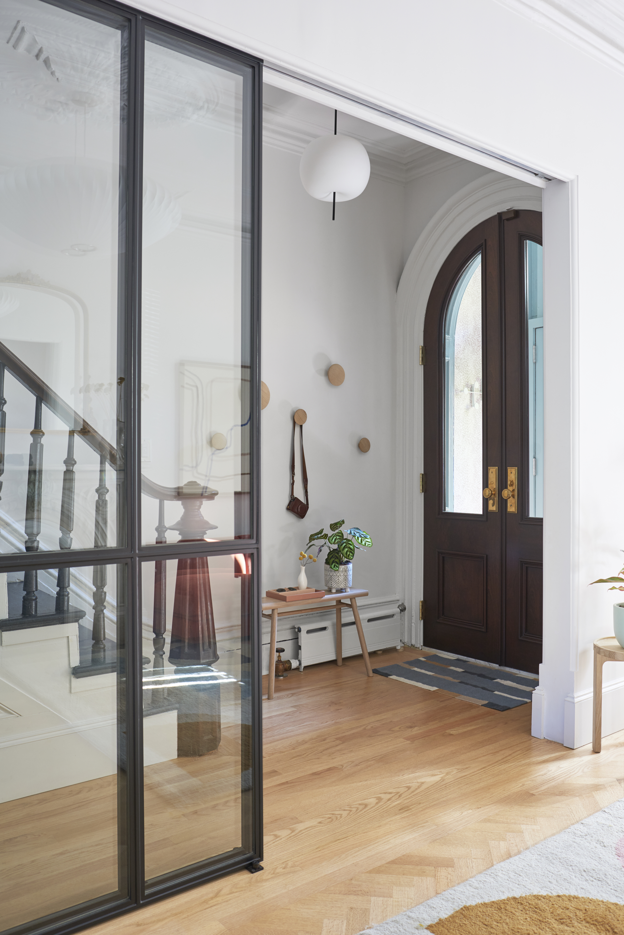
Another important element of your entryway is the floor. Carpeted, wooden floorboards, a long runner-style rug or even tiled hallway floors are commonplace, just remember that this is a space where carpets might be prone to scuffs with people coming in and out. Keep a place by the door where people can remove shoes.
Think the aesthetics too - it's another surface to introduce color, so make sure it works with the wider scheme. 'Just don't have too many stars in the show,' advises Lucia. 'If you want to make your flooring a feature using pattern or color, keep everything else simple. Timber or large format tiles in warm tones make an entrance feel inviting.'
'I always love to put some kind of small rug at the entrance to a home. I think it's a nice transition from outdoor to indoor,' says Jessie McLaughlin of Jessie Lane Interiors.
7. Create a sensory experience
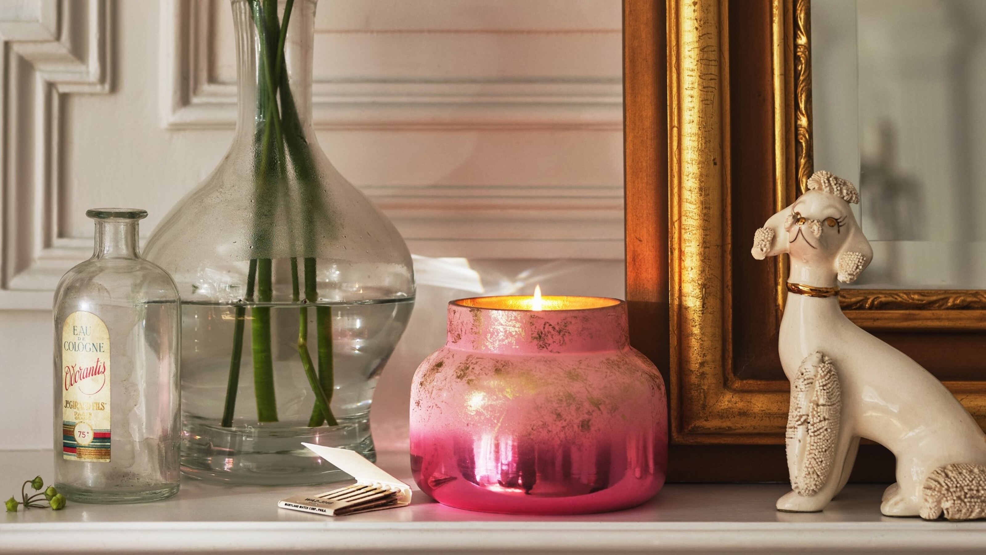
Scent is such nostalgic sense that can evoke a range of emotions. Using this to your advantage and embracing the power of scent can really help a space feel more welcoming and comfortable to guests.
'All five senses are critical to making a home feel welcoming,' says Jessie. 'The scent of a home is an element that is often overlooked. I have a favorite candle on a chest in my entryway that I love to light before people come over.'
Other - less hazardous - room fragrances that can bring a decorative feel might be a diffuser, but there is something comforting about the flickering glow of a candle.
8. Remember storage
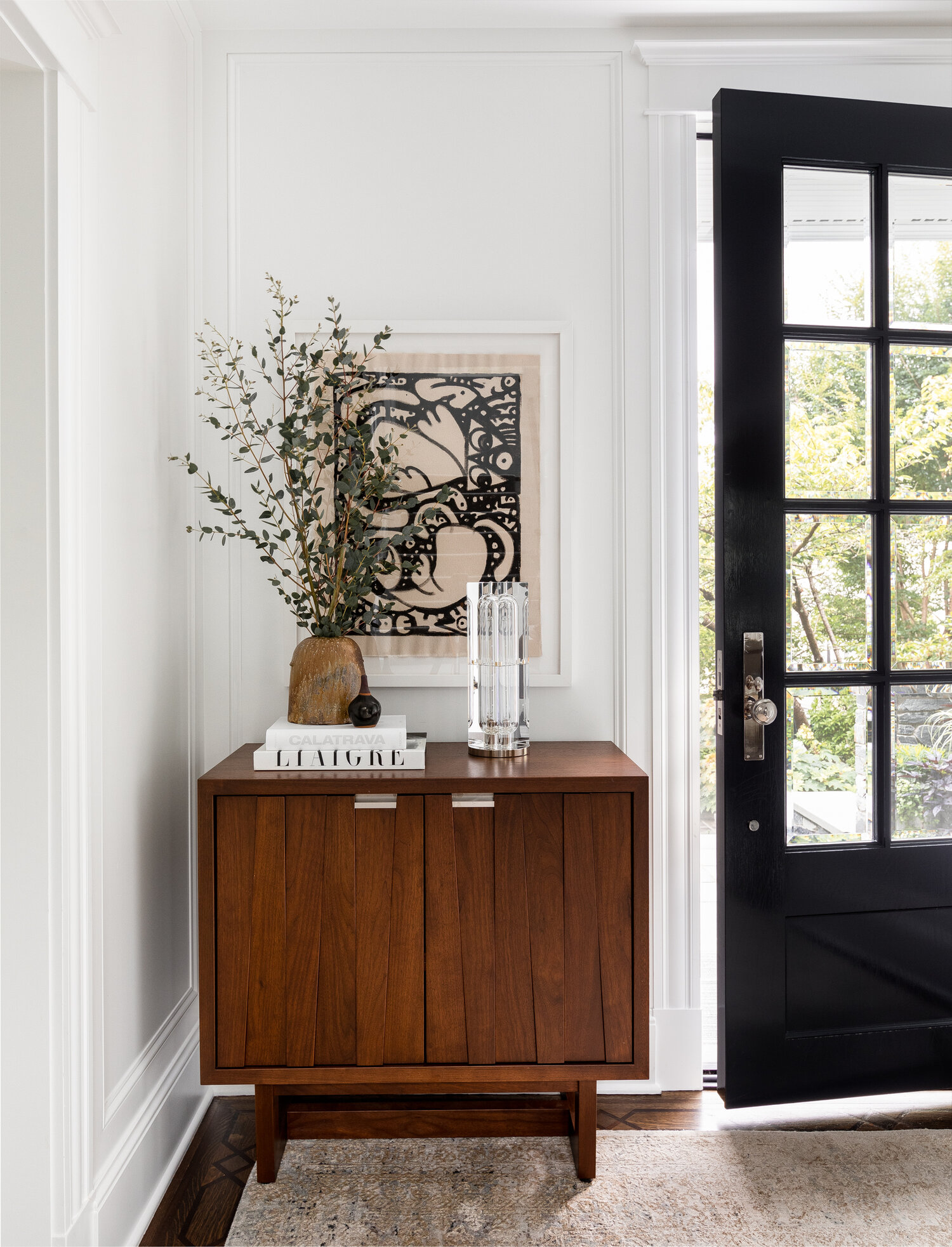
An entryway is a functional space that is used as people move through it. This also means they are prone to clutter and mess, so be sure to stay on top of this and embrace smart hallway storage to make sure keeping the zone clutter-free doesn't feel like a chore. 'One last thing I'd love to mention is making sure the entrance is free of clutter,' says Jessie. 'This creates a calm and welcoming energy when you walk into the space.' Think benches that double up as storage units, tasteful shoe racks, in-build, custom-made furniture and coathooks and stands.


