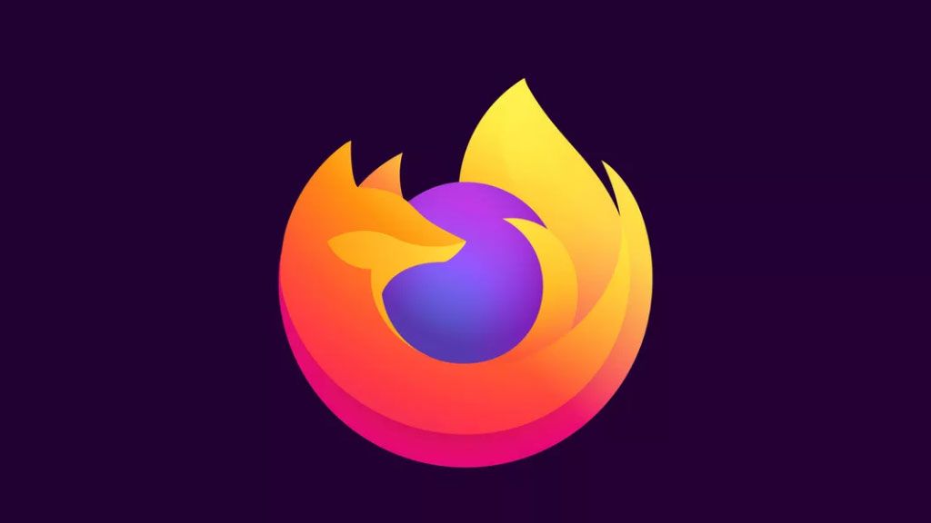
Firefox seems to be gearing up for a logo change, after posting a fox-less version of its logo on its Instagram account. Since the launch of its new mascot last year and news of a more general brand refresh happening now, we've been waiting for a logo update to match – and it looks like it's been announced in as teasing a way as possible. As the browser's logo is as recognisable as the best logos ever, I'm poised for what comes next, and think the brand direction is pretty clear.
While the purple orb is currently sans-fox on both the Instagram profile picture, and in the gif shared to grid, the post says it will be "back next week". Given the new mascot arrived complete with a name (Kit) and a new 'cuter' look, it has to be a redesigned fox that returns to encircle the orb. In fact, I think it'll be the first time the logo actually shows the fox's face since a lot of effort went into introducing him – and he's a personality-filled illustration. You can see the little guy below.
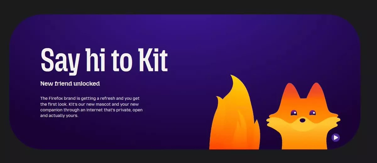
As you can see, Mozilla is placing Kit at the centre of the brand (in a project spearheaded by agency JKR), going so far as to call him a 'new friend'. It's likely the aim is that the shift will empower users to connect more deeply with the brand, setting it apart from faceless browsers like Safari and Chrome and increasing both user engagement and customer base. It's a fair assumption from Mozilla that people are attached to the fox – the company went viral for a tweet that included the image below, with an outpouring of fury for the missing fox.
This logo redesign comes alongside a more general refresh for the Firefox brand, which will apparently include pastel colour palettes and softer, more rounded aesthetics. This could spell an altered colour scheme for the logo itself, with the already paled orange going even more pastel, and the purple getting lighter, too.
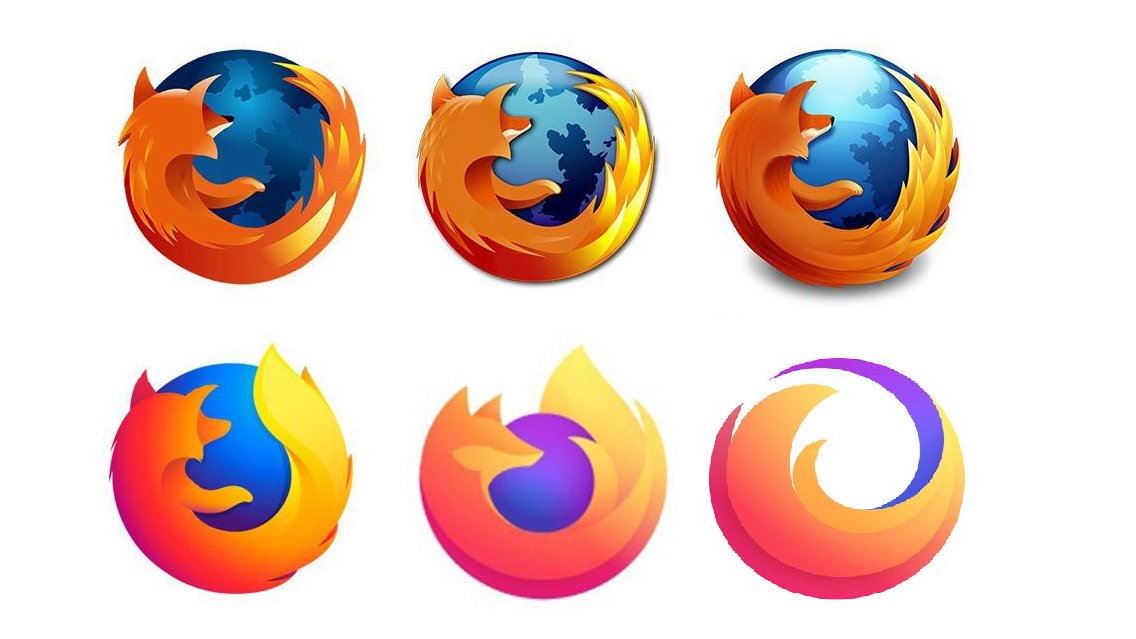
Few logos have transitioned through design iterations with the same grace as the Firefox logo. From its skeumorphic beginnings as a textured globe hugged by a furry fox to the more minimal modern version, it's remained a smart, sleek design perfectly suited to the shortcut bar.
With the majority of brands moving away from the trenches of extreme minimalism lately, I wonder how the Firefox logo will turn out this time – and if it'll help to improve Firefox's 4% share of the browser market.