Gray hasn’t had much attention in interior design of late, in any form. However, there is a gray-adjacent color that’s been a rising trend this year so far: gray-green. Not quite gray, not quite green. Not as soft as sage, and not as ethereal as celadon, these gray-green tones are calming and grounded.
Gray-greens are shades that dance in natural light – so naturally they are beautiful in light-filled settings – but because they can shift so dramatically, they can be tricky to get right. You need to pay close attention to the undertones: too much gray can appear cold, while too much green, and you lose the depth.
Here to guide you through the green-to-gray scale, these five spaces showcase the versatility of this complex color trend and will help you decide where you sit on the spectrum – and which shade suits your space.
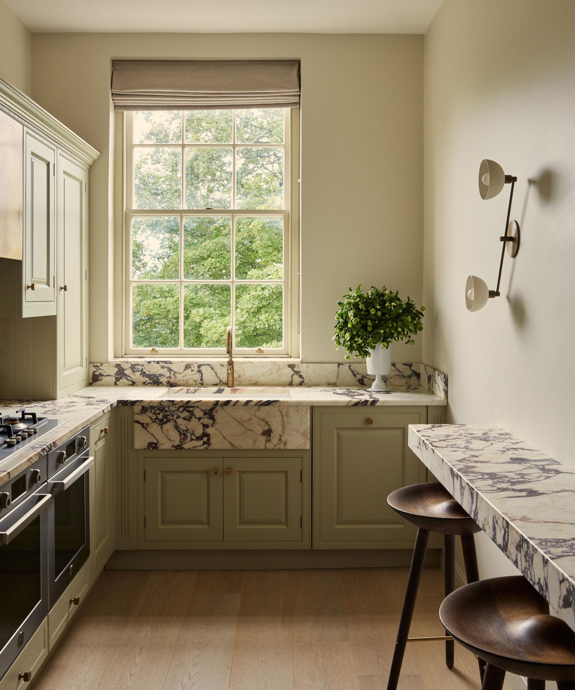
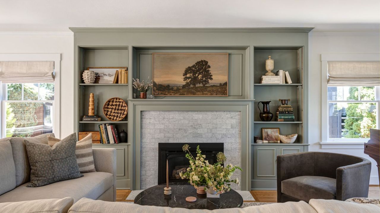
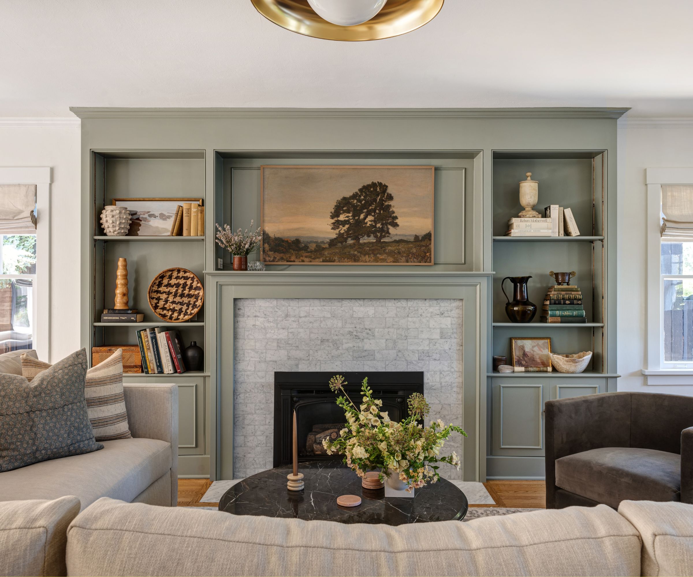
Understated and refined, this green kitchen comes to life through its thoughtful layers of color and texture. A bold Carrara marble crowns the center of the room, while the pale gray green paint sits calmly around it, providing respite from the marble's striking effect.
James and Sara Horsfall, founders of The Bath Kitchen Company, sought a muted gray-meets-green to complement the kitchen's overall minimalist vibe. They explain, 'We wanted a color that still had a neutral aspect to it and wasn’t over-dominating. Ash Grey was very soft, not too cold, and a perfect accent to a pared-back home.'
Described by Farrow & Ball as, 'The underlying green in this shade means that it will appear more intensely colored in natural daylight and greyer in areas of low light,' Ash Grey not only works beautifully beside organic materials but also comes to life with daylight. James and Sara add, 'Inviting, soft yet warm, Ash Grey works well with the English light that flooded the kitchen.'
A sage green with gray undertones, Farrow & Ball's Ash Grey is a sophisticated choice that blends into historic and contemporary spaces.
While gray-green hues are complex, understating their undertones will help you decide which tone works for your space. While Benjamin Moore's Nantucket Gray has a grayer undertone than Farrow & Ball's Ash Grey, which edges on the darker side, placing it slightly further along on the gray-green spectrum.
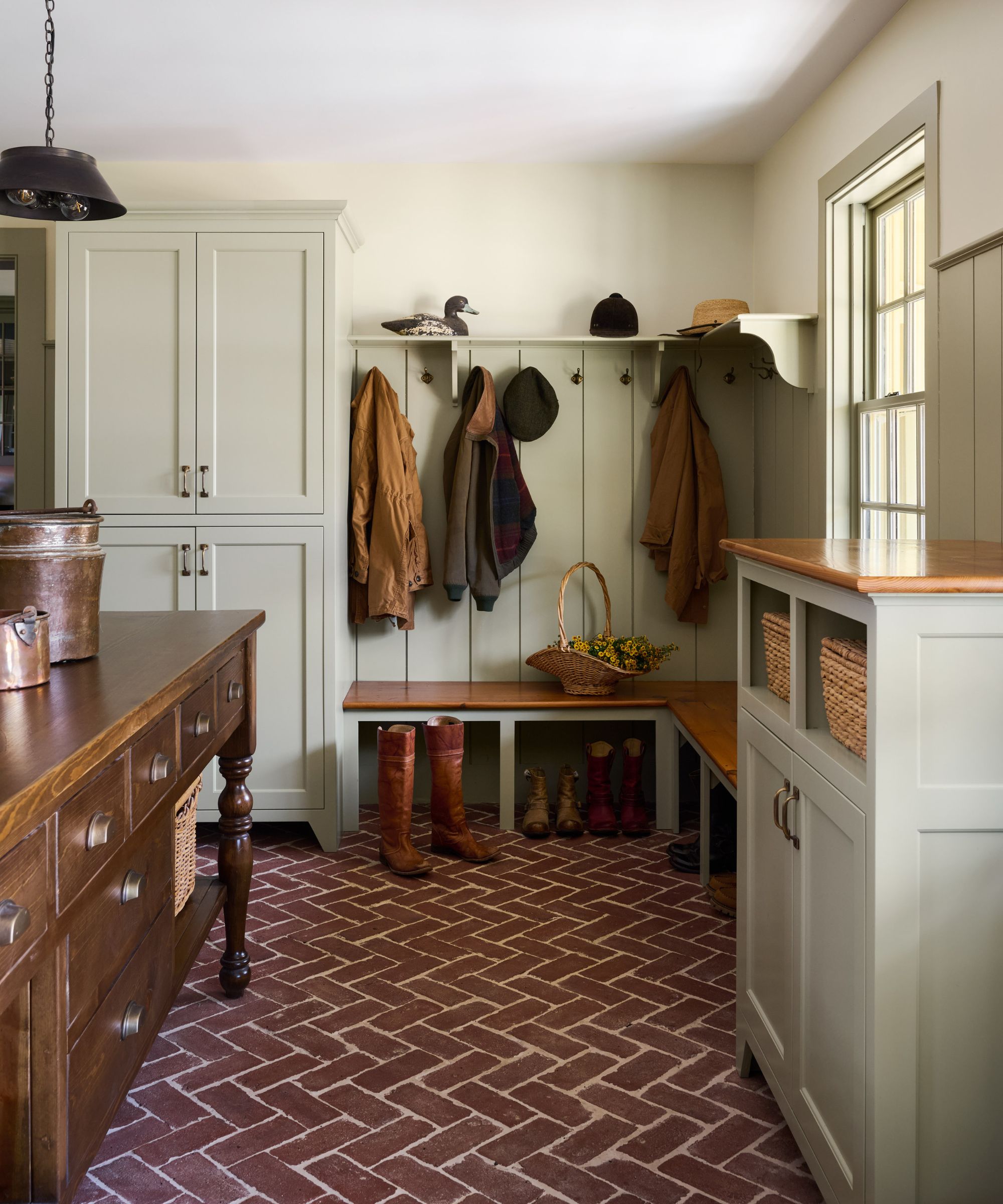
On the lookout for a paint color that felt in keeping with her client's historic home, interior designer Chloë Rideout selected Nantucket Gray for its grounding powers and ability to enhance without jeopardizing a room's integrity. She explains, 'The mudroom is located in a small New England town (called West Newbury, Massachusetts) as part of an addition to a house that was built in the 1790s.'
'Nantucket Gray is one of my favorite chameleon paint colors to use, especially on millwork and cabinetry, as it acts as a neutral base for a room but still provides an interesting depth with the green undertones. To me, it is a green first and then a gray.'
Chloë explains, 'I chose it in this mudroom as I felt it would change beautifully throughout the day as the sun travelled, shifting from green to more of a warm gray at night, and contrast nicely with the brick floors.'
A sage green with deeper gray notes, Benjamin Moore's Nantucket Gray is an enduringly classic choice for cabinetry, walls, or paneling.
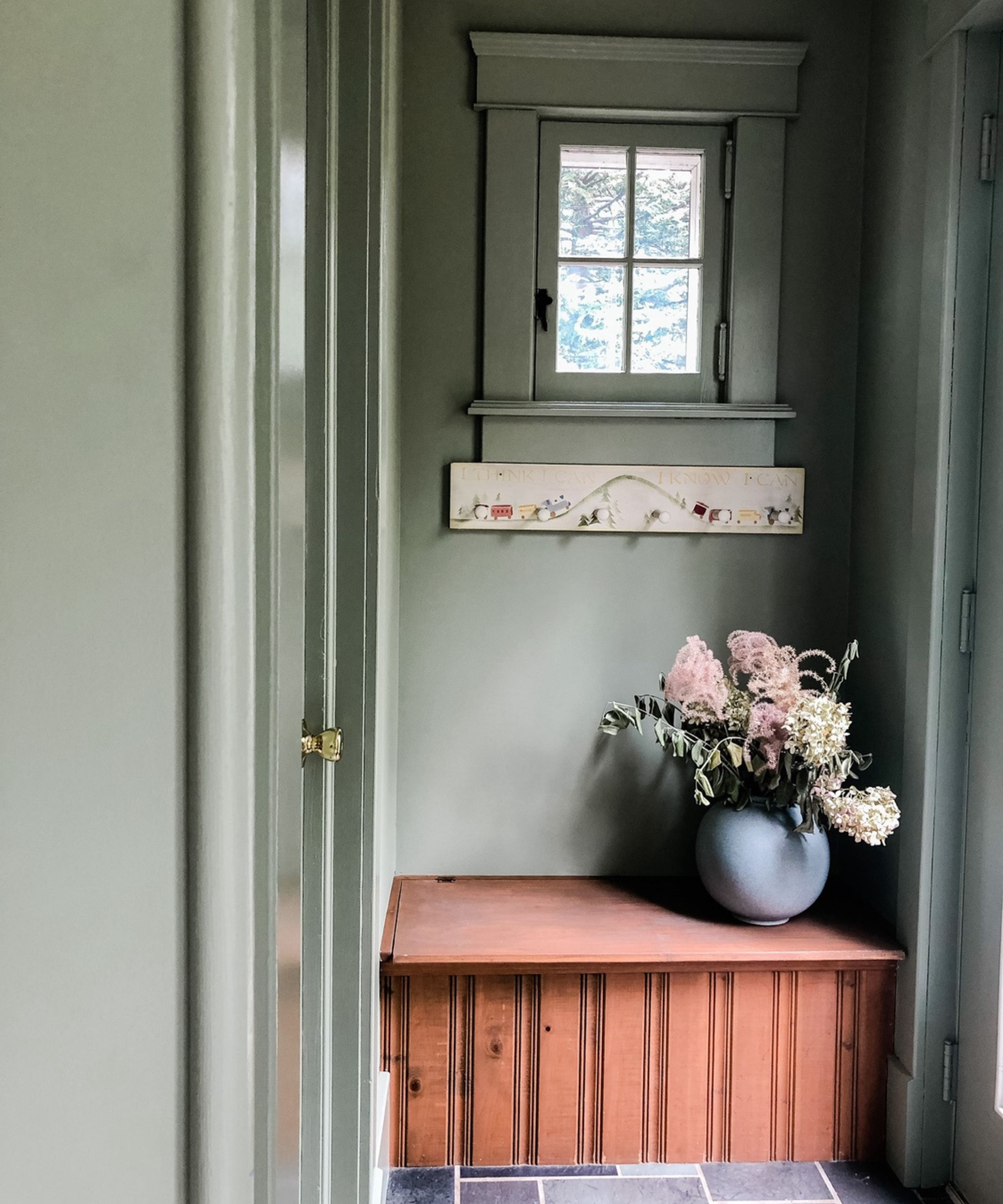
A gray-meets-gray that perfectly blends the two hues, Benjamin Moore's October Mist feels pretty central on the gray-to-green color spectrum. With distinct notes of depth matched by muted tones of green, it's a versatile color that feels fresh whilst still able to envelop.
Emily Sandford, founder of Sanford Collective Interiors, says, 'We chose October Mist for the trim in the adjoining living room, where the walls are a very soft white. In the mudroom, we carried the color onto the walls, ceiling, and casework to create a more enveloping moment. Because the flooring transitions between the two spaces, it helps establish a sense of continuity while still giving each room its own identity. There were also existing elements at play, including the cedar bench and slate floors, and we wanted to gently balance those warmer undertones with something soft and grounding. October Mist felt like the right way to gently anchor those without competing with them.'
Emily adds, 'October Mist is a soft, silvery sage that sits between green and grey. It is quite nuanced and shifts throughout the day depending on the light. In a more enclosed space like this mudroom, it deepens and settles into more of a moody tone, while the adjoining living room, with its floor-to-ceiling windows, it reads almost luminous. There's a softness to it that keeps it from feeling heavy, and enough complexity that it doesn't read as flat. It's the kind of color that feels considered without announcing itself.'
'A silvery sage' that grounds and calms, October Mist has distinctly calming notes, making it a versatile choice for almost any room in the home.
A significantly grayer looking green, Farrow & Ball's Pigeon falls on the gray end of the color scale, making it the perfect choice for rooms in need of depth that's restrained yet still rich.
Emily Ruff, Founder of Cohesively Curated, explains, 'I call Farrow & Ball's Pigeon a chameleon color depending on what you put next to it. In some spaces, it can feel more gray than green, and it also has blue undertones in some lighting. It is a really beautiful and calming color that goes well with everything.'
Emily explains why the gray-green worked as a living room color. 'Our clients purchased this home and loved these original built-ins, but didn't love the wood tone they had. They really didn't want to paint the entire main floor, and the walls had a lovely warm white that we could easily work with. We wanted to bring in a color on the built-ins that didn't feel too bold and distract from the beautiful view out of all of the windows. Pigeon is definitely green, but it is subdued, so it feels like a neutral.'
A gray paint color with green undertones, Pigeon is long-loved for a reason, able to enrich quietly and gently.
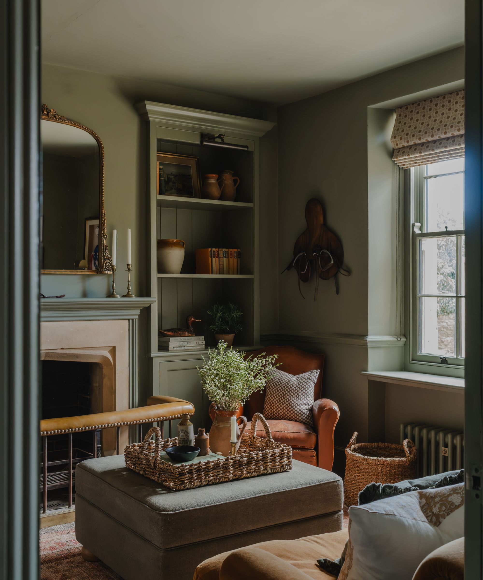
Described as 'a calming gray with natural energy', Coat Paints' Jojo's Green is one of the darkest gray-green paints out there. A charcoal gray mixed with green, it's a sympathetic choice that's perfect for historic homes.
Jojo Barr, founder of House Nine Design, says, 'It's an endlessly characterful gray-green paint with a slightly earthy, ‘muddy’ quality that gives it real depth and sophistication. There’s a calming, natural energy to it – grounding, reassuring, and incredibly easy to live with.'
'Jojo’s Green naturally evokes that English Heritage aesthetic – cozy, comforting and quietly timeless, which suited the snug setting within this Cotswolds home beautifully. It brings depth without overwhelming the room, creating a space that feels both intimate and enduring.'
An almost gray, Jojo's Green falls on the darker side of the gray-green scale, perfect for rooms in need of richness and warmth.
The Gray Green Shopping Edit
Add an organic feel to an armchair or sofa with this fringed linen cushion cover. Simple yet elegant, it'll bring depth and earthiness to any room.
For a dose of decadence, try the Alair Round Ottoman. Featuring dramatic fringing around a round ottoman, it's a playful yet sophisticated living room staple.
Inject your kitchen with some rustic charm using this reclaimed wood pedestal painted in seafoam green.
Transform your bedroom into a soothing retreat with this organic cotton sage green quilt, designed to comfort and elevate all at the same time.
Best paired with a delicate pleated shade, this ceramic lamp base is the perfect way to introduce subtle pops of earthy green into your room.
Finished in a muted sage glaze, this Portuguese stoneware bowl would look best on kitchen shelves amongst other handmade ceramics.
While sage green might feel a little overdone at times, the gray-green trend combines sage's heritage charm with gray's moodiness. While it's easy to style gray-green tones, be wary of the role of light when choosing a paint color by considering the far-reaching spectrum of pale sage to gray.
Love beautiful design ideas, expert advice, and inspiring decor trends? Sign up for our newsletter and get the latest features delivered straight to your inbox.


.png?w=600)