What you need to know
- Google has redesigned some elements of its popular file management app.
- Users will be able to view their recent files in the form of a carousel, just like their Memories on the Google Photos app.
- The new change is seen in the latest beta and some official versions of the app.
Files by Google app is getting a nifty new look when you glance through your recent files, which is very similar to what we have seen on the Google Photos app for quite a while now.
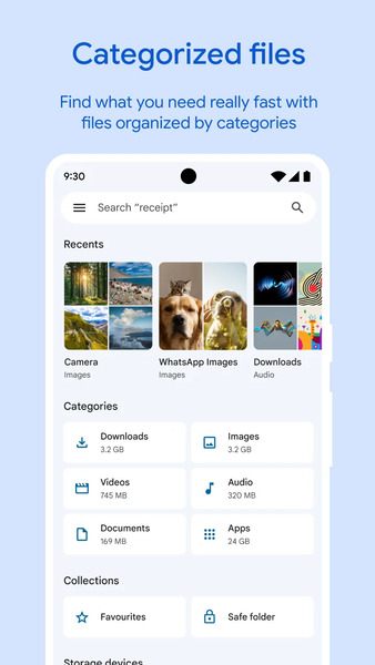
Until now, users were greeted with the "Recents" and "Categories" sections in the app when they opened the Files by Google app on their Android phones. The Recents tab is always used to showcase folders like Camera, Download, Screenshots, and Downloads (Documents) in grid form with a slight preview of the contents.
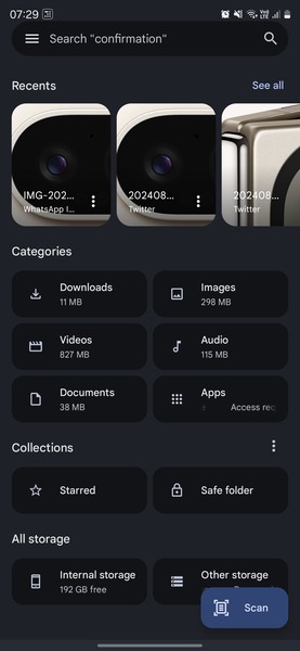
It is now changing with a new update (via 9to5Google), and the same Recent section will now greet you with a Stories-like carousel quite similar to what we see on Google Photos' "Memories" up top.
Your handset's recent files can now be viewed in a carousel format. Rectangular cards show up as previews, and when tapped, the file/image opens in the full-screen view.
The cards are further accompanied by a three-dot menu, which lets you share, send to trash, or mark the respective file as "Starred." A total of ten cards can be viewed in the new carousel, after which users can hit the "see all" button on the top right to open up recent files segregated according to folder names.


While 9to5 points out that these new changes were spotted in the latest beta of the Files by Google app, we could also see the carousel in action with the same app bearing the 1.4237.652465286.1-release version. Google Photos is one of the apps that showcase stories, such as the carousel feature; the Play Store also showcases similar cards in the popular "For You" section.
It's interesting to see Google make these adjustments and provide a consistent user experience across all of its products. There's also the exciting aspect of these improvements occurring just before the official release of Android 15.


