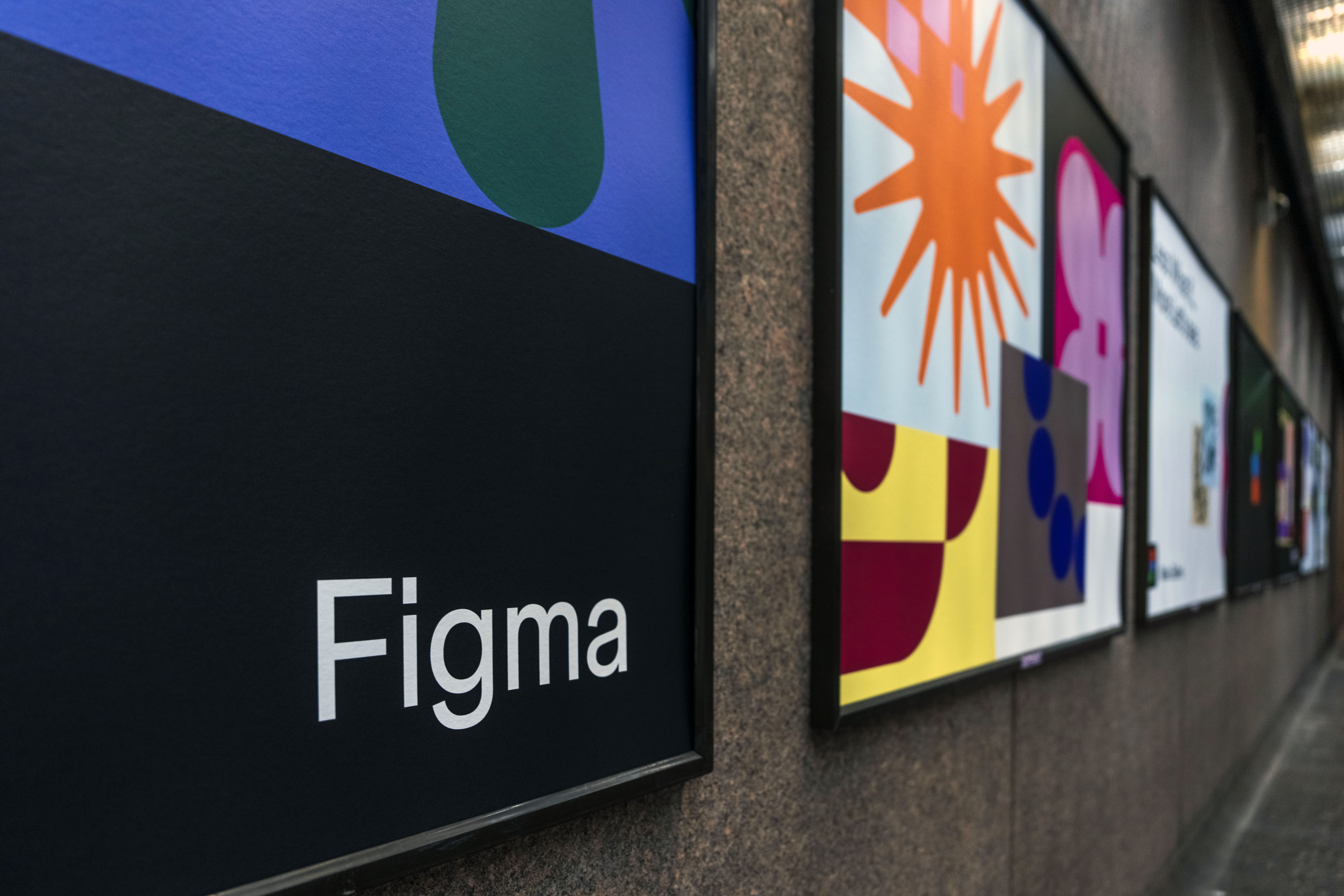
It's been a wild couple of years for Figma, with the web design platform launching – then abandoning – an acquisition deal with Adobe, as well as revealing a bunch of updates including Dev mode and an overhauled UI. And now, the brand has been given a delightfully playful visual refresh.
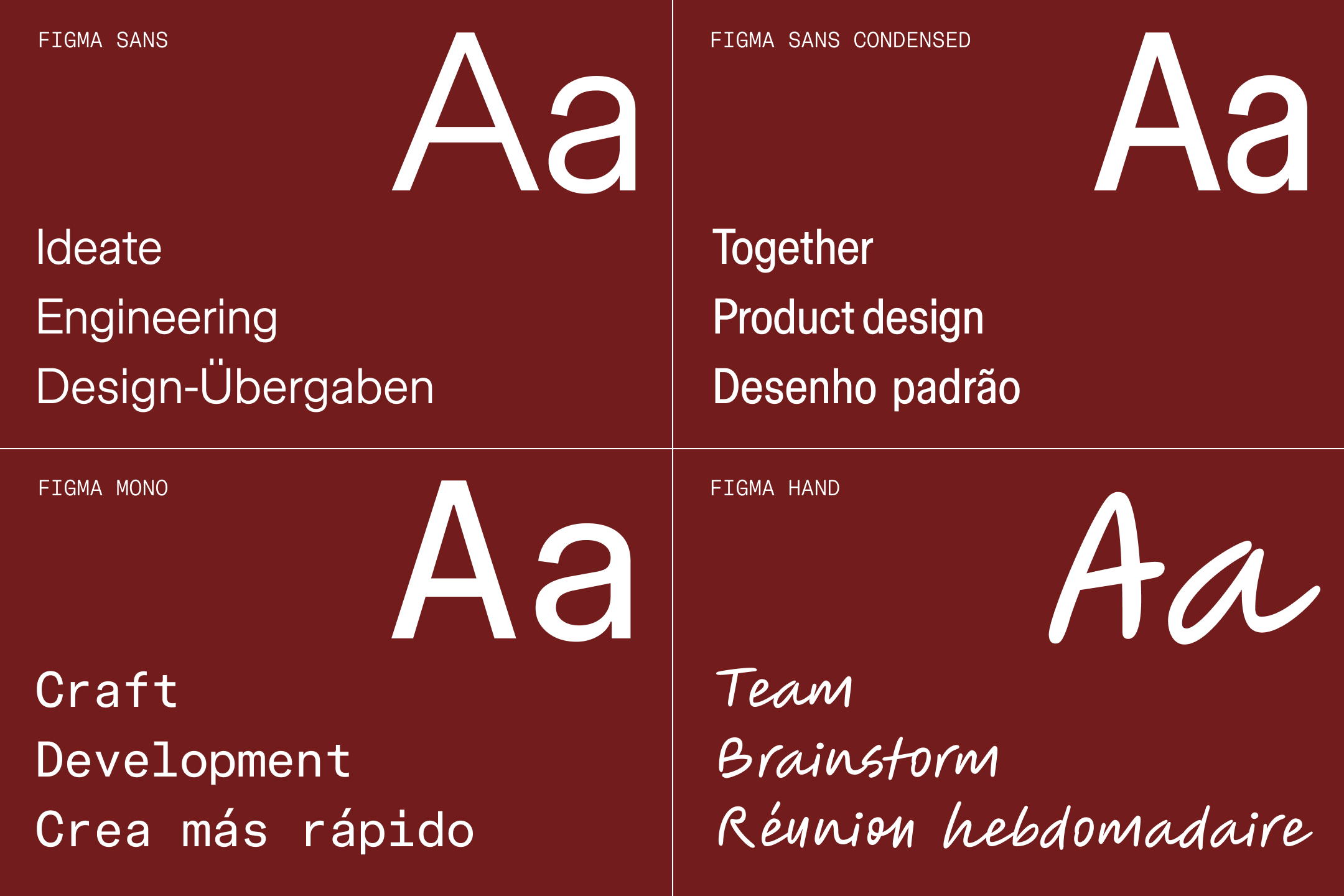
Featuring an expanded colour palette, new motion principles and a brand new typeface, Figma's playground-inspired identity is an unabashed and "unapologetically jumbo" celebration of creativity. For the full lowdown on the platform, take a look at our Figma review.

"The team was drawn to the concept of activities playing out in a shared space, akin to parallel play," Figma shares in a blog post. "Brand Designer Jefferson Cheng recalls drawing early inspiration from the playgrounds of Isamu Noguchi and Mitsuru Senda: “They were a metaphor for the Figma canvas—a place where people come together to create and experiment.”"

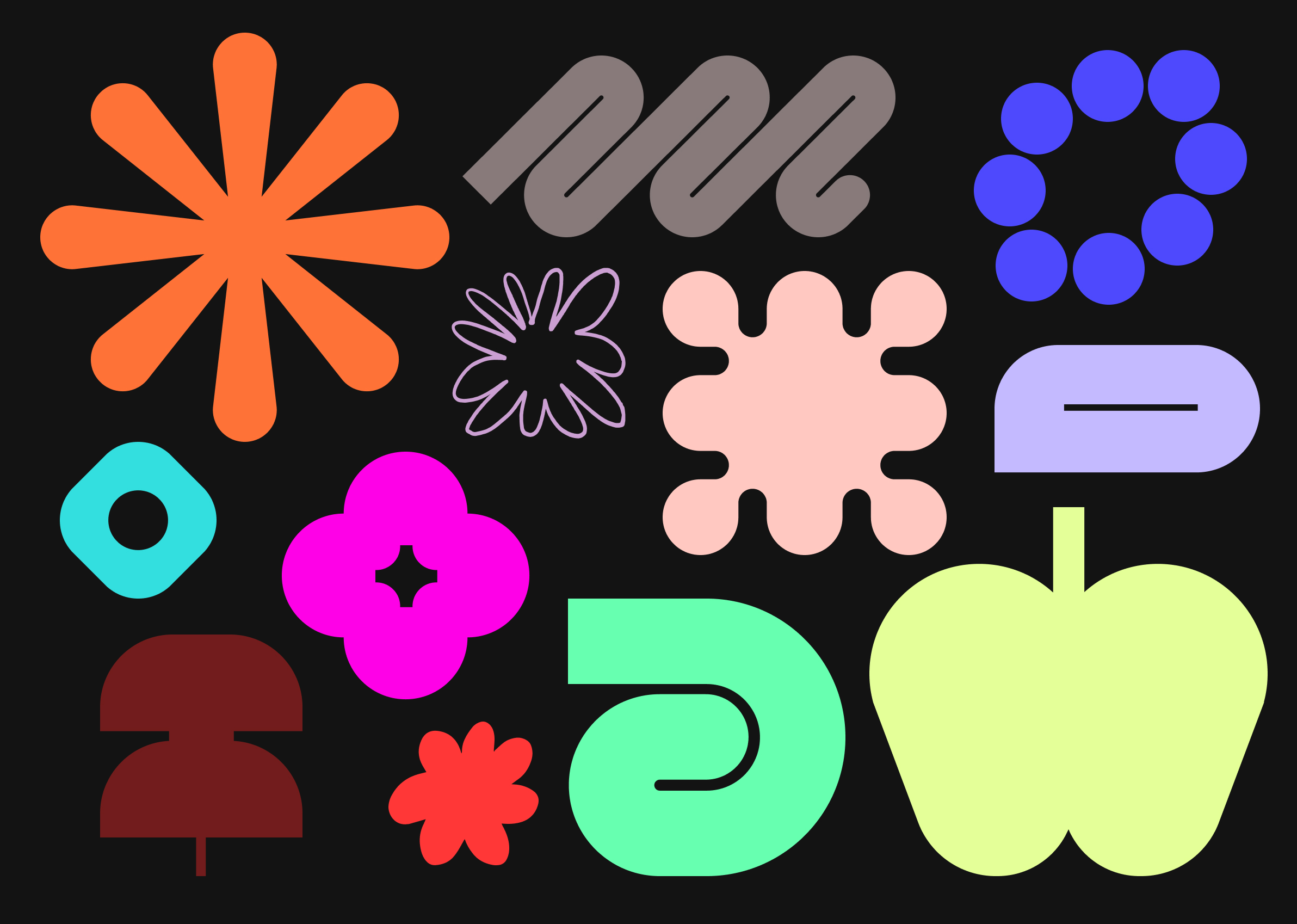
At the heart of the new identity is a series of what Figma calls 'Primitives'; basic shapes (above) forming the building blocks of its illustrations. "These range from ambiguous blobs to representational forms, illustrating various takes on form and function."
Figma explains that while each primitive is distinct, they share key characteristics. “It’s almost as if we zoomed in on each element, stripping away the non-essential and honing in on composition,” says brand designer Jefferson Cheng, explaining how the designs are even larger and simpler than their predecessors. "Importantly, the primitives are vector-based, ensuring they can be created entirely in Figma."

Figma has also introduced a new colour palette including bold primaries, bright neons, and muted earthy tones
And Figma has some bold statements to make about its bold colour choices. Brand Studio Director Damien Correll claims that the idea of a brand 'owning' a colour is unrealistic in 2024. "In an industry where owning a color or pairing is perceived as the pinnacle of successful branding (think Coca-Cola red or John Deere green), Damien believes that such an approach is unrealistic for many contemporary brands: “[Heritage brands] have put in the time to build that equity and, frankly, were there first. We have an incredible in-house team and they pushed for a more sophisticated palette—recognising that we need a spectrum with a principled way of using—rather than a limited, colour-by-numbers approach.”

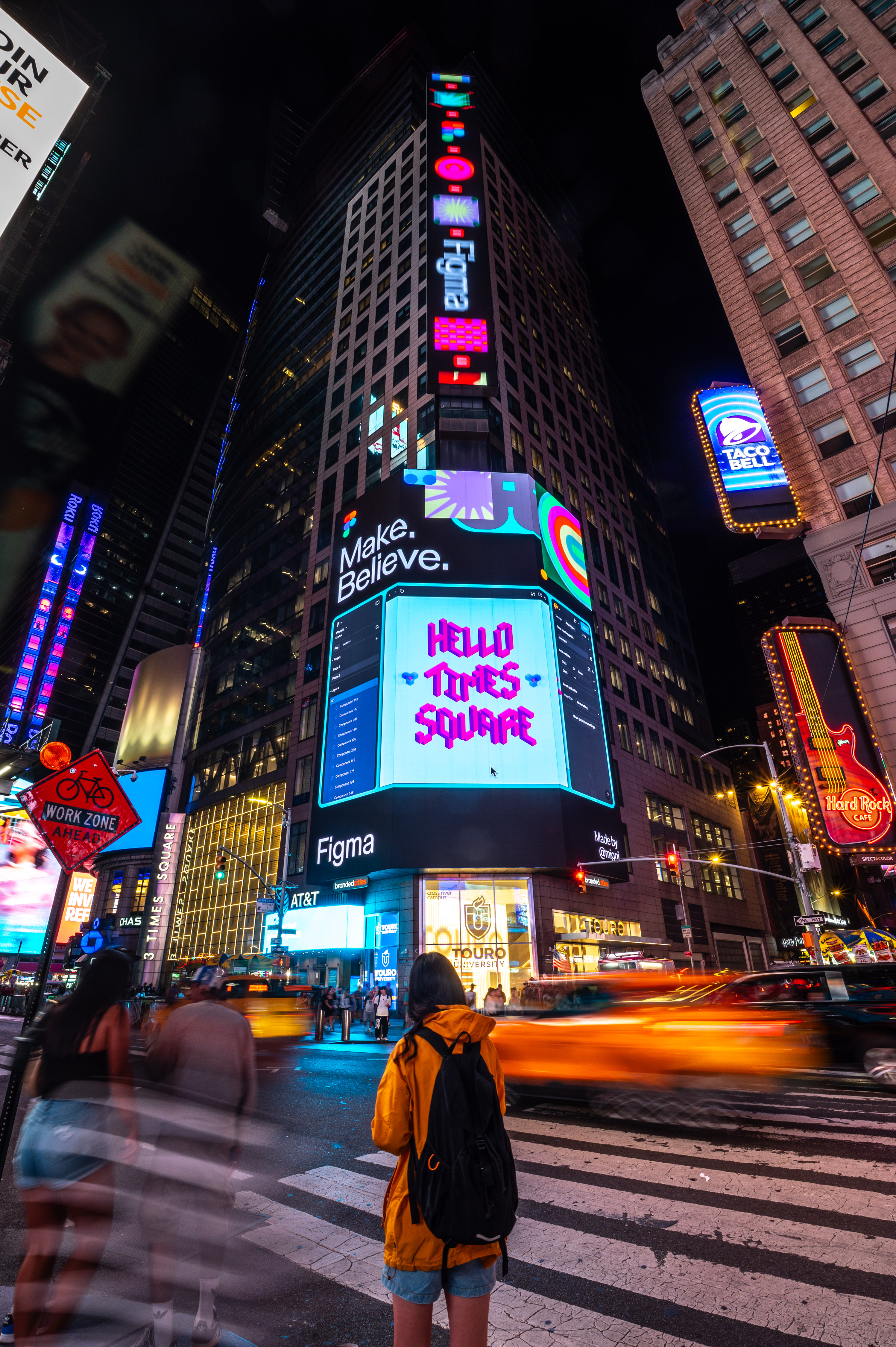
A bold campaign in New York's Times Square launches the new identity, featuring Figma customers such as Yeti, Discord, Amtrak and Twitch, alongside professional creators from the Figma Community and even NYC middle school students to highlight the Figma for Education program.

Indeed, while we've seen plenty of audacious rebrands in recent years, ranging from the brilliant the the disastrous (looking at you, X), it's always satisfying to see a refinement of a brand's existing style take it to new heights. Figma's new look is as unapologetically playful as the brand suggests, and all the more fun for it.


