Whether we're writing about the most timeless kitchen cabinet colors or sharing the hottest new interior design trend, color is part of the everyday here at Homes & Gardens. And our sources for the next biggest color trends can come from anywhere, but one voice we always listen to is that of Farrow & Ball.
Icons in the paint and color world, its brand ambassador, Patrick O'Donnell, is a fountain of knowledge when it comes to any color queries, and when he shares what's the next big thing in the color world, we listen.
Last year was defined by rich burgundies, pretty powder blues, and of course, the notorious buttery yellow, loved for its soft, enveloping qualities. And this year, the love for understated vibrancy and comforting richness continues. Sharing his color trends for 2026, Farrow & Ball's brand ambassador, Patrick O’Donnell, explains that these four color families in particular 'will be making a strong presence in 2026.'
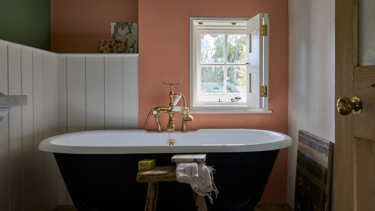
1. Faded Terracotta
We might only be a quarter of the way into 2026, but faded terracotta is already defining this year's trends. Falling somewhere between plaster pink and orange, this earthy, quiet neutral is a warmer alternative to once-popular neutrals like gray or beige.
Patrick says, 'Faded soft terracottas, verging on blushy-pink apricots, are going to be huge.' While some of the best terracotta paints have a deep, rich orange undertone, the beauty of faded clay tones is their neutral feel, able to sing in the background of any room in the home. Patrick goes on to say this color family 'is really lovely and really gentle.'
Picture a living room donning an understated peachy tone, or a bedroom drenched in a pinker version of the hue. Patrick suggests some of Farrow & Ball's most beloved examples, the notorious Setting Plaster, and the slightly darker Templeton Pink.
2. Rich Chocolate
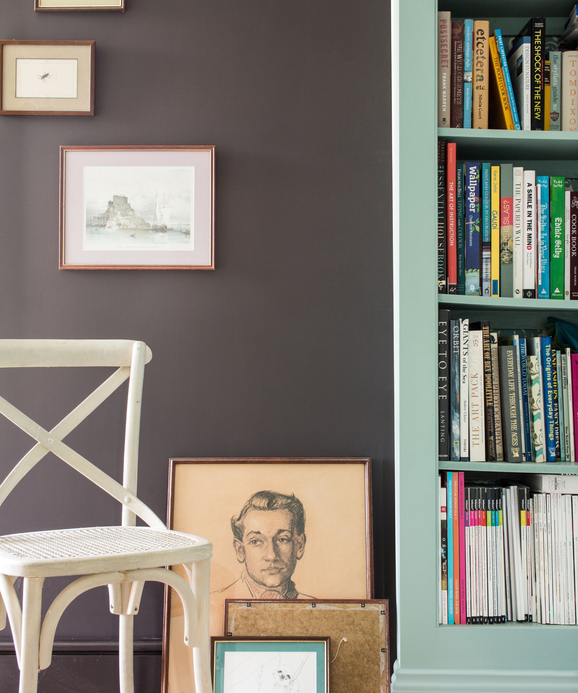
Deep, unctuous versions of brown had the world of interiors in a chokehold last year, with the most stylish rooms being color-drenched in glossy browns. Farrow & Ball says that the love for rich, really dark, brown will continue in 2026.
Patrick calls them 'rich chocolates', characterized by their depth. He continues, 'While chestnuts and tobaccos are really beautiful, we're going to see a little bit of a renaissance of darker browns.' Shades like Cola, a dark brown with red undertones, and the warmer Wainscot are perfect for enveloping a room with richness.
Patrick suggests these rich chocolate browns are 'beautiful for cabinetry or even a sitting room would just be heaven in a dark chocolate.' He recommends 'throwing in burnt oranges, pinks, and greens' for a harmonious contrast. Think the marmelade inspired Marmelo, the understated Pink Drab, and the charming Cooking Apple Green.
3. Eggplant
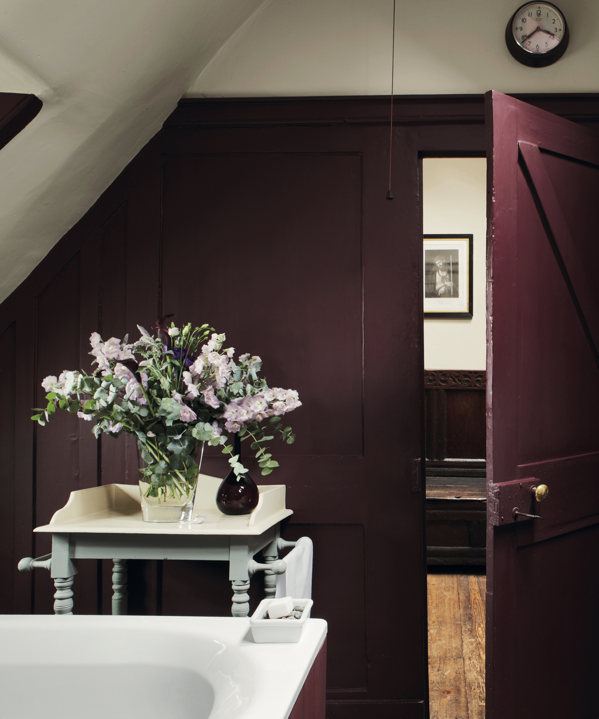
It'll come as no surprise that deep plum is a color trend Patrick predicts will only get more love in 2026. They quietly crept into the back end of last year, cropping up in cozy snugs, powder rooms, and kitchens last fall.
Patrick says, 'The other thing that's coming through quite strongly again is that aubergine note. I think we've seen a lot of that in editorial.' Referring to Brinjal (which Heidi Caillier used to decorate Kendall Jenner's mountain home last year), Patrick adds, 'we got a lot of resonance from that. Those lovely, kind of plum, winey, aubergine notes will be really big this year.'
Deep eggplant hues are best in small rooms; they pack a punch and open up restricted architecture. If you're planning to decorate with Farrow & Ball's Brinjal, pair it with crisp whites, earthy grays and greens, or pale pink.
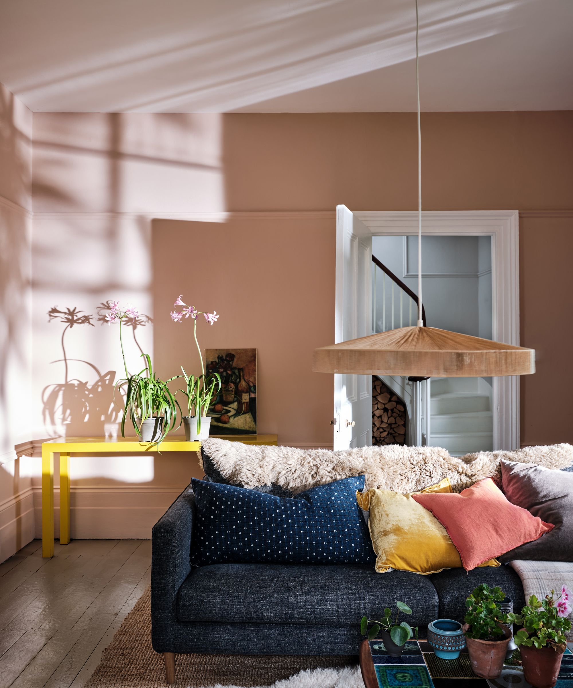
4. Soft Yellow
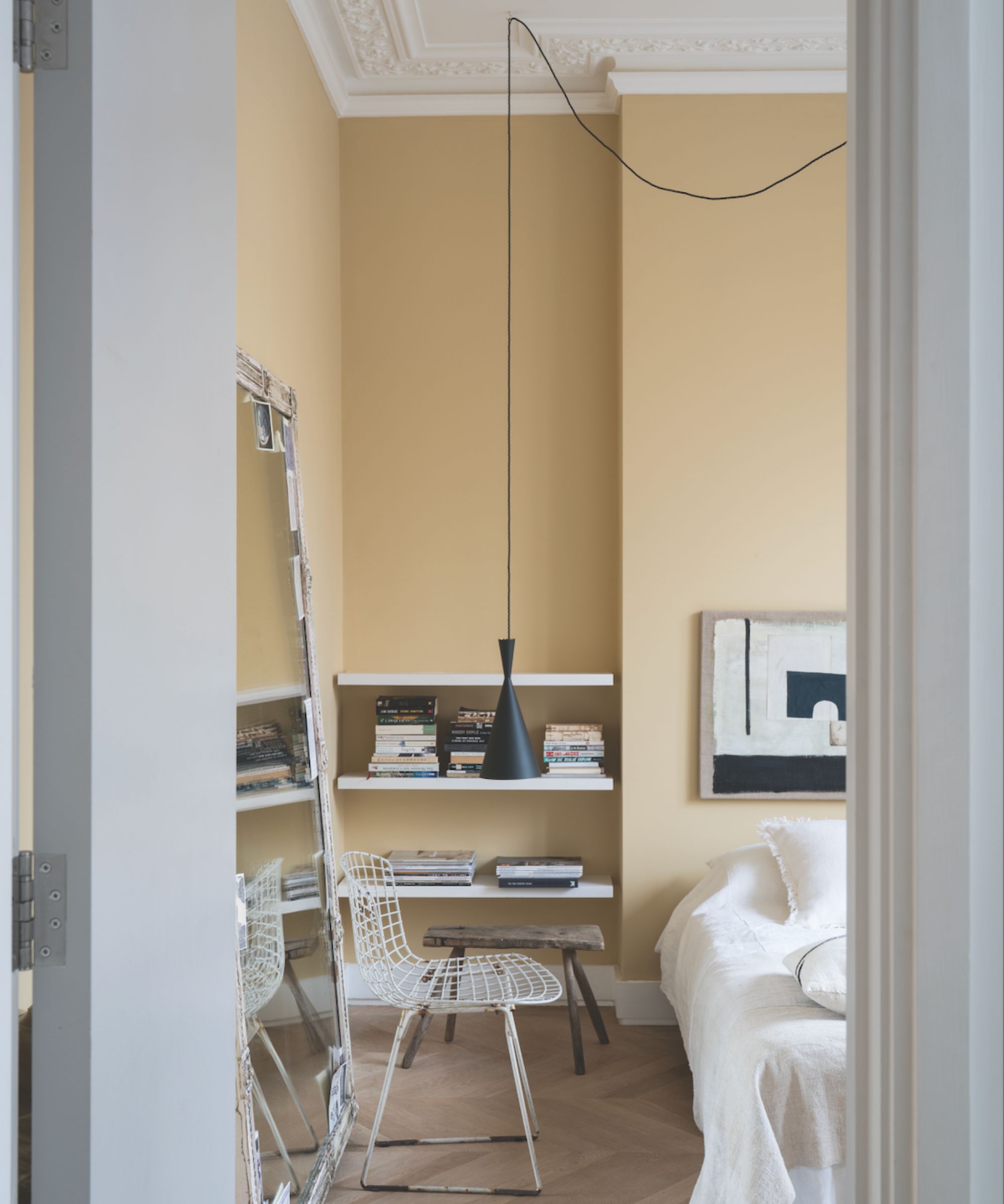
All big trends have a knock-on effect. In the case of color, butter yellow took the interior world by storm for the entirety of 2025, meaning it's inevitable it will ripple into 2026, too.
Patrick says, 'I think soft yellows are going to come through. I know we keep talking about yellows and they never seem to have a full renaissance, but I think really gentle pale or buttery notes like Hay and Sudbury Yellow will.'
While soft yellows are refreshingly easy to style (unlike sunnier shades), it's still worth considering the colors that go with butter yellow to ensure your scheme feels balanced and timeless. A pastel yellow kitchen would welcome richer accents like navy or even burgundy; equally, a pale yellow bathroom might appreciate crisp white trim or crown molding to make the hue pop.
Not a white, beige, cream, or gray in sight in Patrick's predictions for the colors of 2026, proving that these once go-to neutrals are far from the radar. These colors are still very usable and livable – terracotta shades in particular are ideal if you are looking for a neutral-adjacent shade that's going to give more depth and interest.
Love beautiful design ideas, expert advice, and inspiring decor trends? Sign up for our newsletter and get the latest features delivered straight to your inbox.