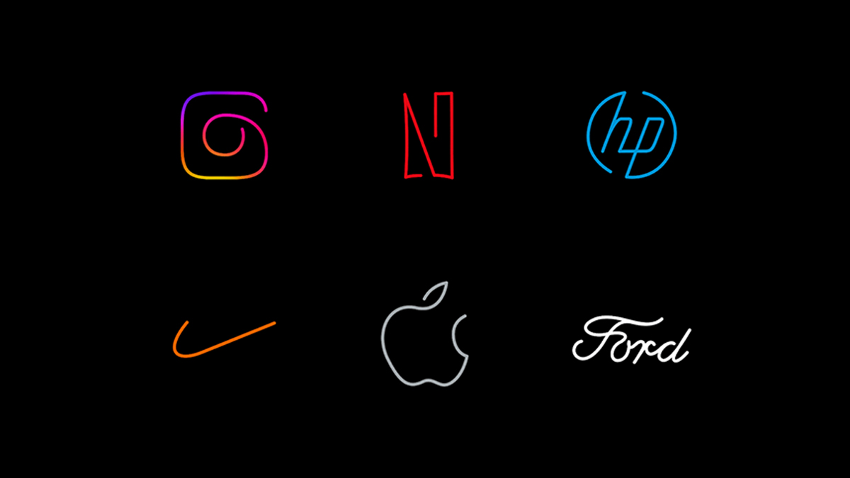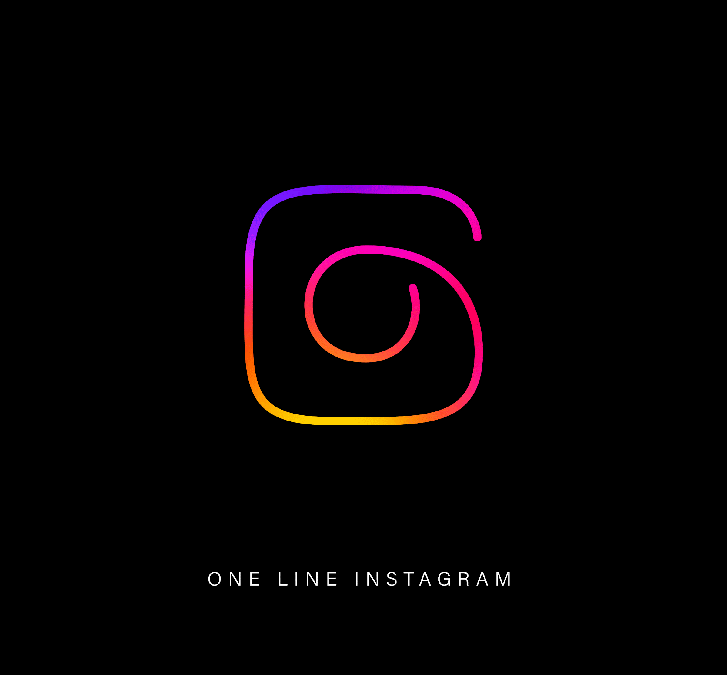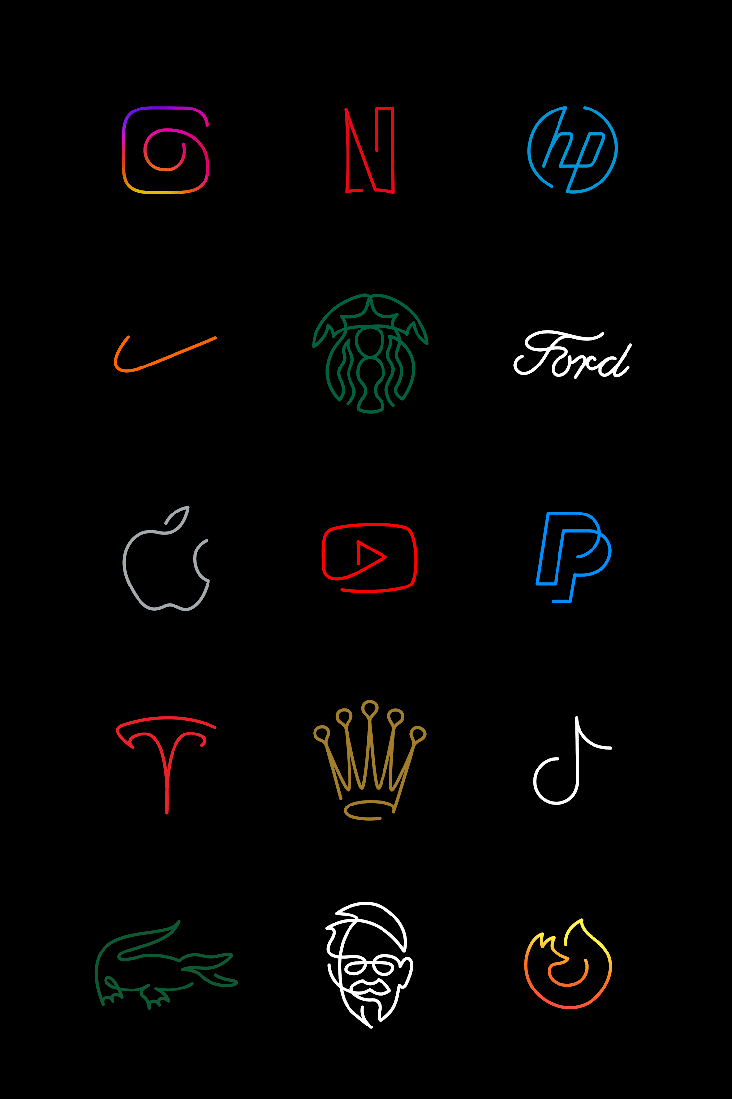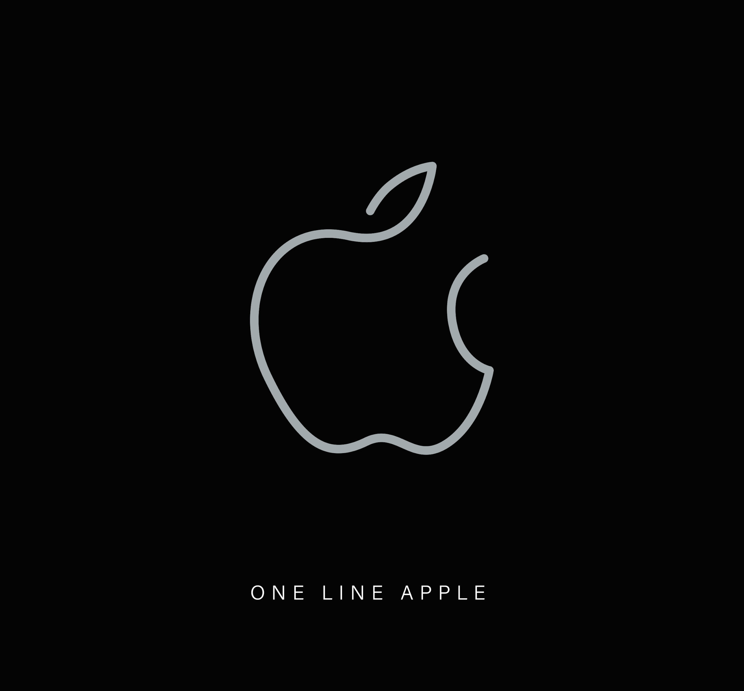
We've seen plenty of designers' unique takes on iconic logos, but here's one project that draws a line under the rest. French designer Stephane Leopold, co-founder of Loooop, a creative studio known for its minimalist line art, has reimagined 44 of the world's most famous logos using one continuous line, and the results are quite mesmerising.
The collection reimagines some of the world’s best logos in Loooop Studio’s signature style. It invites us to rediscover familiar designs in a new light by stripping them down to their essence. And in many cases, the fact that the logos remain instantly recognisable when stripped to their essence only serves to highlight the original designs' ingenuity.

" I usually start with instinctive, hand-drawn line directions to capture the general shape and movement of the subject and to identify its key features," Stephane told Creative Bloq. "For this logo project, the symbols are already quite simple, so it’s not easy to decide which elements to remove. However, my process involves time and refinement, which helps me reach the final result. I truly enjoy experimenting with the line until I’m satisfied with the aesthetic of the final creation."

Simple designs like the Apple and Instagram logos become even more minimal when rendered with a single line. Meanwhile, those that already have a cursive element, such as Coca-Cola or Ford, become even more expressive.
"I find inspiration by letting the child within me act freely," Stephane adds. After all, we all started with a pen and paper, drawing lines before learning to write letters. I never let that go. I’ve been obsessed with logos since I was very young and could memorize them naturally. For this project, I chose some classic logos that are often regarded as among the best ever. I also aimed for a good balance between logo types (icons, wordmarks, etc.) and industries."

From '80s redesigns to medieval reimaginings, it seems there's no end to the different styles iconic logos can be rendered in. For a journey down the logo design hall of fame, take a look at our roundups of the best logos by decade.


