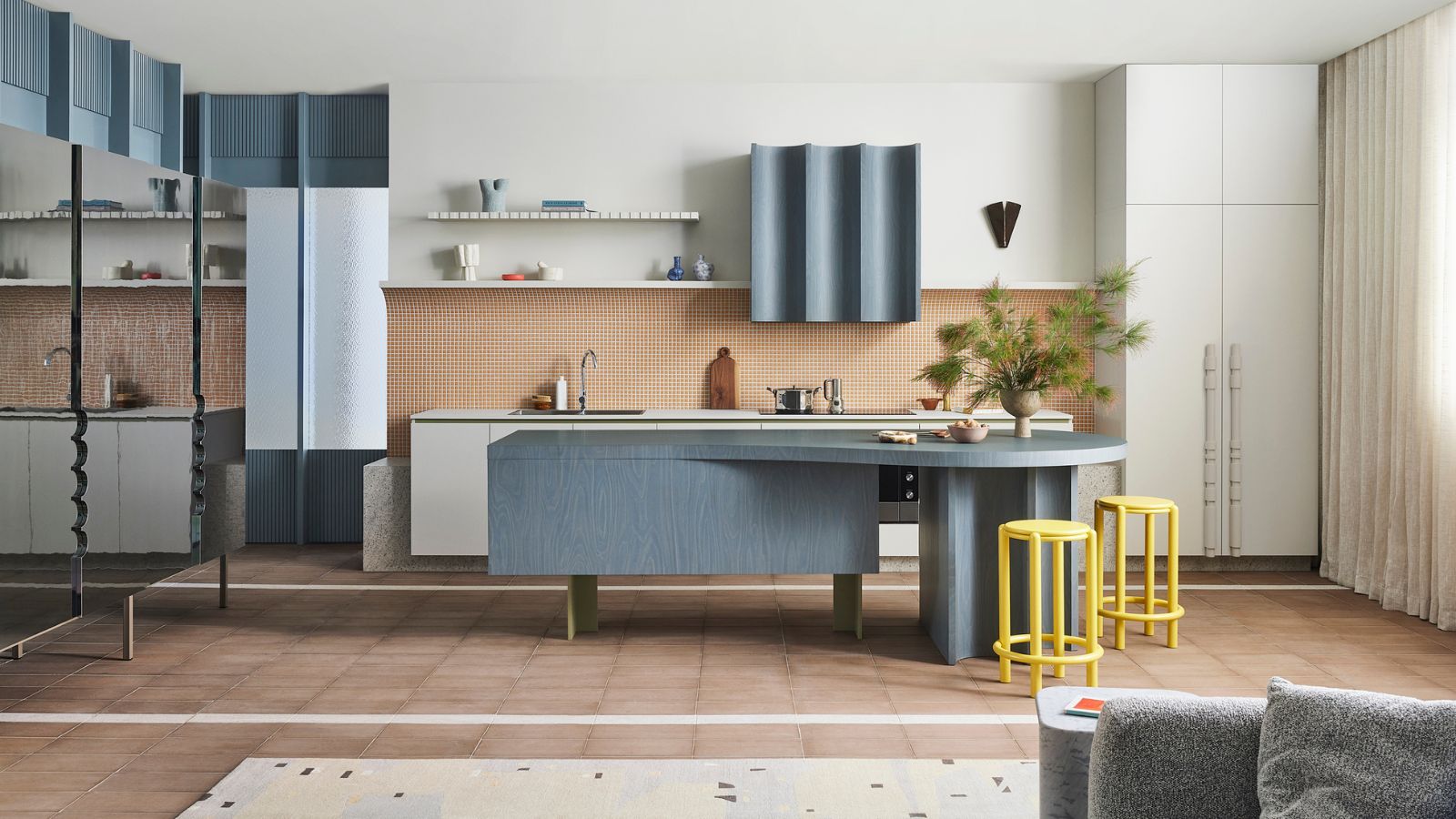
Our brief was to design a conceptual kitchen for a family who were keen to be daring with their design. The project was a collaboration between us, Studio Doherty, and laminate specialists Laminex, so naturally it features many of their surfaces.
Neutrals are used a lot when we think of laminates and this was an exciting opportunity to use other colors and textures – and to try color combinations that we wouldn’t normally use.
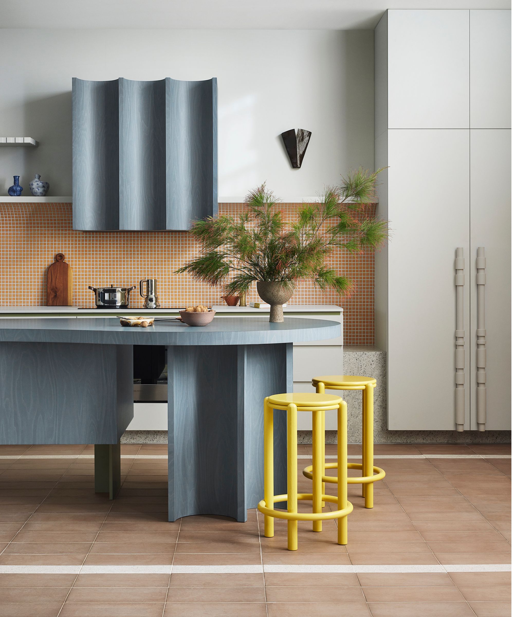
The kitchen is the heart of the home, and we were keen to push this idea with sculptural elements and a series of free-standing kitchen joinery pieces, so this feels like an extension of the living room.
Laminate has an amazing ability to curve, so we explored and pushed this idea to create many rounded sculptural forms to create a feeling of curved kitchen space. The end of the island bench, for example, has flexibility to it, as it can be used as food preparation, yet can also act as a circular dining table.
We took some risks with the material selections – the color choices were important, but it was the qualities of texture, grain, and gloss that provided the drama and layering in this space. The addition of kitchen tiles, specifically mosaic wall tiles in orange, helps to lock down that overarching sense of harmony.
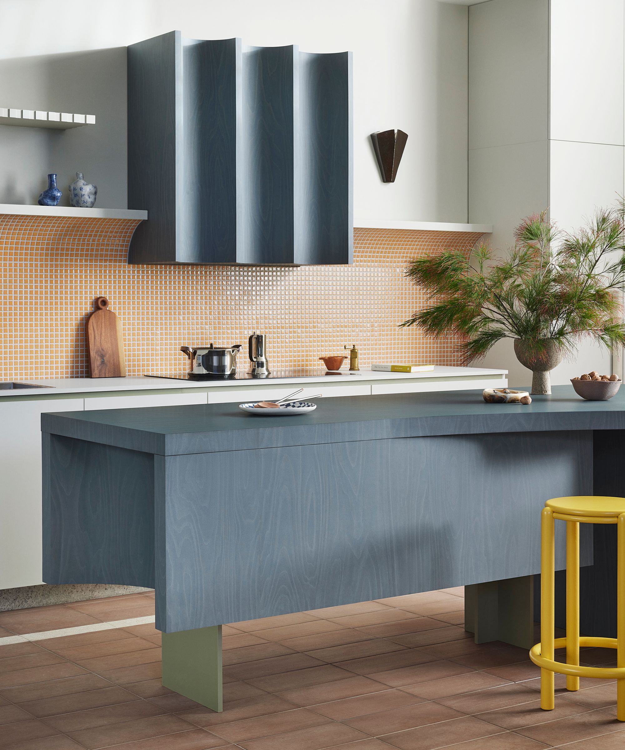
We always anchor the palette with a neutral base and then add some colorful or textured elements. The design of the cooker hood was all about exploring how laminate could curve around a surface and gave us a great opportunity to create a sculptural form out of it.
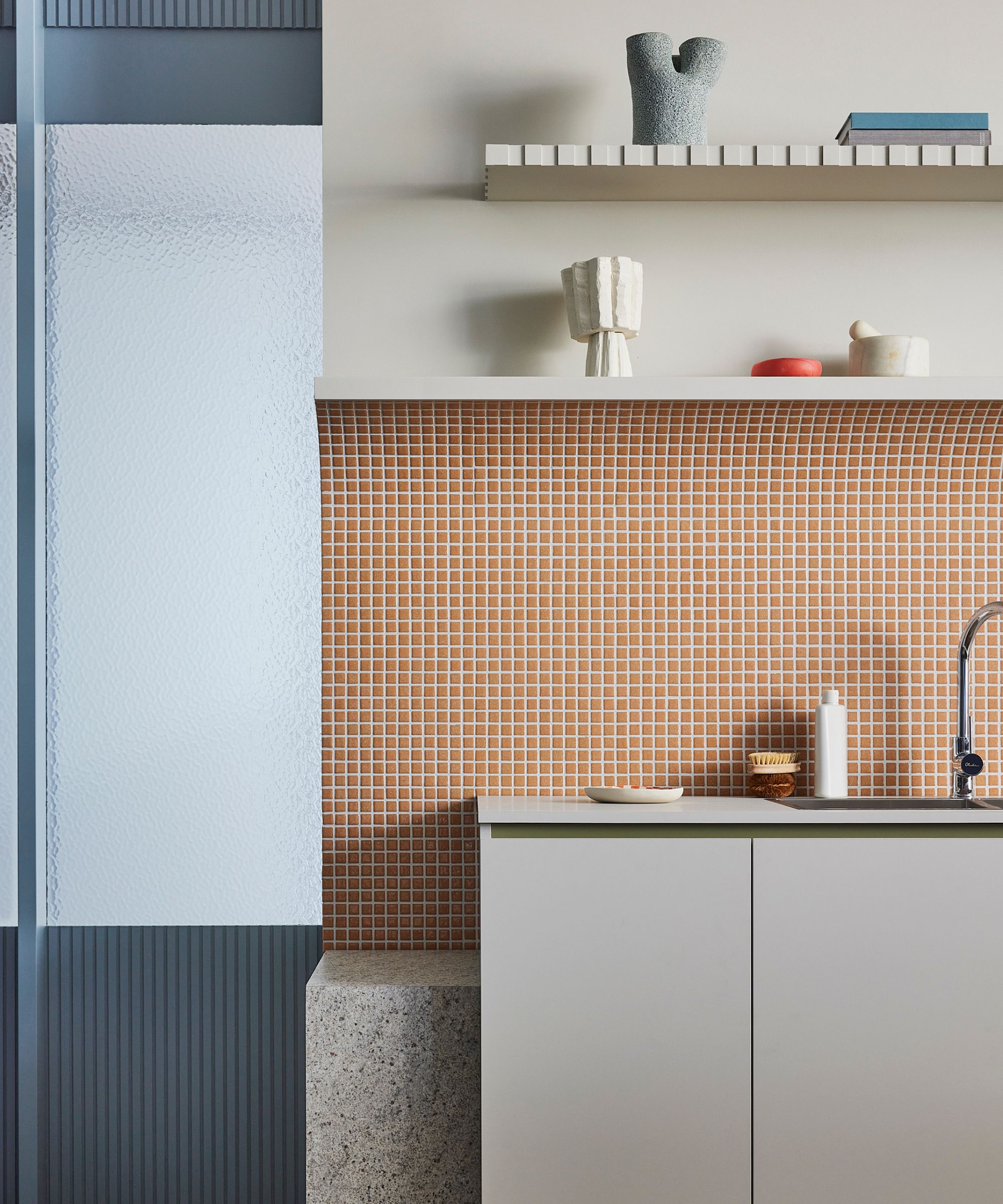
We pushed this curved idea with the splashback and created a curved edge at the top, which formed a neat edge for a shelf to rest on. Elevating the cabinetry off the ground creates a visual lightness, making the pieces appear as if they’re floating.
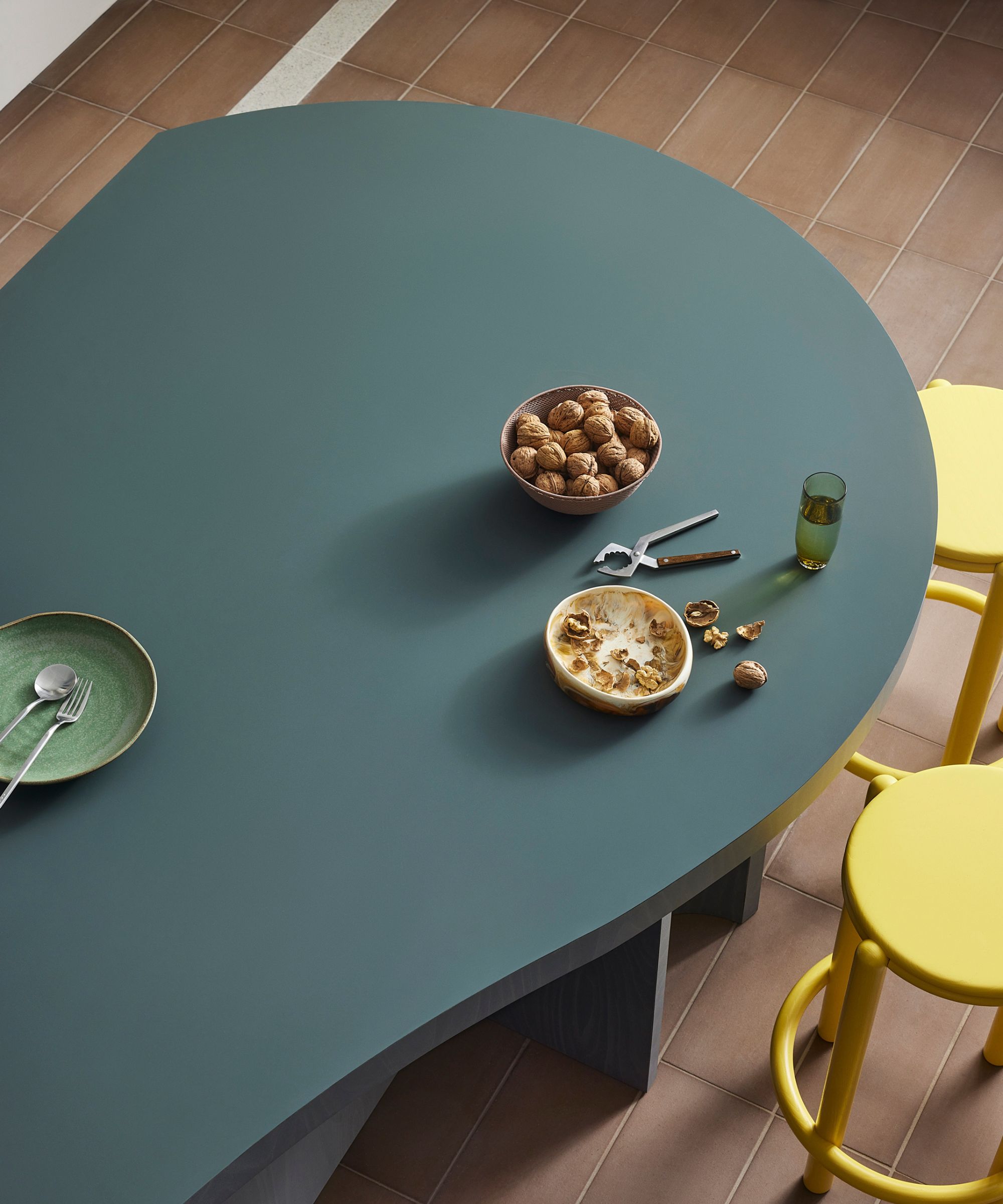
For all its vibrancy and personality, this kitchen is designed to be very practical. Every good kitchen design should also include opportunities to delight in joyful moments. Here, it’s the curved cooker hood, the unique fridge cabinet handles and opening a drawer to discover boldly colored inserts. Not forgetting the decorative wall light – it’s a quiet, sculptural moment that we hope brings joy to the owners.
Shop the look
To emulate the cool kitchen style of this space by Mardi Doherty and Phoebe Lipscombe of Studio Doherty, start with a backdrop of terracotta-colored tiles, layered with cream and sea blue elements.
Introduce a bold color pop as well as plenty of stainless steel combined with rustic textures. Don't forget to include pieces with personality, such as handmade ceramics, to avoid the space feeling cold and clinical.
Porcelain tiles in an earthy hue will introduce a feeling of calm and a connection to nature in a kitchen. Using a sheet is an easier way to achieve a tile effect.
The Casabrews espresso machine is made from sleek stainless steel, designed to look stylish as well as create the perfect home brew.
Lipper's chopping board is made from durable acacia. Resting it on your kitchen cabinet is the perfect way to introduce a warm woody texture into your space.
These hand-made ceramics by Icelandic artist Bjarni Sigurdsson are completed in a natural glaze made from the volcanic ashes of an erupted volcano. Ceramics in the kitchen will add a touch of personality.
This beautiful freestanding cabinet is great for additional kitchen storage. It's made from Oak wood, hand-painted linen, and finished with brass fixtures.
This double Visual Comfort & Co sconce made from brass with a hand-rubbed finish is ideal for adding a cool contemporary touch whilst spotlighting your work surfaces in the kitchen.
Designed by Philippe Starck for Emeco from recycled materials, the Broom Stool is hardwearing, comfortable, and will add an instant color-pop.


