We have officially moved away from dressing from head to toe in neutrals – we're embracing an unexpected red bag here, and a pink trouser suit there. We're no longer fearful of bold colours and patterns in our wardrobes, and we're feeling the same about our homes.
The rise of dopamine dressing has given birth to dopamine decor, with a shift away from greys and taupes, towards a more joyful approach to decorating with happy paint colours.
The interior paint colour trends of 2024 are brimming with optimistic and lively shades, but trying out more daring living room paint colours can leave the most decisive of us dashing back and forth to B&Q with our paint cans. But by decorating with the three colours for a happier home, you can get painting with confidence.
3 happy paint colours to make any room feel uplifting
"The upsurge in ‘dopamine decorating’ and using colour in our home to uplift and inspire us is one of my favourite interior trends in recent memory, and one I think is here to stay as we embrace the power of positive colour palettes," says Marianne Shillingford, creative director at Dulux.
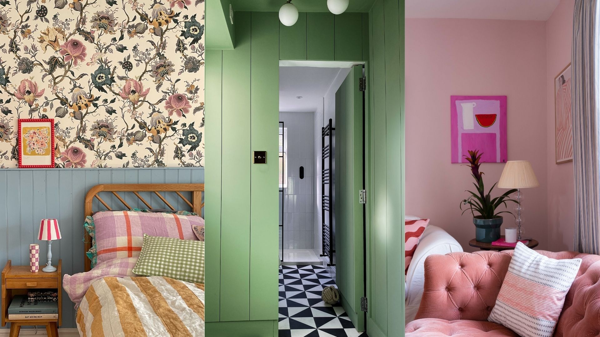
So, what are the happiest colours to decorate with at home? According to Tash Bradley, Lick's director of interior design and colour psychologist, they are cuddly pinks, warming yellows and energising greens.
"These paint colours are typically bright and warm, often with yellow or pink undertones. According to the principles of colour psychology, surrounding yourself with these colours can make you feel more optimistic, uplifted, open, and even happier," says Tash. Here's how to use them.
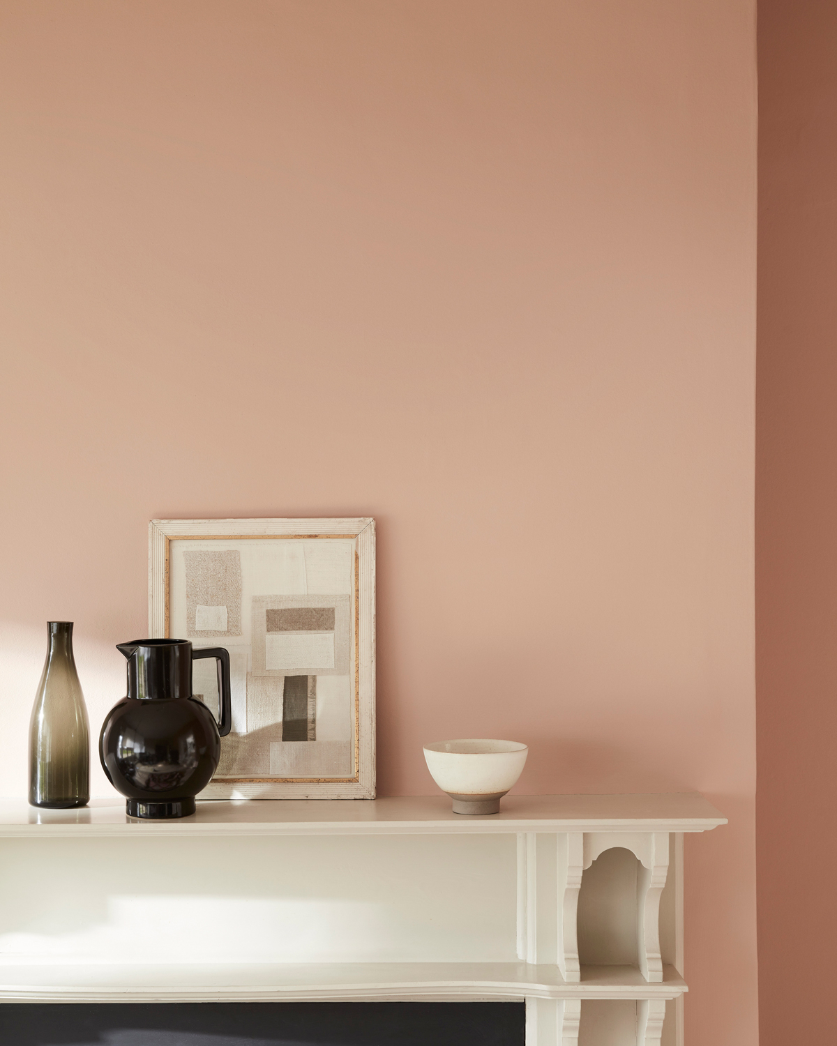
1. Pink
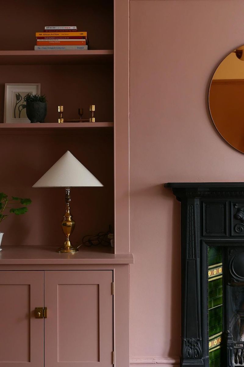
Not only is soft pink one of 2024's biggest interior colour trends, but it was also Dulux's colour of the year. Plus, it's one of the best colours for ceilings, and not too big of a jump away from neutrals, if white and beige are usually your comfort zone. From setting plaster to flamingo, there's a pink to suit all tastes – you can head to our guide to the best pink paint colours for inspiration.
Pink adds a comforting, nurturing feel to any space, says Tash Bradley. "Each of our pinks will create a physically soothing feel and make your shoulders drop the moment you enter the room. A cuddle in a paint tin, Pink 01 is our go-to paint colour for creating subtle but uplifting spaces. Muted grey undertones give it a contemporary feel, while those red notes mean it's full of warmth."
Opt for a beautifully subtle pink, like Pink 01, for a modern alternative to neutrals and a warming alternative to white. Tash says it's one of the best living room paint colours, but it will also look great in a bedroom.
"In fact, you could really use this pink anywhere in your home. It will brighten up a room while creating a cosy, inviting feel," says Tash.
Here are three pink happy paint colours we recommend trying...
RRP: £36 for 2.5L | Championed as the soft pink of the year, this Dulux shade is a refined and understated approach to what most of us think is a 'pink' paint colour, but there's no denying the levels of warmth it lends to any space. Ideal for north facing rooms the red tones help to add an uplifting glow to what would otherwise be dark shadows.
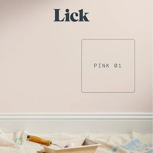
RRP: £45 for 2.5L | As Tash says the muted grey undertones give this soft shade a contemporary feel, while red notes mean it retains plenty of warmth. Lick's Pink 01 has lots of positive reviews, with customers praising its ease of application and the fact a little goes a long way.
RRP: £57.50 for 2.5L | Speaking of this Little Greene pink paint colour Ruth tells woman&home, "The grown-up pink, 'Masquerade’ is both calming and joyful. With its delicate, powder-like hue, Masquerade offers an alluring, natural undertone that is as ‘at-home’ in the bedroom as it is in the bathroom." This is ideal for those who favour a heavier pink pigment.
2. Yellow
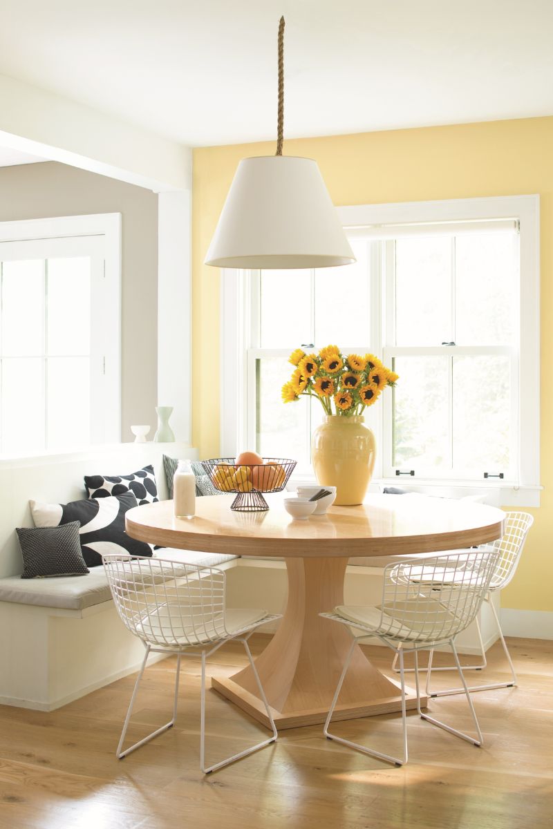
Think of a room filled with sunshine, and it instantly lifts our spirits. Sunny and optimistic, yellow brings energy and warmth. What's more, it pairs beautifully with green, blue and white, so you can always use it as an accent colour within your existing space.
Tash Bradley recommends combining complementary colours yellow and blue for a vibrant and characterful palette. Try Lick's Yellow 08, which is bold but soothing, like afternoon rays of sunshine, with Blue 08. For a more mustard look, you can try Yellow 02, which has an optimistic quality, perfect for creating spaces that invite happiness and inspire confidence.
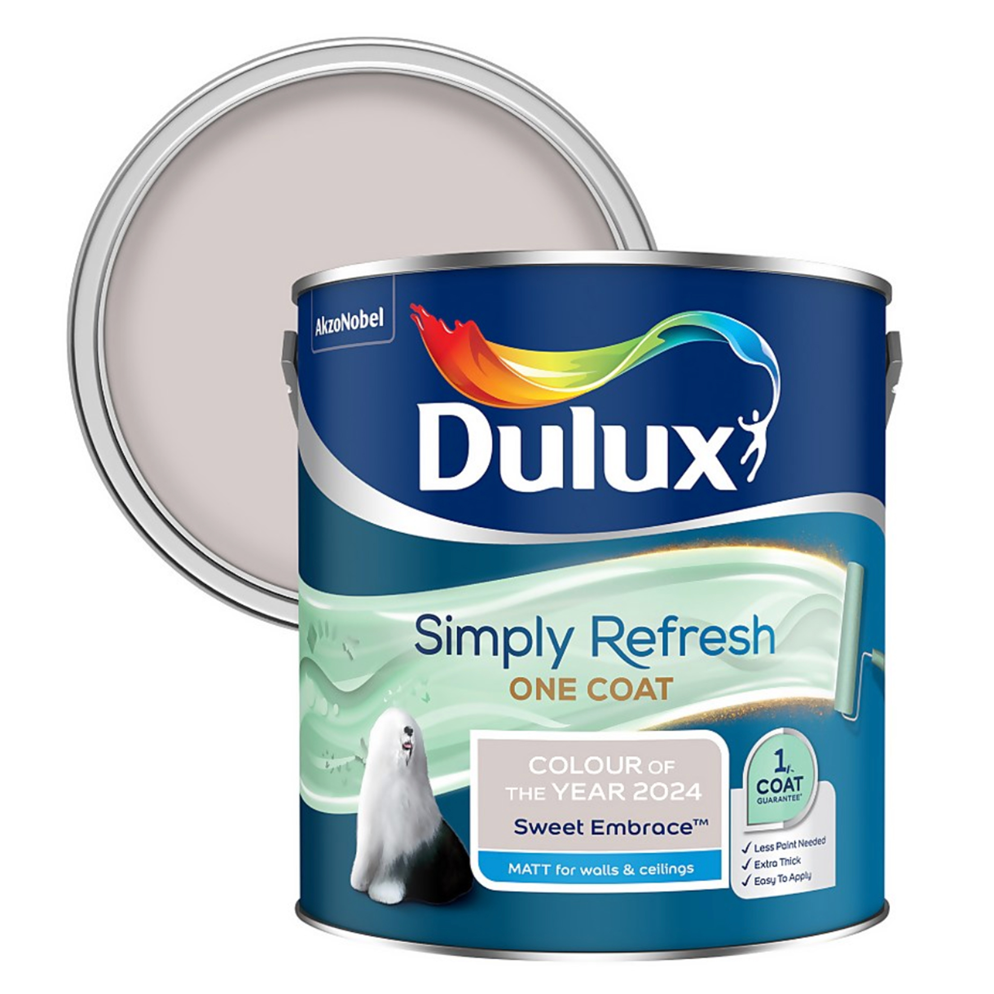
Dulux's creative director Marianne Shillingford recommends combining yellow with floral purples and earthy neutrals. "If you want to make it look like summer exploded in your room, shades like High Summer, Fragrant Peony and the Dulux Colour of the Year 2024, Sweet Embrace™, all combine beautifully to create a buoyant yet balanced scheme," says Marianne.
Here are three yellow happy paint colours we recommend trying...
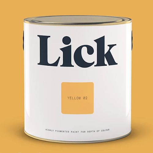
RRP: £36 for 2.5L | With joyful and happy qualities, Yellow 02 is a dark yellow with warm red undertones. Purchase a £2 peel-and-stick tester for less mess and waste.

RRP: £37.58 for 2.5L | Invite the sunshine in by painting window frames yellow, or give walls and skirting boards a sunny update with High Summer by Dulux.
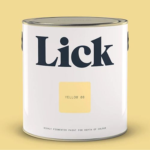
RRP: £36 for 2.5L | With dusty and earthy qualities, Yellow 08 is a muted mid-yellow with warm grey undertones, available at B&Q in eggshell and matt finishes. Pick up a removable paper tester for just £2 (made with real paint) to see how it looks in your home.
3. Green
Often described as "nature's neutral," green is a super popular shade right now, and it's known for making calming spaces that soothe the soul. Whether it's in your decor or on your walls, green tones remind us of being out in green spaces in nature and can make us physically feel more relaxed.
Sitting opposite pink on the colour wheel, shades of green will complement pink tones, whether you go for a pale, apple green or something more dark and moody.
Tash recommends hopeful and uplifting Green 14, at B&Q, which brings warmth and freshness. "With a dash of yellow and grey, it’s instantly uplifting yet still soft and gentle. Paint your woodwork or your kitchen cupboards for a rustic feel or in a bedroom or living room to create a serene space."
Try painting just your picture rails or front door green as a way to dip your toe into decorating with more colour. Interior designer Ann Marie Cousins says she encourages her clients to be brave with colour, combining colours we see in nature with neutrals.
"We hope this will have a positive influence on their everyday lives – a splash of energetic, powerful drama amid the more calming tones of a space makes people feel like they’re being radical and exudes confidence, without it being too much," she says.

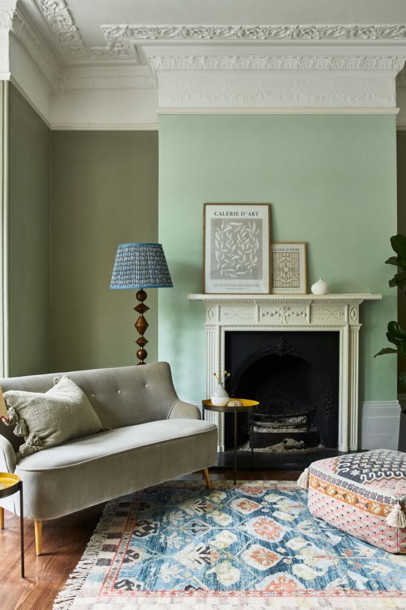
RRP: £29 for 2.5L | Overtly Olive by Dulux is a calming and clean colour, used in the living room pictured above. This particular paint formula can be applied with just one coat and comes highly rated, making it an inexpensive and easy way to refresh tired walls.

RRP: £59 for 2.5L | I love Calke Green by Farrow & Ball – it's great for creating a cosy living room and looks great under electric light in the evening. Combine it with James White, also by Farrow & Ball, on ceilings and upper parts of your walls, as this white has a green undertone.

RRP: £54 for 2.5L | Farrow & Ball's Vert de Terre is a fresh and soft green tone and another popular option among those wanting to bring some colour to living spaces. It has a blue undertone and is therefore less intense and a little cooler than other shades like Dulux's Overtly Olive or F&B's Cooking Apple Green.
FAQs
What are the best colours for an uplifting living room?
"For an instant hit of bold positivity, opt for a yellow," says Dulux creative director Marianne Shillingford. "Shades like Dulux High Summer, Dulux Ochre Sands or the gold-leaning Dulux Wild Wonder provide a surge of sunshine – even the smallest of doses can have a big impact.
"Bolder yellows can be softened by warm neutrals, like Dulux Warm Straw or Dulux Sandy Shallows for a cohesive, sunset vibe."
Are there any colours to avoid?
A rich red wine tone might work in a small snug room or library, but red is often too stimulating in living spaces, unless used as an accent. We naturally have a strong emotional reaction to bright red and it can make us feel on edge.
Think about how much natural light your space gets, as this makes a big difference to how colours look. "Moody blues can look comforting and luxurious in some spaces, especially as light trickles in during sunrise or sunset, but an overcast Britain can have a cooling effect on hues and could leave your room feeling washed out and dull," says Avalana Simpson, founder of luxury wallpaper company Avalana Design.
This goes for yellow too, Avalana adds, as a warm sunshine yellow with a country cottage aesthetic and co-ordinating creams can look stunning in full sunlight, but if you are relying on spot lights it can feel forced and jarring. "Test colour by adding paint pot samples, wallpaper samples and even fabrics to your walls or cupboards so you can test the tones in different light throughout the day," Avalana says.