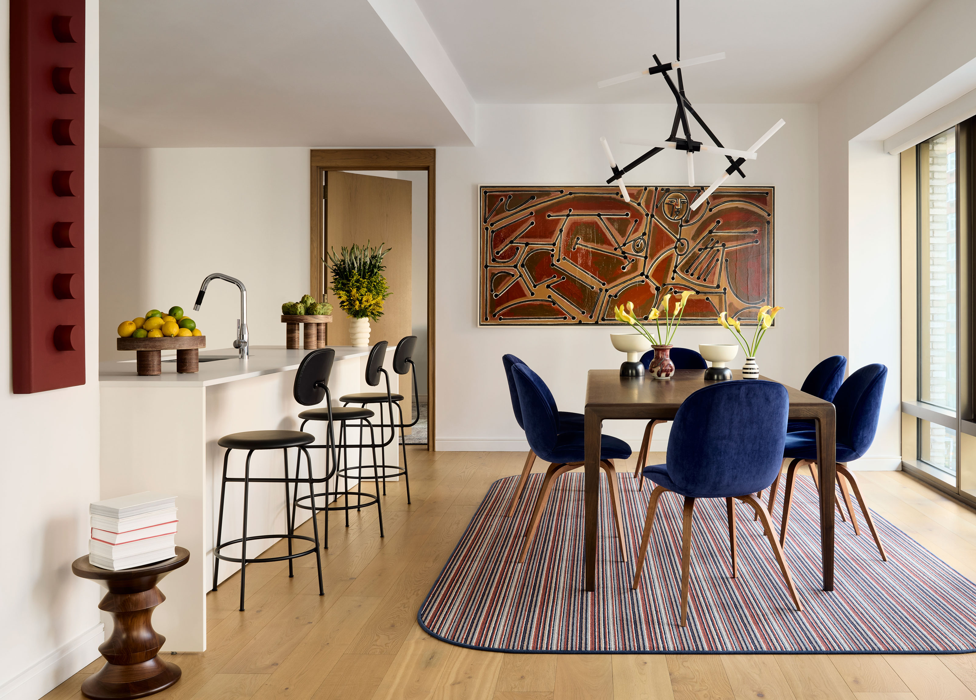
When the owner's of this New York apartment connected with interior designer Justin Charette to decorate their space, they laid down a gauntlet. 'I met the clients through the brilliant Jason Saft who is the owner of “Staged to Sell Home”,' Justin tells me. 'He was asked by the clients' realtor to refer a modern designer who isn’t afraid of color.'
Justin's previous projects for his eponymous design studio, often embracing colors boldly yet with a layered sophistication, proved the designer was more than up for the challenge set by the UK-based couple to reimagine the city bolthole they intended to call home when visiting New York. 'They are both in the art field which explains their love of color,' Justin explains. 'They wanted this NYC pied-a-terre to be a fun crash pad to visit this thriving art focused city.'
So, how does an artist's appreciation for color manifest itself in a modern home? As it turns out, in a somewhat surprising scheme.
A primary palette
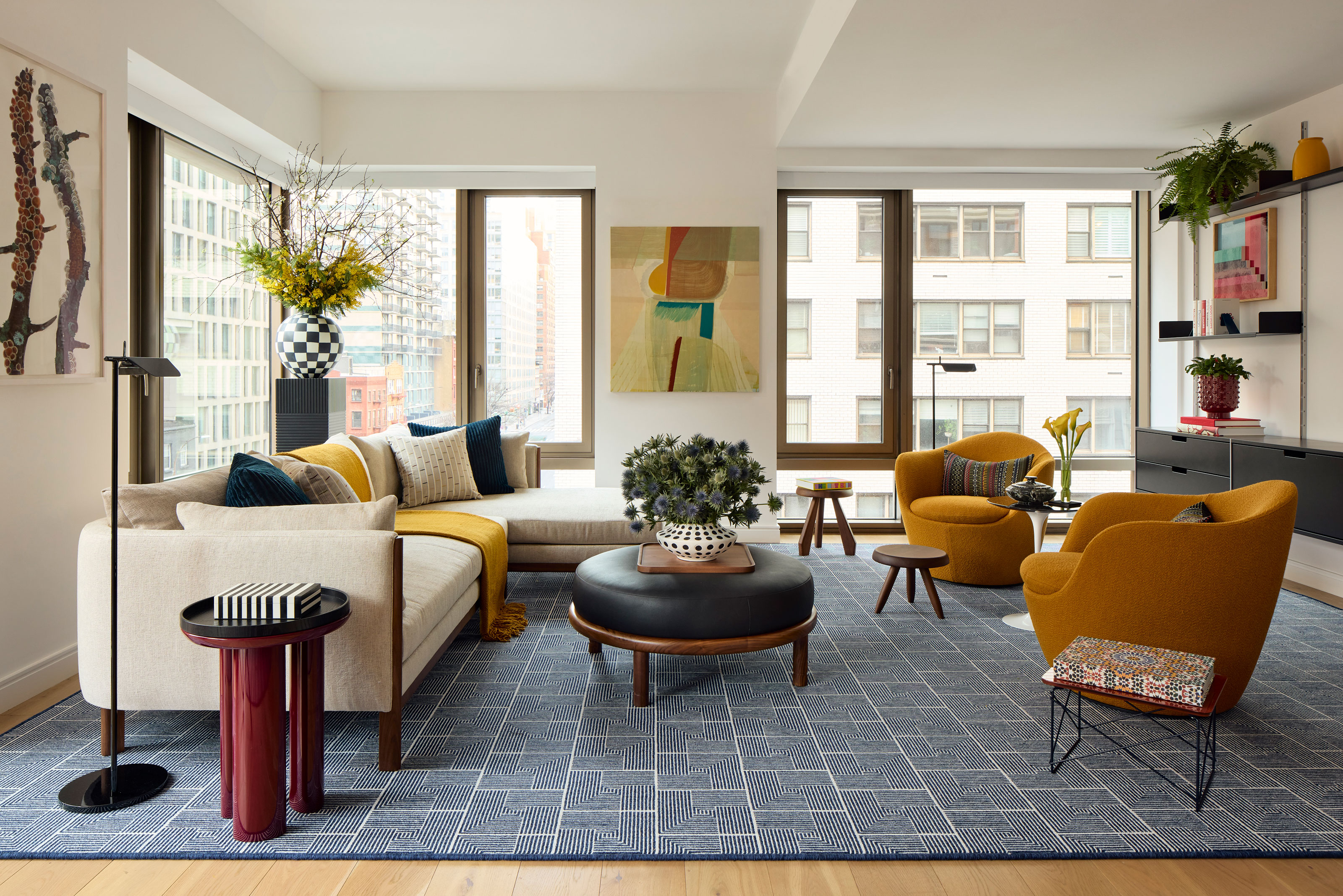
I'll say it — you don't often come across homes decorated almost entirely in a combination of red, blue and yellow, but for the apartment's owners, it was the starting point for their design brief. 'During my first and only meeting with the client they were insistent upon having a space that really embraced primary colors,' Justin explains. 'They love art and believe everything starts on the color wheel with primary colors coming first. Once we discussed color palette in detail it was very easy to navigate the project.'
This wasn't the only ask of the brief, however. Decorating with primary colors instantly lends itself to certain styles — it's a palette celebrated by the Bauhaus Movement, for example, that so greatly influenced Mid-Century Modern style. These clients were looking for a use of color that was a little more nuanced. 'The clients also expressed they didn’t want the furniture to feel to Mid-Century Modern or Danish,' Justin recalls.
'They were very descriptive in their needs which was very refreshing. That, along with trusting my expertise, helped me complete this project in just over 90 days.'
The success of Justin's use of the color palette hangs in the balance. In the open concept living room, dining room and kitchen, shades of mustard, navy and burgundy are more grounding than those pure, vibrant primary shades, ensuring the space is never at risk of feeling anything but elegant.
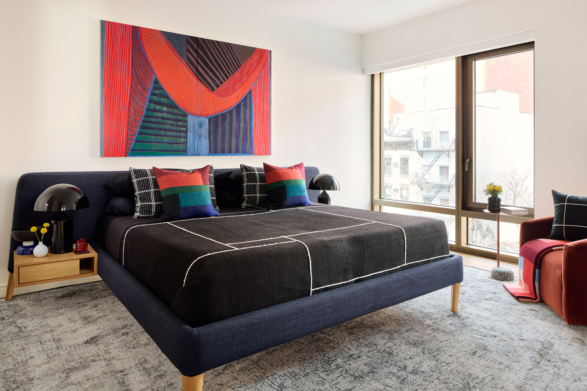
In the primary bedroom, bolshier primary reds and blue bring a joyful energy, but they're curtailed by a navy and black combination among the furnishings that keeps the space in grown-up territory.
'The key to a primary color palette is incorporating a good balance of neutrals on the larger pieces of furniture, and natural wood tones for warmth,' Justin tells me. 'This adds sophistication and keeps it from feeling juvenile.'
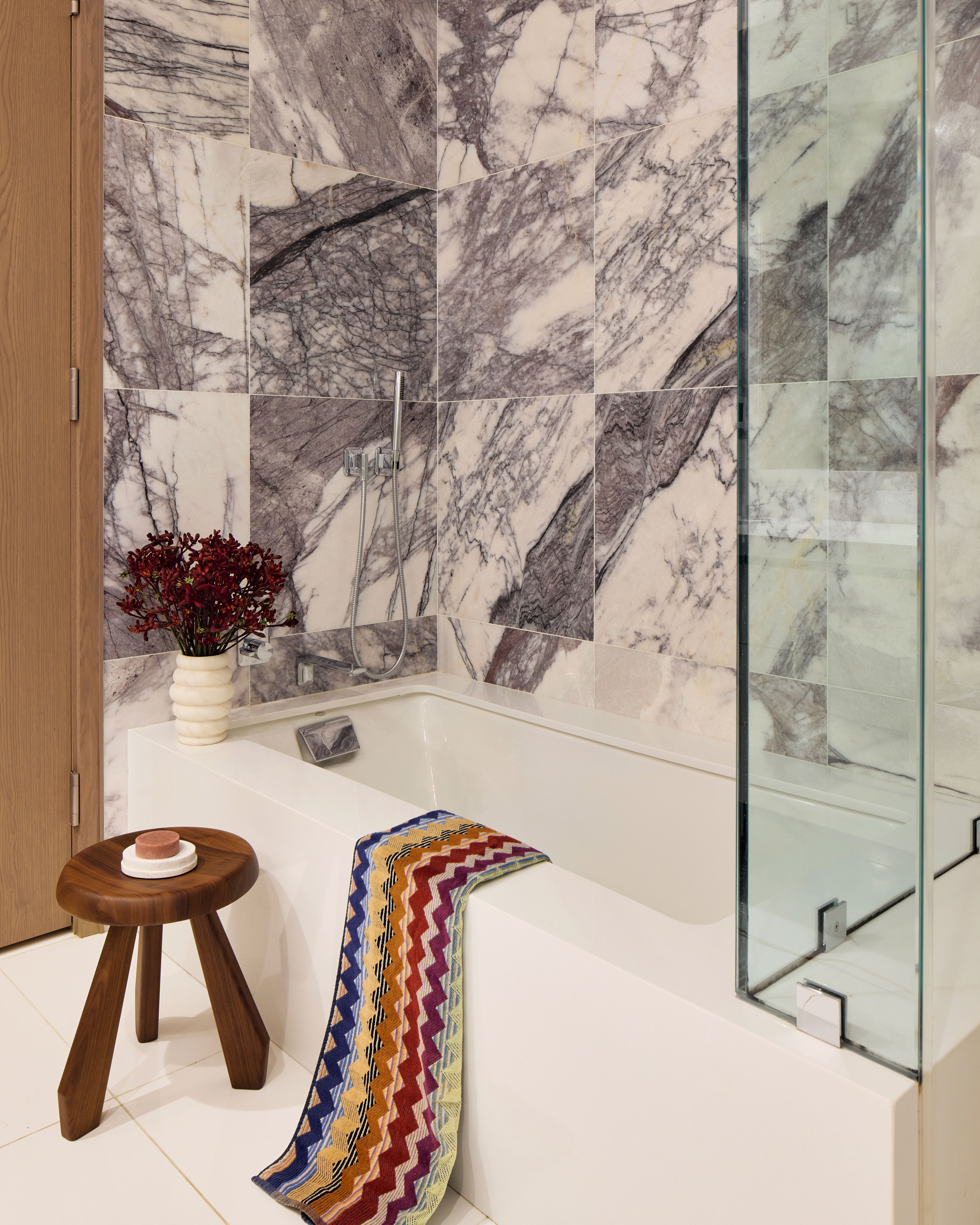
In spaces like the kitchen and bathroom, simple choices have been made to reflect this more sophisticated approach to the palette. 'The clients wanted the bathroom and kitchen to feel playful but simple,' Justin says. 'We selected simple straightforward materials that are timeless and not overly specific. Where we had more fun was with the accessories.'
Artistic endeavors
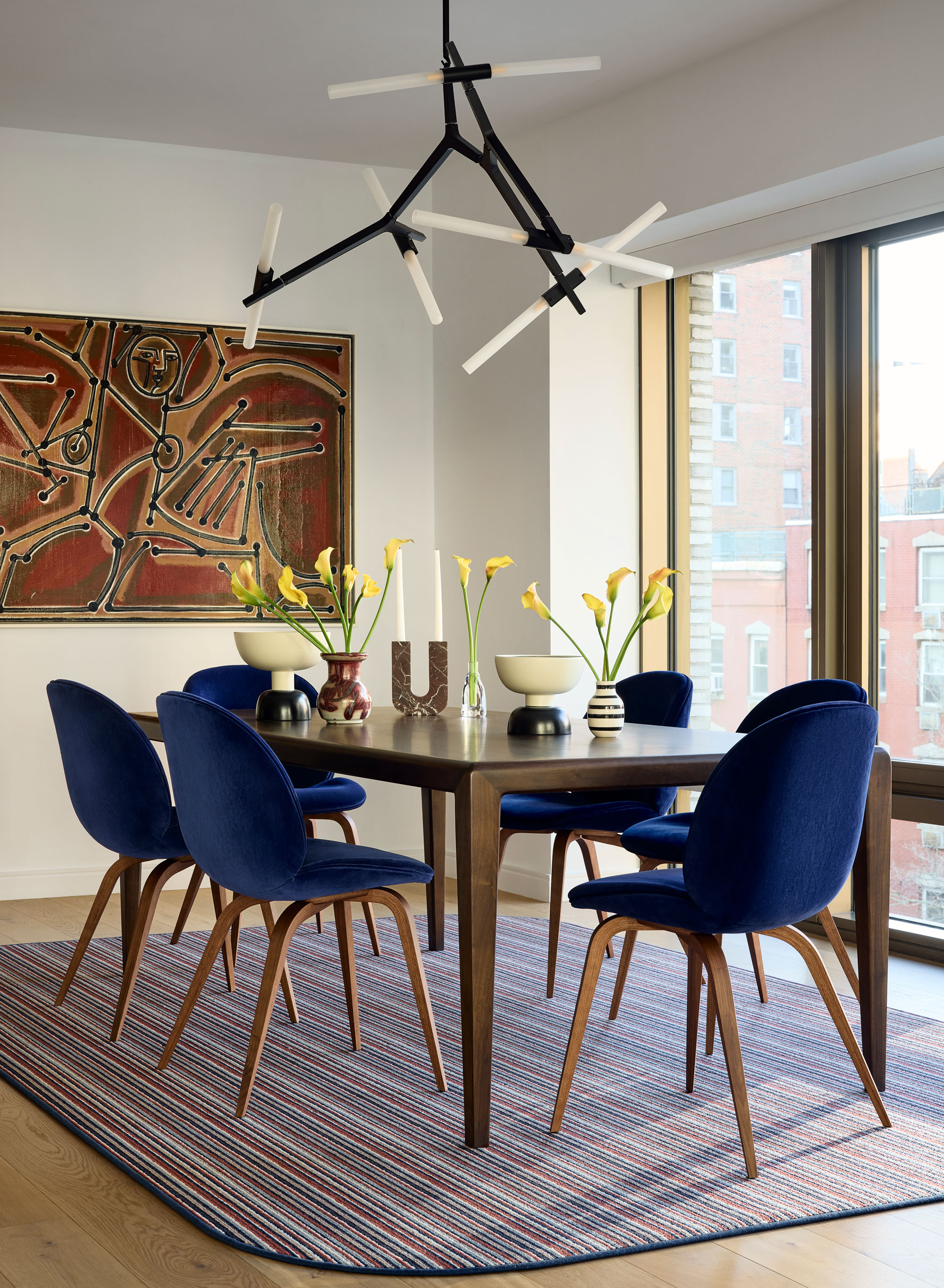
For clients involved in art, it's no surprise their pied-a-terre has a gallery-like feel. In each room, the wall decor helps to round out the color scheme, while adding dimension and movement.
It also, as Justin explains, helps to solve one of the big challenges with decorating an apartment like this one, with its corner location and large glazing component.
'One of the main challenges in designing a corner apartments is trying not to block the light — it was important to keep the sofa on legs as well as the ottoman to let light stream,' Justin says, 'but I also think it’s important to utilize all walls between windows for art to provide balance among the view.'
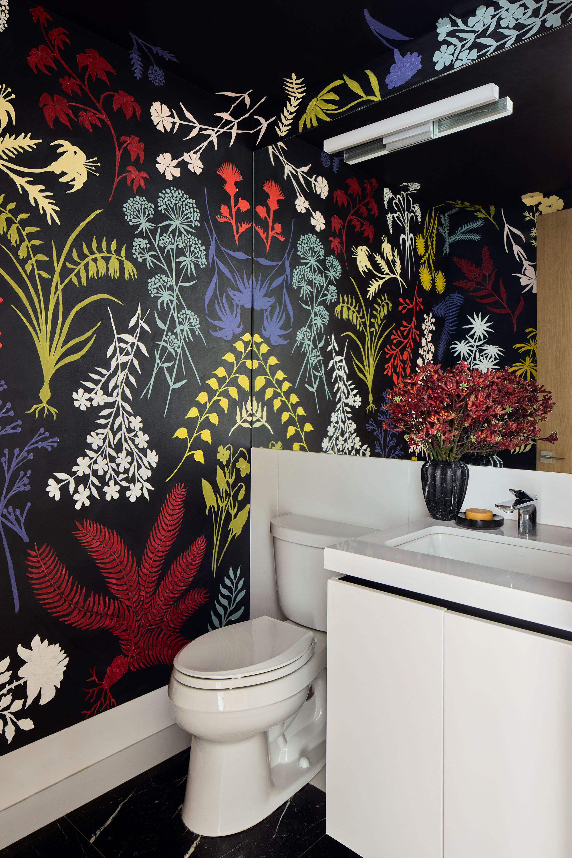
Though the smallest room in the apartment, the powder room is perhaps takes the biggest swing when it comes to artistic endeavors.
'The WC is a handprinted mural by a local artist named Abby,' Justin explains. 'Given this half bath is one of the first things you see when walking down the hallway we wanted it to pack a punch, and much like the rest of the space it’s focused on primary colors, but deviates on some of the floral to add depth and sophistication.'
Be our guest
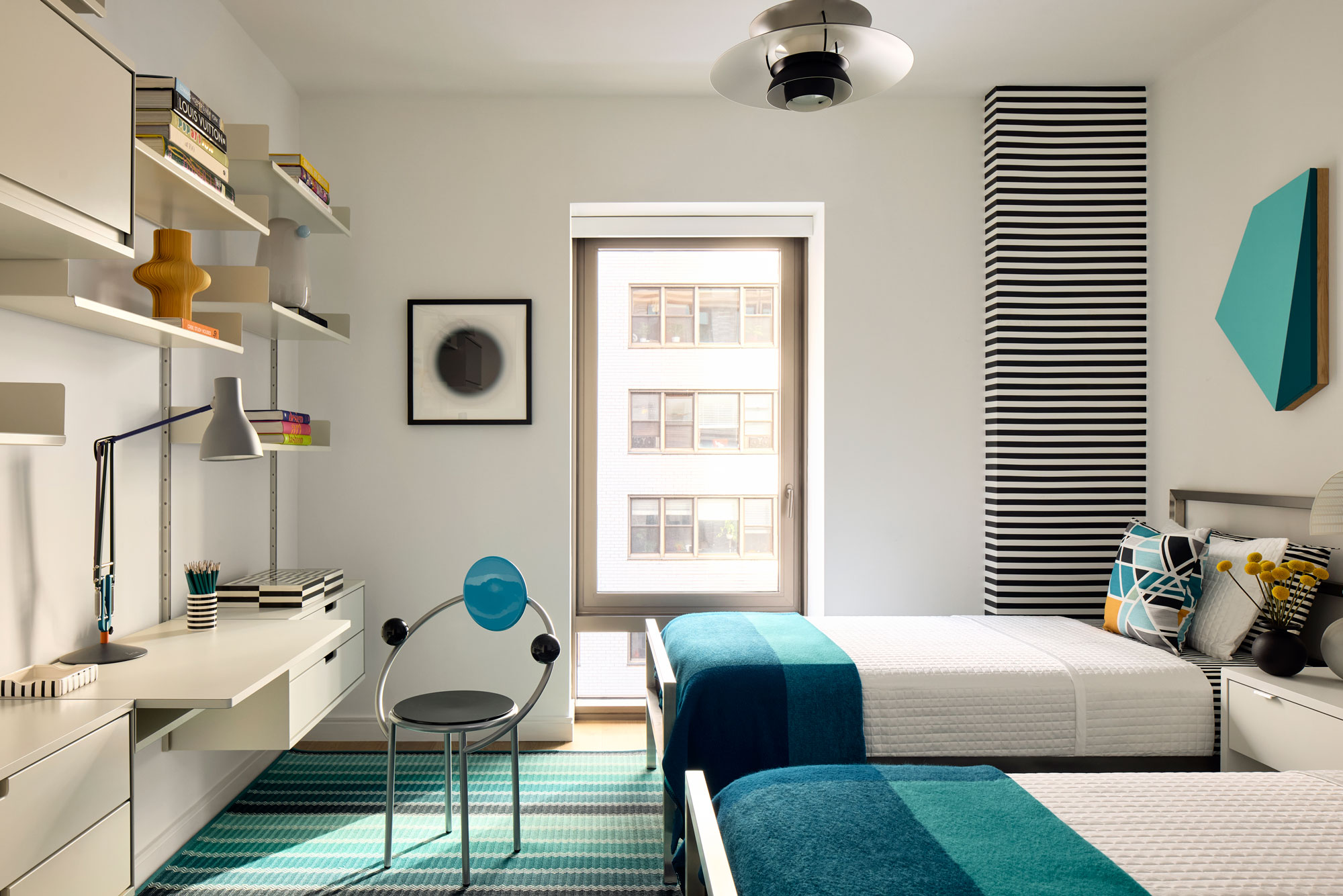
While guest bedrooms can often feel like an afterthought, this one offers a slightly different perspective and change of pace. A cooler color palette brightens the space, and adds a freshness that feels right for its dual purpose as a home office.
It's a small space that Justin had to make work hard. 'It was a tall order to fit two extra long twin beds, a nightstand, and a large desk/shelving unit in a 10x10 room,' he says. 'They needed a place to work that was not the dining table, and wanted space for two adults to sleep.'
From the staggered shelving to the wall art, it's a small room design that doesn't lack for something to say. 'I used stripes and graphic patterns to help pull the eye around the room,' Justin explains. 'The stripes are hand painted with precision. Given the space is tight I didn’t want to take up any floor space with curtains, but wanted the wall to have some interest to balance out the desk on the opposite side of the room.'
It's another space that has an undeniable sense of fun to it. And isn't that what really unites each room of this apartment's design? A cohesive color palette across a home is one thing, but the sense of joy this scheme conjures is even more important to note.


