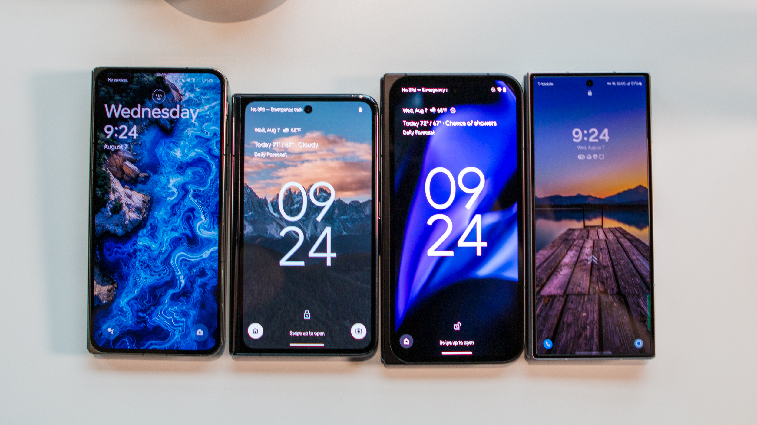
If you put most book-style foldable phones next to each other, you'll notice a trend. Most of them are tall and narrow when closed, which allows them to be a bit more square when unfolded. To me, this has always felt like the wrong design decision, as it was one that tried to stick as close to a "regular" smartphone design rather than playing to the strengths of a book-style foldable.
That is until the original Google Pixel Fold came along in 2023. Oft-rumored and substantially delayed past its original release, the Pixel Fold opted for a squat, wide design that unfolded into a landscape almost 16:9 aspect ratio, much more closely mimicking a tablet than other book-style foldables.
But its sequel, the awkwardly named Google Pixel 9 Pro Fold, decided to act more like other foldables I've used and forget the unique identity of its predecessor. While Google may have improved many other aspects of its latest foldable, the wrong choice was to go for a more "traditional" foldable phone design. Here's why I want to see Google go back to a wider design for the Pixel 10 Pro Fold.
It's better for apps
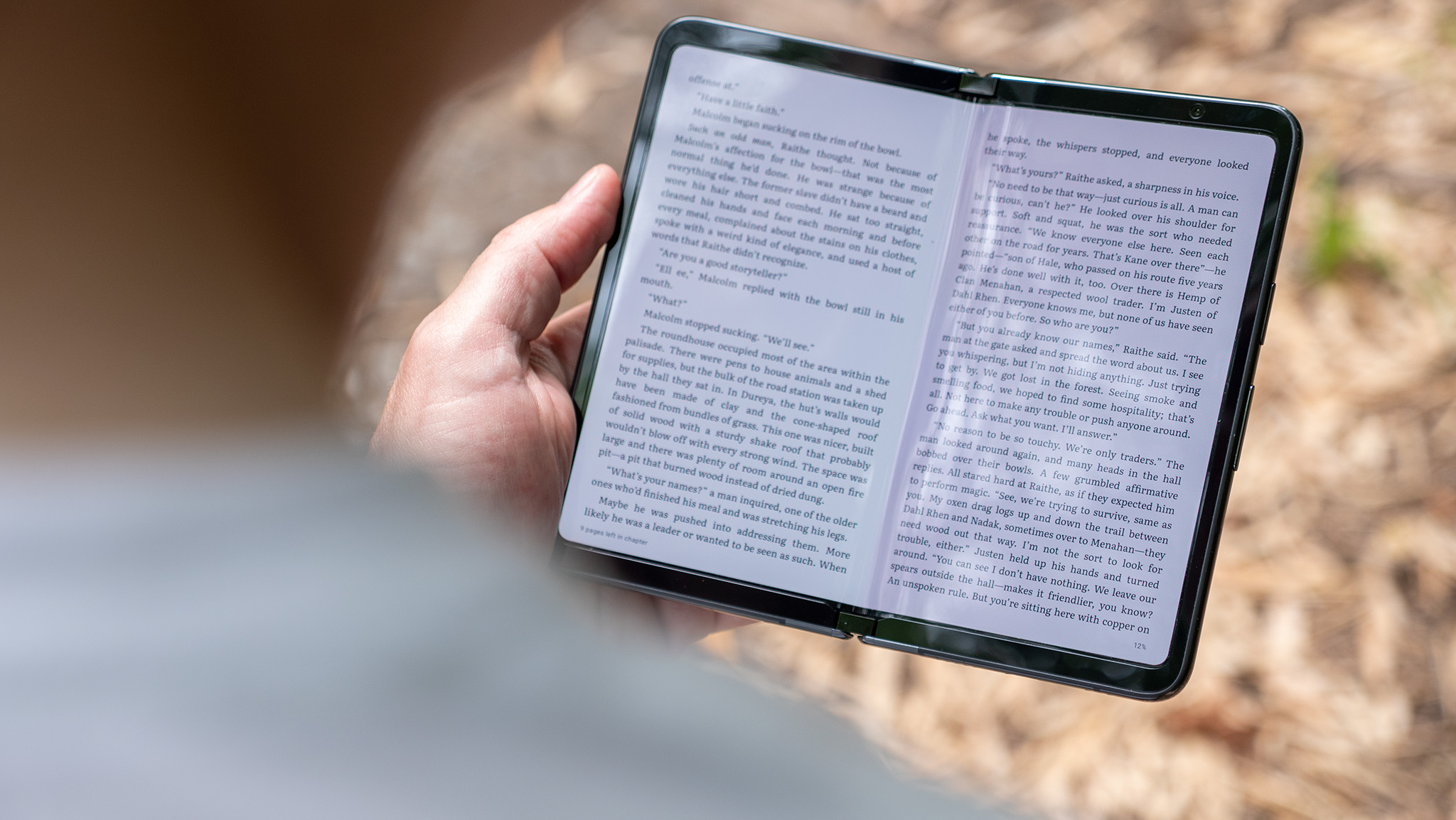
One of the key takeaways from my original Pixel Fold review was that the wide aspect ratio wasn't just great for apps on the outer screen but better on the inner display, as well. But this wasn't inherently because the screen was wider. Rather, it was because opening the Pixel Fold made apps think you were suddenly using a tablet in landscape mode.
In fact, the only other foldable that was like this was the Oppo Find N2, and that device was never released outside of China.
That last part is the most important part of the Pixel Fold's design, as it ensures that the giant screen is used correctly. Every other foldable on the market still acts like a giant smartphone when opened up. It's essentially a "wide portrait" screen, and it makes many apps feel awkward and useless when opening them on the big screen.
Take Gmail, for example. While Google worked to ensure that many of its apps started behaving more like tablet apps when opened on big foldable displays, Gmail still thinks it's being opened on a normal tall, narrow smartphone screen even though it's being displayed on a big, wide foldable display. That is unless you're opening it on the original Pixel Fold.
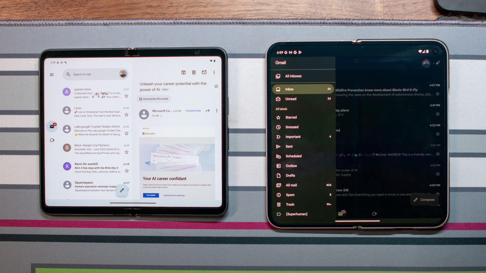
On the Pixel Fold, Gmail opens up in the proper landscape tablet dual-pane view, giving you the list of folders and tags on the left, while the open email or list of emails resides on the right side. Sure, you could get this same view if you rotated your open foldable 90 degrees sideways, but I'd rather it just open the right way the first time.
When I've got a big foldable screen, I expect to have a more efficient workflow than when on a smaller phone screen. In other words, I shouldn't need to pull out the slide-out menu on the left. It should just be there. This also keeps me from having to constantly navigate forward and backward when reading emails, as emails open next to my inbox instead of on top of it.
Another example is the YouTube app, which actually opens in tablet view no matter which way you rotate a foldable, but videos themselves work better on the Pixel Fold's aspect ratio when using them in "flex" mode. That's when you fold the display at an angle and use the bottom half like a kickstand to watch a video or play a game.
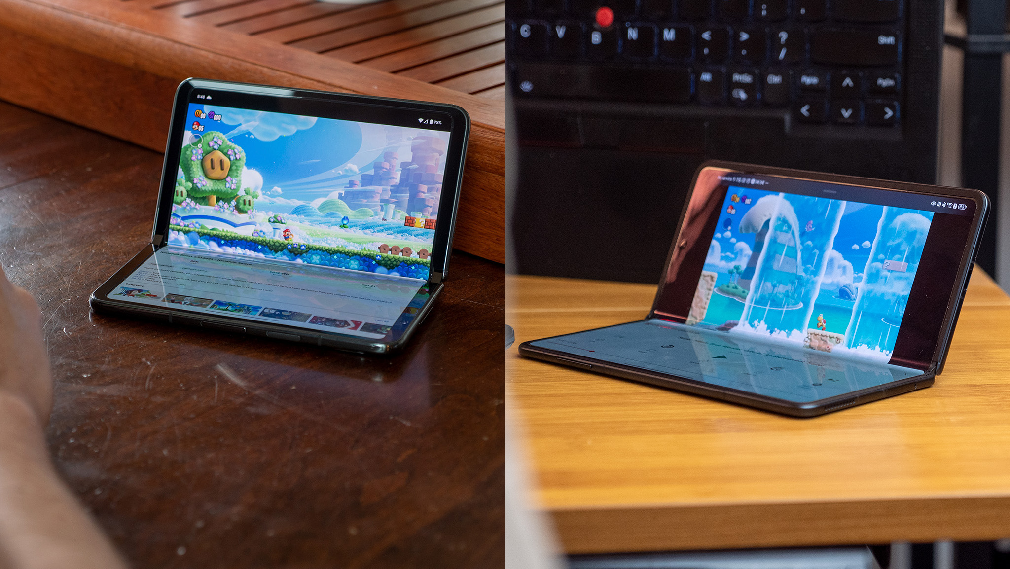
The original Google Pixel Fold displays the video on the entire half of the screen, while every other foldable I've used has black bars on the side because the display doesn't have the right aspect ratio for this purpose. The example above is the Pixel Fold next to the Honor Magic V3, but this particular problem occurs on all the best foldable phones.
One more example is Discord, which is generally a terrible app to use on book-style folding phones because it's so darn buggy. But using it on the Pixel Fold is less problematic on the big screen because it actually fits the entire chat, plus the navigation pane and server list on that beautiful, wide inner display.
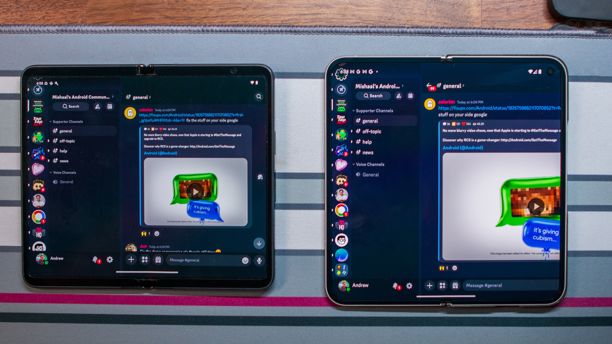
On the Pixel 9 Pro Fold, the chat gets cut off because of the narrower aspect ratio. To see the entire chat, you actually need to slide the side panel back of the screen to the left, leaving a giant chat window to take over your screen and waste a lot of space.
While a notable number of apps have worked to fix these issues over the past year since the original Pixel Fold launched, there are still plenty that don't behave as expected on large foldable phones.
Developers can, of course, opt into showing tablet UIs when large screens are present but it doesn't fix the inherent problem of displays that are too tall and not wide enough. The original Pixel Fold fixed this, but I'm afraid no other company will have the courage—Google included—to attempt the same move again, and that's a real shame.
