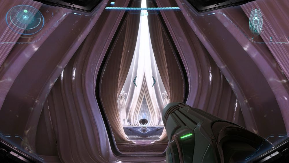
We wrote earlier in the year about how much we like Metroid Prime 4's art direction, describing it as a “1970s pulp sci-fi alien aesthetic piped through Halo”. It feels fresher than many recent AAA games, and the game's release this month hasn't disappointed.
What we didn't mention was a particular aspect of game's art that's now getting all the attention on social media: why does the architecture in Chrono Tower look so yonic? Perhaps the 'T' rating isn't only for violence.