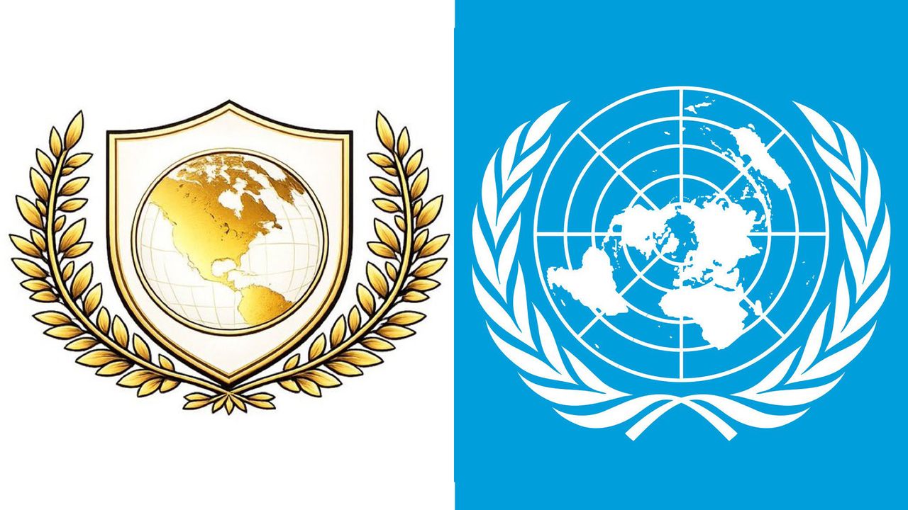
Donald Trump has just launched a new entity called 'Board of Peace' – and with it comes a new logo. And guess what colour it is? That's right. Gold.
Revealed at the World Economic Forum in Davos on Thursday, the new board was apparently created to tackle world conflicts. And if that sounds a little similar to the UN, wait until you see the Board of Peace logo.
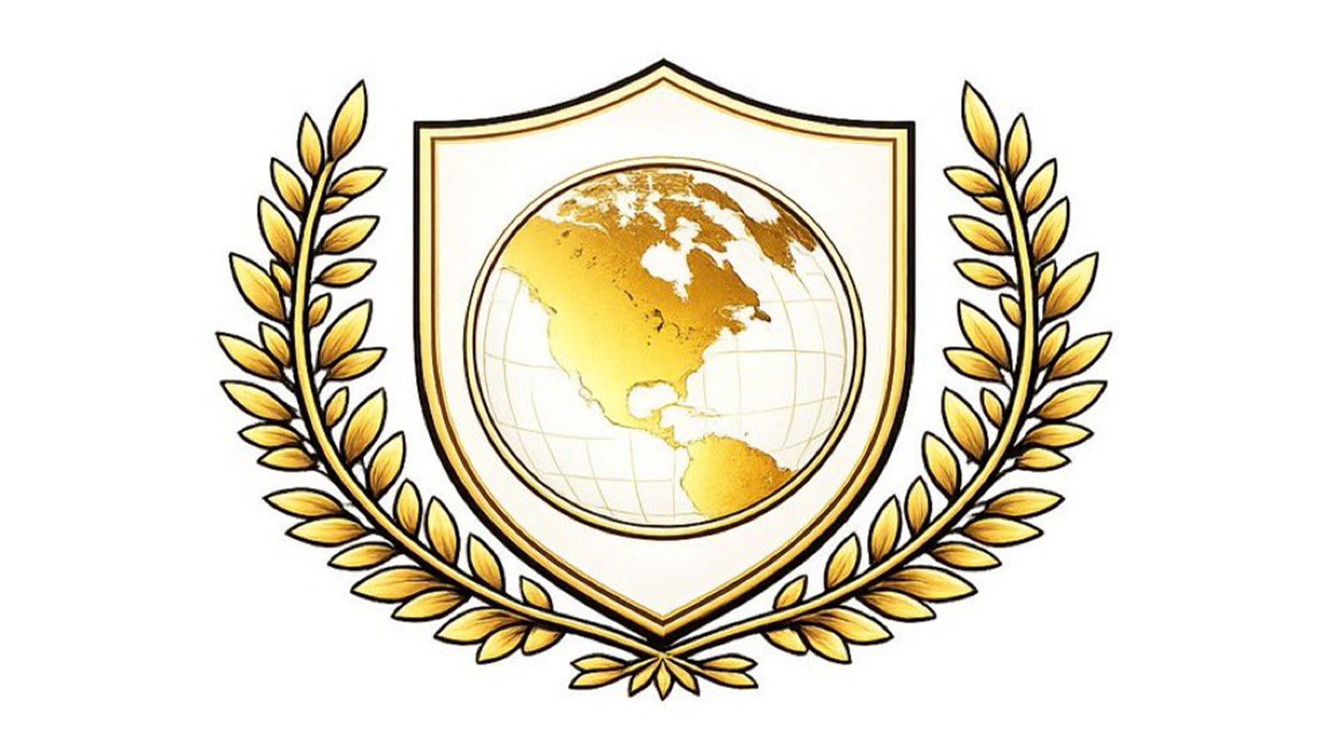
The UN logo of course features a wreath of olive tree branches surrounding a map of the globe. The Board of Peace logo is pretty similar – except the world is now simply North America, and the whole thing is rendered in shiny, gaudy gold.
Needless to say, the design is raising eyebrows online.
Beyond parody: Trump's "Board of Peace" logo is basically the UN logo repainted in tacky fake gold and with "the world" reduced to only North America. pic.twitter.com/t6e66oNbe8January 22, 2026
If a person asked AI to (1) take the UN logo(2) reduce the map to not much more than the US, Canada, Greenland & Venezuela(3) put it on a school shield from an old American high school movie(4) dip it in gold paintthen the result would be the logo used for the Board of Peace pic.twitter.com/JJHoUcT15zJanuary 23, 2026
The “Board of Peace" logo is the UN logo but dipped in gold and edited so the world only includes America with a shield implying “U.S protection”.Coincidence Or replacement? You tell me. pic.twitter.com/yWySfPRkJGJanuary 22, 2026
According to the UN, the original emblem of the United Nations was "created by a team of designers during the United Nations Conference on International Organization in 1945. The design team was led by Oliver Lincoln Lundquist. The UN emblem was designed to be "a map of the world representing an azimuthal equidistant projection centred on the North Pole, inscribed in a wreath consisting of crossed conventionalized branches of the olive tree, in gold on a field of smoke-blue with all water areas in white. The projection of the map extends to 60 degrees south latitude, and includes five concentric circles"
As for the Board of Paece logo, no official design rationale has been publicly shared. But judging by the final result, we wouldn't be surprised if "The UN logo dipped in gold" was basically the brief.
.jpg?w=600)

