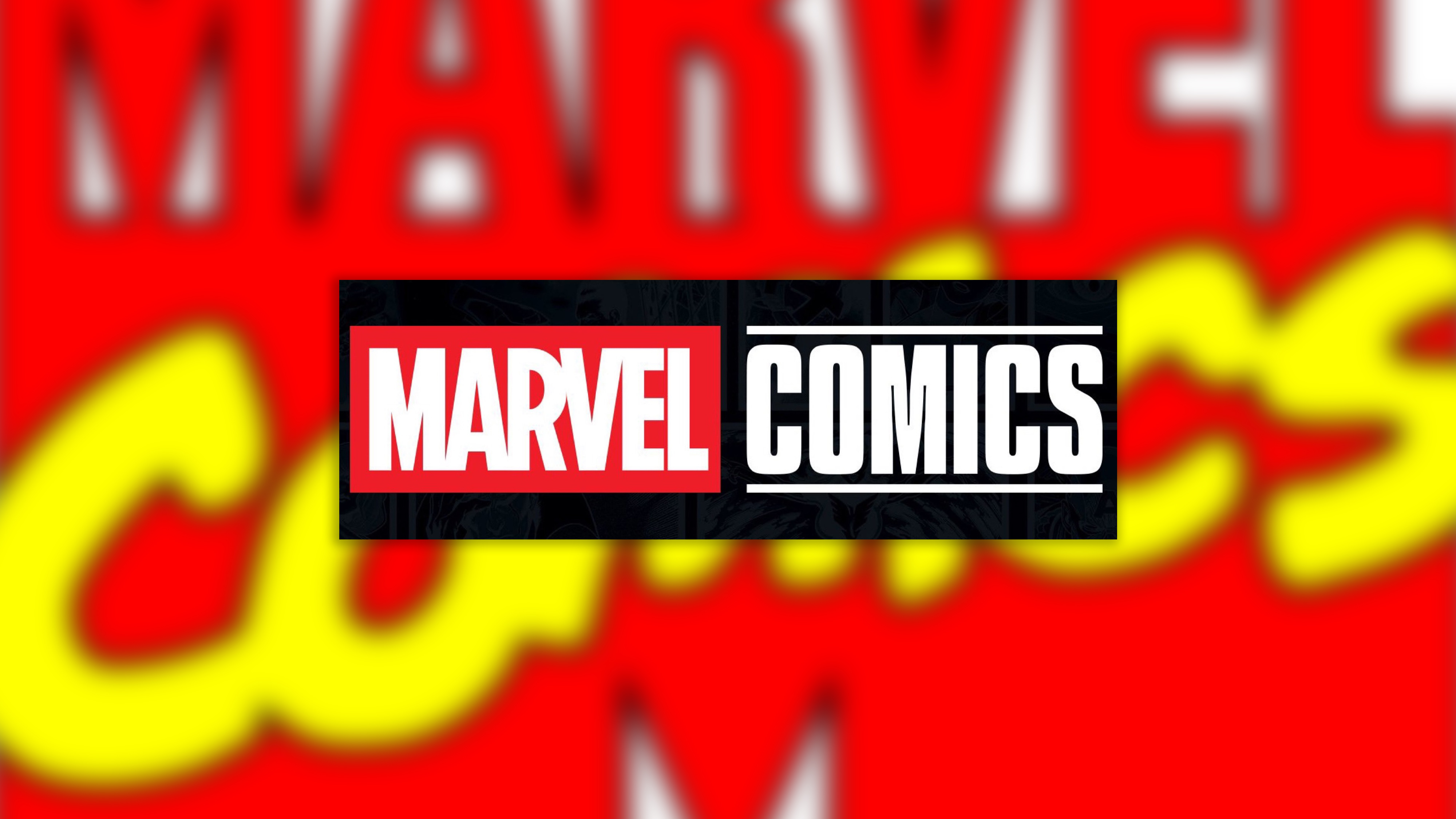
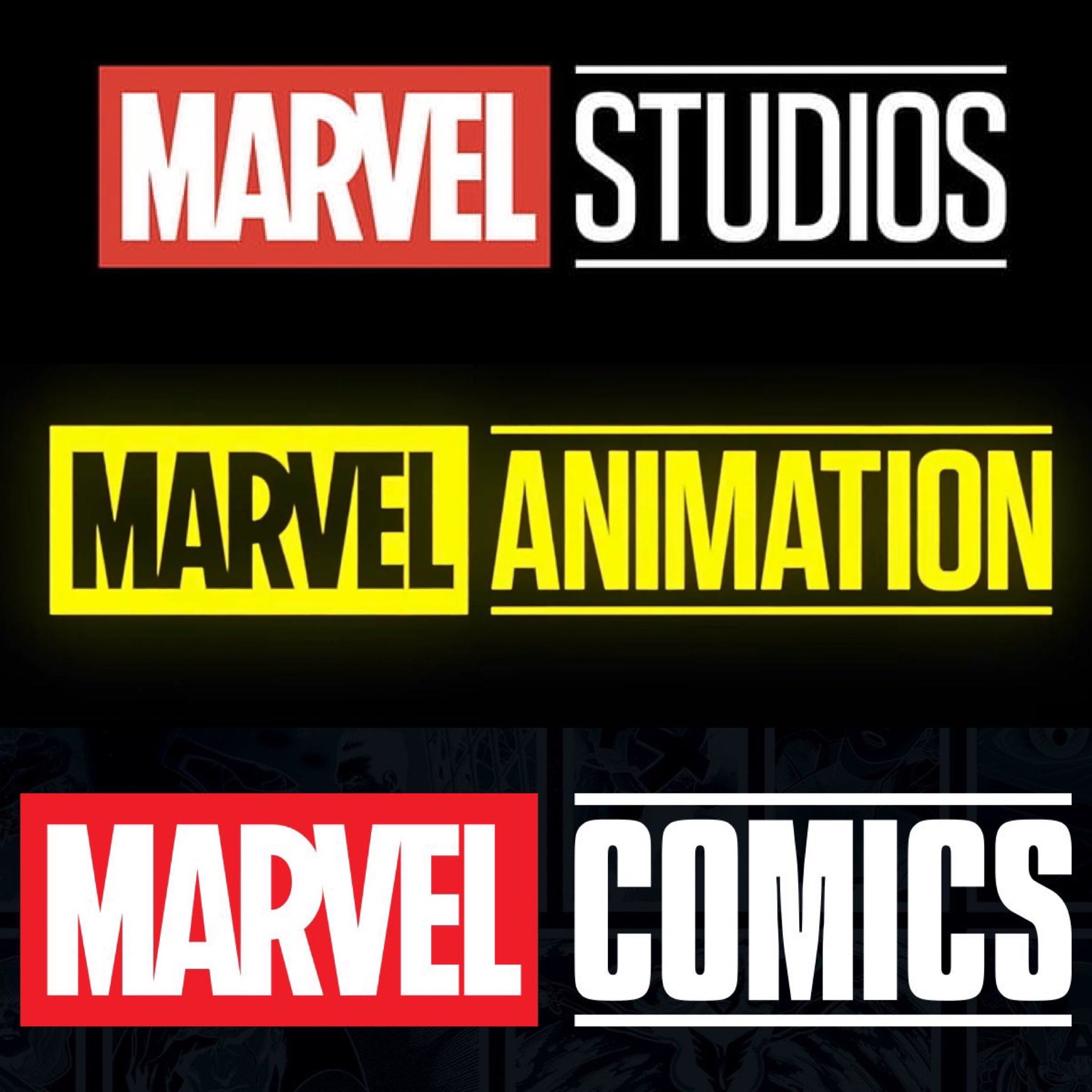
Marvel has revealed a new logo for its comics devision, bringing the branding very much in line with that of Marvel Studios and Marvel Animation. Yep, Marvel Comics has been MCU-ified – and while there's certainly something to be said for brand consistency, the internet seems to agree that this plain new design hardly screams "fun" – especially when compared with older logos from Marvel Comics' history.
The new logo, revealed via a post on X from the brand, features the standard Marvel logo alongside the word 'Comics' in plain sans-serif text, both underlined and overlined. And that's about it. (Looking for design inspiration? Check out the best logos of all time.)
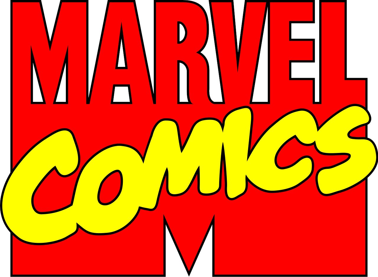
But with so many brands taking a leaf out of their own history books and resurrecting old logos right now, what would Marvel Comics look like if it did the same? Pretty darn fun, if it looked to the 1990s. With an MTV-style bold red 'Marvel' plus bright yellow handwritten 'Comics', it's a nostalgic delight. Couldn't Marvel have pulled a Pepsi and taken us back in time?
I get brand synergy and whatnot but this is lame.This will forever be infinitely cooler. https://t.co/iUrmwXwFf4 pic.twitter.com/8ijf6jxjxfJune 16, 2024
Dude honestly fuck this like if you want brand synergy do something like this (very rough edit but you get the idea). They should rebrand the movie one to respect the comics. Once again Marvel is acting like the comics are there to service the movies and not the other way https://t.co/21JWGRZW0G pic.twitter.com/3YUXOJPtVAJune 16, 2024
Ew!! Anywayhere’s the REAL Marvel Comics logo https://t.co/Z5b356xp72 pic.twitter.com/66EKGKgJKmJune 16, 2024
And as well a looking a little corporate, the new movie studio-inspired logo can't help but present a somewhat cynical impression – that it's now the films that come first at Marvel. Financially, of course that's no surprise. But with practically every Marvel character originating from a comic book, it's a little sad to see the comics division demonstrably trying to look like the film division – something feels a little back-to-front there.
Brands from Burger King to Burberry have resurrected old designs in recent years, and the results are often both striking and fun. But it seems Marvel didn't get the memo that minimal logos aren't doing brands any favours right now.
