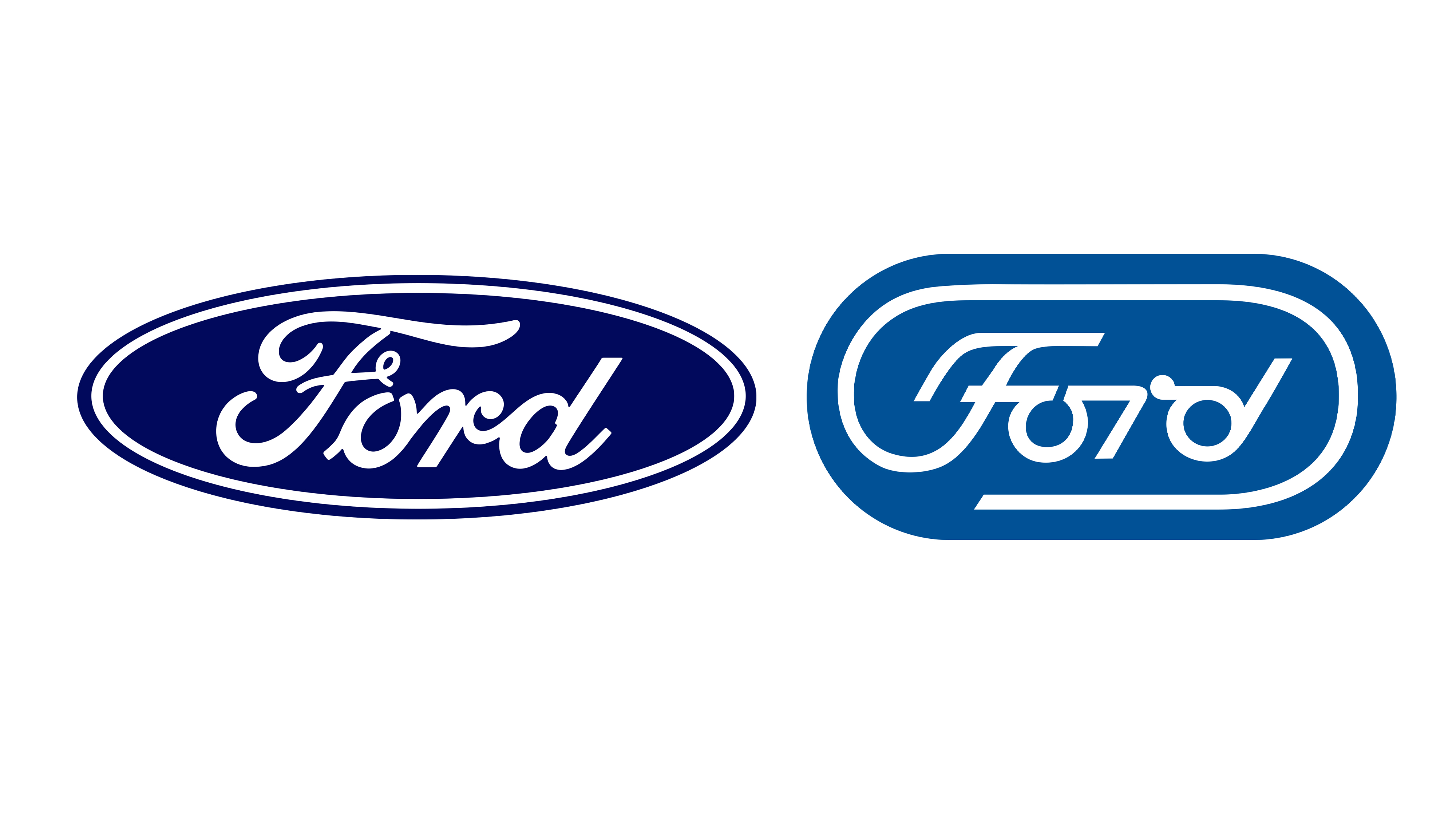
It seems like pretty much every major car manufacturer has rebranded in recent years, with most opting for a flat, simplified version of their previous logo. One brand that's bucked the trend by sticking to its existing wordmark with just a tiny change is Ford – but if it were to rebrand, it could do a lot worse than revisiting a brilliant unused design from 1966.
The logo by esteemed graphic design Paul Rand does the rounds on social media every few years, and is once again enjoying renewed appreciation on Reddit and X. Indeed, it might be one of the best logos that never was.